

Visual design is the main area of expertise at Hand-Heart Design Firm. Using typography, images and layout, we turn what a brand wants to say into something people can understand and remember. The work covers advertising design (posters, flyers, signs and light boxes), print design (tickets, invitation cards) and layout design (catalogues, annual reports, books). Good visual design communicates clearly, has aesthetic and material quality, and looks the way it was designed to, whether it is printed or shown on screen.
Visual design is the discipline that communicates through what people see. By creating and combining symbols, images and words, it turns an idea or a message into something people can understand and remember. Our visual designers draw on typography, visual art and layout to meet the communication goal of each project.
What does visual design cover?
- Poster design
- Newspaper advertisements
- Magazine advertisements
- Metro and transit advertising
- Large-format banners
- Shop signs and light boxes
- Flyers and direct mail
- Lettering and custom type
- Business cards
- Tickets and vouchers
- Invitation cards
- Promotional postcards
- Greeting cards
- Calendars
- Product and company catalogues
- Company profiles
- Brochures
- Annual reports
- Sustainability reports (see ESG report design)
- Books and course materials


When this page is the right starting point—and when it is not
Visual design is the service we are asked about most often, and the one whose scope is most often misread. It is the right fit for a communication piece with a defined purpose: a poster, a catalogue, a key visual for an event, the layout of an annual report. The goal is clear, the deliverable is concrete, and the work usually takes three to eight weeks.
In the situations below, visual design is not the right starting point. We would suggest going straight to another page, which saves a round of back-and-forth:
- You need a logo, a wordmark, or a full set of identity guidelines
- That is corporate identity work. A single good-looking graphic cannot solve the problem of every department using the identity differently. See corporate identity system (CIS).
- The company is changing its name or direction and needs to be understood differently
- That is rebranding: the diagnosis comes first, the visuals after. See rebranding.
- You need a sustainability report or a CSR report
- It follows a regulated format, runs to hundreds of pages and draws on data from several departments, so it is handled differently from ordinary layout work. See ESG report design.
- You need signs inside a building or on a site
- That is a wayfinding system: the routes are worked out first, then the look. See wayfinding system design.
- You need a product box
- Packaging has to work out structure and shipping first; the visual side comes second. See packaging design.
If your project spans two of these, just send us the details. In the first conversation we will work out together where it makes most sense to start.
What you receive
At the end of every visual design project you receive: print-ready artwork (bleed, colour mode, outlined type), the editable working files, web-ready exports, and a one-page “how to use it” sheet covering sizes, colours and finishing. If your own staff or suppliers will extend the design later, that sheet states which parts may be changed and which should be left alone.
Common deliverables: what you supply, how long it takes, what you get back
The table lists the six deliverables we produce most often. Schedules start on the day all materials are in hand and include two rounds of revision; printing and finishing time is extra.
| Deliverable | What you supply | Typical schedule | What you receive | Print supervision |
|---|---|---|---|---|
| Poster, event key visual | Event name and dates, organiser and its identity, mandatory text and logos, size and where it will be displayed | 2–4 weeks | Finished key visual, adaptations to other sizes (landscape, social media, light box), how-to-use sheet | Available (proofing, colour matching) |
| Catalogue, company profile, brochure | Final copy, product images or a photo shoot, identity guidelines, page count and print run | 4–8 weeks | Finished artwork for the whole publication, editable working files, PDF for online use | Available (proofs, press check) |
| Annual report, yearbook | Chapter structure, a contact person in each department, the raw figures behind the charts, last year’s edition | 8–12 weeks | Finished artwork and charts for the whole publication; a bilingual edition is quoted separately | Available |
| Invitation card, greeting card | Copy, who it goes to and how many, budget (this decides paper and finishing) | 2–3 weeks | Finished artwork, paper and finishing specification, envelope | Available (finishing proofs) |
| Monthly calendar, year planner | Theme, the source of the photographs or illustrations, the list of holidays and anniversaries | 6–8 weeks | Finished artwork for 12 or 6 sheets, binding specifications | Available |
| Flyer, folded leaflet, email mailer | Final copy, product images, the channel (printed or electronic) | 2–3 weeks | Finished artwork and the electronic version | Available for printed pieces |
Sustainability reports are not included in this table, because they follow a regulated structure and draw on data from several departments. For the method and the schedule, see ESG report design.
The elements a visual design is built from
A finished piece is usually assembled from the elements below. The clearer each element is, the more orderly the page:
- Key visual
- Headline
- Subhead
- Body copy
- Contact details
- Corporate identity
- Typeface and lettering
- Layout
- Colour scheme
- Photography and image editing
- Paper stock
- Print finishing
Of these, print finishing is the most often overlooked, yet it often decides how the piece feels: varnish, lamination, embossing, debossing, gold foil, silver foil, perforation, creasing, die-cutting and spot colours. The same artwork with different finishing gives the printed piece a completely different character.
A layout that holds up in black and white is the only one that looks good in colour.— that is why we call the first draft the “black draft”
What design can do, and what it cannot
What it can do: turn difficult, complex information into something visual, so that what really matters gets noticed. Before starting we define what “finished” looks like (DOD, Definition of Done), and we let facts and figures decide the layout rather than setting one person’s taste against another’s.
What it cannot do: no design, however good, changes the product or the service itself. So we first ask what the piece is meant to achieve, then decide whether to take it on and how. Design is not decoration; it finds the shortest route for a message to reach people.
What makes a visual design good?
- Carries the message clearly and precisely
- Rests on one clear idea
- Is easy to read
- Has aesthetic and material quality
- Meets the marketing or promotional goal it was made for
- Catches the attention of the people it is aimed at
- Is remembered afterwards
- Triggers sensory responses or associations beyond sight
Of these eight, the first four are the pass mark; the last four are where good design parts company with ordinary design. Anyone can make a message clear. Making it stay with the reader, and even spark associations, is where the value of design lies.
The visual design process: seven stages
Our graphic design projects run through seven stages. Each stage has a defined output, and two rounds of revision are built in:
- Briefing
Establish what the piece has to achieve. Is it promoting an event, building an image, or conveying complex information? The goal shapes every decision that follows.
- Gathering material
Collect the source material, any existing identity guidelines, reference work and competing pieces, and confirm where usable images and copy will come from.
- Concept
Find the core idea for the piece: one thought that runs through the whole design, rather than a pile of elements that each look good on their own.
- Sketches
Try layouts quickly by hand or as rough diagrams. This step is the cheapest and fastest; if the direction is wrong, this is where changing it costs least.
- First draft (black draft)
No colour yet, only the structure of the page and the hierarchy of the information. A layout that holds up in black and white is the only one that looks good in colour. This stage includes one round of revision.
- Refined draft (colour scheme)
Bring in colour, imagery and detailing, and settle the typefaces and the finishing method. This stage includes one round of revision.
- Approval and print-ready artwork
Complete the prepress files, checking bleed, colour mode, outlined type and the position of every finishing effect, and extend the design to any related applications.
How does a real project move from proposal to final artwork?
In a real project the seven stages keep the same order. Each of the four published projects below began with several style directions; one was chosen and then developed further.
Sanfar Diamond One: two directions, continuing the “galaxy”
For this residential development in the Star Diamond district of Tainan, the design team first drew three sets of keywords from reference cases: the cultural character of Tainan; “music” and “love”, which Sanfar wanted to convey; and the diamond, canal and galaxy of the site’s surroundings. The brand style concept proposal then put forward two directions, A “Galaxy” and B “Reflected Splendour”, each with a key visual and logo sketches. The final design continued the galaxy imagery and ink-brush technique of direction A, developing into a “1” logo that ends in a dry-brush stroke, which was then extended to business cards, outdoor billboards, key cards, carrier bags and leaflets. The full story is on the Diamond One key visual project page.
Global Corporate Sustainability Forum (GCSF): four styles, three sketches, then steady simplification
The forum logo itself is made of lettering, so of the four style proposals, A to D, direction D, which makes the lettering the visual focus, was carried forward; of the three sketches, the composition that stacks the event name and the year into a central cube was selected. Because the key visual had to be produced at large scale, for example as event backdrops, development was a process of steady simplification: the fine decorative lines between the letters of the theme lettering were removed, and the gradients and three-dimensional effects were simplified into a single, unified sense of volume. For the event leaflet, the colour scheme and layout rules were set first, followed by the first draft and the refined draft. The full story is on the GCSF key visual project page.
Legislative Yuan 2024 New Year card: four directions, with “Great Fortune in the Year of the Dragon” selected
The first-round proposal offered four directions on the Year of the Dragon theme, each planned together with a card format (folded left to right, folded top to bottom, or a single card) and finishes such as gold foil and debossing. After “Great Fortune in the Year of the Dragon”, which combines two dragons chasing a pearl with mandarin oranges, was selected, the dragon’s claws were adjusted, the English greeting was simplified and more detail was added to the image. The style proposal that followed set a “detailed” version beside an “abstract” version and specified the paper, spot silver foiling and letterpress printing; for the envelope, a die-cut window was proposed. After the refined draft, the final artwork for the card and envelope was completed. The full story is on the Legislative Yuan New Year card project page.
Tainan Public Library mascot Wabao: three style directions, eight character sketches
Character design follows the same rhythm. The Tainan Public Library mascot “Wabao” started with three style directions: an anthropomorphic animal, a little sprite and a monster. The second round of sketches developed eight frog characters, each with its own name and personality; one of them, a travel-loving “little blogger”, became the basis for Wabao’s backstory. Several sets of costume designs and front, side and back turnaround views were then added so the character could be extended to merchandise and events.
Selected visual design projects
Our visual design work spans listed companies, state-owned enterprises and public agencies. A selection:
- Sanfar Diamond One key visual
Key visual for a property development, plus its applications
 Hand-Heart 2025 Year of the Snake card
2026 Red Dot Design Award, Germany
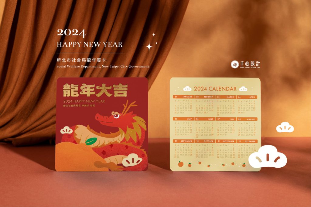 New Taipei City Social Welfare Department Year of the Dragon card
Annual card for a public agency, with print finishing
 Taiwan Railways 2018 yearbook
Annual report layout combined with illustration
- Bureau of Cultural Affairs, Kaohsiung—poster
Key visual for a public-sector event
 Global Corporate Sustainability Forum (GCSF)
Key visual and event leaflet
- Legislative Yuan New Year card
Print finishing and the way the card opens
 Howard Hotel 2024 calendar
Layout and binding for a corporate gift
See the design in motion
This project film shows the design and motion work for Hand-Heart’s 2025 greeting card, and can be watched alongside the design notes on this page.
Which organisations can use these visual design projects as a reference?
Find the situation closest to your own below, then look at the specific approach taken in the matching project.
- If your library wants to carry its existing identity onto paper carrier bags, you can look at how the Tainan Public Library carrier bags carry over the library emblem, the standard colours and the gradient-square supporting graphics.
- If your hotel needs key cards, meal vouchers and a map to fit into one card holder, the Howard Resort Xitou key card set shows how the map can carry over the illustration style of the key card.
- If your product catalogue needs to separate product series, you can borrow the approach of the grip catalogue for Liqing Rubber, which groups the grips by series, stands them upright side by side and labels each with its number.
Frequently asked questions
What is the difference between visual design, graphic design and brand design?
Graphic design and visual design mean essentially the same thing: visual communication on a flat surface (posters, flyers, catalogues, annual reports). Brand design works at a different level: it deals with the positioning and the identity system of a brand (logo, colours, type rules) and acts as the higher-order rule set for visual design. In practice the usual sequence is: the corporate identity system (CIS) comes first, then visual design produces the applications according to those rules. Further reading: corporate identity system (CIS) explained.
Why is the first draft done in black and white?
Because colour hides the problems in a layout. A page with a muddled information hierarchy can look quite good once attractive colours are added, yet readers still fail to find the point when they actually read it. Confirming the structure and the hierarchy in black and white first, then bringing in colour, is the more reliable order. That is why we call the first draft the “black draft”.
What should you watch out for in a sustainability (CSR/ESG) report?
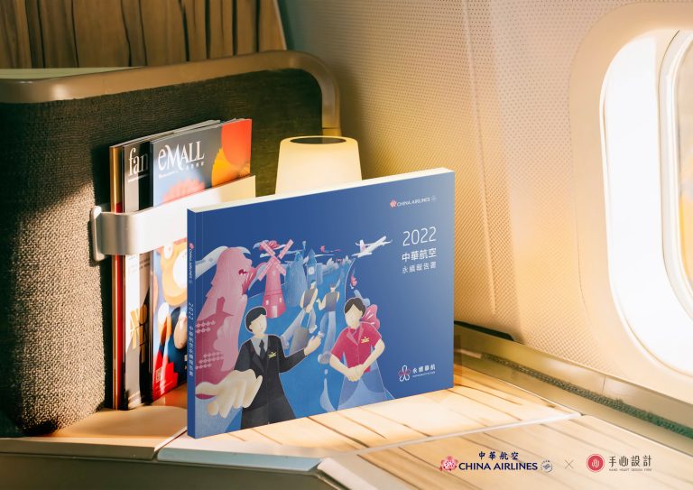
The challenge with a sustainability report is that it holds a great deal of data yet still has to be readable. Three things matter. First, turn the figures into charts and information graphics instead of pages of running text. Second, build a clear chapter hierarchy and page rhythm so readers know where they are. Third, follow the content structure of the disclosure framework in use, such as GRI. We have designed reports for China Airlines, EVA Air, Taishin Financial Holding, Radiant Opto-Electronics, Innolux and Powertech Technology, among other listed companies. For the full method and schedule, see ESG report design.
How is the fee calculated?
Graphic design is normally priced by the piece or by the page. The main variables are: which items and how many, the page count, whether photography or illustration is needed, the number of revision rounds, and whether print supervision is included. A single poster and a hundred-page annual report are priced in completely different ways. The first conversation is free of charge; we confirm the scope before quoting.
What do I need to prepare?
Four kinds of material. First, the copy: final text is best, but a draft is fine to start with. Second, the images you can use, and their licence status. Third, any existing brand identity guidelines (logo, standard colours, typefaces). Fourth, the purpose and specification: size, quantity, print or digital, and the channel it goes out on. The more complete this is, the less time is spent going back and forth.
Have a design project in mind?
Whether it is a single poster, an annual report or a full year of promotional material, tell us what you need and by when, and we will give you an honest assessment of what is feasible. The first conversation is free, and there is no obligation to go ahead afterwards.
Book a free design consultationOr call us on +886-7-285-7000|[email protected]
What is a corporate identity system (CIS)? MI, BI and VI explained
Packaging design: structure and graphics from one team
A complete guide to rebranding
Poster portfolio: cultural venues, government bodies and corporate events
Or leave your request here
A short note on the items, the quantity and when you need them is enough. We will reply within two working days.