
Hand-Heart Design Firm refined the brand identity of RAYFU and Chen Nan Iron Wire. Brand workshops helped the company restate its core values, and “Quality First, Dedicated Service, Continuous Improvement” was translated into a new wordmark and brand visual system. The aim was to help a manufacturer with more than thirty years of experience move from a recognised supplier to a clearly recognisable brand. The scope covered the wordmarks of both RAYFU and Chen Nan Iron Wire, the brand colours, final trademark artwork guidelines and three key visuals for the website.
Design Concept
Why did RAYFU need to update its brand identity?
RAYFU and Chen Nan Iron Wire have specialised in fasteners for more than thirty years. They have built a complete supply chain, from wire production and screw manufacturing to global export, and continue to grow in international markets with products made in Taiwan. As the company grew in size and global reach, its existing trademark and brand assets no longer fully reflected its professional image and brand positioning. Through brand workshops and in-depth interviews, Hand-Heart redefined the brand’s core values and future direction, and built an identity system suited to the company’s current stage of growth.
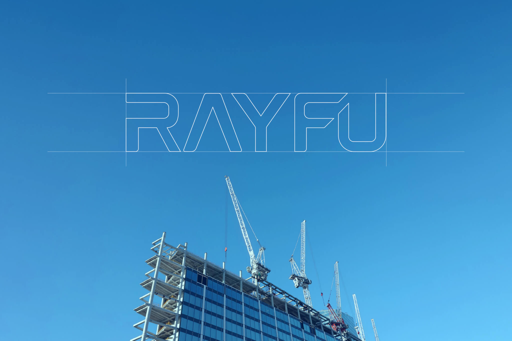
How does the new wordmark express Quality First, Dedicated Service and Continuous Improvement?
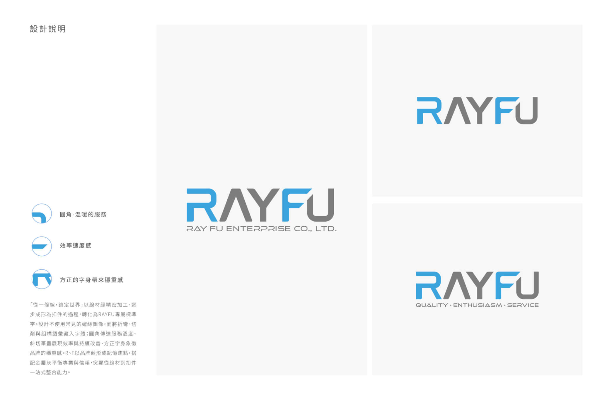
Our brand research showed that RAYFU’s strengths come from mature manufacturing expertise and, just as much, from a corporate culture built up over many years: high standards for quality, quick responses to customer needs, and a habit of continually improving processes and service. We distilled these into three core brand values—Quality First, Dedicated Service and Continuous Improvement—and turned them into a visual language. The new wordmark uses a stable, square letter structure to convey professionalism and quality, with rounded corners that bring warmth to the idea of service. It also draws on the wire forms of the fastener industry to symbolise continuous improvement and growth, while a warm RAYFU Blue builds a trustworthy brand image with an international feel.
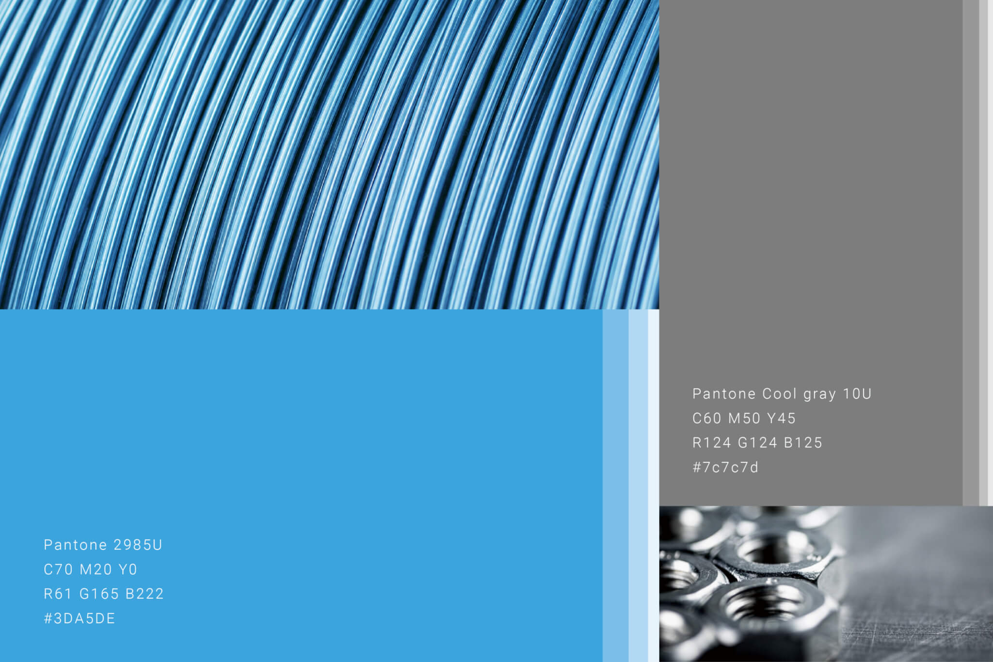
According to the design notes, the square letterforms give a sense of stability, the rounded corners stand for warm service, and the overall shapes suggest efficiency and speed. The English lettering uses a sans-serif typeface with clear, legible outlines, echoing the strength and durability of screw products. The wordmark is set in blue and grey and can be paired with the full company name, RAY FU ENTERPRISE CO., LTD., or the tagline QUALITY · ENTHUSIASM · SERVICE beneath it. The brand colour is RAYFU Blue, Pantone 2985U, paired with a grey, Pantone Cool Gray 10U.
How does the identity extend to the website’s key visuals?
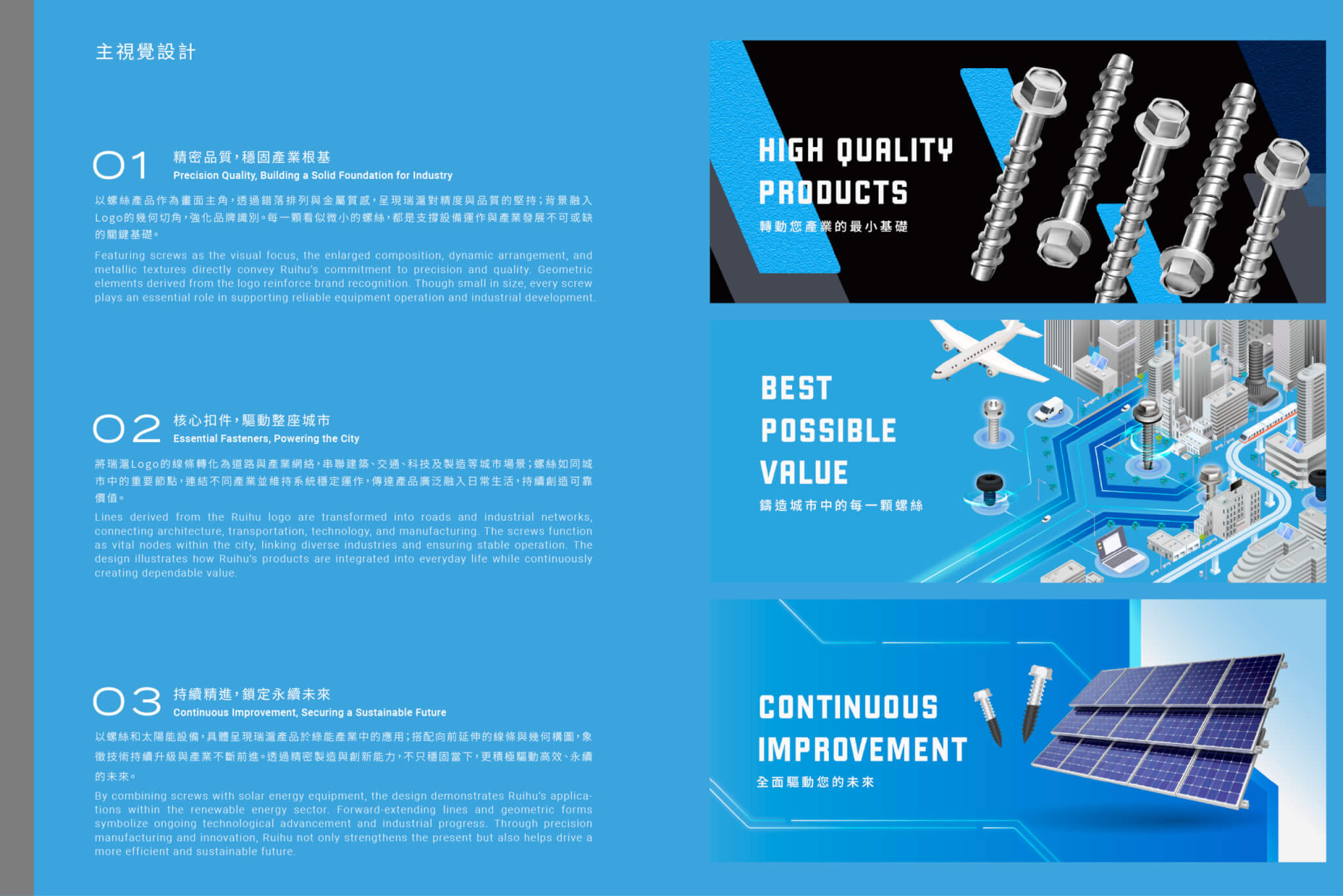
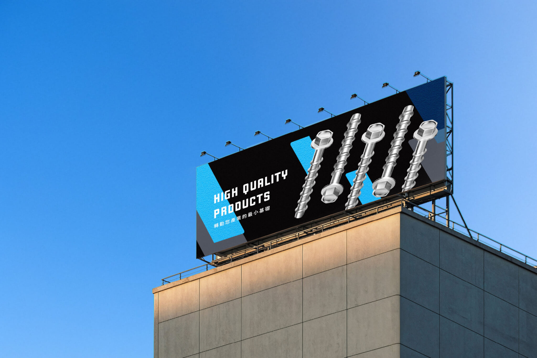
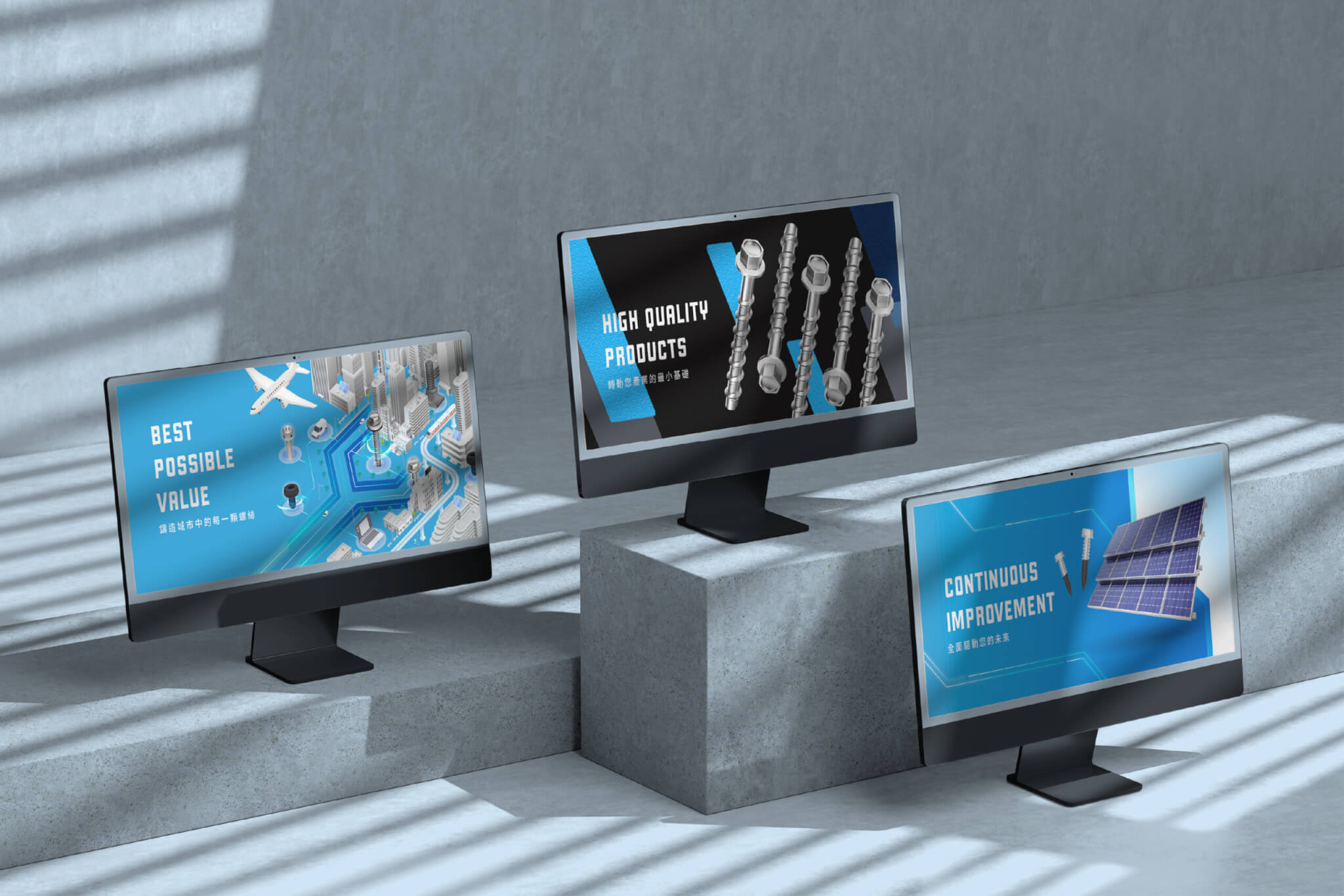
Once the wordmark and colours were settled, Hand-Heart extended the same visual language into three key visuals for the website. “HIGH QUALITY PRODUCTS” features enlarged screws in a staggered arrangement with a metallic finish, expressing close attention to precision and quality, with the geometric cut corners of the logo in the background. “BEST POSSIBLE VALUE” turns the lines of the logo into roads and industrial networks that link city scenes of architecture, transport, technology and manufacturing, with screws as the nodes that keep the city running. “CONTINUOUS IMPROVEMENT” pairs screws with solar equipment to show how the products are used in the green energy industry, and lines reaching forward symbolise ongoing technical upgrades.
How did the design move from workshop to final artwork?
Late February 2024 (based on file dates) saw a proposal to fine-tune the logo, presented with a first draft of the wordmark, and a RAYFU brand workshop. From March, the English wordmark and the style of the website key visuals were presented together, and by May the first draft had gone through three versions. During the refinement stage from May to July, the wordmark and key visuals reached a third version, and the key visuals alone went on to a fifth. August brought the refined wordmark for Chen Nan Iron Wire, along with final trademark artwork guidelines and clear-space rules for the wordmarks of both companies. The project was completed in January 2025.
This identity refinement is about more than a new wordmark. It turns more than thirty years of expertise, quality and trust into a brand asset that people can recognise and that can be carried forward. The new identity establishes a clearer, more consistent brand image, helping RAYFU grow from a company valued for its manufacturing capability into a brand with international recognition and long-term value.
What are RAYFU’s wordmark and key visuals each meant to convey?
RAYFU’s wordmark is designed around professionalism, service and continuous improvement, while the website key visuals extend the shapes of the wordmark and logo.
- The square structure of the wordmark is there to convey professionalism and quality; the design notes describe the rounded corners as standing for warm service.
- The wordmark draws on the wire forms of the fastener industry, a reference intended to symbolise continuous improvement and growth.
- The wordmark pairs RAYFU Blue with grey; RAYFU Blue is intended to build a trustworthy brand image with an international feel.
- The three website key visuals carry the lines of the wordmark and the geometric cut corners of the logo into each image.
Which companies can learn from RAYFU’s approach?
If you are reworking your company’s trademark and brand applications, RAYFU’s approach is a useful reference.
- If your manufacturing business has moved into international markets and needs to adjust its brand positioning, you can start, as RAYFU did, with workshops that clarify your core values.
- If two of your companies are updating their identities at the same time, consider preparing separate final trademark artwork guidelines for each.
A sensible order: clarify your values first, then develop the wordmark and its applications.
How we take a brand identity from clarifying values to a wordmark and its applications is explained in our rebranding guide.
Completed
Project Planner
Lead Designer
Designers
2025.01
Lien-chieh Su, Ivy Wang, Wan-Chih Hsiao
Dong Pan
Chien-ying Yang, Nina Lin