
From supplied data to a readable page
Confirm the year, unit and source first. Then decide whether the page needs a comparison, a trend or a relationship. Arrange the heading, chart and notes so readers can find the point before studying the details.
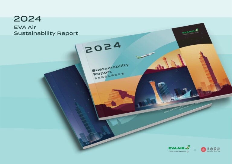
EVA Air’s 2024 report uses a two-colour system based on its brand green across chapters and inner pages. The project shows the cover and page layouts. See the EVA Air project
ESG design turns a company’s sustainability data into communication that can be understood, read to the end and passed on. Hand-Heart Design Firm offers three deliverables: the design of the full sustainability report, the design of an executive summary, and a MOTION GRAPHIC animation that condenses the whole report into a short film. Our partners include listed companies and public bodies such as China Airlines, EVA Air, Delta Electronics, AUO, Innolux, Powertech Technology, Nanya Technology, Cathay Financial Holdings, Shin Kong Financial Holding and Taichung Commercial Bank. The reports we have helped design have received 37 Taiwan Corporate Sustainability Awards in total.
A sustainability report easily runs to several hundred pages, yet very few people read one all the way through. Investors look only at the headline points, job seekers only want to know whether the company is worth joining, customers care only about supply chain risk. The material is the same, but each reader needs a different level of detail. This is exactly what ESG design sets out to solve: take one body of content and make three versions, each suited to its own reader.
A whole year of collected data ends up as a PDF that nobody finishes. That is the most common fate of a sustainability report, and the thing we most want to avoid on every project.
The hard part of a sustainability report is never too little material. It is too much material, too little time and too many people involved. Settle the five points below before you put the work out to tender and you avoid the three most common outcomes: the design drifting by page 60, figures still being changed a week before publication, and three versions that tell the story differently.
- Page count, versions, languages
- The full report is for regulators and investors, the executive summary for customers and job seekers, the animation for the general public and your own staff. All three share one visual language and one set of figures, so planning them together costs the least. A mid-sized report runs to roughly 100 to 150 pages; an English edition is usually 15 to 25% longer than the Chinese one, so leave room in the schedule.
- Who owns which data
- Which department supplies the figures for each chapter, and who the contact is. A report commonly draws on more than ten contributing departments; without a list, nobody can chase anything. Fixing the structure first and filling in the content later is normal, but text and figures each need a final date after which nothing changes.
- QA
- Who does the final check of figures, units, years and consistency with last year’s report. This is a responsibility the design team cannot take over. Change requests should be collected by a single contact before they are sent, so that ten departments do not each edit the same page.
- Deadlines along the way
- Counting back from the publication date: printing and video output 2 to 3 weeks before, the whole book signed off 4 to 5 weeks before, full layout 8 to 12 weeks before, the visual proposal approved 12 to 14 weeks before, structure and data inventory 14 to 16 weeks before. If the publication date is already fixed, tell the design team at the start.
- Readers
- Investors look only at the figures, job seekers want to know whether the company is worth joining, customers care only about supply chain risk. List the two or three kinds of reader you most want to reach this year; that decides directly what stays in the executive summary and what the animation says.
These five points are set out on a single sheet for clients: the sustainability report design brief checklist. No sign-up needed, and you can print it directly.
Three deliverables in ESG design
The formal document, structured according to disclosure frameworks such as GRI, for regulators, rating bodies and investors. Several hundred pages of information architecture and data visualisation.
The whole report condensed into a dozen or so pages, keeping only the key commitments, figures and results. Used for customer proposals, recruitment briefings and handouts at trade fairs.
The report turned into a video of a few minutes. Suited to the website home page, social media, shareholder meetings and internal communication, so that people who would never open the report still get the whole story.
Why does one report need three versions?
Because readers have completely different amounts of time and completely different purposes. Present one set of sustainability results in one form, and only one kind of person will ever see it.
| Version | Main readers | Where it is used | Reading time |
|---|---|---|---|
| Full report | Regulators, rating bodies, institutional investors | Formal disclosure, ESG ratings, due diligence | Tens of minutes or more |
| Executive summary | Customers, supply chain partners, job seekers | Proposal attachment, recruitment briefings, trade fair handouts | About 5 minutes |
| Animated version | General public, social media users, internal staff | Website, social media, shareholder meetings, training | 2–4 minutes |
The three versions share one visual language and one set of figures, so nothing has to be designed twice and there is no risk of three documents that say different things. Planning once and producing three outputs is the least expensive way to work.
How we work together
- Confirming what is needed
We confirm the reporting year, the disclosure framework in use, which versions are needed (full / summary / animation), and the publication schedule.
- Data inventory and structure
We take stock of the figures and text already gathered and plan the chapter structure and reading path. We can start before the content is final: fixing the structure first and filling in the content later is the norm.
- Visual proposal
We present a design direction for the cover, the inside page templates and the chart styles. Only once it is approved do we lay out the whole book.
- Full layout and chart production
We complete the whole book to the approved template, turn the figures into charts one by one and proofread them. This stage includes revisions.
- Extending to summary and animation
If needed, we develop the summary and the animation from the finished full version, sharing one visual language.
- Prepress and output
Imposition for print, confirmation of paper stock and environmental specifications, output of the digital PDF and the video formats.
What the design covers in each version
Full sustainability report design
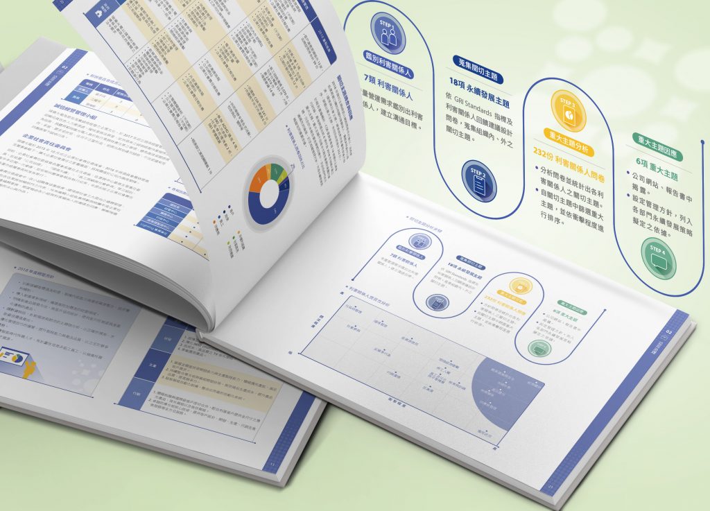
Information architecture, data visualisation, chapter rhythm and white space, a visual vocabulary consistent with the existing corporate identity, imposition and paper specification, digital PDF output. The point is to give several hundred pages a clear hierarchy, so that readers always know which chapter they are in and what matters on the page.
Take the EVA Air 2024 sustainability report: the book is divided into seven chapters, from “About EVA Air” to “Towards Social Inclusion”, plus appendices. Every chapter opener uses an aircraft window as its key visual, with the main colour alternating between green and orange. The opener for Chapter 1 lists sections 1-1 to 1-4; turn the page and “1-1 Operations Overview” pairs a world map with donut percentage charts, while “1-2 Financial Performance” sets bar charts, donut charts and a multi-year data table side by side. Chapter openers in a fixed style mark where each chapter begins, with the section numbers and charts following on. That is what the “clear hierarchy” described above looks like on the page.
Executive summary design
We take the key commitments, figures and results out of the full report and lay them out again as a standalone document of a dozen or so pages. The hard part of an executive summary is what to leave out, not the layout: how to use information visualisation to bring out the key points in the fewest pages. It takes an experienced designer to decide what stays; it is not simply making the original book shorter. It is commonly attached to proposals, handed out at recruitment briefings, and carried to trade fairs and customer visits.
MOTION GRAPHIC animation design
We turn the narrative line of the report into a video script, the figures into animated charts, and add voice-over or title cards. What design has to handle here is rhythm: which number stays on screen a little longer, which passage is carried by a transition. That decides whether the viewer watches to the end. The output format can be adjusted for use as a website banner, a square version for social media or a version for the shareholder meeting.
We approach sustainability reports the way we approach corporate identity
Hand-Heart’s core work is corporate identity system (CIS) design. When we build an identity system we do not stop at drawing a good-looking logo; we set up a whole set of rules that can be applied again and again: how the page is divided into columns, how the icons are made consistent, what the colours stand for, which drawing style the illustrations use.
We apply the same method to sustainability reports. Without rules, a document of several hundred pages will always drift by page 60: the charts in this chapter are pie charts, in the next they are bars; the icons on this page are line drawings, on the next they are solid blocks. Readers cannot say what feels wrong, but they stop reading. So we set the standards before we start laying anything out.
We first define the grid, column widths, head and foot margins and the size and leading of each text level, then extend one template across the whole book. That is how readers learn that text in this position belongs to this level.
We design a complete icon set for the report, with consistent stroke weight, corner radius and white-space proportion. We do not piece it together from stock libraries: icons gathered that way are the main reason pages look messy.
We set the primary colour, the supporting colours and a colour per chapter, and fix the order in which chart colours are used. One kind of data speaks in the same colour anywhere in the book.
We unify the viewpoint, the line work, the colouring method and the figure proportions, so that cover and inside pages belong to one world rather than a patchwork drawn by different hands.


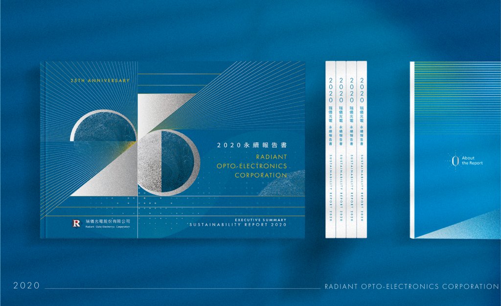
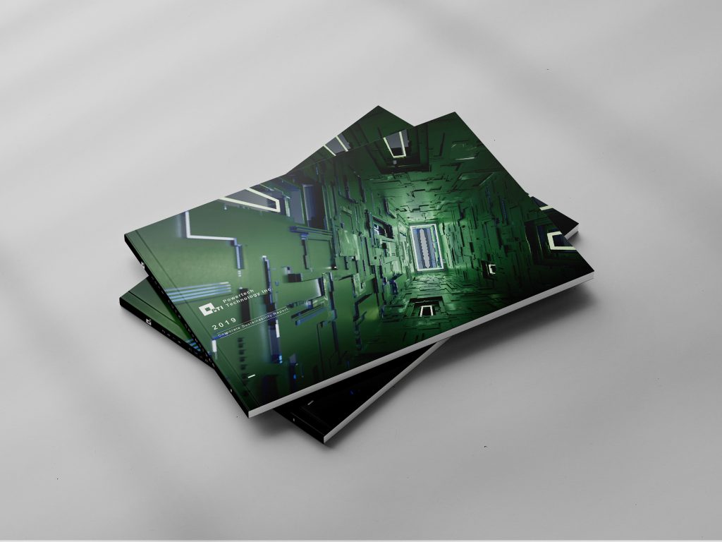
Covers: they should not all look the same
The cover decides whether the reader opens the book. Two sustainability reports from industries with different characters call for different visual strategies. This, too, is basic corporate identity work: understand who the company is first, then decide what language to speak in.

Why a report should not look like everyone else’s
Taste is what a sustainability report loses most easily
Hand-Heart holds that good design stands where philosophy, science and aesthetics meet, and that these correspond to character, quality and taste. A sustainability report is where these three are sacrificed most often: because it follows a regulated format, it easily turns into a fill-in-the-blanks exercise.
Philosophy → character
What a report is really about is whom the company answers to. The content must not be distorted to make a page look good, and must not be blurred for the sake of a flattering figure. That is a question of character, not of design.
Science → quality
There is a lot of information, many indicators, and different readers. So we split it into three deliverables (full version, executive summary and animation), each solving a different reader’s problem, rather than shrinking one book down.
Aesthetics → taste
Whether the cover should look like last year’s depends on what this year has to say. The 37 Taiwan Corporate Sustainability Awards came from letting each company’s content grow its own form.
Only when the three come together do good work and good results follow. The full explanation is on the About Hand-Heart page.
Results: 37 Taiwan Corporate Sustainability Awards
The sustainability reports Hand-Heart has helped design since 2015 have received 37 TCSA Taiwan Corporate Sustainability Awards in total (sustainability report category), of which 16 are Platinum level, and twice a report took that year’s Best Sustainability Report.
| Year | Award-winning partners and level | Awards |
|---|---|---|
| 2025 | Nanya Technology (Best Sustainability Report of the year) / EVA Air · Powertech Technology (Platinum) | 3 |
| 2023 | Innolux · Powertech Technology · Chailease Holding · Far Eastern New Century · Taishin Financial Holding · Nanya Technology (Platinum) / Radiant Opto-Electronics (Silver) / China Airlines (best in the service sector) | 8 |
| 2022 | Innolux · Powertech Technology · Chailease Holding (Platinum) / Radiant Opto-Electronics · AcBel Polytech (Silver) | 5 |
| 2020 | Powertech Technology (Platinum) / Radiant Opto-Electronics (Gold) / Innolux · Chailease Holding (Silver) | 4 |
| 2019 | Shin Kong Financial Holding · Powertech Technology (Platinum) / Radiant Opto-Electronics (Gold) / Innolux (Silver) / Taichung Commercial Bank (Bronze) | 5 |
| 2018 | AUO · Delta Electronics (Platinum) / Radiant Opto-Electronics · Innolux · Shin Kong Life Insurance · China Development Financial (Gold) / Taichung Commercial Bank (Bronze) | 7 |
| 2017 | Radiant Opto-Electronics (Gold) / Taichung Commercial Bank (Silver) | 2 |
| 2016 | Radiant Opto-Electronics · China Airlines (Gold) | 2 |
| 2015 | Radiant Opto-Electronics (Gold) | 1 |
Among them, Radiant Opto-Electronics won 8 awards across nine consecutive years, and Innolux and Powertech Technology 5 each. In 2025 Nanya Technology received that year’s Best Sustainability Report, the highest honour in the report category, given to only a few companies in any one round.
The awards belong to the companies themselves. But a report that can win one shows that the completeness of its disclosure and the effectiveness of its communication were both recognised by the judges, and communication is exactly the part design is responsible for.
The hard part of a report is never too little material. It is too much material and too little of the reader’s time. Investors only want to see the figures, job seekers want to know whether the company is worth joining, customers care only about supply chain risk. Present one set of results in one form, and only one kind of person will see it.
Animation in practice: the China Airlines sustainability report
A sustainability report of several hundred pages condensed into one video that can play on the website and on social media. Figures become animated charts and chapters become the beats of a narrative, so that people who would never open the PDF still learn in a few minutes what the company has done.
Sustainability report design projects
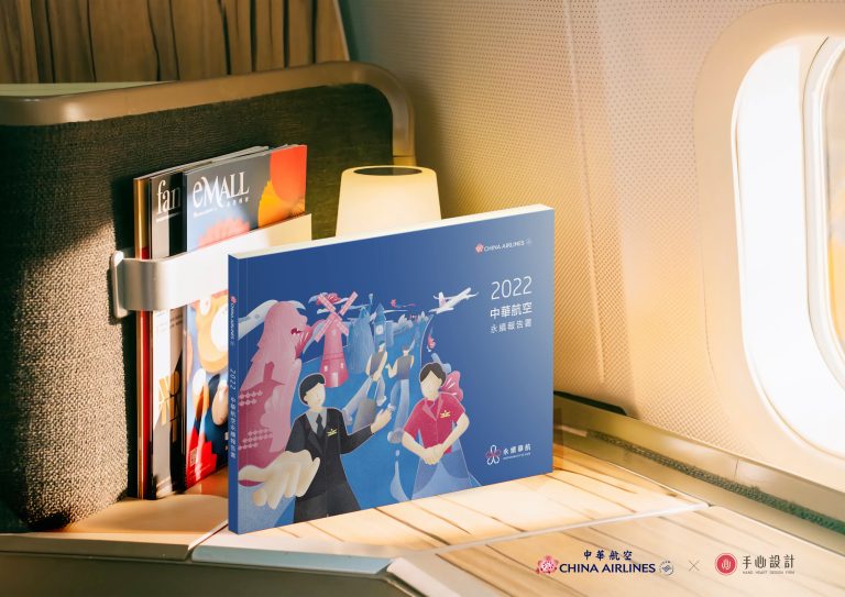 China Airlines
2022 sustainability report + animation
- EVA Air
2024 sustainability report
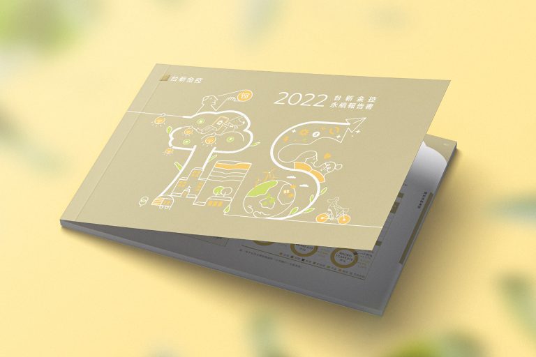 Taishin Financial Holding
Data visualisation for financial services
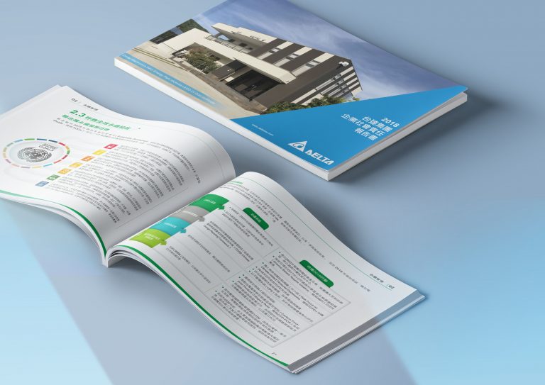 Delta Electronics
Corporate social responsibility report
See all sustainability report design work →
Companies and institutions we have worked with
- Aviation and transport
- China Airlines, EVA Air, Taiwan Railway Corporation, Taiwan International Ports Corporation
- Semiconductors
- ASE Group, Powertech Technology, Nanya Technology, Fitipower Integrated Technology
- Optoelectronics and displays
- AUO, Innolux, Radiant Opto-Electronics
- Finance
- Cathay Financial Holdings, Shin Kong Financial Holding, Shin Kong Life Insurance, China Development Financial, Taichung Commercial Bank, Chailease Holding
- Manufacturing
- Delta Electronics, AcBel Polytech, ABC Taiwan Electronics, Nan Pao Resins
China Airlines, Powertech Technology, Radiant Opto-Electronics and Taichung Commercial Bank are among the partners we have worked with year after year. A sustainability report is a project that starts again every year, so being asked back for several years running is the most solid proof of quality this kind of design can offer.
See the design in motion
This film shows the design of the China Airlines 2025 sustainability animation in motion; watch it alongside the design notes on this page.
Which organisations can learn from these sustainability report and yearbook projects?
If your organisation needs a chapter structure, bilingual editions or visuals rooted in its industry, you can compare the approaches in these projects with the situations below.
- If your report has many chapters and charts, you can look at the chapter pages, chapter colours and chart design of the Taiwan International Ports Corporation 2024 sustainability report.
- If your yearbook needs Chinese and English editions, the Taiwan Railways 2018 yearbook shows how illustration can present figures, events and achievements.
- If you want the report to reflect your core business, look at how the Nan Pao Resins 2021 sustainability report developed a torn-paper collage from the idea of “adhesion” and carried it through to the chapter pages and inside page templates.
Frequently asked questions
What is the difference between an ESG report, a CSR report and a sustainability report?
They broadly mean the same document; the differences lie in the era and in what each framework emphasises. It was first called a CSR report (corporate social responsibility), with the emphasis on public benefit and community involvement. Internationally the focus then shifted to ESG (environmental, social, governance). In Taiwan the official name has in recent years settled on “sustainability report”. Hand-Heart has worked from the CSR period through to today and knows how chapter structures differ from one framework to the next.
Can you do only the executive summary, or only the animation?
Yes. If the full report has already been completed by someone else, Hand-Heart can take on only the executive summary or only the animation, working from the existing report to decide what to keep and how to present it. Planning all three together is usually less expensive, though: they share one visual language, so a design direction does not have to be developed twice.
How long does the animation take, and how long is it?
The length depends on where it will be used; for a website and social media it is usually no longer than a few minutes. The production schedule depends on whether the report is final, whether voice-over is needed, and how complex the animated charts are. We suggest planning it before the report is finished so it can run alongside the page design; the total schedule is then much shorter than commissioning it separately afterwards.
The report content is not finished yet. Can we start anyway?
Yes, and we recommend it. In practice content and design almost always run in parallel: the chapter structure and the templates are settled first, and content comes in as it is ready. Waiting until every word is final usually squeezes the printing schedule at the end.
What do we need to prepare?
We suggest having ready: the reporting year and the version of the disclosure framework, the figures and text already gathered (drafts are fine), your existing corporate identity standards (logo, corporate colours, typefaces), the expected page count and print run, and the publication schedule. It is fine if not everything is ready; Hand-Heart can help you sort out the information hierarchy.
Have you started planning this year’s sustainability report?
Tell us the reporting year, the framework you use and the planned publication date, and Hand-Heart will give you an honest assessment of a workable schedule and scope, including whether to produce the executive summary and the animation at the same time. The first conversation is free, and it is fine if nothing comes of it.
Book a free ESG design consultationOr call us directly on +886-7-285-7000 | [email protected]
Sustainability report design portfolio
Visual design: advertising, print, layout
What is a corporate identity system (CIS)? MI, BI and VI explained
Or leave your requirements here
A short note on the reporting year, the versions you need and when you would like it finished is enough. We reply within two working days.
Methods and project sources: Hand-Heart Design Firm. Page compiled on 27 September 2026.