為因應國際社會、全球企業對於「聯合國永續發展目標」的重視與積極應對,永續發展目標聯盟自2018年起,每年皆串連國內產官學研機構,辦理「全球企業永續論壇」(Global Corporate Sustainability Forum, GCSF),旨在連結台灣各界學術研究脈絡、最新趨勢,並與國際社會交流,落實永續教育並掌握企業商機。
To response international companies’ emphasis on Sustainable Development Goals, SDGs from U.N., Alliance for Sustainable Development Goals, A‧SDGs. Since 2018, A.SDGs and the Combination of Industry, Official and University hold the Global Corporate Sustainability Forum, GCSF every year. The aim is to link Taiwan academic research and the latest trends, and communicate with the international, implement sustainable education and take business opportunities.

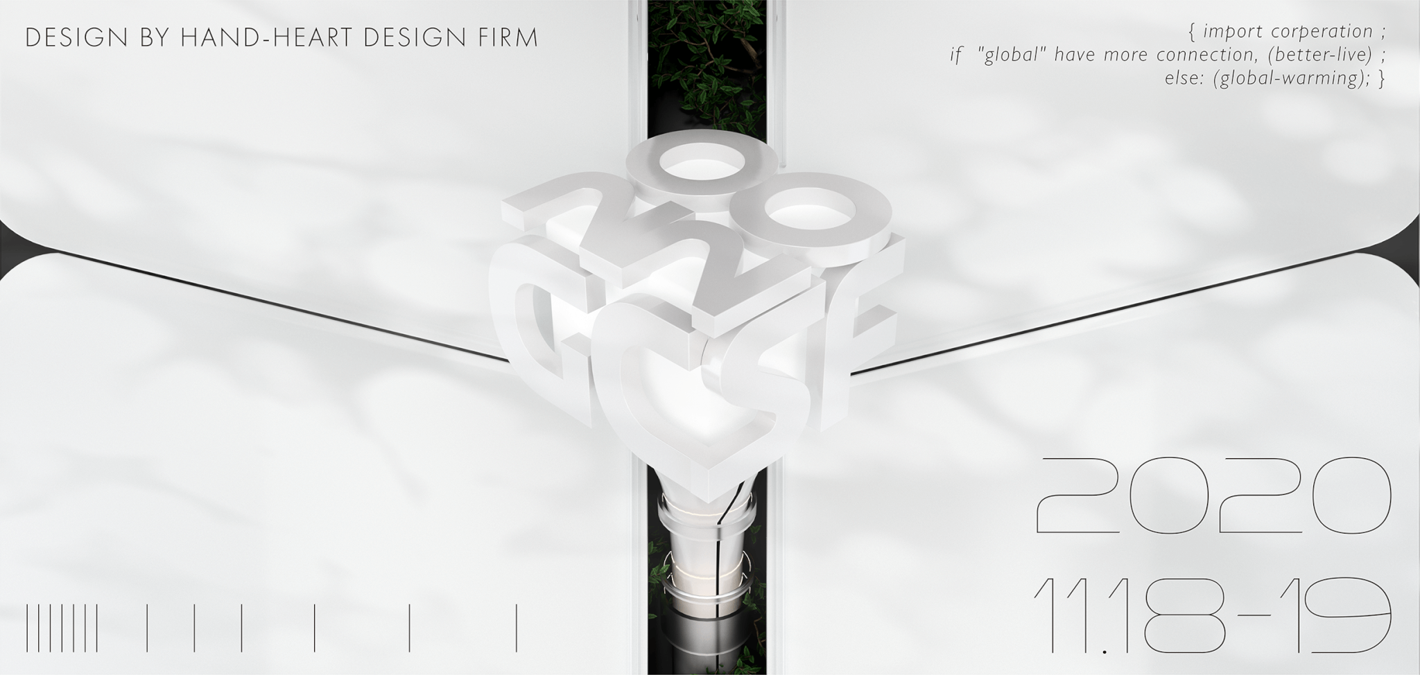
延續2020年論壇主題「Inclusiveness 包容性、Innovation 創新、Investment 投資」,將論壇名稱以具份量感的立體方塊呈現,簡約卻穩重的文字結構結合光影流動,創造逐漸進步與不斷突破的世界,周圍的變動色彩則象徵來自多元面向的各大企業,彼此碰撞交融,帶領社會開創新世代。強烈、穩重的視覺延伸出專業、展望國際的感受,具現代感的編排方式也代表論壇「創新、突破」的精神。
Continuing the 2020 forum themes Inclusiveness, Innovation, Investment, presenting the forum name with a high quantity of three-dimensional box. Simple but steady text combined with the flow of light and shadow, creating an image that the world is gradual progress and continuous breakthroughs.
The changing colors around it symbolize companies from diversified industry that collide with each other and lead the society to create new generations. The strong and steady vision extends the professional and international future, and the modern lay out also represents the spirit of innovation and breakthrough of the GCSF.

摺頁設計考量閱讀的便利性,採用特殊的折疊方式使觀者能夠如同書本般地翻閱內容,也能展開呈現整體資訊。編排延續主視覺設計,將內文劃分為四大區塊並規劃相對應主色,增加各段落之差異性,亦強化整份摺頁的系統性,除使用主色呈現重點資訊外,將其餘色彩的使用盡可能地降低,不但創造了資訊閱讀上的層級差異,俐落、清爽的編排風格更塑造GCSF論壇具國際感、規模感的領導地位。
The brochure design considers the convenience of reading. It adopts a special folding method that can be read like a book, and unfold easily to show the overall information.
The arrangement continues the key visual design, divides the text into four major sections and plans the corresponding colors, increases the difference of each paragraph, and strengthens the systematization.
In addition to using the main color to present key information, the use of other colors is reduced as much as possible. It not only creates differences in the information reading, but also let the GCSF Forum’s leading position have a more international sense and a sense of scale.
-
設計師 Designer-盧臆雯 LU,YI-WEN、周一潔 JHOU,YI-JIE
專案企劃 Project Planning-王彥筑 WANG,YAN-ZHU
設計總監 Executive Design Director-徐志揚 HSU,CHIH-YANG
#GCSF #全球企業永續論壇 #主視覺設計 #平面設計 #手心設計 #論壇設計 #網站設計 #活動設計 #海報設計 #DM設計 #摺頁設計 #HandHeartDesign #TaiwanDesign #WebDesign #ForumDesign #GraphicDesign #KeyVisionDesign #PosterDesign #DMDesign #BrochureDesign