
SELECTED WORKS — 01 / 11
Follow your curiosity.從一個好奇開始。
Drag to explore. Choose a project to enter its motion.左右拖曳探索作品,輕點進入動態。
 01Radiant Opto-Electronics瑞儀光電
 02Year of the Snake蛇年賀卡
 03Guang Sheng Tang廣生堂
 04National Central Library國家圖書館
 05China Airlines中華航空
 06Tainan Public Library臺南市立圖書館
 07Kaohsiung National Stadium高雄國家體育場
 08MOMA TAINAN南國美
 09Ministry of Foreign Affairs外交部
 10深澳漁港Shenao Fishing Port
 11衍介聯合建築師事務所WWHY Architects & Associates
Radiant Opto-Electronics瑞儀光電
Brand Visual Renewal品牌視覺更新
A visual identity shaped by the trajectories of light.以光的軌跡,重新建立品牌的視覺語言。
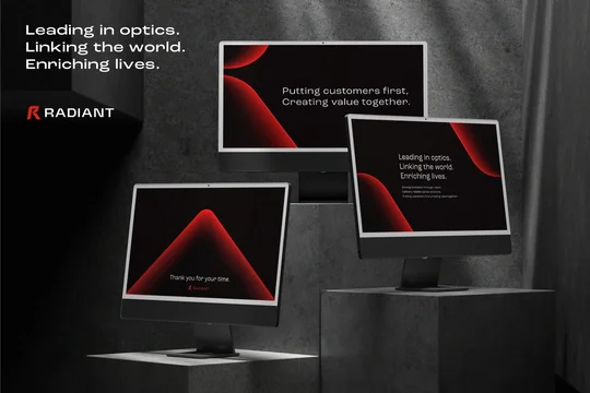
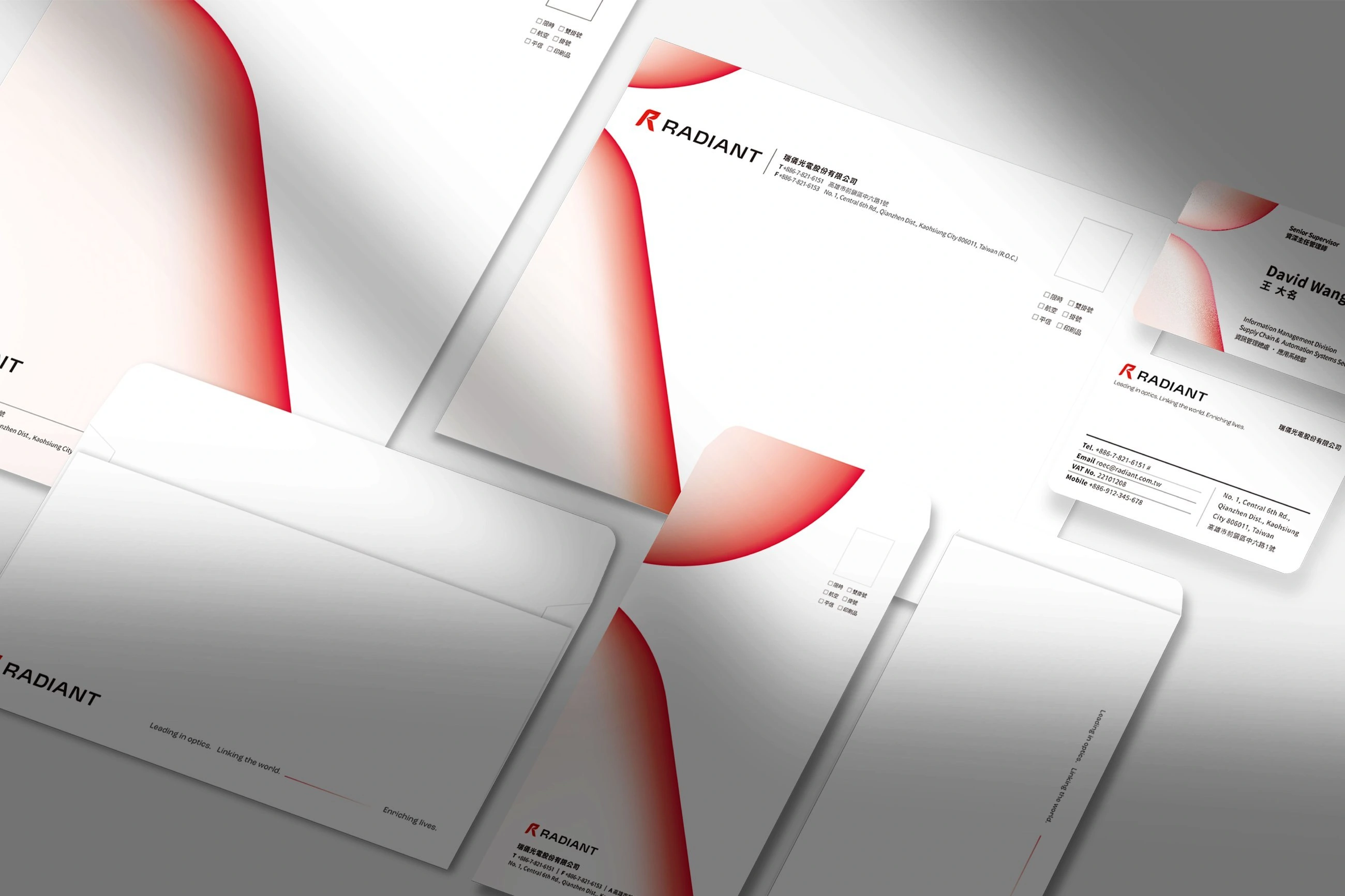
Hand Heart Design led the CIS brand identity renewal for Radiant Opto-Electronics (concluded 2026), under the concept of “light extending from within.” The mark was reshaped around three cues — sharp turns for R&D strength, soft curves for collaborative warmth, a dynamic diagonal for forward momentum — extended into a supporting graphic system built from the trajectories of light.手心設計為瑞儀光電執行 CIS 品牌識別更新(2026 年結案)。以「光由內而外延展」為概念重塑標誌——銳利轉折對應研發實力、柔和弧線象徵共創親和、動態斜角傳遞前進力量——並延伸出一套取材光線軌跡的輔助圖形系統。
- General Manager — Hsu Chih-Yang總經理 — 徐志揚
- Brand Director — Su Yu-An品牌總監 — 蘇昱安
- Project Management — Huang Shih-Han專案管理 — 黃詩涵
- Design Lead — Su Hsiao-Wen設計組長 — 蘇筱雯
- Designers — Chang Chia-Yu, Chang Ya-Wen, Yeh Tzu-Hao, Li Pin-Chen設計師 — 張嘉育, 張雅文, 葉子豪, 李品蓁
- Motion Design — Cheng Chih-Hung動態設計 — 鄭智鴻
Hand Heart Design led the CIS brand identity renewal for Radiant Opto-Electronics (concluded 2026), under the concept of “light extending from within.” The mark was reshaped around three cues — sharp turns for R&D strength, soft curves for collaborative warmth, a dynamic diagonal for forward momentum — extended into a supporting graphic system built from the trajectories of light.手心設計為瑞儀光電執行 CIS 品牌識別更新(2026 年結案)。以「光由內而外延展」為概念重塑標誌——銳利轉折對應研發實力、柔和弧線象徵共創親和、動態斜角傳遞前進力量——並延伸出一套取材光線軌跡的輔助圖形系統。
- General Manager — Hsu Chih-Yang總經理 — 徐志揚
- Brand Director — Su Yu-An品牌總監 — 蘇昱安
- Project Management — Huang Shih-Han專案管理 — 黃詩涵
- Design Lead — Su Hsiao-Wen設計組長 — 蘇筱雯
- Designers — Chang Chia-Yu, Chang Ya-Wen, Yeh Tzu-Hao, Li Pin-Chen設計師 — 張嘉育, 張雅文, 葉子豪, 李品蓁
- Motion Design — Cheng Chih-Hung動態設計 — 鄭智鴻



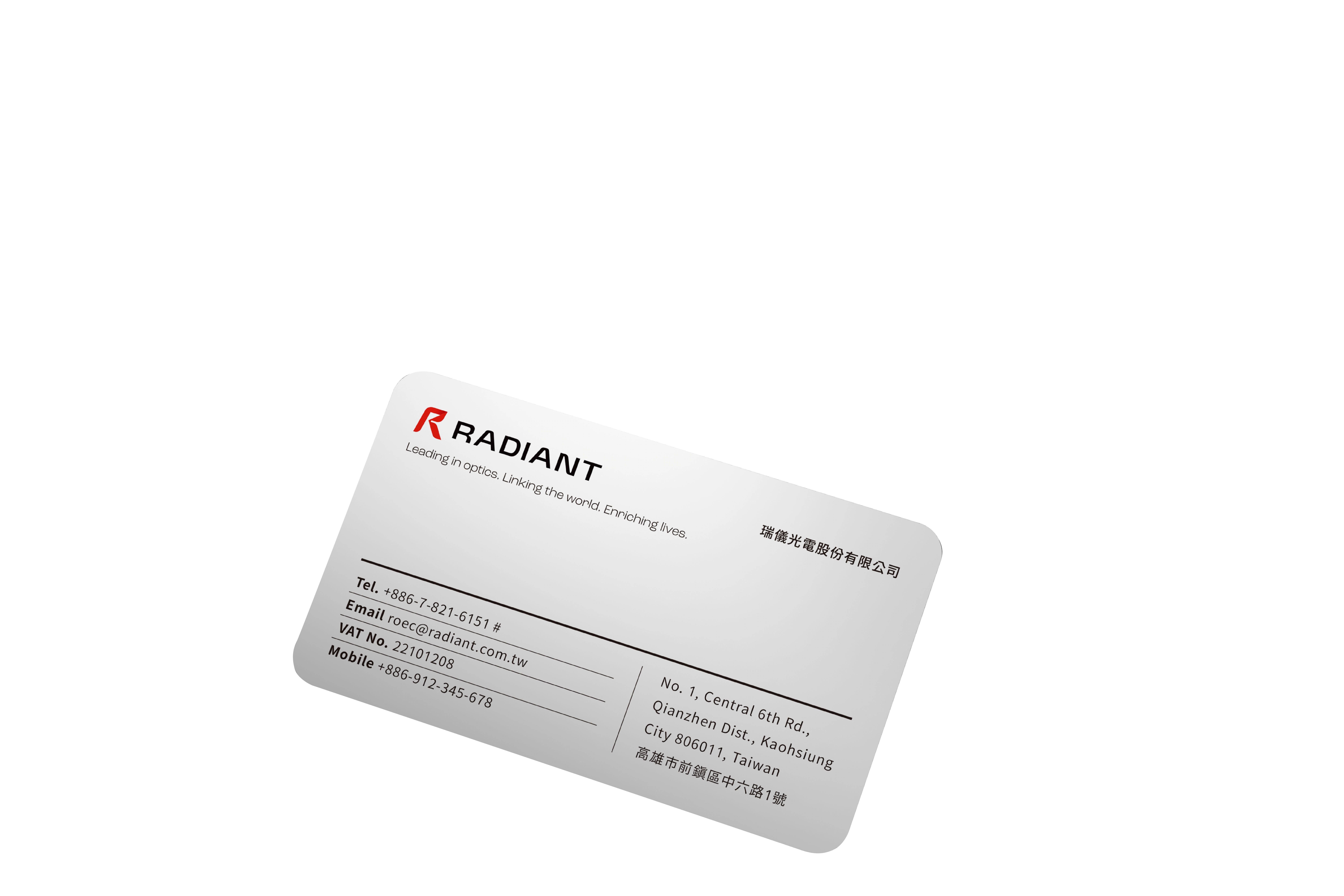
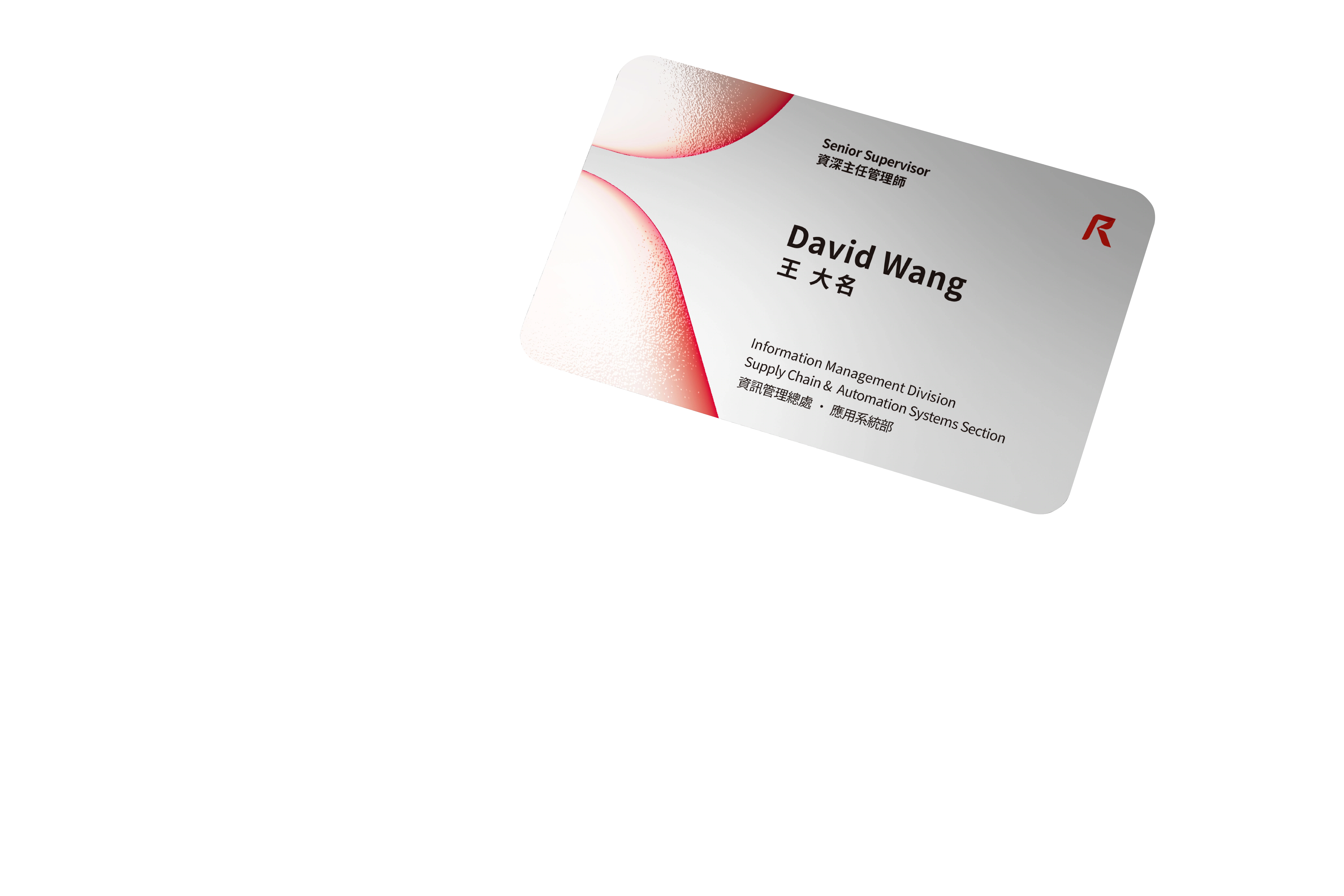
To meet a wide range of application scenarios, we reinterpreted the motion of light — refraction, focusing — into a fluid supporting graphic system applied across presentations, business cards, corporate stationery and more, building consistency while expressing Radiant's professionalism and credibility as an international enterprise.為對應多元的應用場景,我們重新詮釋光線折射、聚焦等運動軌跡,創造一套具流動性的輔助圖形系統應用於簡報、名片及企業信紙等各項品項,建立一致性的同時,也展現瑞儀光電作為國際企業的專業及信賴感。
What the brand identity delivers is more than a new visual look — it gives visible form to Radiant's vision and mission, helping the brand attract more talent on its path toward internationalization, connect with partners around the world, and together enrich the human experience through optical innovation.品牌識別所完成的,不只是視覺上的嶄新形象,更是視覺化呈現瑞儀光電的願景使命,讓品牌在國際化的道路上吸引更多人才一同為了光學創新,一同連結世界夥伴,共同豐富人類體驗!
Year of the Snake蛇年賀卡
Greeting Card Design新年賀卡設計
Shedding, transformation, and a new beginning.以層層蛇紋,呈現蛻變與新生。
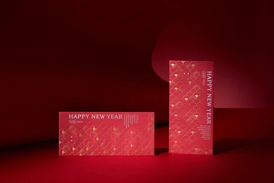
Hand Heart's 2025 Lunar New Year card set takes the snake as its motif — the sleeve's pull-out interaction echoes shedding and transformation, its layered scales mirroring a year of reinvention.手心 2025 蛇年賀卡套組:以「蛇」為主軸,透過卡套抽拉互動表現脫皮、蛻變,層層蛇紋呼應手心這一年的重組與前進。
- General Manager — Chih-yang Hsu總經理 — 徐志揚
- Project Planner — Ivy Wang專案企劃 — 王彥筑
- Designers — Guan-Shian Wu, Xiao-wen Su, Zhi-hao Yeh設計師 — 吳冠賢, 蘇筱雯, 葉子豪

Hand Heart's 2025 Lunar New Year card set takes the snake as its motif — the sleeve's pull-out interaction echoes shedding and transformation, its layered scales mirroring a year of reinvention.手心 2025 蛇年賀卡套組:以「蛇」為主軸,透過卡套抽拉互動表現脫皮、蛻變,層層蛇紋呼應手心這一年的重組與前進。
- General Manager — Chih-yang Hsu總經理 — 徐志揚
- Project Planner — Ivy Wang專案企劃 — 王彥筑
- Designers — Guan-Shian Wu, Xiao-wen Su, Zhi-hao Yeh設計師 — 吳冠賢, 蘇筱雯, 葉子豪
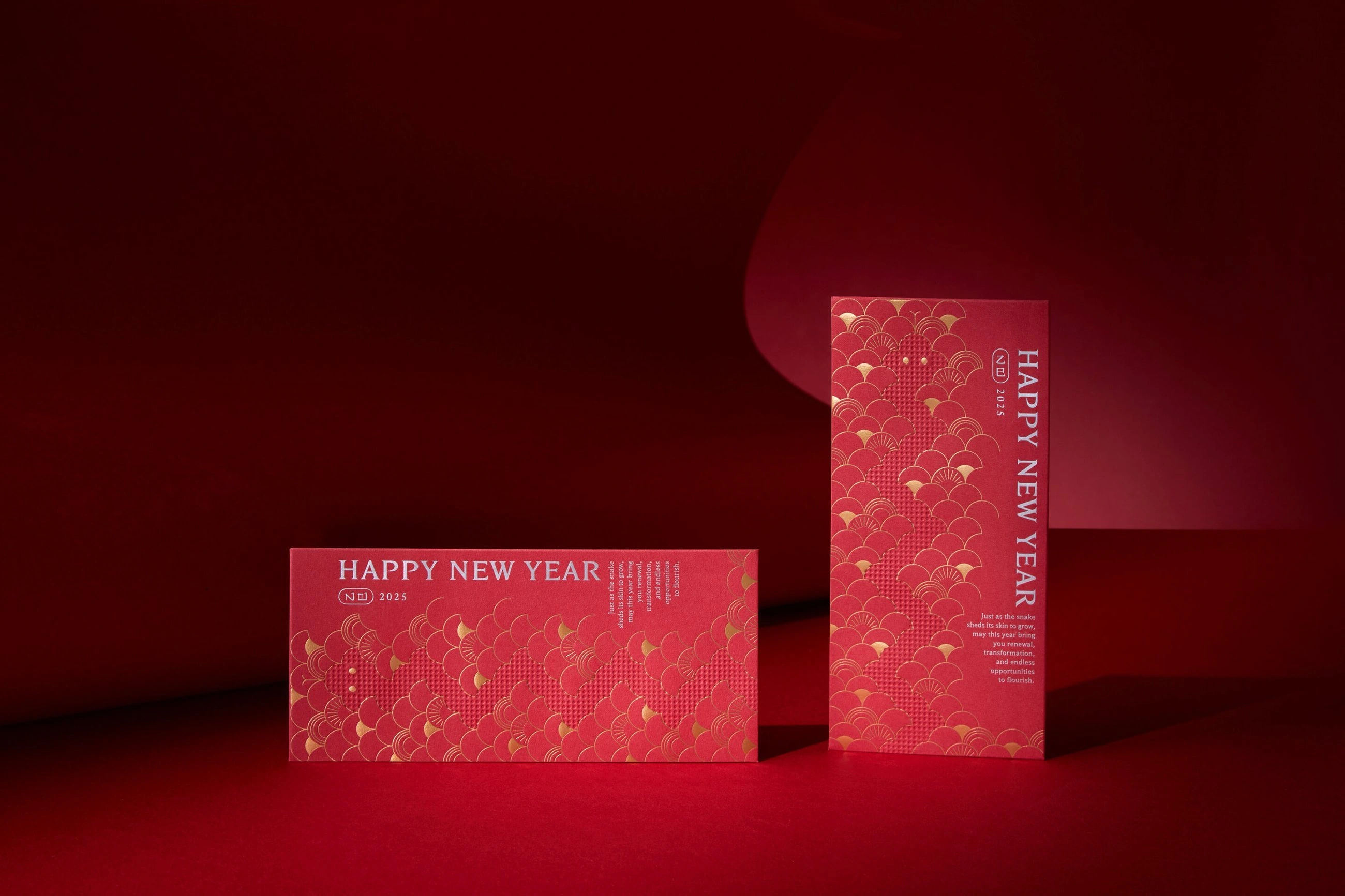
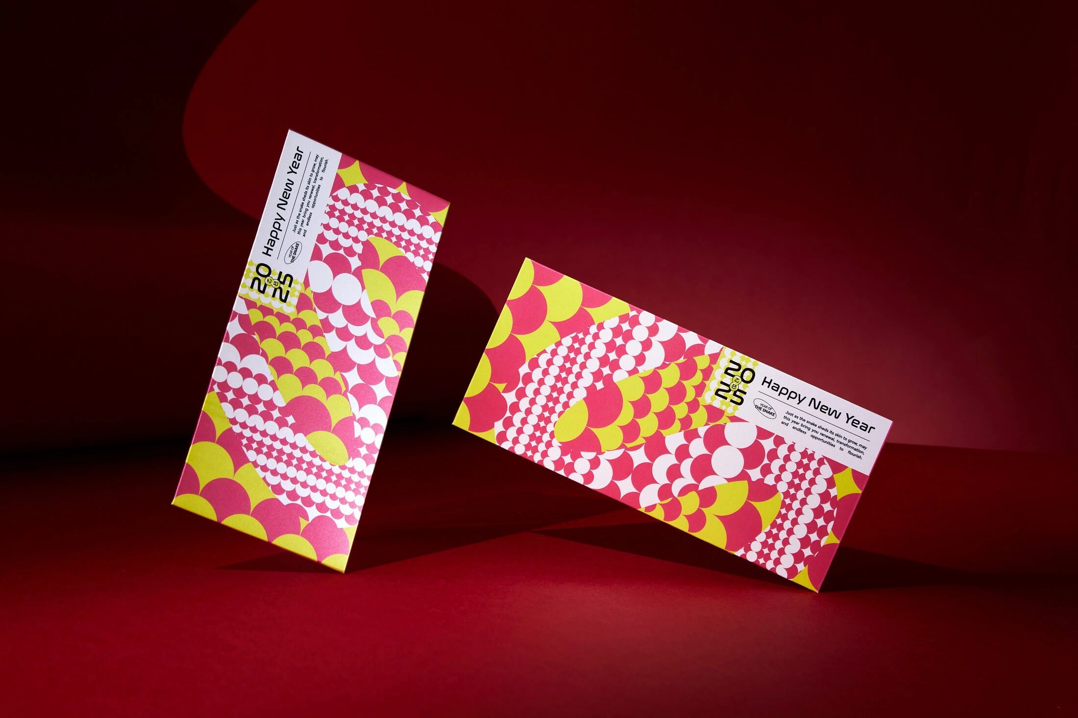
Looking back on 2025, Hand Heart's Lunar New Year card took the snake as its central motif, using the card sleeve's pull-out interaction to depict the process of shedding and transformation. The layered progression of serpent scales also mirrors how Hand Heart, throughout that year, kept meeting challenges by breaking down and reassembling itself.回望 2025 年,手心的新年賀卡以「蛇」作為核心意象,透過賀卡卡套的抽拉互動設計,描繪蛇脫皮、蛻變的過程;層層推進的蛇紋變化,也映照著手心在那一年裡,面對挑戰、不斷拆解與重組自我的狀態。
Inside, three red envelope designs carry the scale motif forward, each rendered in a different palette to express hopes for 2025. Red paired with gold-foil scales conveys warmth and blessing, while bold, vivid scale patterns point toward breakthrough, creation, and an unknown future — turning the gesture of blessing into an extension of energy for the year ahead.內裡三款紅包袋延續蛇鱗的紋理語彙,並以不同色彩回應對 2025 的想像。紅色系搭配燙金鱗片,象徵祝福與熱度;而鮮明跳躍的蛇紋配色,則指向突破、創造與未知的未來。讓祝福不只停留在形式,而成為迎向新一年的能量延伸。
Guang Sheng Tang廣生堂
Brand Repositioning品牌重塑
Reframing premium bird’s nest for everyday life.讓精品燕窩,走進更多人的日常。
A brand rebuild for Li-Liang International — a brand-alignment workshop reframed the positioning, breaking bird's nest's pricey, tonic image into “high-tech premium bird's nest that everyone can afford.”為「力量國際」重塑品牌:透過品牌共識營梳理定位,打破燕窩高價、滋補的既定印象,提出「大眾吃得起的高科技精品燕窩」。
- General Manager — Chih-Yang Hsu總經理 — 徐志揚
- Brand Director — Ian Su品牌總監 — 蘇昱安
- Project Planning — Elizabeth Lu專案企劃 — 呂宜家
- Designers — Rou-Tzu Pan, Xiao-Wen Su, Hsin-I Hsieh, Wei-Chih Hsu, Wendy Chang, Alun Wang, Guan-Shian Wu設計師 — 潘柔慈, 蘇筱雯, 謝心怡, 徐維志, 張嘉育, 王琮綸, 吳冠賢
- Motion Designer — Zhi-Hong Cheng動態設計 — 鄭智鴻
A brand rebuild for Li-Liang International — a brand-alignment workshop reframed the positioning, breaking bird's nest's pricey, tonic image into “high-tech premium bird's nest that everyone can afford.”為「力量國際」重塑品牌:透過品牌共識營梳理定位,打破燕窩高價、滋補的既定印象,提出「大眾吃得起的高科技精品燕窩」。
- General Manager — Chih-Yang Hsu總經理 — 徐志揚
- Brand Director — Ian Su品牌總監 — 蘇昱安
- Project Planning — Elizabeth Lu專案企劃 — 呂宜家
- Designers — Rou-Tzu Pan, Xiao-Wen Su, Hsin-I Hsieh, Wei-Chih Hsu, Wendy Chang, Alun Wang, Guan-Shian Wu設計師 — 潘柔慈, 蘇筱雯, 謝心怡, 徐維志, 張嘉育, 王琮綸, 吳冠賢
- Motion Designer — Zhi-Hong Cheng動態設計 — 鄭智鴻
National Central Library國家圖書館
Brand Identity Renewal品牌識別更新
Rooted in archives. Open to the future.典藏為基石,知識即動能,開放見未來。
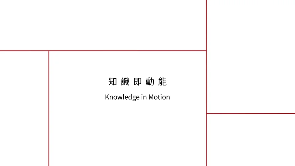
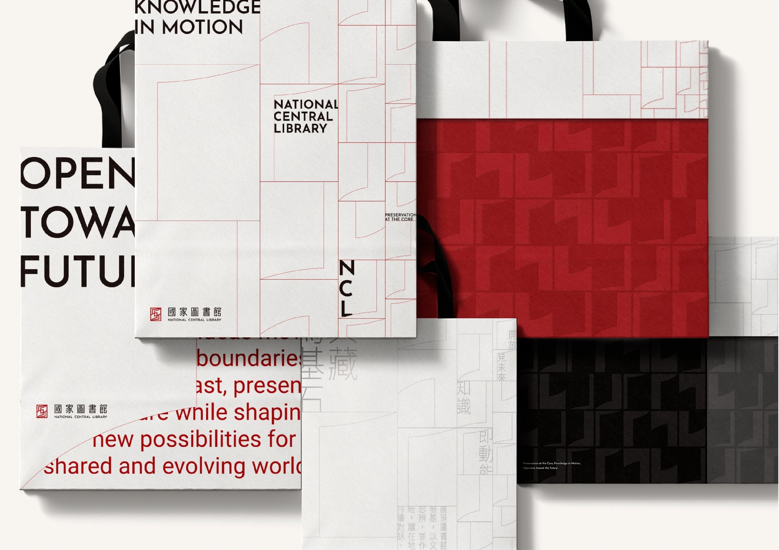
A brand identity renewal for the National Central Library, built on “archives as foundation, knowledge as momentum, openness as future” — a brand able to keep speaking to the present and what comes next.國家圖書館品牌識別更新:以「典藏為基石、知識即動能、開放見未來」為核心,建立能與當代及未來持續對話的品牌形象。
- General Manager — Chih-Yang Hsu總經理 — 徐志揚
- Brand Director — Ian Su品牌總監 — 蘇昱安
- Project Planning — Anton Su, Ivy Wang, Vivian Hu, Elizabeth Lu專案企劃 — 蘇連捷, 王彥筑, 胡維恩, 呂宜家
- Designers — Xiao-Wen Su, Rou-Tzu Pan, Guan-Shian Wu, Chi-Ming Wang, Alun Wang, Ya-Wen Chang, Wendy Chang, Yu-Chen Wang設計師 — 蘇筱雯, 潘柔慈, 吳冠賢, 王啟明, 王琮綸, 張雅文, 張嘉育, 王昱蓁
- Motion Design — Zhi-Hong Cheng動態 — 鄭智鴻
A brand identity renewal for the National Central Library, built on “archives as foundation, knowledge as momentum, openness as future” — a brand able to keep speaking to the present and what comes next.國家圖書館品牌識別更新:以「典藏為基石、知識即動能、開放見未來」為核心,建立能與當代及未來持續對話的品牌形象。
- General Manager — Chih-Yang Hsu總經理 — 徐志揚
- Brand Director — Ian Su品牌總監 — 蘇昱安
- Project Planning — Anton Su, Ivy Wang, Vivian Hu, Elizabeth Lu專案企劃 — 蘇連捷, 王彥筑, 胡維恩, 呂宜家
- Designers — Xiao-Wen Su, Rou-Tzu Pan, Guan-Shian Wu, Chi-Ming Wang, Alun Wang, Ya-Wen Chang, Wendy Chang, Yu-Chen Wang設計師 — 蘇筱雯, 潘柔慈, 吳冠賢, 王啟明, 王琮綸, 張雅文, 張嘉育, 王昱蓁
- Motion Design — Zhi-Hong Cheng動態 — 鄭智鴻
China Airlines中華航空
CIS 2.0 · Membership Card DesignCIS 2.0 · 會員卡設計
A world of connections, held in one card.將飛往世界的連結,凝聚於一張會員卡。
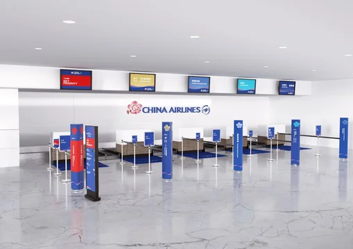
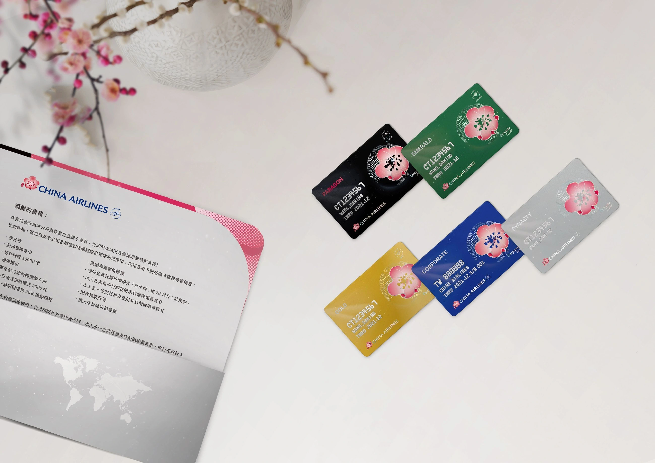
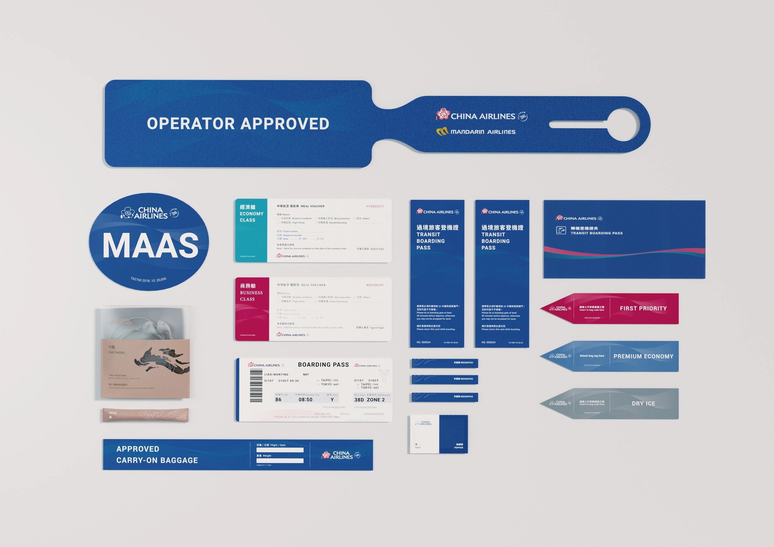
The China Airlines membership card design is one of the application design projects under Hand Heart Design's “China Airlines CIS 2.0 Brand Identity Design” engagement. Centered on the brand tagline “Every encounter is destiny — China Airlines puts guests first,” a three-dimensional, point-cloud globe represents the density of China Airlines' route network. To highlight Taiwan's distinct geography, the top-tier Diamond Card is inlaid with crystal to convey prestige, while simplified, interlacing route lines evoke a blossoming plum flower — also implying a journey toward the world; its five petals unfold into the five continents, set against a swirling nebula that conveys the vastness of flight across the sky.中華航空 會員卡設計 為手心設計承接〈中華航空 CIS2.0 品牌識別設計〉專案中之應用設計項目,以「相逢自是有緣,華航以客為尊」品牌標語為中心理念,立體結構的3D點狀地球象徵華航綿密航點的分佈,為凸顯獨特的台灣地理位置,特別於頂級的晶鑽卡鑲嵌水晶以顯尊榮身份,飛往各國航線的曲線以簡化交錯方式呈現綻放梅花意象,也隱含邁向全球之義;五瓣花瓣舒展為五大洲,背景星雲繚繞,呈現航行天際之宇宙浩瀚。
- Designers — Hsu Chih-Yang, Pan Dong, Su Shao-Han, Li Ci-Jin, Lin Yu-An設計師 — 徐志揚, 潘東, 蘇韵涵, 李其晉, 林育安
- Project Planning — Su Lien-Chieh, Lin Yu-Jhen專案企劃 — 蘇連捷, 林玉真
- Executive Design Director — Hsu Chih-Yang設計總監 — 徐志揚
The China Airlines membership card design is one of the application design projects under Hand Heart Design's “China Airlines CIS 2.0 Brand Identity Design” engagement. Centered on the brand tagline “Every encounter is destiny — China Airlines puts guests first,” a three-dimensional, point-cloud globe represents the density of China Airlines' route network. To highlight Taiwan's distinct geography, the top-tier Diamond Card is inlaid with crystal to convey prestige, while simplified, interlacing route lines evoke a blossoming plum flower — also implying a journey toward the world; its five petals unfold into the five continents, set against a swirling nebula that conveys the vastness of flight across the sky.中華航空 會員卡設計 為手心設計承接〈中華航空 CIS2.0 品牌識別設計〉專案中之應用設計項目,以「相逢自是有緣,華航以客為尊」品牌標語為中心理念,立體結構的3D點狀地球象徵華航綿密航點的分佈,為凸顯獨特的台灣地理位置,特別於頂級的晶鑽卡鑲嵌水晶以顯尊榮身份,飛往各國航線的曲線以簡化交錯方式呈現綻放梅花意象,也隱含邁向全球之義;五瓣花瓣舒展為五大洲,背景星雲繚繞,呈現航行天際之宇宙浩瀚。
- Designers — Hsu Chih-Yang, Pan Dong, Su Shao-Han, Li Ci-Jin, Lin Yu-An設計師 — 徐志揚, 潘東, 蘇韵涵, 李其晉, 林育安
- Project Planning — Su Lien-Chieh, Lin Yu-Jhen專案企劃 — 蘇連捷, 林玉真
- Executive Design Director — Hsu Chih-Yang設計總監 — 徐志揚
Tainan Public Library台南市立圖書館
CIS Design品牌識別設計
Architecture, books, and light become an identity.讓建築、書冊與光影,成為圖書館的識別。
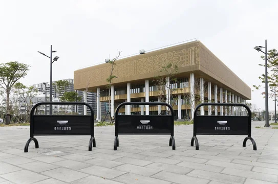
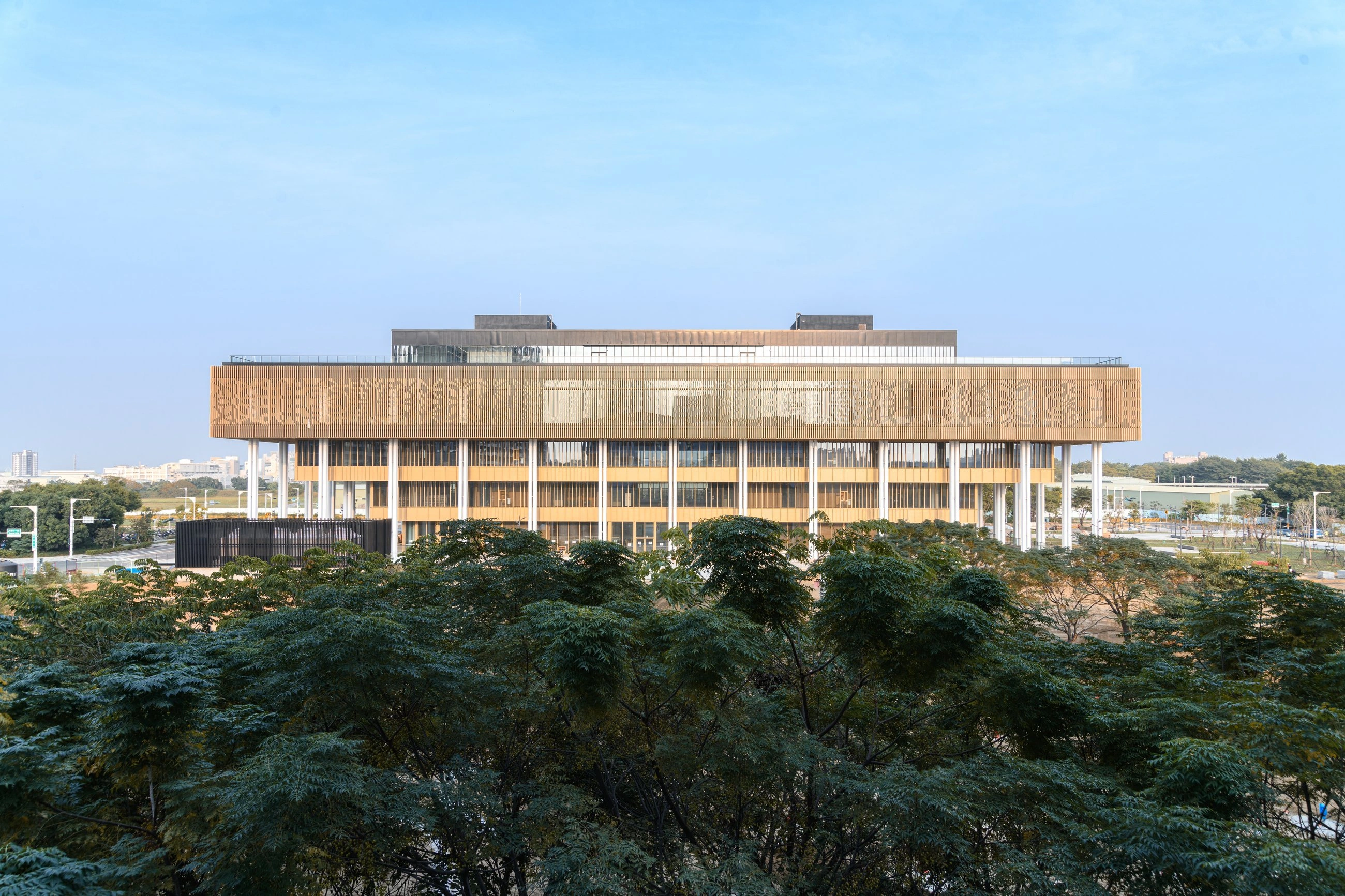
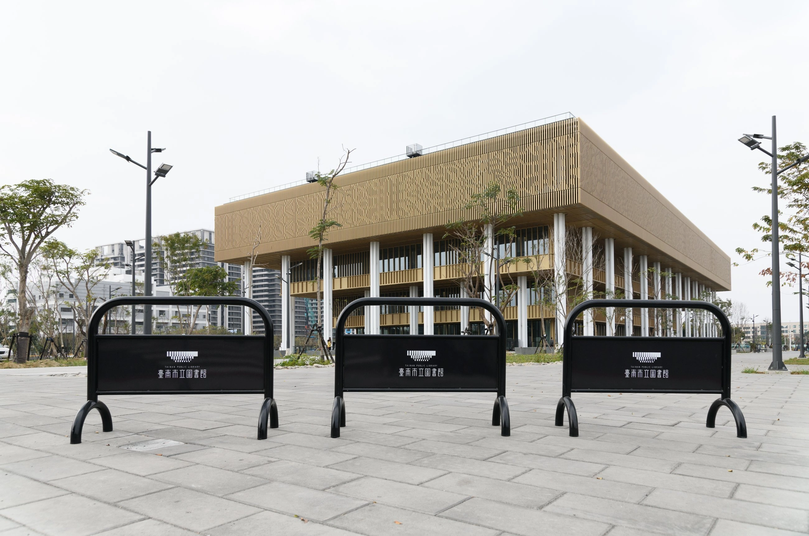
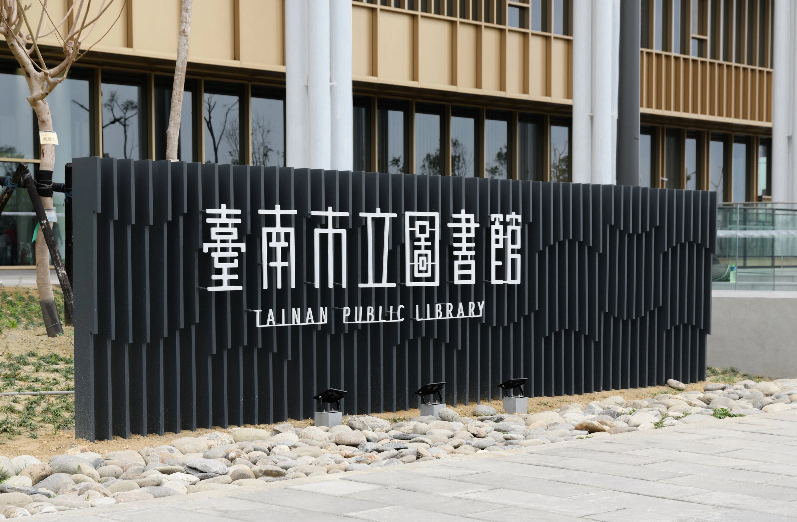
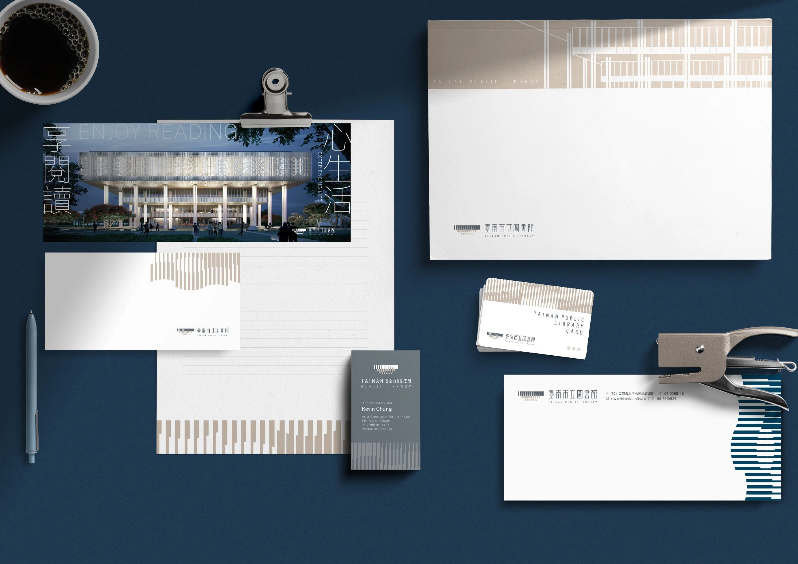
CIS for Tainan Public Library's new main branch — the building's stepped, tapering silhouette becomes the mark, its book-like square units and gradient rhythm carrying light, shadow, and breath.台南市立圖書館新總館 CIS:以逐層內縮的建築外觀為標誌輪廓,用象徵書冊的方形單元加漸變手法,帶入光影與呼吸感。
- Designers — Liu Chia-Chen, Jiang Pei-Yu, Pan Dong, Lu Yi-Wen設計師 — 劉家溱, 江珮瑜, 潘東, 盧臆雯
- Project Planning — Su Lien-Chieh, Wang Yan-Zhu專案企劃 — 蘇連捷, 王彥筑
- Executive Design Director — Hsu Chih-Yang設計總監 — 徐志揚
CIS for Tainan Public Library's new main branch — the building's stepped, tapering silhouette becomes the mark, its book-like square units and gradient rhythm carrying light, shadow, and breath.台南市立圖書館新總館 CIS:以逐層內縮的建築外觀為標誌輪廓,用象徵書冊的方形單元加漸變手法,帶入光影與呼吸感。
- Designers — Liu Chia-Chen, Jiang Pei-Yu, Pan Dong, Lu Yi-Wen設計師 — 劉家溱, 江珮瑜, 潘東, 盧臆雯
- Project Planning — Su Lien-Chieh, Wang Yan-Zhu專案企劃 — 蘇連捷, 王彥筑
- Executive Design Director — Hsu Chih-Yang設計總監 — 徐志揚
Gueiren Branch / Gardening
Baihe Branch / The Culture of the Hot Spring
Luouja Branch / Pottery
Hsu Shih Music Library / Music
Hsu Shih Music Library / Music
Yujing Branch / The Culture of Fruit
West Central Branch / Video and Audio Information
Shanhua Branch / The Culture of Cuisine
Anping Branch / The Etiquette, Custom, Historic Site
Houbi Branch / The Culture of the Rice
Longci Branch / Photography
Beimen Branch / The Culture of Fishing
A dynamic identity system extends the mark: its square units are recomposed, by each branch's collection focus, into 44 representative icons — keeping every branch tied to the main library while letting its own character show, and ready to grow as the system expands.延伸出一套動態識別系統:解構標誌的方形單元,依各分館館藏特色重組成 44 個代表圖標,讓分館各具特色又與總館一脈相連,未來擴館也能持續延伸。
Kaohsiung National Stadium高雄國家體育場
Wayfinding System Design指標系統設計
Finding your way through color, form, and language.以色彩、圖像與語言,指引每一段行進。
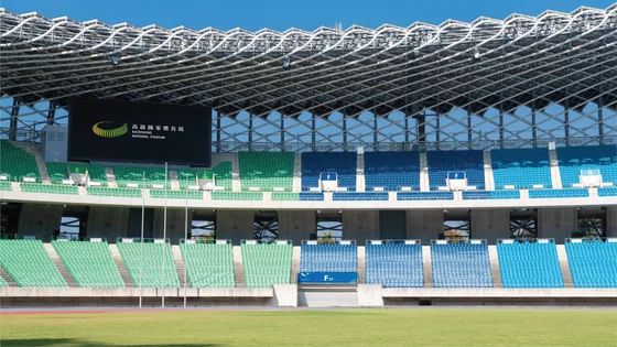
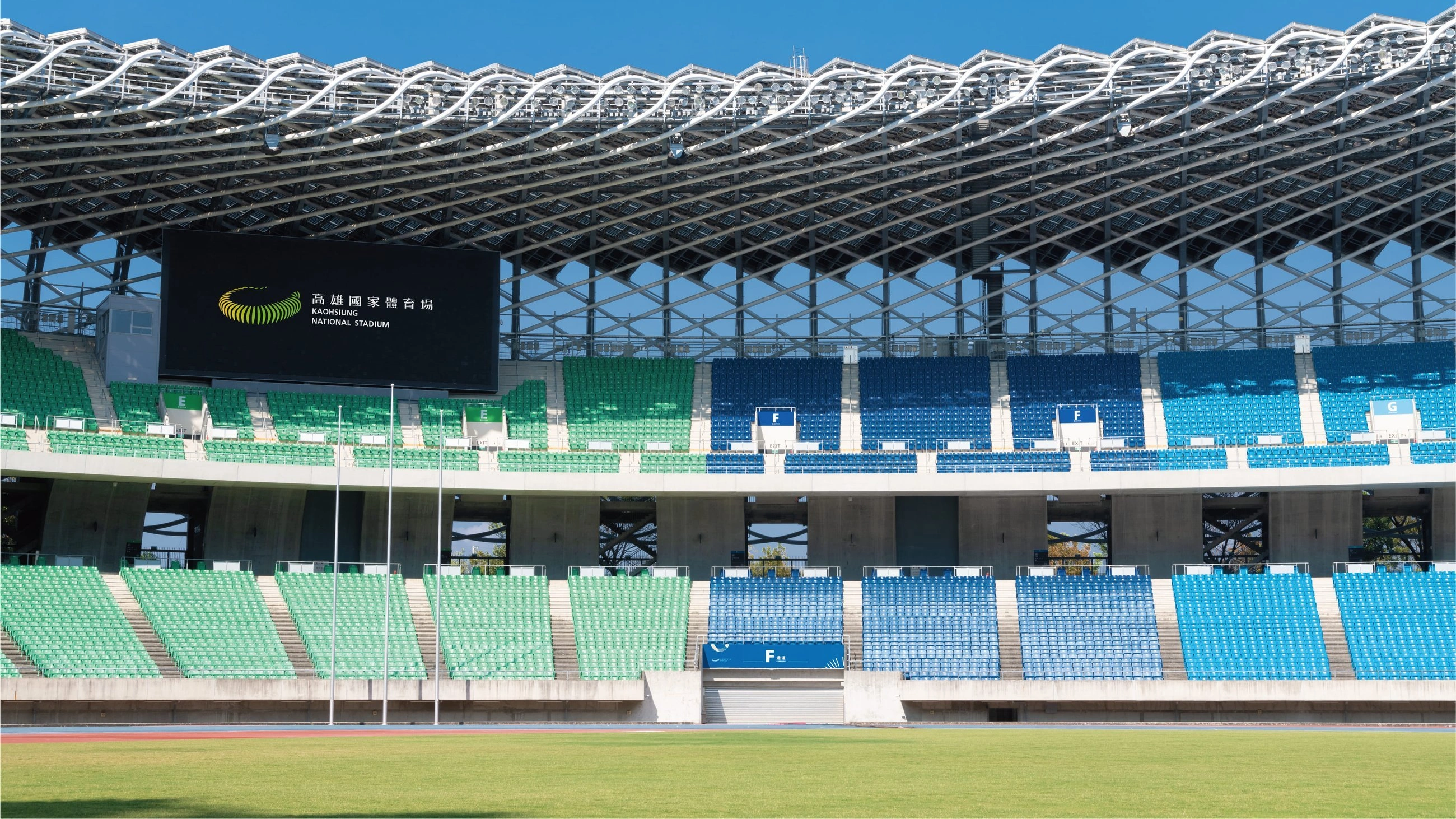
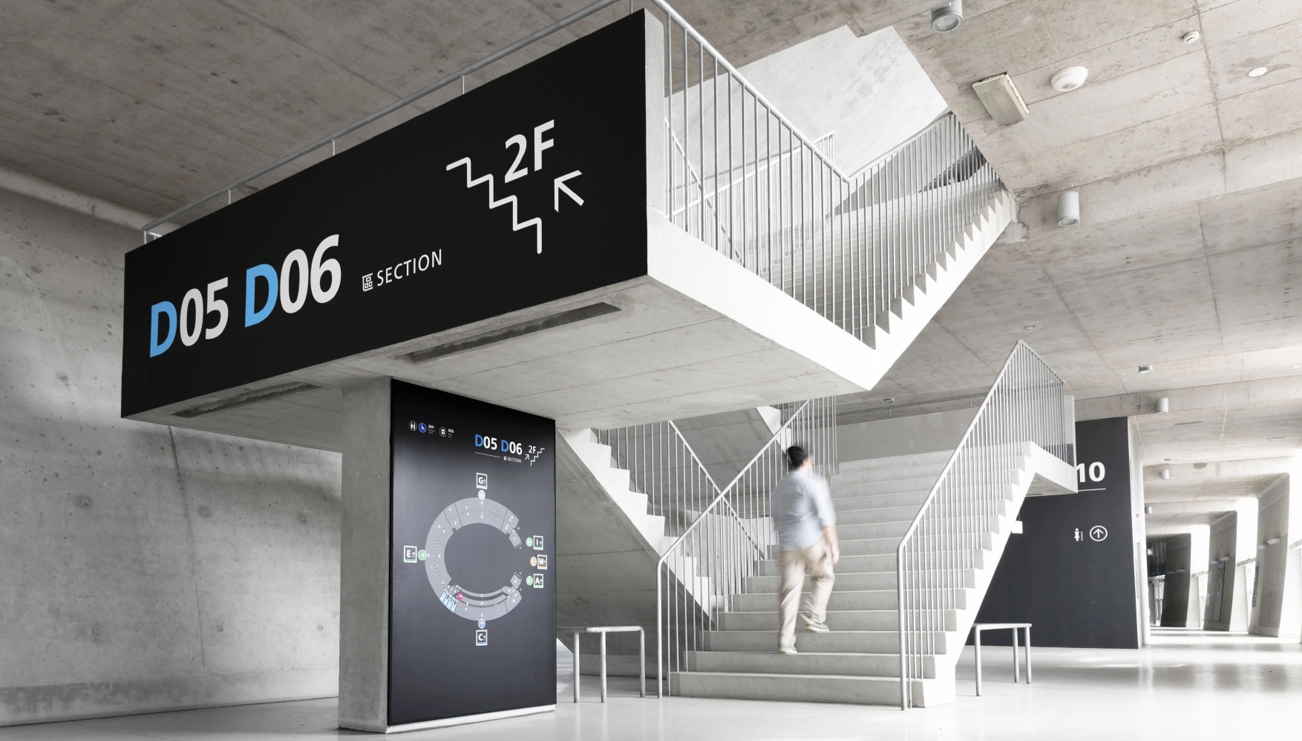
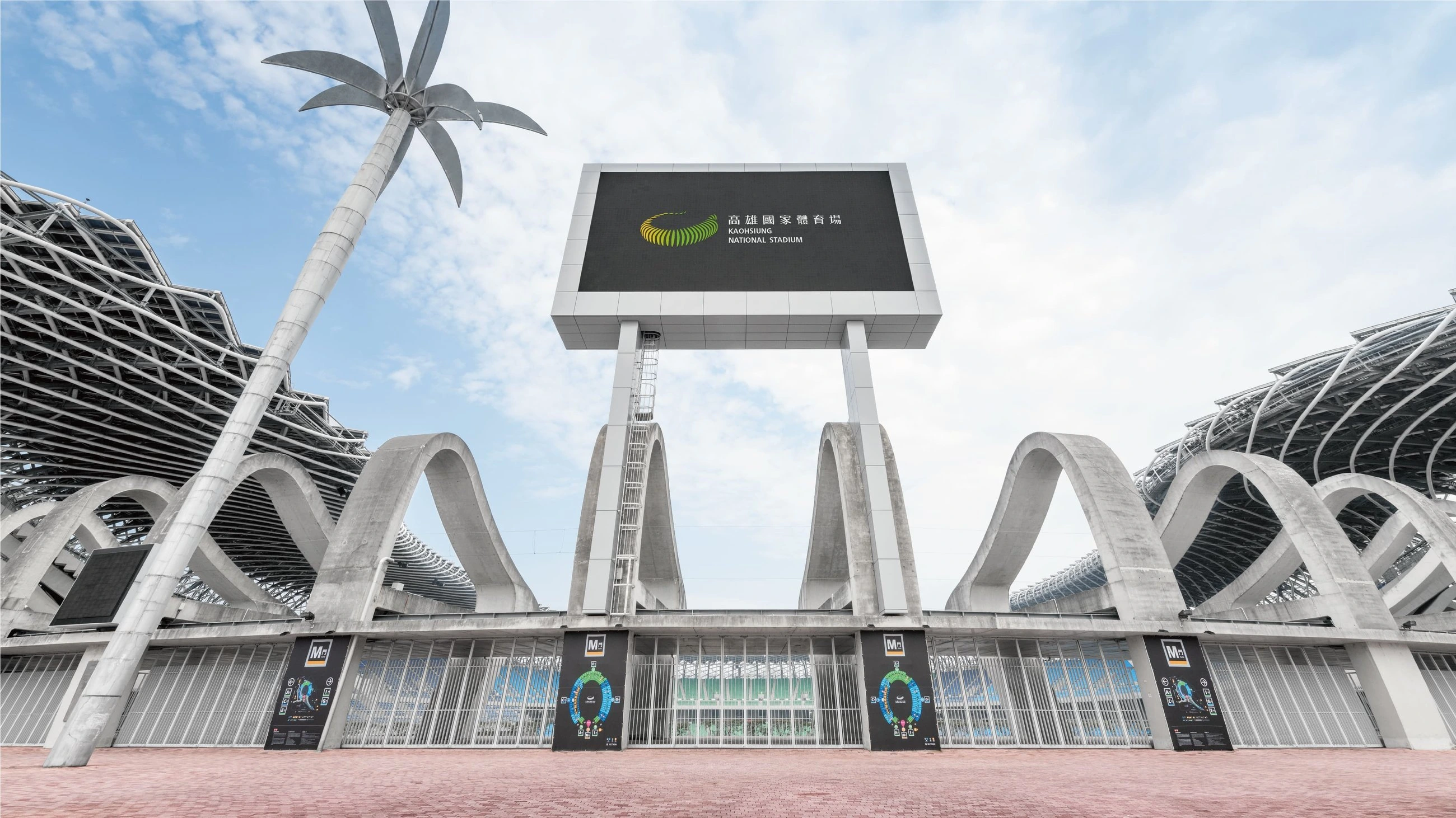
Hand Heart Design planned the complete wayfinding system for Kaohsiung National Stadium — the main venue of the 2009 World Games, designed by architect Toyo Ito. The project analyzed problems with the original signage, rebuilt a color-coded zoning system, and validated visibility through a scientific process, letting spectators find their seats and entrances quickly, from a distance to up close, by color, pattern, English, and numerals. The project won both the German Red Dot Design Award and the iF Design Award, standing as a landmark case for large-venue wayfinding design in Taiwan.手心設計事務所為高雄國家體育場(2009 世界運動會主場館、建築師伊東豊雄設計)規劃全場館指標系統(Wayfinding System):分析舊有指標問題、重建色彩分區系統,並以科學化流程驗證視認性,讓觀眾由遠至近依色彩、圖案、英文、數字快速找到座位與出入口。本案獲德國紅點設計獎與 iF 設計獎雙料肯定,是台灣大型場館指標設計的代表案例。
- Design Director — Chih-yang Hsu設計總監 — 徐志揚
- Project Manager — Lien-Chieh Su專案管理 — 蘇連捷
- Designers — Chih-yang Hsu, Yi-huei Lin, I-chen Lee, Dong Pan, I-wen Lu, Yi-jie Zhou, Jia-qin Liu, Pei-yu Chiang, Yen-chiu Wang, Yo-xuan Liu, Ting-li Huang, Chun-yu Chuang, Re-ning Chiu, Chi-jin Lee, Shang-qi Su, Chi-wen Hsieh設計師 — 徐志揚, 林宜慧, 李奕臻, 潘東, 盧臆雯, 周一潔, 劉家溱, 江珮瑜, 王彥筑, 劉又瑄, 黃庭莉, 莊淳喻, 邱若寧, 李其晉, 蘇上棋, 謝奇彣
- Project Consultants — Yi-hsun Lee, Ming-hong Hong, Sung-te Tsai專案顧問 — 李億勳, 洪明宏, 蔡頌德
- Photographer — David Wang攝影 — 王大衛
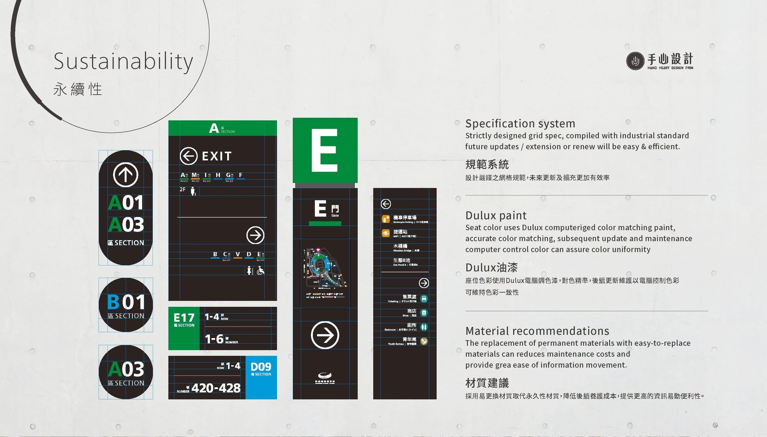
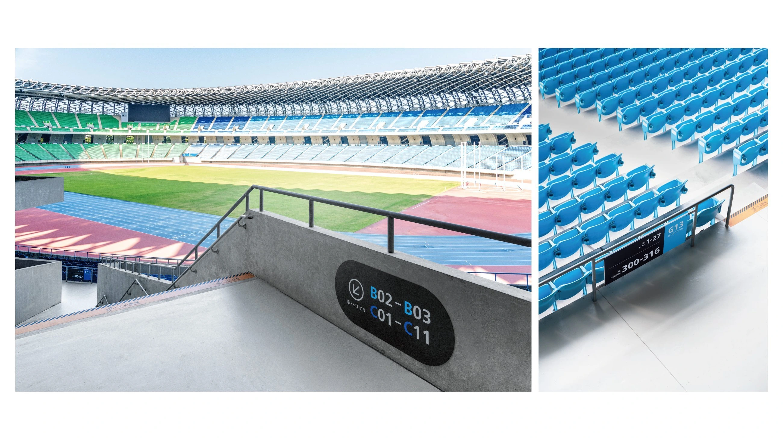
Since the stadium's original 40,000 seats could not be recolored, the Hand Heart team turned this constraint into a design feature, using the seats' own colors as the seating-zone system. To complement the material character of the building's exposed concrete and to strengthen information visibility, an achromatic base color was chosen — aiming to soften the signage's impact on the existing architecture while retaining strong environmental identity and legibility, creating a visual impression that feels energetic, modern, and rhythmic.由於場館內原有的四萬張座椅無法更改色彩,手心團隊將這個侷限的條件轉換為設計特色,以座椅色彩作為座位分區系統,為了搭配建築本體「清水模」的材質特性,同時強化資訊的視認性,因此選用無彩色的底色,期望能弱化指標對原有建築的影響,同時保有指標設計高度的環境識別與指標視認機能,營造出具有活力、現代化、律動的視覺意象。
識別動態Identity in motion
南國美MOMA TAINAN
標案提案・非最終定案作品Tender proposal · Not the final approved work
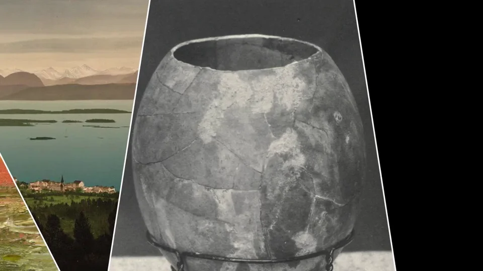
建築輪廓、五邊形與藝術影像,在動態中相互轉換。Architecture, geometry and art, moving into one another.
識別動態Identity in motion
外交部Ministry of Foreign Affairs
標案提案・非最終定案作品Tender proposal · Not the final approved work
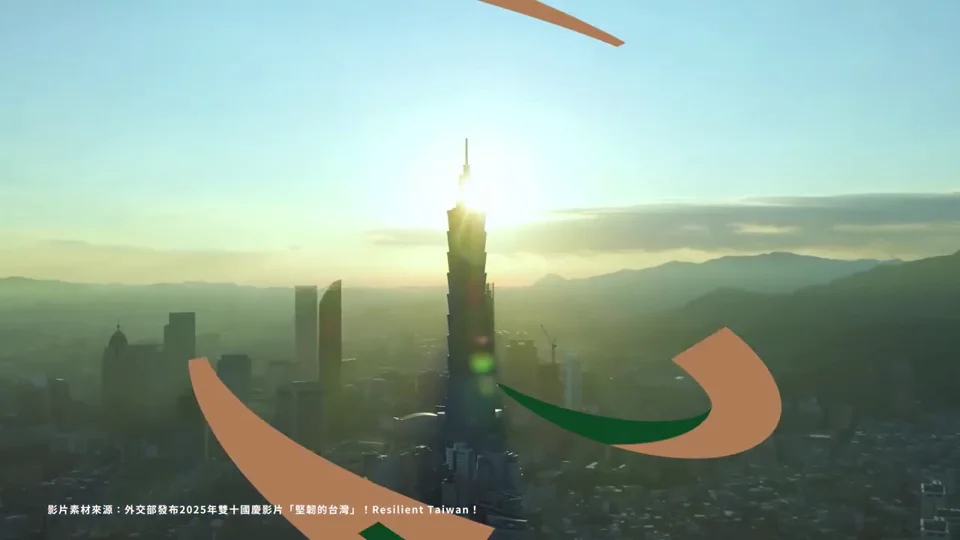
色彩與字形延伸,展開識別的不同可能。Colour and typography unfold into new possibilities.