
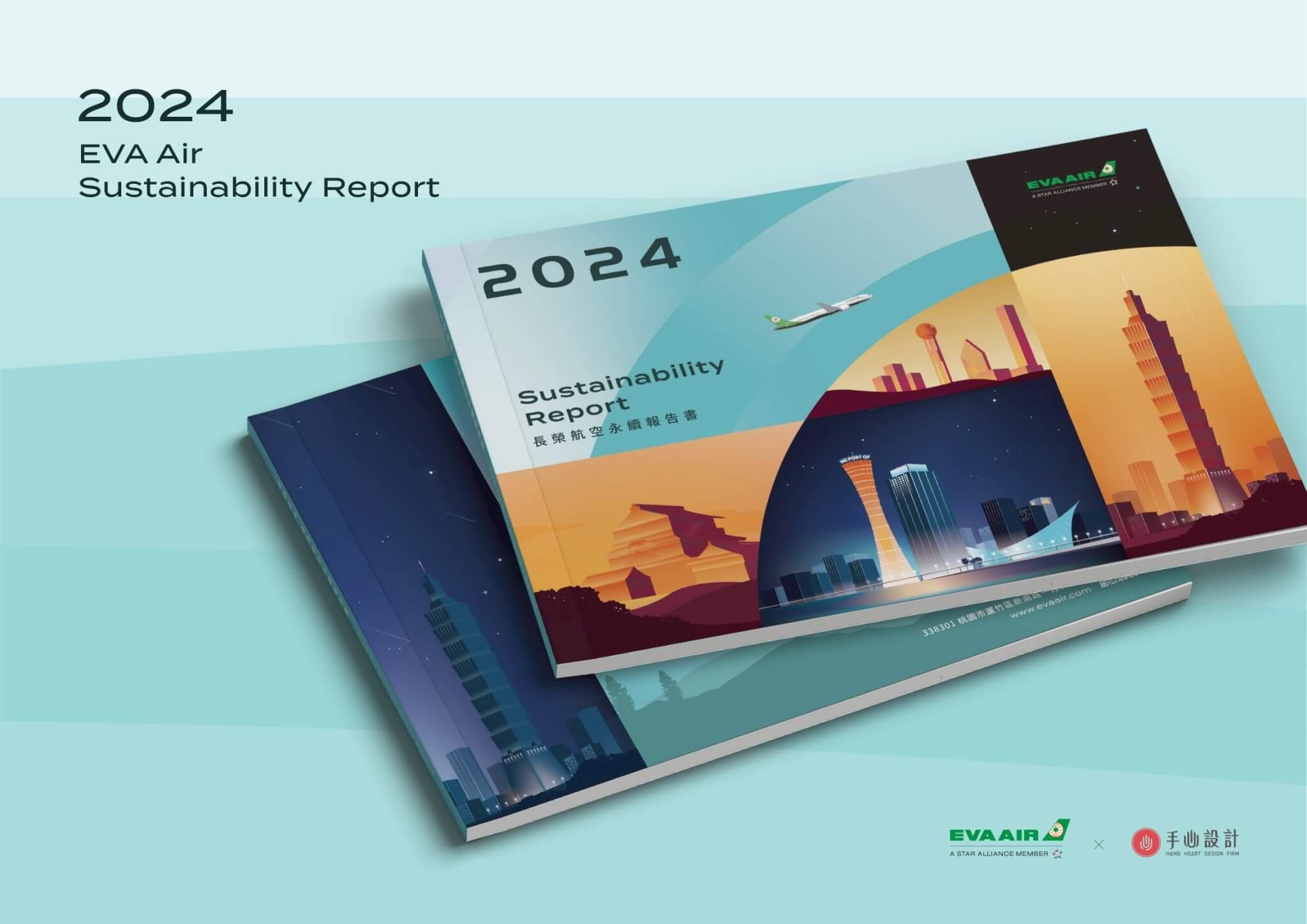
For the second year running, Hand-Heart Design Firm designed EVA Air’s sustainability report, this time the 2024 edition. The cover uses hand-drawn illustration and geometric colour blocks to show the movement of flight routes, bringing in landmarks from destinations including Ehime, Kobe, Houston and Dallas, along with Taipei 101. Inside, a dual-tone system based on the brand green runs through the chapter layouts to make the sustainability information simpler and smoother to read. The report presents EVA Air’s sustainability information for 2024, and the project was completed in August 2025.
What did EVA Air’s sustainability report design need to handle?
EVA Air’s sustainability report design had to handle the chapter hierarchy, the indexes to disclosure standards, and layouts for the Chinese, English and e-book versions.
- The report is divided into seven chapters and appendices, each chapter has 3 to 4 sections, and the contents page also lists a foreword.
- The appendices include indexes to disclosure standards such as GRI and SASB, two international sustainability reporting frameworks, as well as a cross-reference table on the climate-related disclosures required of listed companies.
- The interior pages were laid out in separate Chinese and English versions, and the e-book version moves the top tabs and page numbers to the right-hand side of the page.
How does the cover turn flight routes and destinations into images?
This was our second year designing EVA Air’s sustainability report. While keeping the brand’s international outlook and professional image, this year’s cover uses hand-drawn illustration, with geometric colour blocks that divide and overlap, to show the movement of flight routes and the connections between destinations.
Landmarks from Ehime, Kobe, Houston and Dallas, along with Taipei 101, appear beneath skies that shift from day to night. Together, they show how closely flight links the world and take the viewer on a journey through many different landscapes.
Inside, a dual-tone palette based on the brand green runs through the chapters and page layouts for a simpler, smoother read.
The first cover drafts, in February 2025, proposed two directions. Direction A used geometric colour blocks that divide and overlap to show movement around the world, bringing in destination landmarks and skies at different times of day. Direction B used the smile-shaped curve and gradient glow left by a plane crossing the sky to convey warm, professional service. The refined cover page included in the April 2025 interior guidelines proposal shows the composition of Direction A carrying through, while the combination of landmarks was still being adjusted.
How does the brand-green dual-tone palette extend across seven chapters?
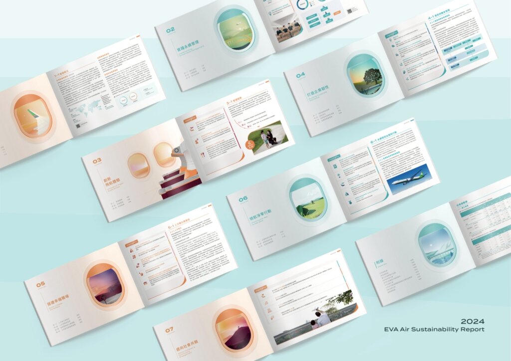
The report is divided into seven chapters and appendices: “About EVA Air”, “Practising Sustainable Management”, “Innovating the Flight Experience”, “Building Corporate Resilience”, “Creating a Happy Workplace”, “Leading Net-Zero Action” and “Moving Towards Social Inclusion”. Each chapter opener uses an aircraft window as its key visual, framing a different illustrated landscape or in-flight scene, and the main colour of the openers alternates between green and orange.
The interior guidelines proposal alternates two chapter colours from one chapter to the next, with the aim of keeping the report from becoming too colourful. The layout is based on a 12-column grid that can be split into combinations such as 3/9, 4/8, 5/7 and 6/6. Text always sits within a light grey type area, while illustrations and photos can extend beyond it. The top tabs change with each chapter’s main colour, and the e-book version moves the tabs and page numbers to the right-hand side of the page.
The interior layouts were produced in two sets, one Chinese and one English. In June 2025 (based on file dates), the Chinese version went through two rounds of full proofs.
How are data and processes presented on the interior pages?
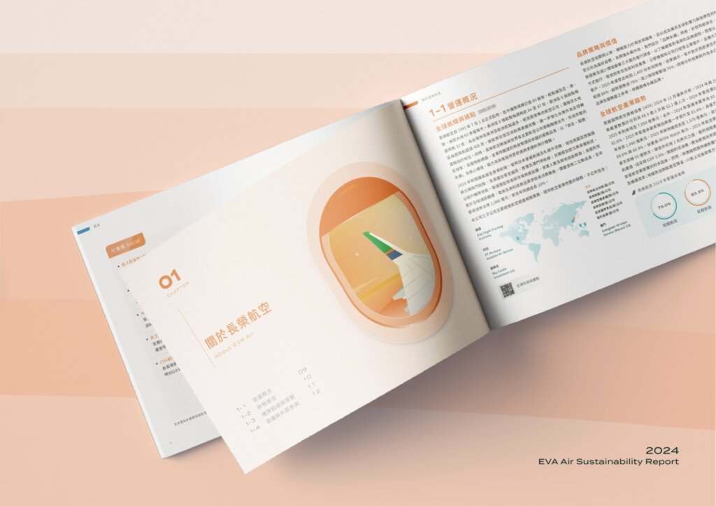
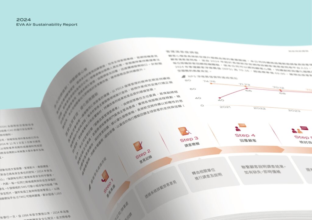
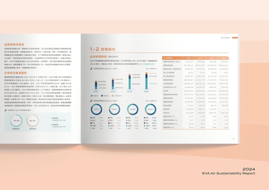
In Chapter 1, for example, the opener lists sections 1-1 to 1-4. Inside, “1-1 Operational Overview” pairs a world map with ring percentage charts, while “1-2 Financial Performance” sets bar charts, ring charts and a multi-year data table side by side. Another page turns the customer feedback handling process into a step-by-step flowchart starting from Step 1, with a line chart of the Net Promoter Score (NPS) above it.
What is each of these design guidelines for?
EVA Air’s interior guidelines cover chapter colours, text-and-image layouts, text hierarchy, and icons and charts, and end with trial layouts using real content. The proposal states the purpose of the chapter colours and the layout system.
- Chapter colours: two sets of chapter colours alternate, and the proposal states that the aim is to keep the whole report from becoming too colourful, so that it is simpler and easier to read.
- Layout: pages are divided into a 12-column grid, with text inside a light grey area and illustrations and photos free to extend beyond it; the proposal states that the aim is to give the layouts more variety.
- Typography: typeface, size and weight are set for first- to third-level headings, chart titles, image captions and notes, and body text, with one typeface for English and numerals and another for Chinese.
- Icons and charts: basic guidelines for icons and charts give the layout a reference point; sizes and column widths can adapt to the information, and colours can be fine-tuned.
- Trial layouts: the final section of the proposal lays out pages using real text and charts from the foreword, sustainability management and sustainable supply chain management, showing how the guidelines look once applied.
Which organisations can learn from this project?
If either of the following applies to your sustainability report, the approach taken for EVA Air may be a useful reference:
- If your report has many chapters and its appendices include disclosure standard indexes and a climate-related disclosure table, you can look at the guidelines for chapter colours and text hierarchy.
- If you need Chinese, English and e-book versions, it is worth looking at how the layout system was planned and where the e-book places its tabs and page numbers.
A useful order: organise the chapters and appendices first, then set the colour, layout and typography guidelines, and finally run trial layouts with real text and charts.
If you are planning your company’s sustainability report, see Hand-Heart’s sustainability report design service. Before commissioning the work, you can also use our sustainability report design brief to set out the report’s scope, versions, proofreading and schedule.
Completed
General Manager
Project Manager
Designers
2025.08
Chih-yang Hsu
Amanda Huang
Wendy Zhang, Eric Hsu