
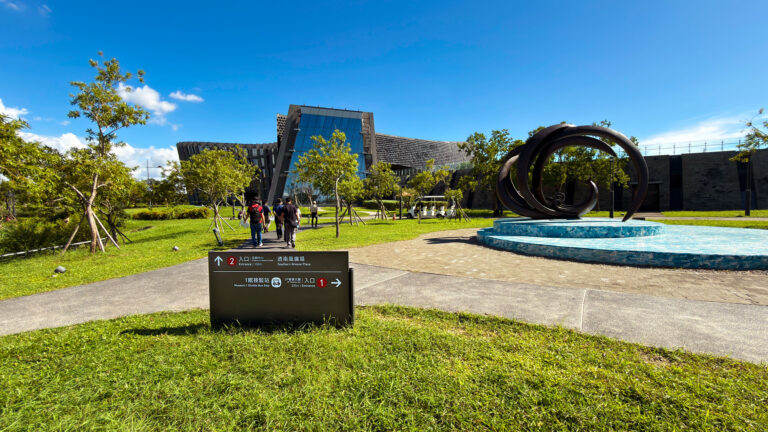
Wayfinding system design brings together corporate identity, visual design, industrial design and spatial design to help people reach their destination by the shortest route through a complex building. Hand-Heart Design Firm is a Taiwanese team focused on wayfinding systems, with services covering circulation analysis, zoning system planning, legibility verification and construction supervision. Representative projects include the National Palace Museum Southern Branch, Kaohsiung National Stadium (Red Dot Award and iF Design Award, Germany) and the Research Building of National Kaohsiung Normal University (Red Dot Design Award 2021). Hand-Heart believes the best signs are an accent to the architecture, not a burden on the space.
Wayfinding system design draws on several design disciplines: corporate identity, visual design, industrial design, three-dimensional form, spatial design and architecture. It uses the elements of the corporate identity system (the colour scheme, the typographic hierarchy, supporting graphics and the pictogram system) and works them into layouts and three-dimensional forms that help people locate themselves in a space or on a site. A successful wayfinding system does a few things well: it helps people find the shortest route through a building, and it makes the information and directions along that route easy to understand. For a wayfinding system to run smoothly, the maps, signs and the rest of the strategy, circulation guidance included, should stay as close as possible to the way people look for things in every other space they use.
A wayfinding system is not “a few signs to be made”. It is a job that runs all the way from the logic of the space to acceptance on site. Settle the four points below before you put the project out to tender and the early stage gets much shorter.
- Venue
- Museums, stadiums, campuses and parks, hospitals, schools, residential developments: the task is always finding the way, but the difficulty is different every time. A stadium has to handle tens of thousands of people arriving by every mode of transport within a short window. A museum has to keep first-time visitors from getting lost between galleries. A hospital has to look after people pushing wheelchairs and people who cannot see clearly. So before design work starts we need these documents: site plans, floor plans, escape route plans, the sign message schedule, accessible vehicle and pedestrian routes, and the positions of AEDs, nursing rooms and all-gender toilets together with the lighting layout. Only with those in hand can we decide where a sign is needed and where to leave the space empty.
- Interfaces with the building works
- Who is responsible for fabrication and installation decides how the contract is split, and the earlier that is clear the better. Hand-Heart can take on planning and design only, design plus construction supervision, or a design-build scope that includes fabrication and installation. The three scopes carry different responsibilities and different acceptance criteria, so settle this before the tender. Whether walls can be drilled, whether the ceiling can carry suspended signs, whether outdoor signs need a typhoon-resistant structure and where the power points for internally illuminated signs are: each of these feeds back into the design. Fabrication and installation usually take 4 to 8 weeks; counting back from the opening date is the only way to know the day the design has to be final.
- Verification
- How large the characters have to be is not a matter of feel. The optimum visual angle for reading text is 17 minutes of arc; converted, the minimum character height is about 1/202 of the viewing distance, and twice that for people with impaired vision. Once the numbers are in, three rounds of on-site verification follow: a 1:1 full-size print compared on site, a physical mock-up checked under the real lighting, and tests against backlighting and night-time illuminance. The dark grey background at Kaohsiung National Stadium was settled only after five background colours were measured on site.
- Supervision and acceptance
- Supervision of installation on site, a point-by-point check, and an as-built report on completion. Most design firms leave this part out, and it is the part that decides whether the system works. What is right on the drawing is not necessarily right once it is built.
Which documents to prepare and which four items to check at acceptance are set out on a single sheet for clients: Wayfinding project brief. No contact details required, and it prints out as it is.
The five stages of a wayfinding project
Wayfinding system design starts from the logic of the space; it is not “designing a few signs”. Hand-Heart runs its projects in five stages, each with a defined deliverable. A mid-size project averages 3–6 months from the first consultation to final acceptance; for large mixed-use venues, the schedule is adjusted to the actual situation.
- Discovery & InsightsWe walk the site to find the pain points in the circulation and how the space reads. We work out where users arriving by each mode of transport actually want to go.Deliverable: site survey and circulation pain-point report
- Logical PlanningWe define the information hierarchy, mark the guidance nodes and plan the full logic of sign locations, deciding where a sign is needed and where it is not.Deliverable: zoning system and sign location plan
- Design PresentationWe present the visual scheme (layout, typeface, colour, material and three-dimensional treatment) and verify the viewing distances.Deliverable: design proposal and legibility verification
- Validation & FabricationPhysical mock-ups confirm the effect; during production we run quality control and track the schedule. What is right on the drawing is not necessarily right once it is built.Deliverable: physical mock-ups and production quality control
- Construction & AcceptanceWe supervise the installation on site, check point by point and hand over an as-built report on completion. This is the part most design firms leave out, and the part that decides whether the system works.Deliverable: construction supervision and as-built report
Hand-Heart covers site-wide wayfinding systems, pictogram systems, circulation analysis and design, wayfinding standards manuals, material and structural design, and fabrication with construction supervision. See the full scope of services and fees →
Patents: Hand-Heart’s sign structure design is protected by Republic of China (Taiwan) invention patent No. 908504, “Sign Board”; the invisible-pattern printing technique often used on signs is protected by invention patent No. 908503, “Printing Method for Invisible Patterns and the Printed Matter Thereof”. An invention patent has to pass substantive examination and demonstrate novelty and an inventive step, which is uncommon in the design services industry.
Once the numbers are in, how do we verify them?
The formula gives a lower bound, not a guarantee. The same character height reads very differently on a dark background, against the light or under night lighting, so every Hand-Heart project runs three rounds of on-site verification:
- 1:1 full-size print, compared on site
We print the drawing at actual size, put it up on site and check it from the position people will really stand in. Type that looks perfectly clear when you zoom in on the drawing often turns out to be another matter ten metres away.
- Physical mock-up, confirmed on site
We build a sample in the actual material and check it under the real lighting. Acrylic, metal and applied film reflect light differently; the same grey looks like two different greys on screen and on the wall.
- Illuminance and backlighting tests
We repeat the check at different times of day and under different lighting, particularly during the hours when a glass curtain wall leaves the sign backlit, and at night. A sign that only works at noon is not good enough.
Even the background colour was measured: the Kaohsiung National Stadium example
In August 2019 Hand-Heart ran a field test of background colour legibility at Kaohsiung National Stadium: five background samples (dark grey, white, dark blue, grey and the original blue), with participants recording the “furthest viewing distance” at which they could begin to make out Chinese, English and the icons clearly, and the results ranked by distance.
The final decision on background colour did not rest on test scores alone. It took three steps: first the measured legibility ranking, then the aesthetic question of how the colour sits against the fair-faced concrete, and finally approval by the bureau director, who settled on the dark grey. The reasons for dark grey are equally concrete: it suits the texture of the fair-faced concrete, blends into the surroundings, actually makes the sign information stand out more, and keeps colour matching between different materials straightforward.
That is what “scientific verification” looks like in practice: the data rules out the clearly wrong options, and professional judgement together with the approval of the operating authority makes the final call.
Campuses and museums: how is the work verified, and how is it updated later?
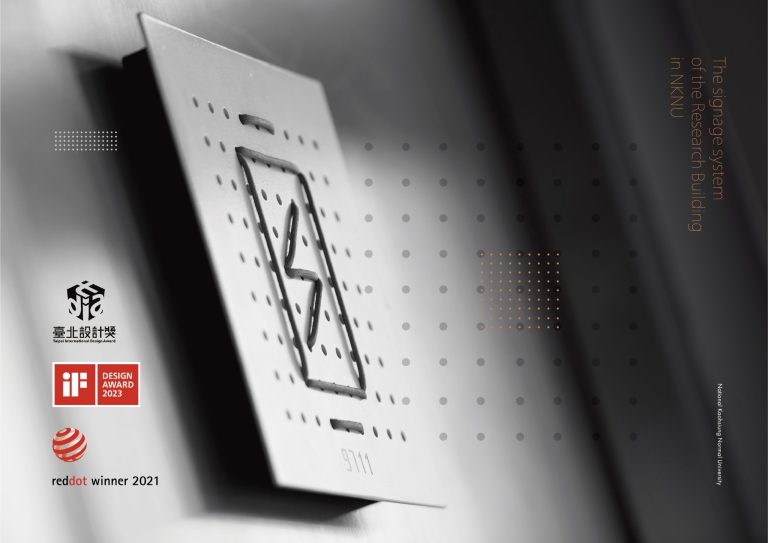
At the Research Building of National Kaohsiung Normal University, the signs are divided by function into 15 types, A1 to H, and each one was marked on the floor plans for 1–3F and 4–7F to confirm its position. Character heights were worked back from the viewing distance, using a 17′ visual angle to find the minimum height, with a separate calculation for people with impaired vision; the sign templates were then taken on site and checked in position against the actual walls and ceilings. The base material is a modular perforated metal panel, with numbers and icons woven in waterproof, durable waxed cord. The material can be reused and the cord woven into all kinds of graphics and text, and the modular approach leaves room for later maintenance and expansion.
At the National Palace Museum Southern Branch, vehicle, pedestrian and accessible routes each have different viewing distances. Hand-Heart first audited the location, type and number of every sign and placed paper prototypes point by point on the site-wide plan. Character sizes were then confirmed with 1:1 set-outs on site and the legibility formula, and each user route was followed to check, sign by sign, that the sequence was unbroken and every arrow pointed the right way. Every sign on the site is coded by mounting method and function, and each type has fixed dimensions and specifications. The standards were handed over to the museum together with the shop drawings and a system schedule, as the basis for future additions and maintenance.
Maintenance also covers the unexpected. After severe Typhoon Danas passed through in July 2025, some of the newly installed feather-shaped signs at the Southern Branch were blown over. The Hand-Heart team reached the site on the day the damage was reported and spent 12 hours dismantling and clearing the damaged signs. A structural engineer then inspected them, the bases were enlarged and diagonal bracing plates added, and the signs were rebuilt, completed and accepted within a month.
Verification answers the question “can it be read clearly now?”; coding, standards and reusable construction answer “how will it be extended and updated later?”
How large does the type need to be? Hand-Heart calculates it rather than guessing
Where science, aesthetics and philosophy meet
Hand-Heart believes good wayfinding design stands where three things meet. Science supplies the grounds: the limits of the human visual angle, the statistics on eye height, the reflective behaviour of materials, all of which can be measured and checked. Aesthetics decides whether the signs can live with the architecture, becoming part of the space rather than a patch on it. Philosophy answers a more basic question: how does this space want people to be treated?
Leave one of them out and something goes wrong. Science alone produces signs that are correct but cold and out of step with their surroundings. Aesthetics alone produces decoration that looks good and cannot be read. Philosophy alone stops at a fine statement that is never put into practice. So every judgement Hand-Heart makes has to rest on an academic basis. The formula, the figures and the verification process below are what that belief looks like in practice.
“Is this type too small?” is the question that comes up most often in a wayfinding project, and the one most easily settled by instinct. Hand-Heart does not settle it by feel. We use a formula for legible character height to work out the minimum height for each position, then verify it on site.
α = 3438 × L ÷ Dα = visual angle (minutes of arc, MOA) | L = character height (cm) | D = viewing distance (cm)
The optimum visual angle for reading text is 17 minutes of arc (17′). Substituting 17′ and solving for L gives the minimum character height at that position: L = 17 × D ÷ 3438. As a ratio that is easier to remember, that is about 1/202 of the viewing distance: every 2 metres of viewing distance calls for at least 1 cm of character height.
| Viewing distance | Minimum character height, general users | Minimum character height, impaired vision |
|---|---|---|
| 3 m | 1.5 cm | 3.0 cm |
| 5 m | 2.5 cm | 4.9 cm |
| 10 m | 4.9 cm | 9.9 cm |
| 20 m | 9.9 cm | 19.8 cm |
| 30 m | 14.8 cm | 29.7 cm |
The minimum character height for people with impaired vision is twice the general figure. That column is not an optional extra. Signage in a public space designed only to the general figures is a real barrier to movement for older people and people with low vision.
Mounting height is calculated too
Like character height, the height at which a sign hangs rests on data. Hand-Heart works from average eye heights in human factors data (150 cm for adult men and women, 117.5 cm for children and wheelchair users) and sets two limits: an upper bound of 50 degrees above the horizontal (any higher and the neck aches and the sign is hard to read), and a lower bound that keeps the sightline clear of pedestrians within 5 metres ahead.
| Sign mounting height | Sign face height | Typical viewing distance | Corresponding character height |
|---|---|---|---|
| 3.2 m | 70 cm or less | approx. 10.9 m | 5.4 – 10.8 cm |
| 2.9 m | 60 cm or less | approx. 9.2 m | 4.6 – 9.1 cm |
These figures come from the actual calculations for the Kaohsiung National Stadium project. Mounting height, panel size, viewing distance and character height all pull on one another; change one and the other three have to be recalculated.
Four things to look at in a good wayfinding system
- 01Present where it is needed, quiet everywhere else
More signs are not better signs. Put them at the key decision points on the route (junctions, level changes and entrances) and leave the rest of the path clear. That lowers fabrication costs and visual noise at the same time.
- 02Layer the information from far to near
At a distance people read colour, at middle distance they read symbols, and only close up do they read text. A sign packed with everything says nothing.
- 03The order never changes
The same kind of information appears in the same order on every sign. People predict the next sign from the one before; once the order shifts, the trust is gone.
- 04Everyone can use it
That includes users who differ in sight, in reading ability or in language. For them a poorly designed wayfinding system is not merely an inconvenience; it is a real barrier standing in their way.
Recognition distance: colour → symbol → text
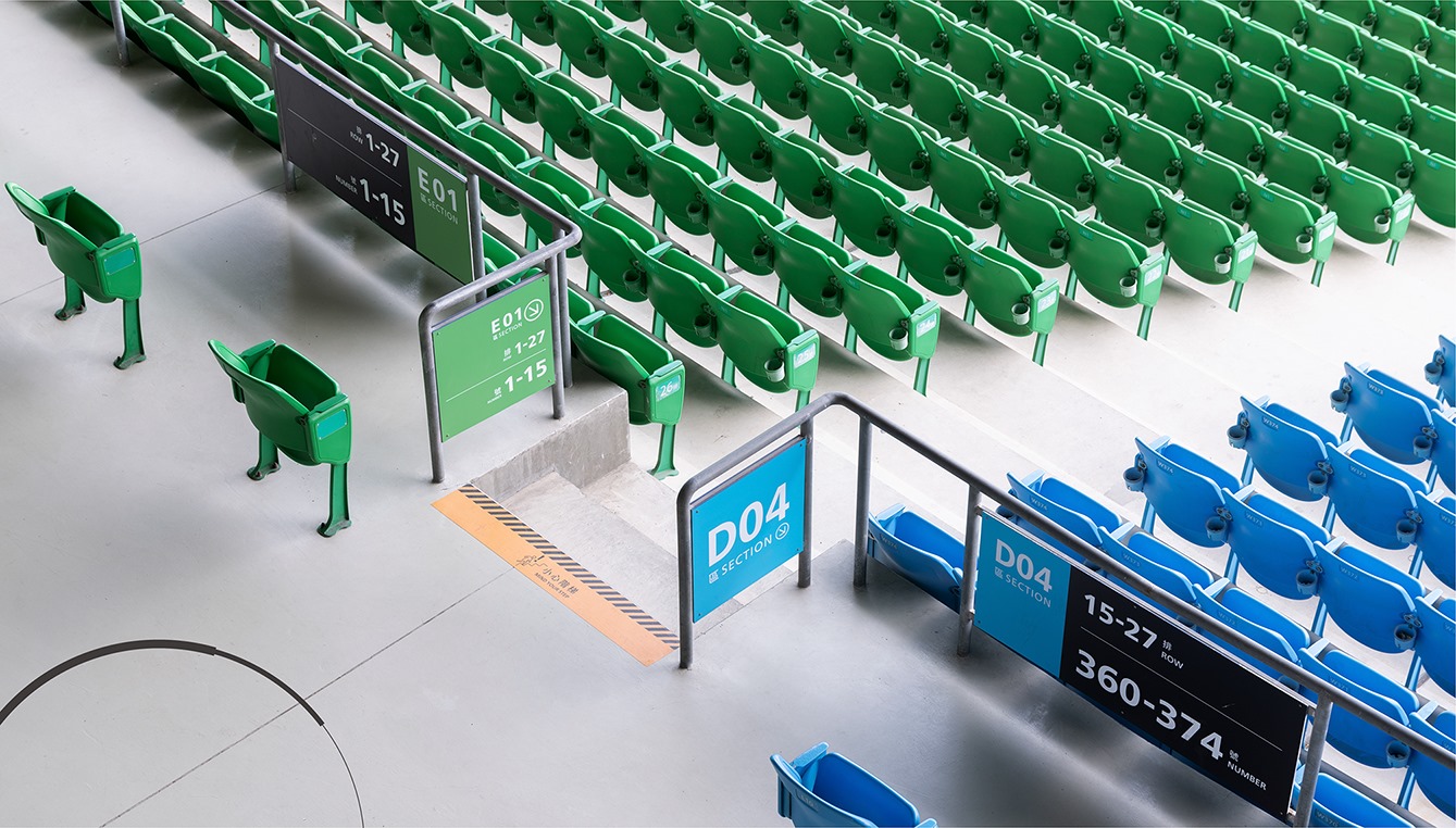
The same sign reveals different things at different distances. Take the zone signs at Kaohsiung National Stadium:
From far away only the block of colour reads; at middle distance the code becomes legible; only close up does “SECTION” appear. Sign information has to be layered in that order, not all set at a single size.
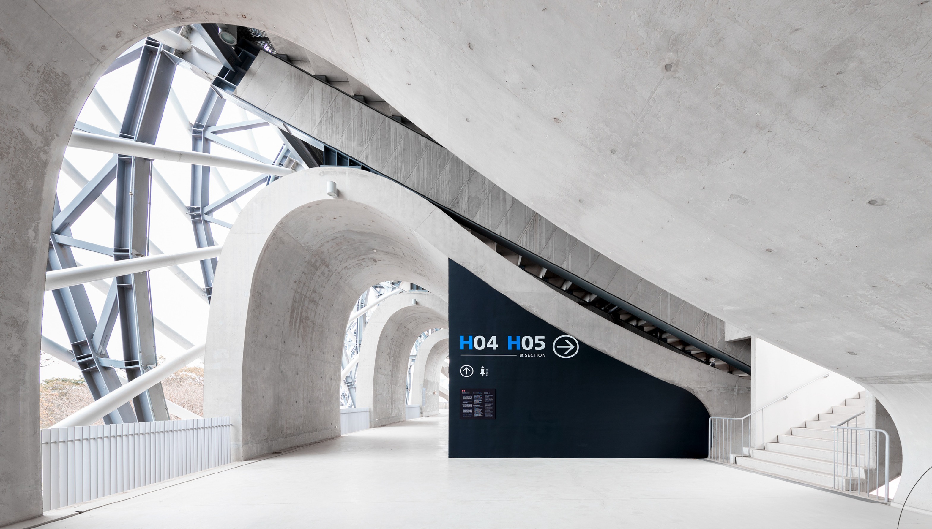
Signs should be an accent to the architecture, not a burden on the space
When designing directional signs and wayfinding systems, the fewer signs it takes, the better. Hand-Heart Design Firm believes that the best wayfinding system is the one that reduces its own presence in the space, while keeping firm control of how the information guides people and how efficiently it does so. So when Hand-Heart designs wayfinding for residential communities, venues, campuses and museums, it always works through the logic of routes and circulation with strategic wayfinding thinking, placing signs at the key junctions along the route. That lowers the number of signs and the cost of managing them, further reduces the impact of visual information on the environment, and lets the signs do their real work inside the building: giving direction and identifying places.
The wayfinding system lets users find the shortest route, and the information hierarchy set out by the signs and their layout makes finding the way through the building simple, clear and practical.
A modular wayfinding system: Kaohsiung National Stadium
The steps above build a modular wayfinding system, one that fits the building and also matches what people expect from directional guidance.
Take Hand-Heart Design Firm’s wayfinding system for Kaohsiung National Stadium, winner of the Red Dot Design Award and the iF Design Award in Germany. Through site visits and a survey of existing conditions we mapped the routes of users arriving on foot, by metro, by bus, by car and by scooter; grouped those users; and separated their different goals from their shared destinations: parking, ticketing, seats, toilets, concessions, meeting points, entrances and exits. Only after checking that the sign routes made sense did we move on to systematic standards and design.
We simplified the zoning system shared by the building and the signs, giving a clear zoning logic through colour, letters and numbers in that order from far to near, and building sign modules that carry the identity of the space. The order is not arbitrary: it follows the way human vision picks up colour, then form, then text as the distance closes, which simplifies how people read the system and helps first-time visitors to a complex space get their bearings quickly.
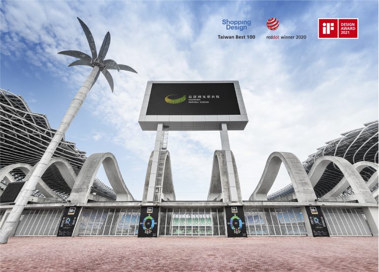
A good wayfinding system gives people enough information on every route to make the right choice at each junction. It also lets them understand where they stand within an unfamiliar building, and shows clear, simple information at key decision points so that people choose the right direction naturally.
The best wayfinding system has less presence in the space.— Signs exist so that people find their way, not so that people see the signs
Keeping signs quiet takes more work up front
Hand-Heart’s design principle is simple: give users the shortest route, so that the wayfinding system serves them better and meets the principles of universal design.
But using few signs without letting people get lost is not hard because of the drawing. What makes it hard is the work beforehand that nobody sees.
Getting there takes a lot of work up front
We audit the circulation of each type of user, analyse the decision points and walk through the special situations: a traveller pushing luggage, a visitor in a wheelchair, a parent here for the first time, a commuter short of time. At the same corner, each of them needs different information.
This early research exists to make sure the experience really does improve, and to meet the seven principles of universal design: equitable use, flexibility in use, simple and intuitive use, perceptible information, tolerance for error, low physical effort, and size and space for approach and use. (Set out in 1997 by Ron Mace and colleagues at the Center for Universal Design, North Carolina State University.)
Whether the signs are any good is ultimately not a matter of how prominent they are, but of how many people never have to stop and ask the way.
Wayfinding projects
- National Palace Museum Southern Branch
Site-wide wayfinding design and installation, including construction supervision
- National Kaohsiung Normal University Research Building
Red Dot Design Award 2021; Taipei International Design Award 2023, Silver
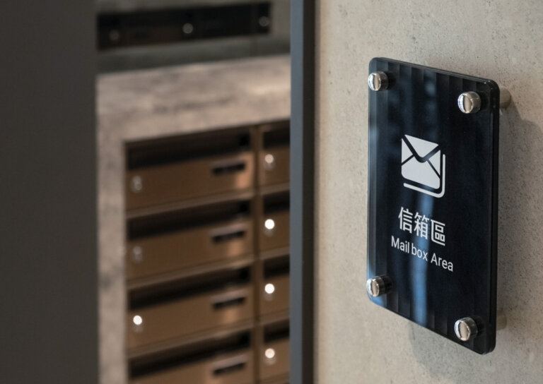 SanFar Property
Guidance and place identity brought together across a residential development
- Taichung International Convention and Exhibition Center
Wayfinding system design project, 2025
See the design in motion
This film shows the design of the NKNU research building project in motion; watch it alongside the design notes on this page.
Which organisations can learn from these wayfinding and environmental graphics projects?
Depending on how your space is used and how you need to manage its signs, you can draw on the approaches in the projects below.
- If your township office wants to bring Hakka language learning into its workplace, the Wanluan Township Office Hakka-language environmental graphics show how characters and the key visual can be extended to department signs, the service counter and the floor directory at the entrance.
- If your kindergarten wants to extend its existing characters onto the stairs, you can follow the Wanluan Township Kindergarten Hakka-language environmental graphics: composite the illustrations onto photos of the actual stairs first to see how they will look on the angled steps.
- If the venue you manage has many sign types and its records are hard to search, you can borrow the approach of the Kaohsiung National Stadium wayfinding system, where a letter-and-number code links each sign face to its material and location.
Frequently asked questions
How is wayfinding system design different from “making signs”?
Making signs is manufacturing; wayfinding system design is planning. The first answers “what does this sign look like”; the second answers “how many signs does this space need, where does each one go, what should each one say, and how do they relate to one another”. The difference matters: however handsome a sign is, if it sits in the wrong place or the information hierarchy is muddled, people still get lost. Hand-Heart starts with circulation analysis and zoning logic, and moves into visual design only once the sign locations are fixed.
Why do fewer signs make the way easier to find?
Because people have limited cognitive resources in an unfamiliar space. Dense signage leaves them unsure which sign to read and turns into “visual noise”. What works is placing signs only at the decision points (junctions, level changes, entrances) and keeping the rest of the route clear. Given clear guidance at the moments that matter, people simply carry on along the stretches in between. It also brings down the cost of making the signs and of maintaining them later.
How does a wayfinding system connect to the corporate identity system (CIS)?
A wayfinding system carries the elements of the corporate identity system straight over: the colour scheme, the typeface and typographic hierarchy, supporting graphics and the pictogram system. So if an organisation already has a CIS, the wayfinding design should extend it rather than start again. If it does not, we usually suggest settling the corporate identity first, otherwise the signs become the one visual language in the space with nothing behind it. Further reading: Corporate identity system (CIS) explained.
How large does the type on a sign need to be? Is there a formula?
Yes. Hand-Heart uses the formula for legible character height: α = 3438 × L ÷ D, where α is the visual angle in minutes of arc, L is the character height and D is the viewing distance. Substituting the optimum visual angle of 17 minutes of arc and solving for L gives minimum character height = 17 × viewing distance ÷ 3438, roughly 1/202 of the viewing distance, or at least 1 cm of character height for every 2 metres of viewing distance. For people with impaired vision, double it. The formula comes from the 2011 master’s thesis by Hsu Chih-Yang and from the ANSI/HFES 100-2007 human factors engineering standard.
Once the character height is calculated, does it still need checking on site?
Yes. The formula gives a lower bound, not a guarantee: the same character height reads very differently on a dark background, against the light or under night lighting. Hand-Heart verifies in three rounds: first, a 1:1 full-size print of the drawing put up on site for comparison; second, a physical mock-up in the actual material checked under the real lighting; third, repeat tests at different times of day and different illuminance levels, particularly against the light and at night.
When is it time to redo a wayfinding system?
Four common moments. One: the space has been rebuilt or extended and the original circulation logic no longer fits. Two: people keep getting lost or asking the way at the same spot; front-line staff know this best. Three: the signs have been added one at a time over the years, so style, material and information order no longer match. Four: the organisation has updated its corporate identity and the signs still carry the old one.
At what point should a wayfinding team join a new building project?
As early as possible; ideally during the architectural design stage. Sign locations, power supply, cast-in fixings and structural interfaces all have to be integrated with the building. Plan the signs only after the fit-out is finished and you often run into “nothing to fix the sign to where it should hang, and no power where it should be lit”. Hand-Heart can take part in circulation analysis while the building is still being planned, so that the signs grow together with the space.
Planning a new building, or looking to improve the circulation in an existing space?
Hand-Heart offers a free circulation review. For sites in southern Taiwan we can arrange a free visit; for central and northern Taiwan and for projects overseas we start online from plans and photographs, then arrange a site visit if the work calls for it. Send us the plans and the problems you are running into, and we will tell you honestly whether you need a complete system or whether a few local adjustments will do.
Book a free circulation review →Or call +886-7-285-7000 | [email protected]
Methods and project sources: Hand-Heart Design Firm. Page compiled on 27 September 2026.