
Design Concept
Hand-Heart Design Firm designed the wayfinding system for the residential developments of SanFar Property (SanFar Construction). It covers signage for the shared amenity spaces, lift and floor signs, and driveway guidance and a colour plan for the underground car parks. The system is planned to be shared across several developments. Its core concept is “The Flowing Sound”, expressed through layered glazed glass and colours that change from floor to floor.
What did the wayfinding system for SanFar’s residential developments need to solve?
The wayfinding system for SanFar’s residential developments had to work across several projects, guide drivers through underground car parks and make the shared amenity spaces easy to identify.
- One set of guidelines is used for several developments, so the materials for elements such as the 3D building-name letters, and the overall dimensions of the parking bays, have to be adjusted for each development.
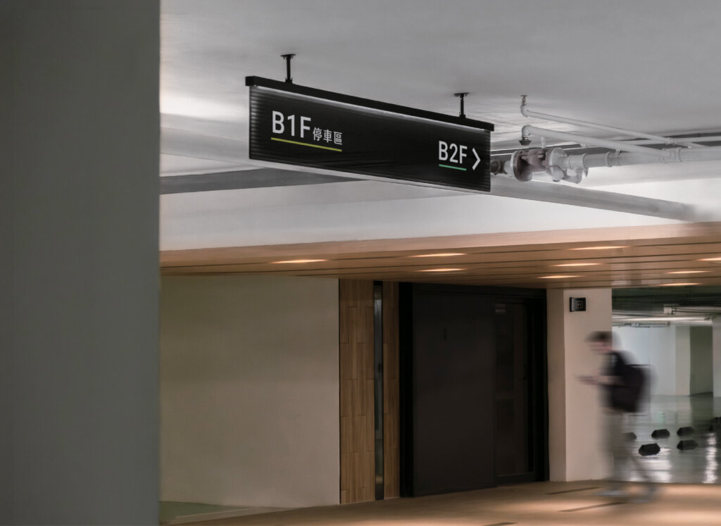
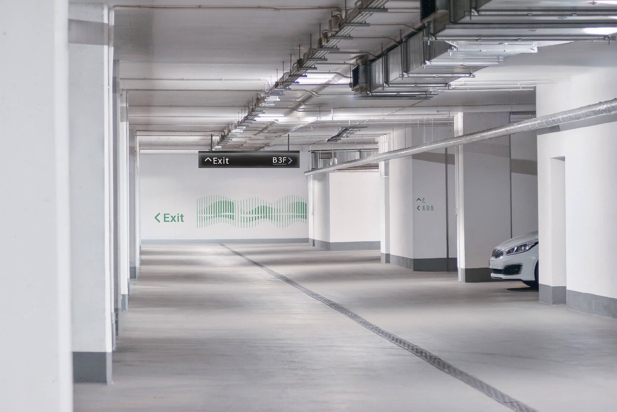
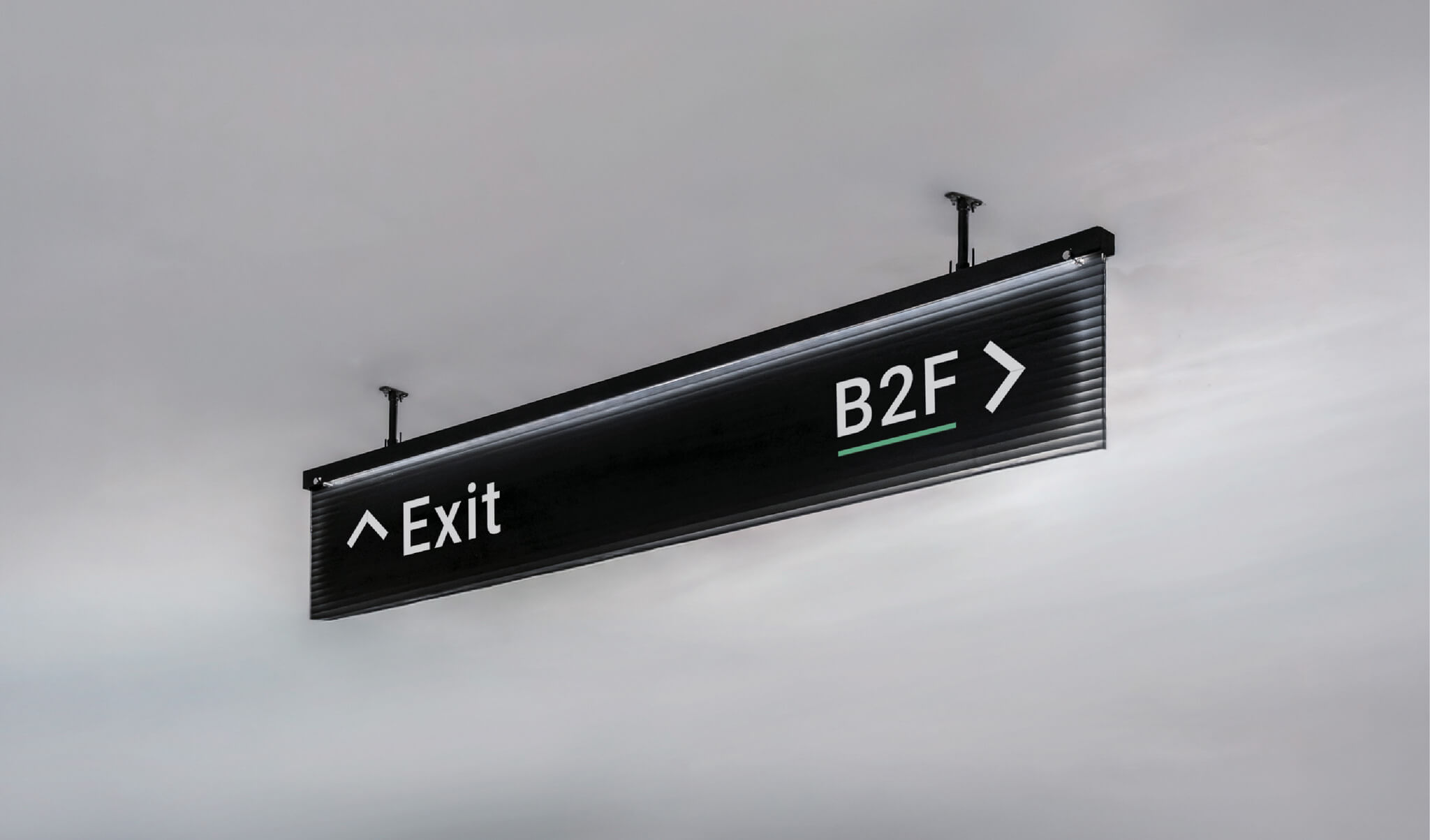
- The underground car parks include overhead driveway signs and driveway traffic lights, and each level from B1 to B7 has its own floor colour.
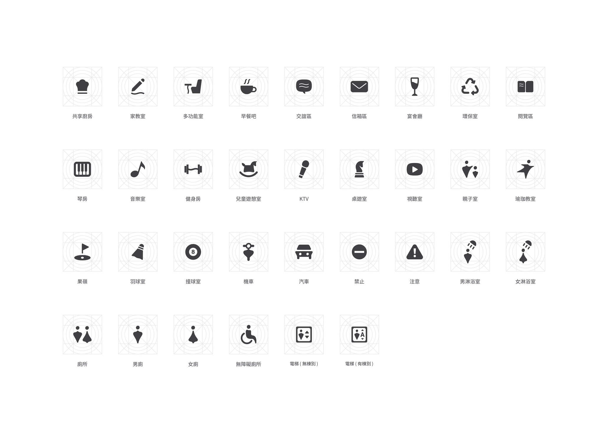
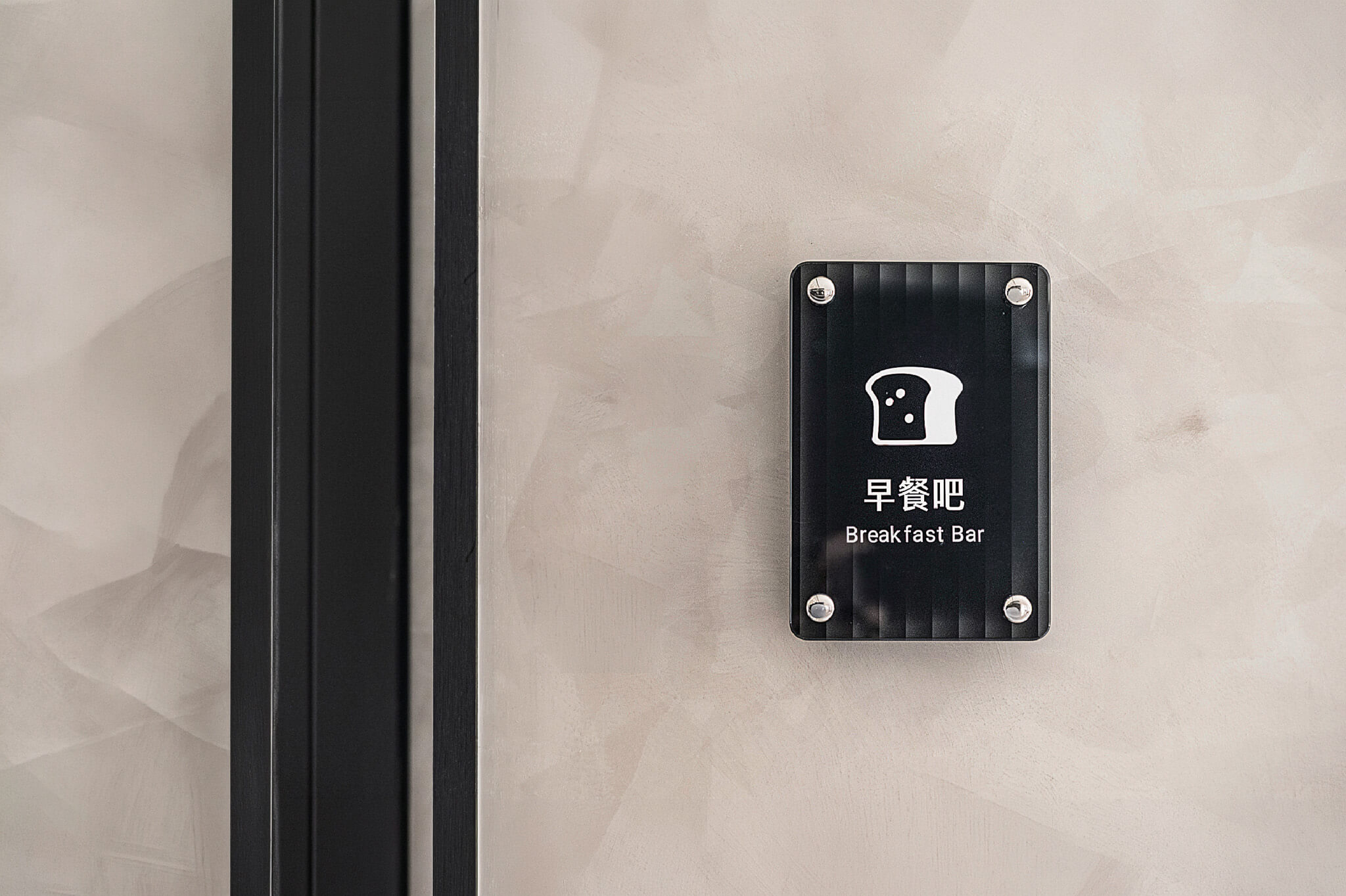
- A separate set of icons covers shared amenity spaces such as the gym, banquet hall, music room, shared kitchen and family room.
What concept does SanFar’s wayfinding system start from?
The Flowing Sound: Where Music and Culture Converge
In everyday city life, music flows like water—intangible yet continuous—connecting culture, space and people’s memories of daily life. Taking this as our starting point, we made “music” and “water” the shared design language of the wayfinding system, symbolising how culture keeps flowing, mixing and carrying on in the city. The concept also echoes the idea of living with peace of mind that SanFar Construction champions, so that the space becomes more than a place to live: it becomes a setting that carries culture and emotion.
The first draft, dated 7 March 2024, developed three directions from four brand keywords: music, culture, peace of mind and sustainability. They were A, “Music Resonating in Architecture”; B, “Music and Architecture Intertwined, Lighting Up the Paths of Life”; and C, “The Flowing Sound: Where Music and Culture Converge”. The refined draft of 4 June 2024 kept only Direction C, “The Flowing Sound”, and turned what music and water have in common into a design language: flow, ripples, change, absorption and blending.

Glass as an Expression of Flow and Resonance
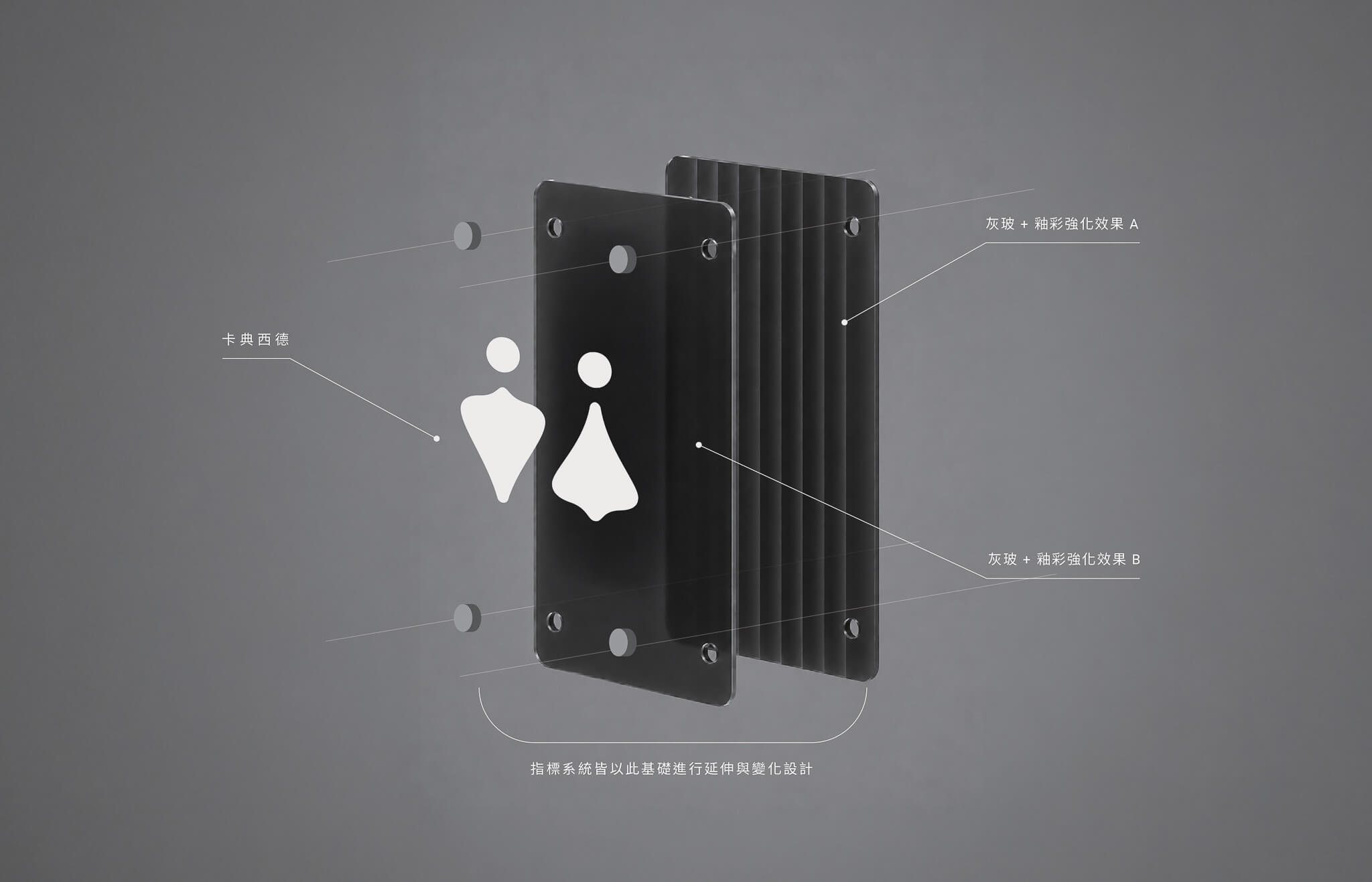
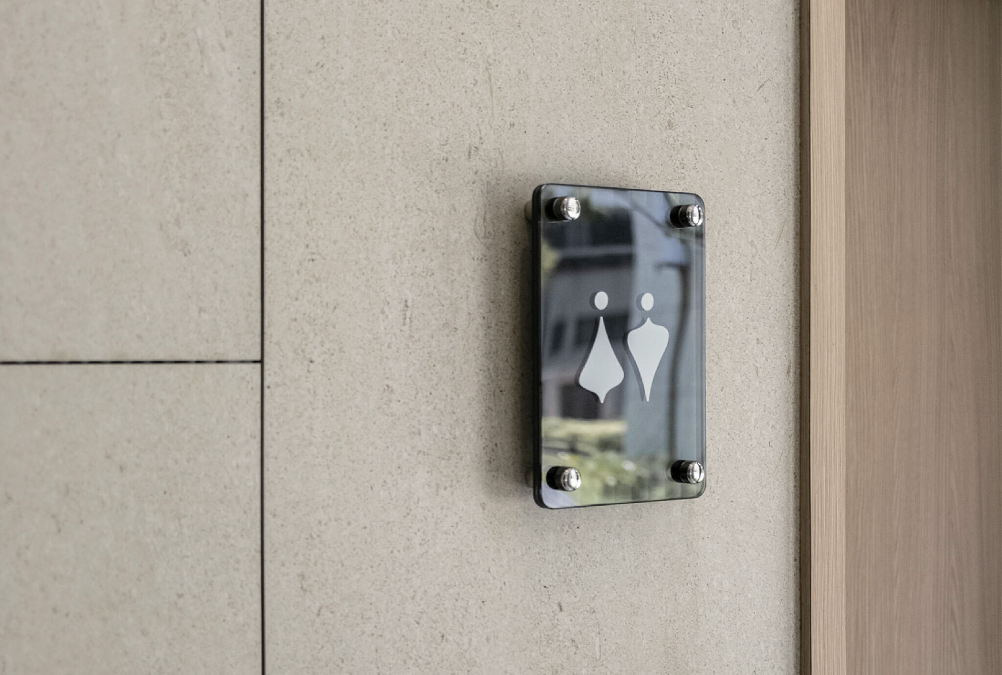
The design uses the transparency and layered quality of glass to link music, culture and the origins of life. Layers of glass refract the light that passes through them, creating shifting light and shadow that evoke water waves and sound waves resonating together. The signs do more than show the way: they become part of the architecture and keep conveying the vitality of culture in motion.
What types of signs does SanFar’s wayfinding system include?
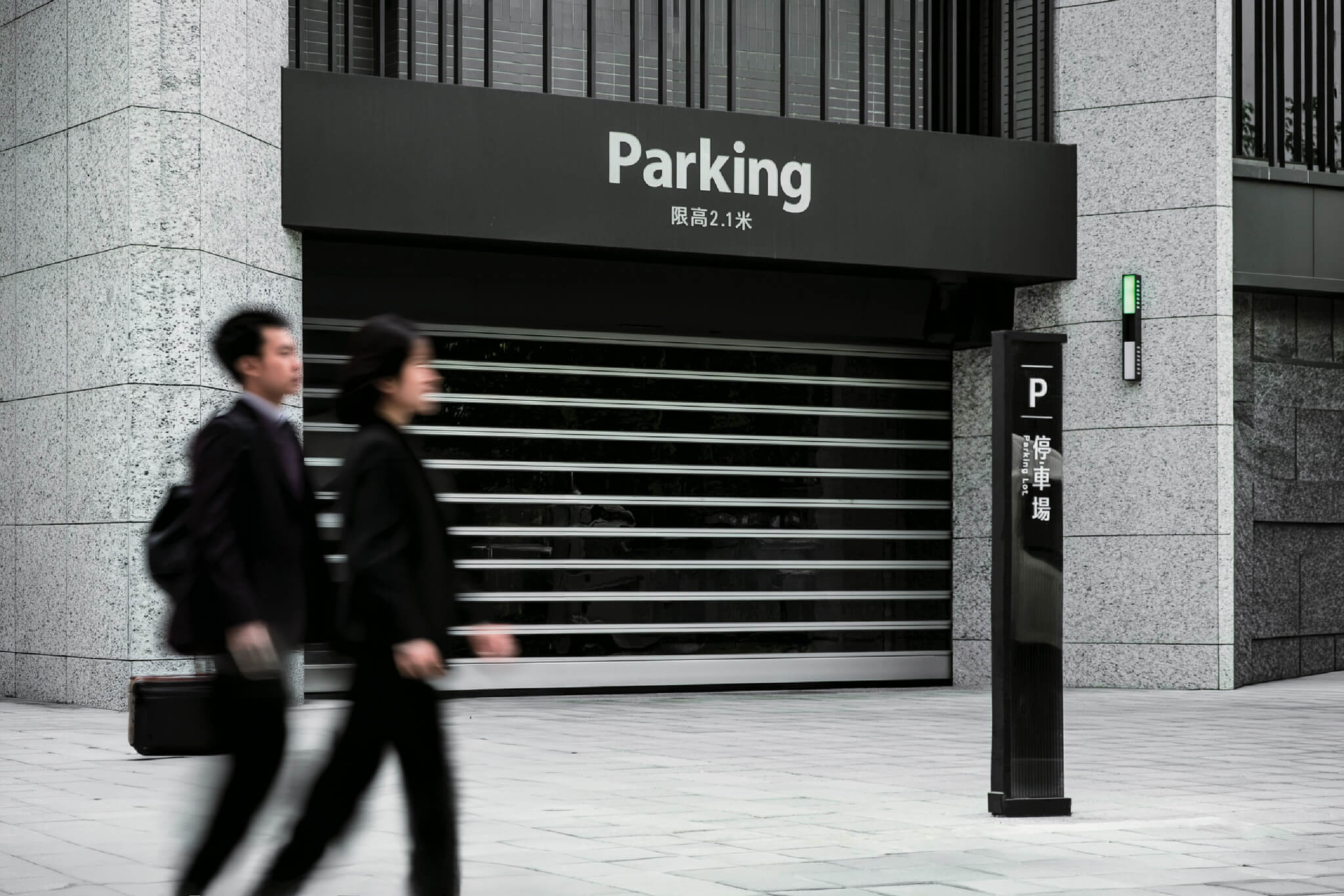
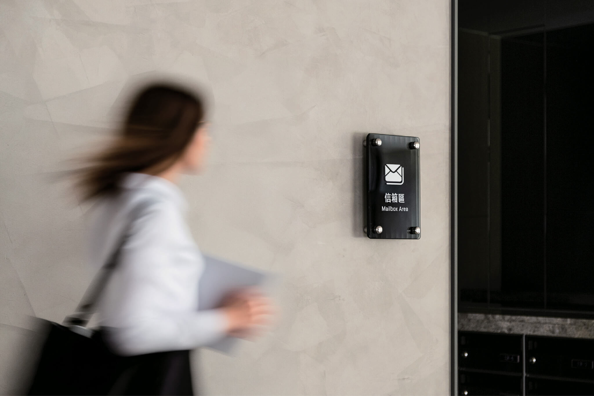
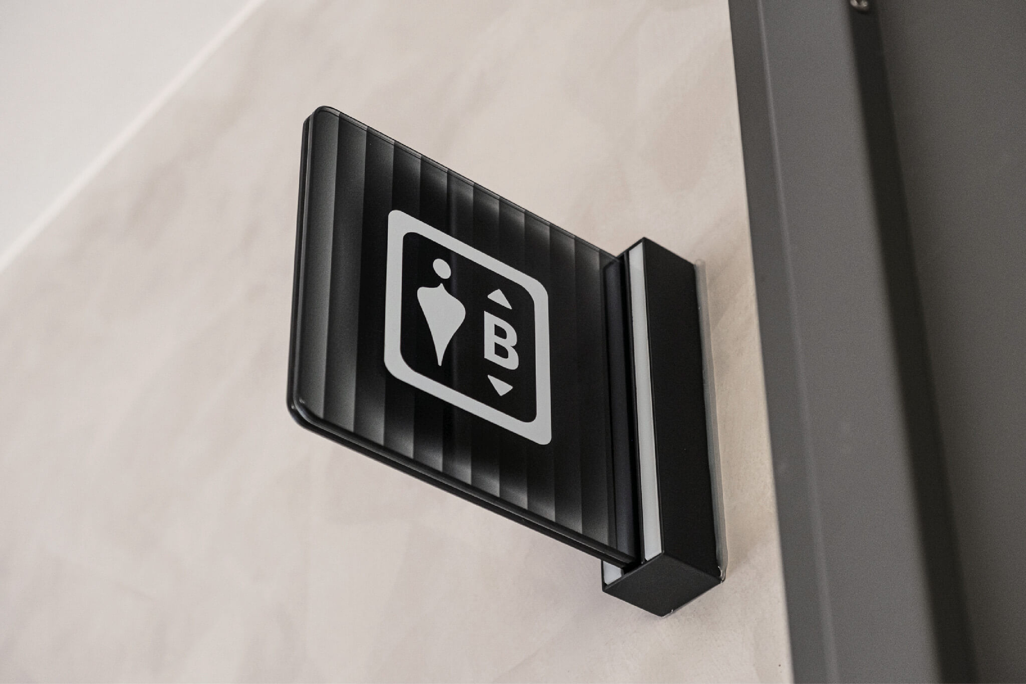
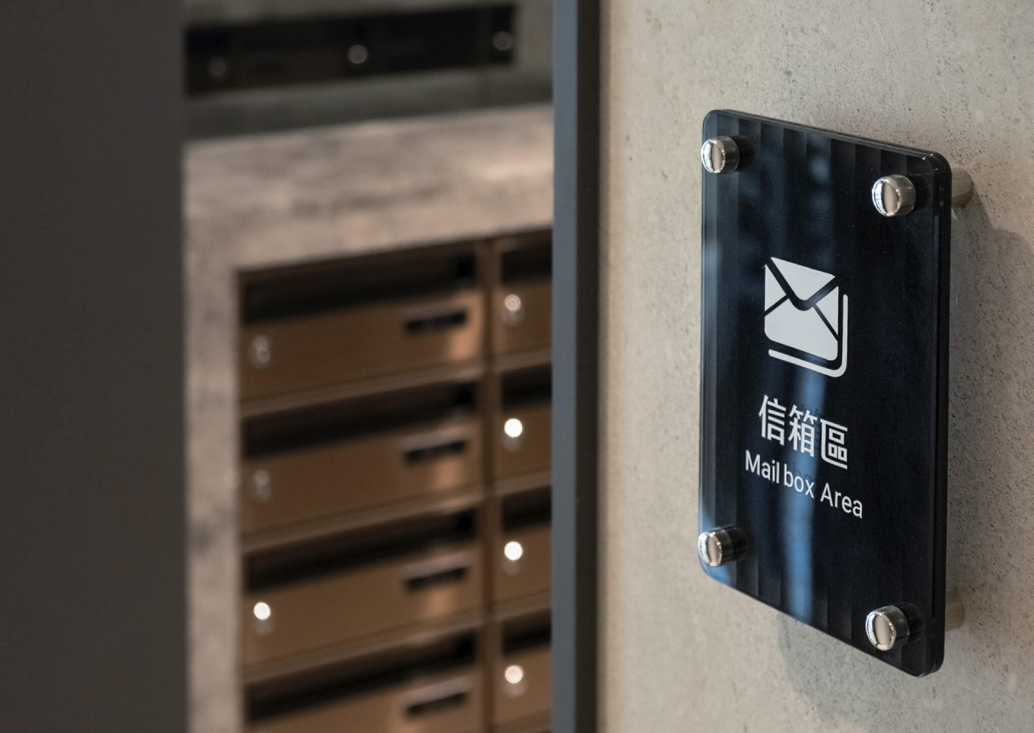
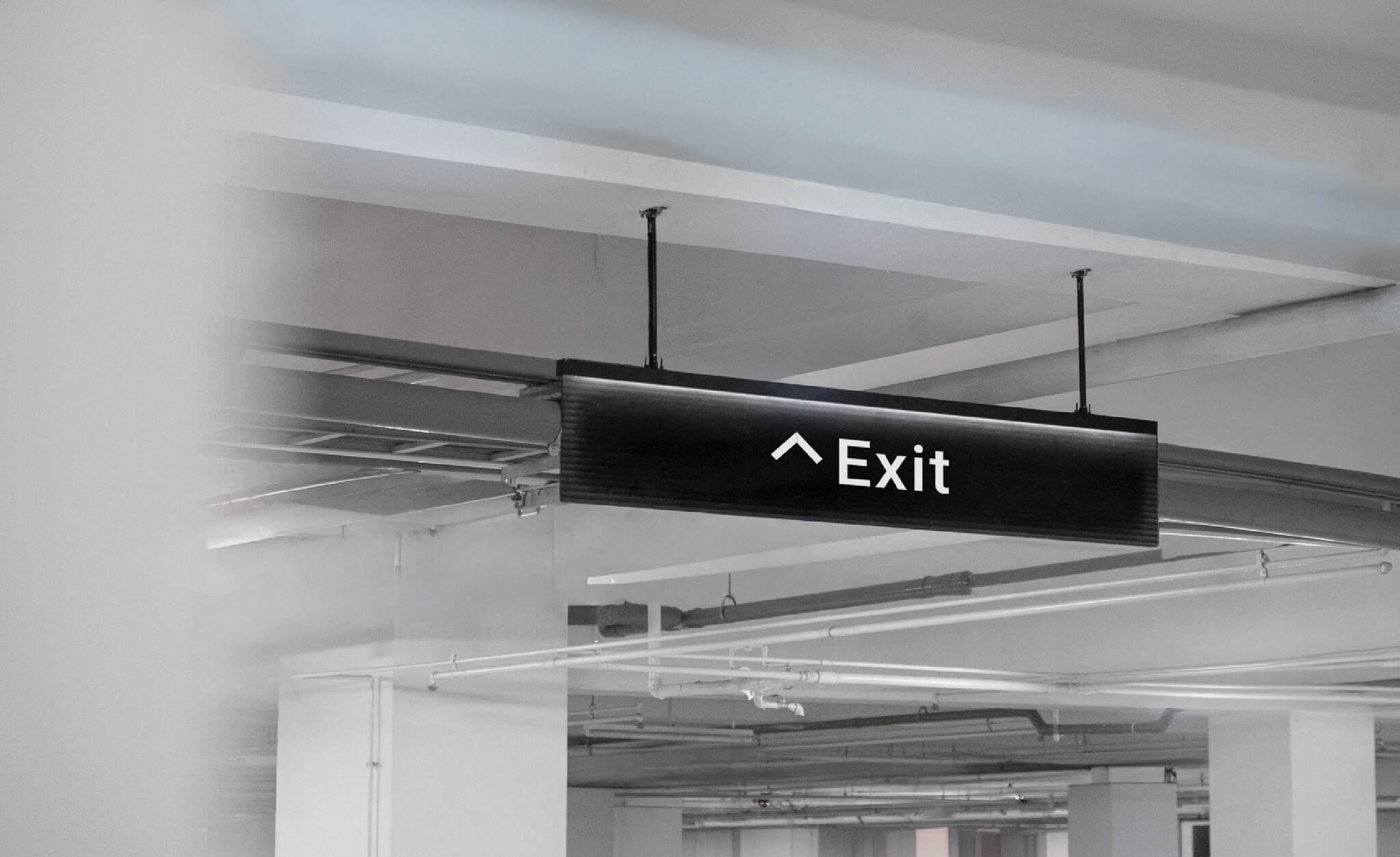
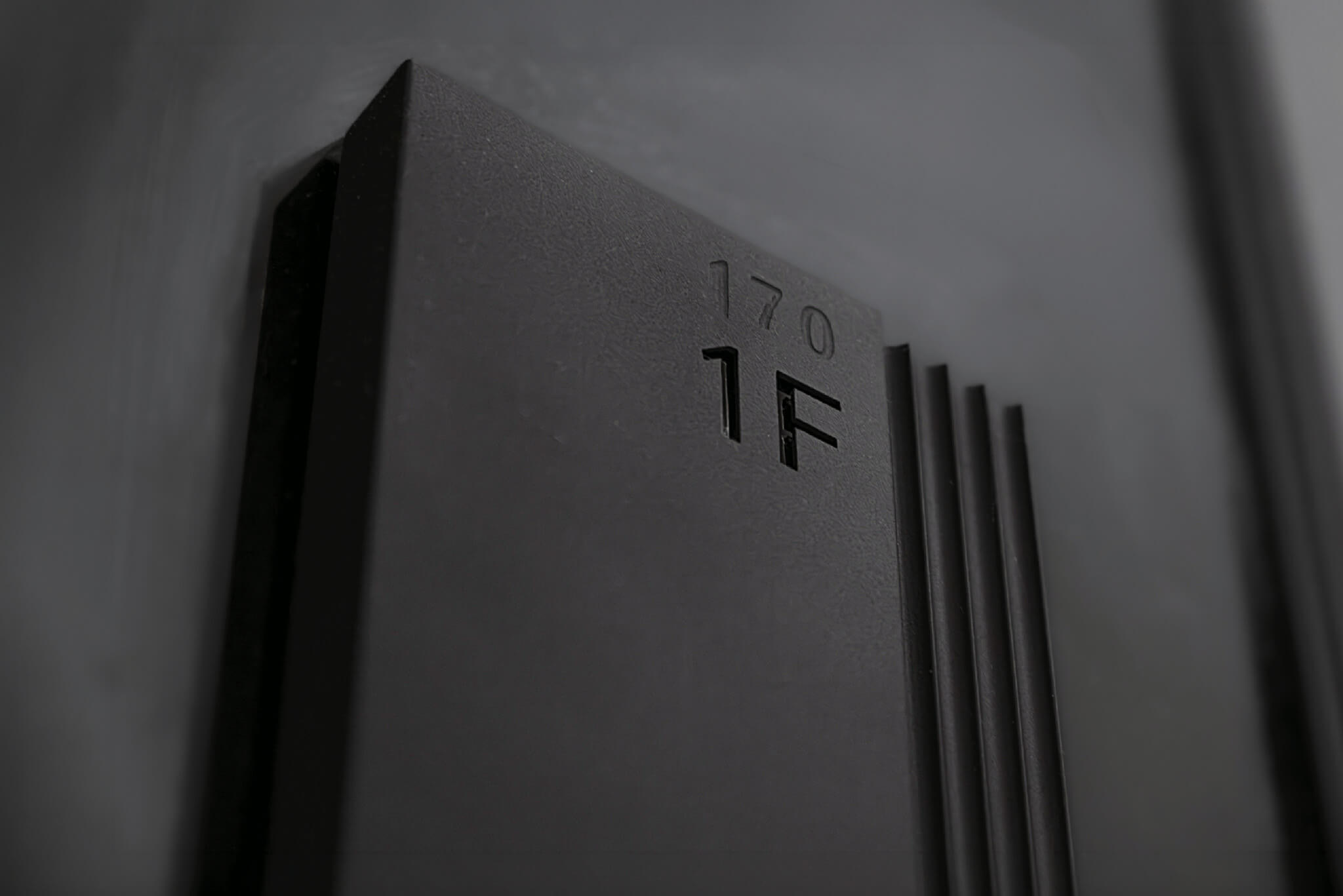
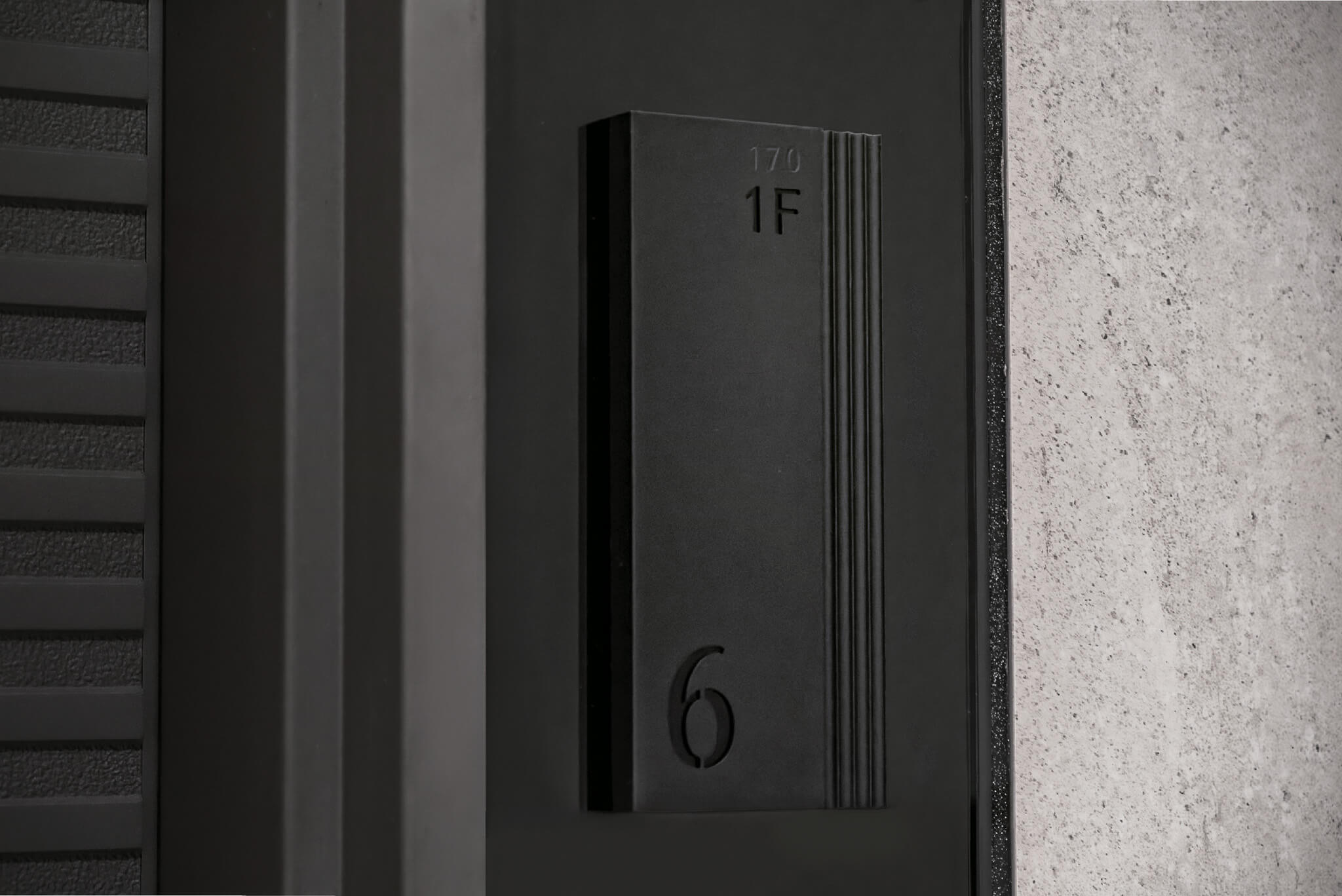
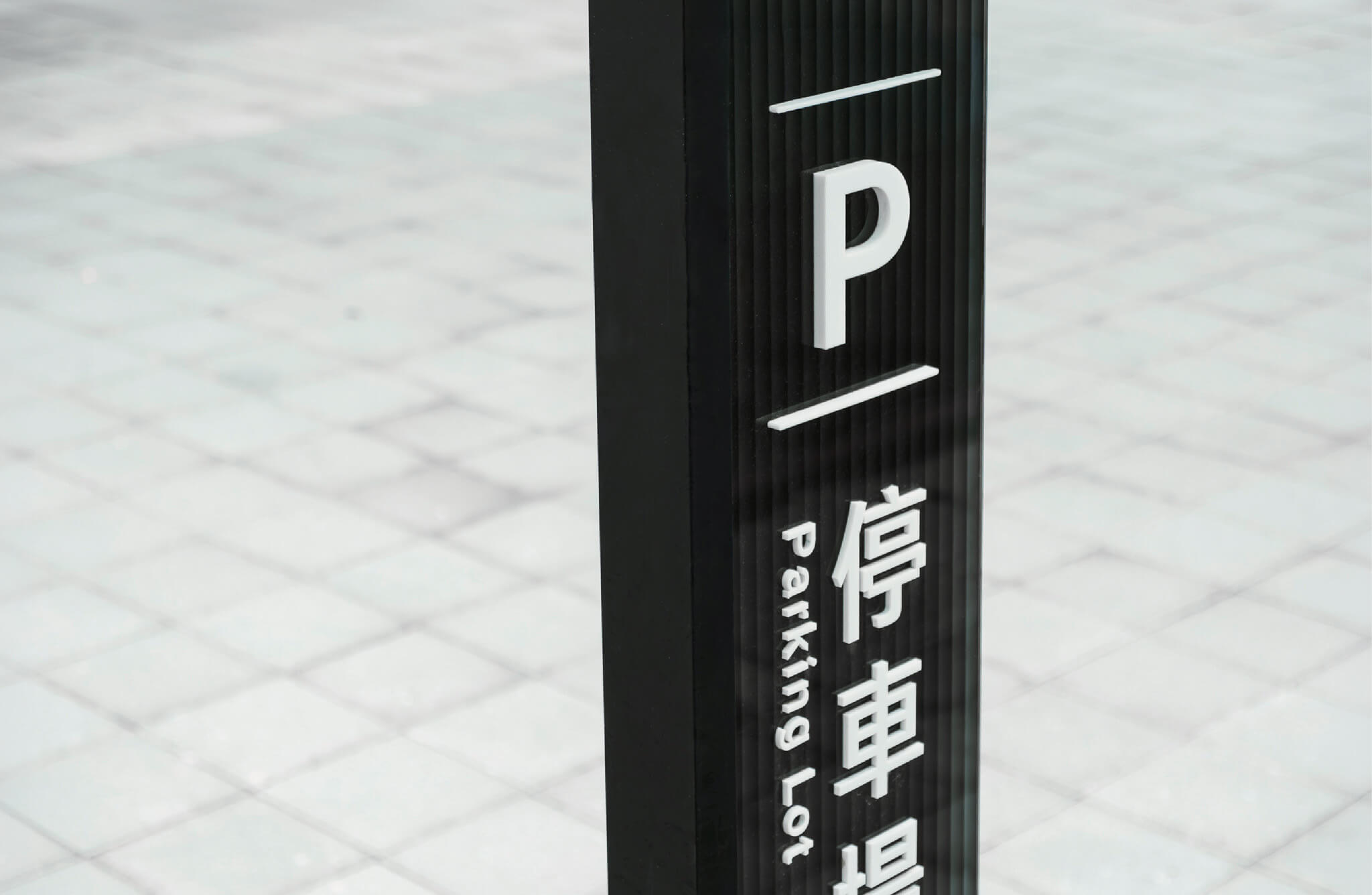
The system is divided by location and purpose into eleven sign types, labelled A to K: freestanding signs at the basement entrances, overhead directional signs above the driveways, wall-mounted signs in public spaces, projecting signs beside the lifts and wall-mounted signs in back-of-house areas, plus 3D floor numbers, 3D building-name letters, column signs, two types of directional wall signs and driveway traffic lights. A separate set of icons was designed for the shared amenity spaces, including the gym, banquet hall, music room, karaoke room, shared kitchen, family room, reading area and children’s playroom.
Each glass sign is made from two 5 mm panes of grey glass, each digitally printed with glaze; the two panes are then laminated together with the glazed faces turned inwards. The panels are held by black metal fittings with built-in warm white light strips.
Building a Spatial Melody with Colour
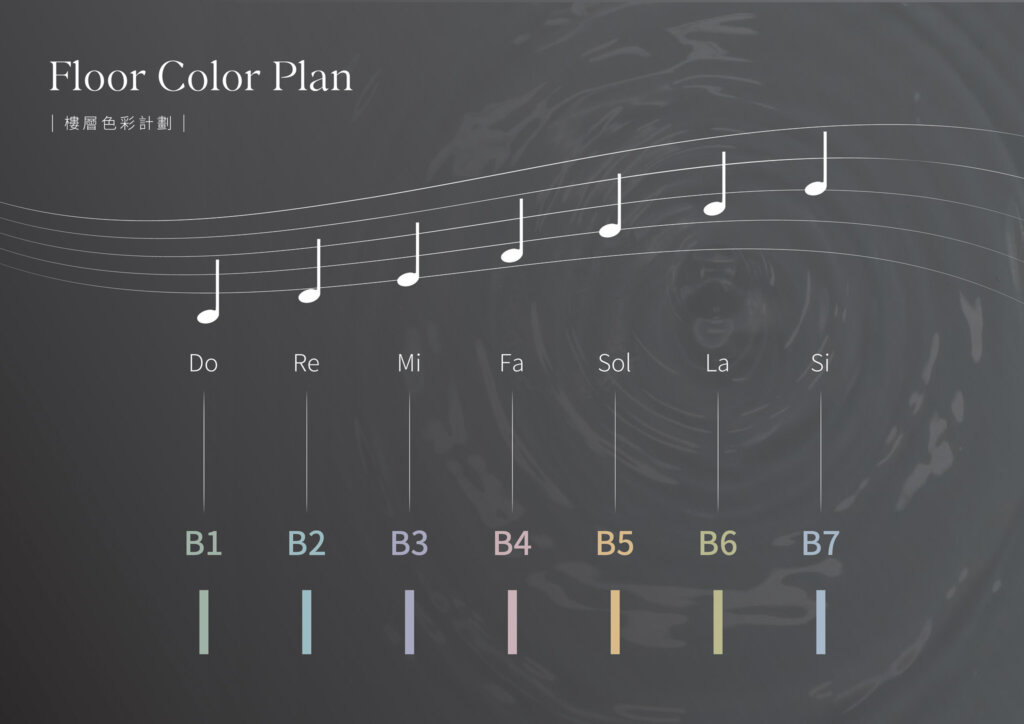
The colour plan grows out of the perceived link between sound and colour. Drawing on the idea of chromesthesia, the plan gives each floor its own colour identity with its own rhythm. As people move through the building, the colours unfold like musical notes, forming a spatial melody in which sight and emotion intertwine. This supports recognition within the wayfinding system and enriches the experience of the whole environment.
How were the colours for each floor chosen?
The colour plan uses the synaesthetic idea that different musical notes evoke different colours. Basement levels B1 to B7 are each matched to a note (C, D, E, F, G, A, B) and a colour, with the saturation lowered to suit the overall environment, so the colours guide people without disrupting the look of the space. For lettering, the guidelines use Arphic’s Fang Xin Shu typeface for Chinese and Roboto for English. Text is centred for one-way directions, and aligned left and right respectively for two-way directions.
From Testing to Installation: Every Step Serves the Experience
To carry the concept through into the finished space, we ran several rounds of material sampling and on-site testing, checking how different types of glass, glaze concentrations, firing temperatures and layering methods affected light, colour and legibility. The result balances visual appeal, brand quality and wayfinding function, so that every sign combines design expression with ease of use.
How is one wayfinding system applied across different developments?
The refined drafts were compiled into a single set of guidelines. The installation recommendations include keeping the lower edge of overhead driveway signs at least 215 cm above the ground, placing public-space signs to the left of doors where possible, and centring the 3D floor numbers on the wall facing the lifts, midway between the two lift doors. The materials for elements such as the 3D building-name letters change with each development’s exterior style, and the overall dimensions of the parking bays are adjusted to each development’s bay specifications. The guidelines also extend to the design of parking bays and crash barriers, and mark the sign positions in each development’s basement one by one. The guidelines are intended as a reference: details are adjusted slightly to suit the content and the site, and conditions on site must be assessed again at installation.
What design considerations lie behind the floor colours and the shared guidelines?
In SanFar’s wayfinding system, the floor colours balance guidance with visual appeal, while the guidelines set out how to adjust on site and how to lay out text.
- The floor colours are toned down to suit the overall environment; the proposal states that this is meant to keep the colours useful for guidance without spoiling the visual appeal.
- The methods in the guidelines are meant as a reference and can be adjusted slightly to suit the content and site conditions; conditions on site must be assessed again at installation.
- The materials for elements such as the 3D building-name letters change with each development’s exterior style, while the overall parking bay dimensions follow each development’s bay specifications.
- Text layout depends on the direction shown: centred for one-way directions, and aligned left and right respectively for two-way directions.
Which residential developments can learn from this project?
If you need to share wayfinding guidelines across developments, distinguish floors or label shared amenities, this project is a useful reference.
- If you are managing several developments, you can look at how the guidelines adjust materials and parking bays to each one.
- If your underground car park has many levels, consider giving each level its own colour, as this project does.
- If your development has many kinds of shared amenity space, the complete icon set designed here is worth a look.
A good order: start with the sign types, then look at the floor colours and installation recommendations.
How we approach wayfinding from planning and design through to installation is explained on our wayfinding system design page.


Completed
Project Manager
Lead Designer
Designers
Partner
Fonts
2025.10
Lien-chieh Su
I-chen Lee
Jun-xian Wu, Zhi-hao Yeh, Pin-chen Lee
San-Mei Art Glass Creative
Morisawa Arphic
Does your space need a wayfinding system too?
Send us your floor plan and the problems you are running into. Hand-Heart offers a free site visit, a circulation review and an assessment of sign locations, and tells you honestly whether you need a complete system or whether a few adjustments are enough.
Book a free circulation review →
Or call us on +886-7-285-7000 | [email protected]