Graphic Design|Hand-Heart 2025 Year of the Snake Greeting Card

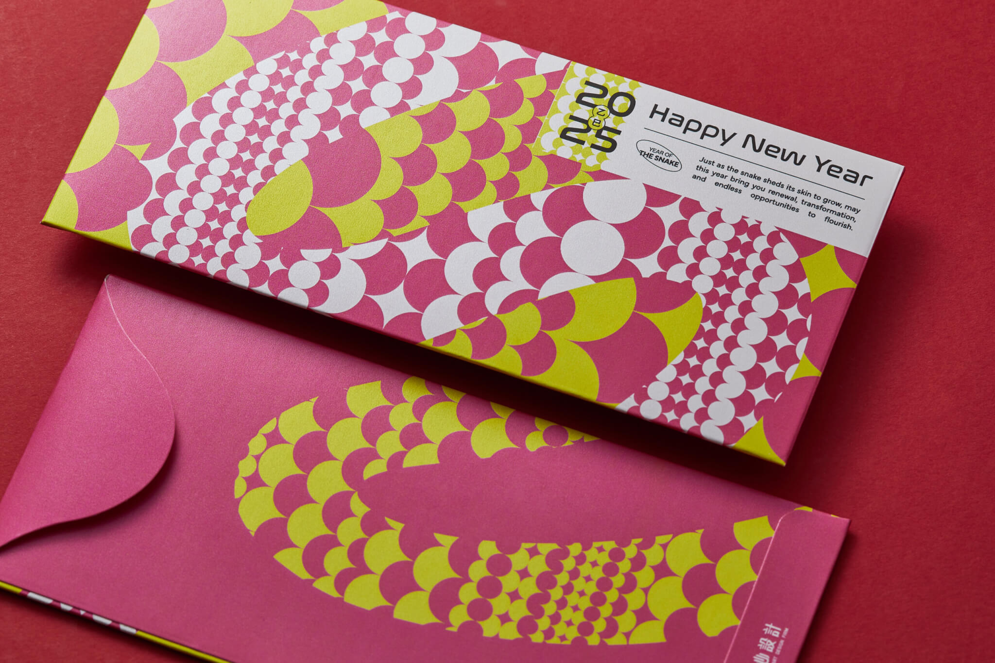
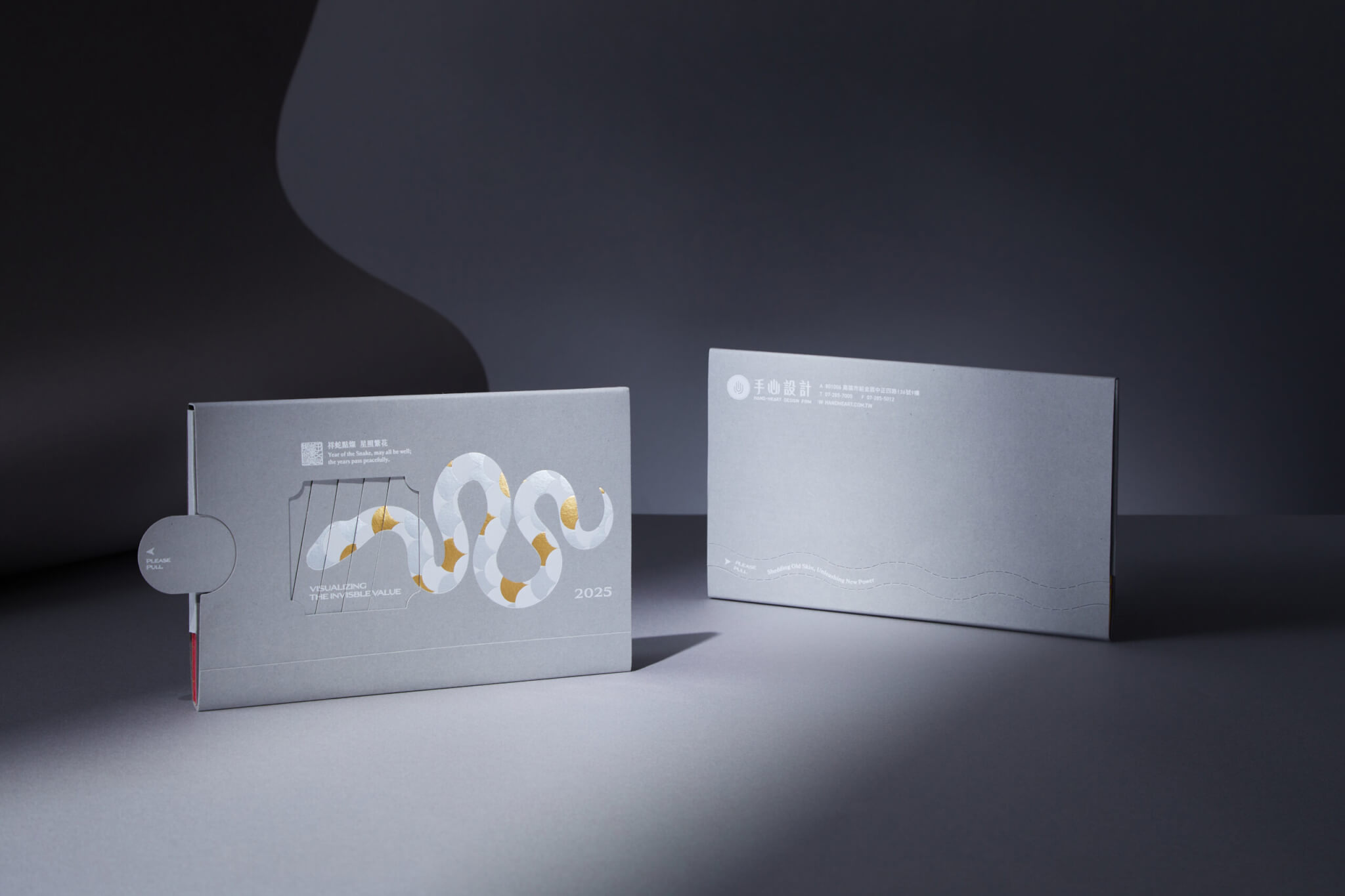
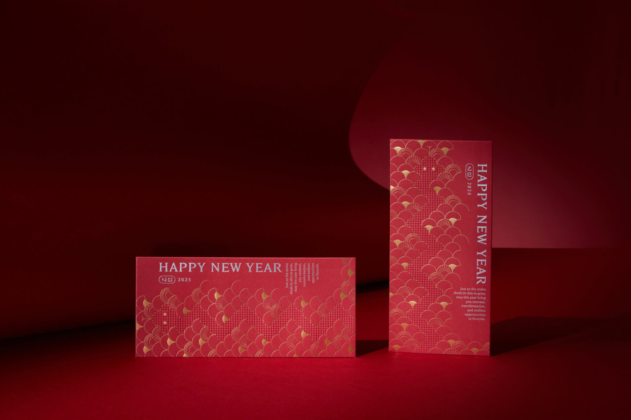
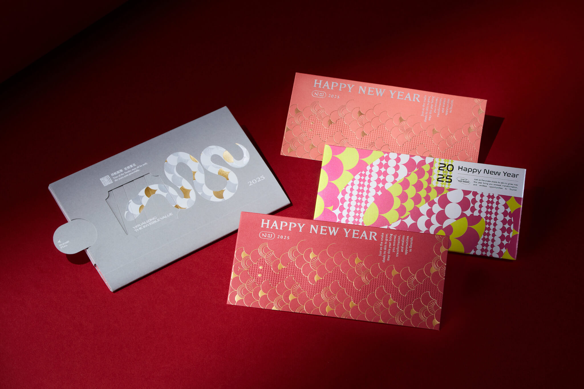
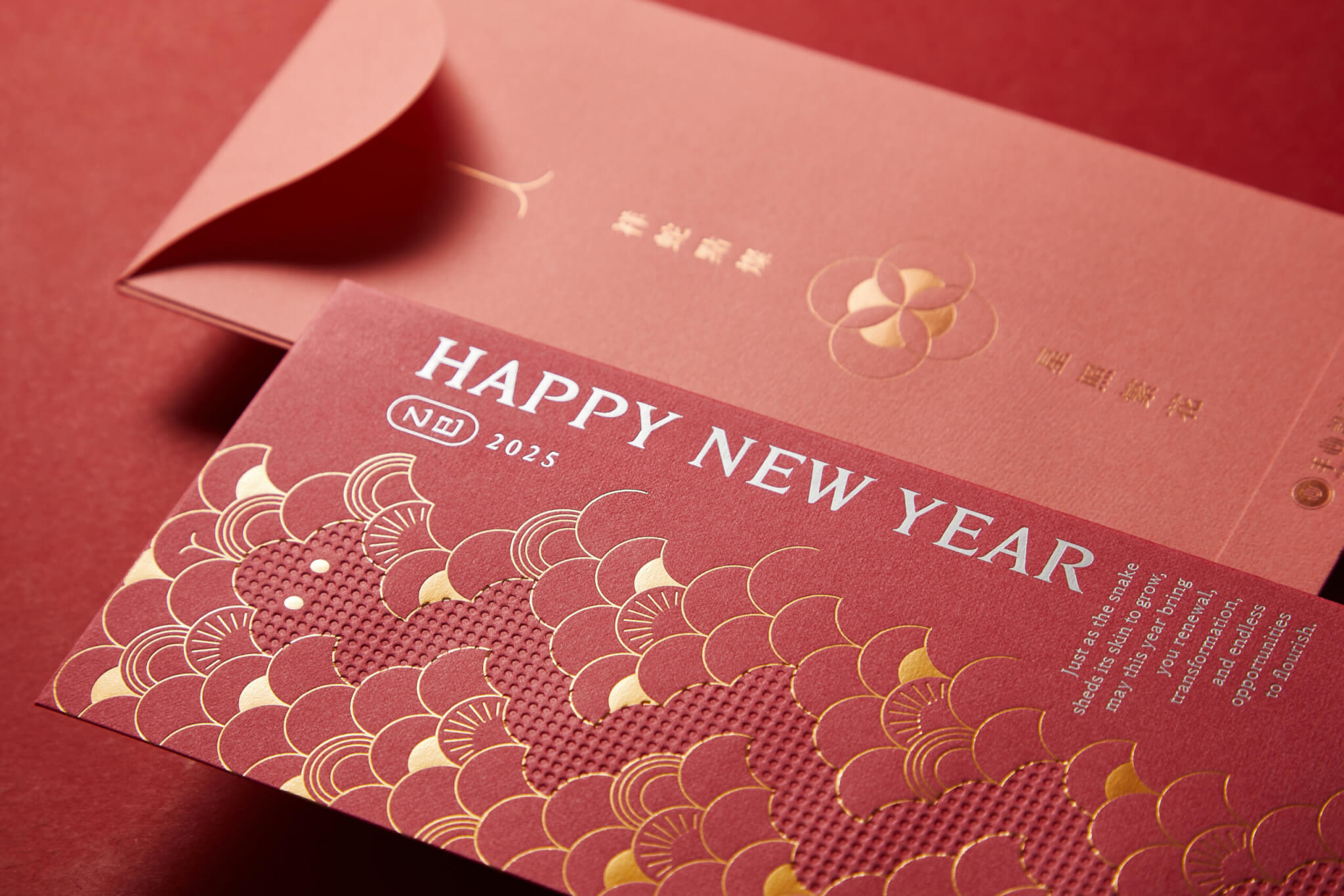
The 2025 Year of the Snake greeting card by Hand-Heart Design Firm received the Red Dot Design Award 2026. Its central image is the snake’s transformation: a pull-out sleeve shows the snake shedding its skin and being renewed, and three red envelopes inside carry the same scale pattern. Gold foil and vivid colours stand for blessing, warmth and breakthrough, so the card carries its energy into the new year.
Red Dot Winner 2026 label, Red Dot Design Award

Red Dot Design Award 2026, Red Dot Winner
This project received the Red Dot Design Award 2026. Hand-Heart holds every project to the same standard: an annual greeting card is checked item by item, just as a large identity project would be, from concept and choice of materials to print finishing. See Hand-Heart’s full award record →

Design Concept

What does Hand-Heart’s 2025 Year of the Snake card express?

Hand-Heart Design Firm’s New Year greeting set looks back on 2025 with the snake as its central motif. A pull-out card sleeve captures the snake as it sheds its skin and transforms. The snake pattern changes layer by layer, mirroring a year in which we faced challenges and kept taking ourselves apart and putting ourselves back together.

How do the sleeve and the three red envelopes show the snake’s transformation?

Inside, three red envelopes continue the snake-scale motif, each in its own colours, reflecting how we pictured 2025. Red tones with gold-foil scales stand for blessing and warmth, while bright, lively snake patterns point towards breakthrough, creativity and an unknown future. The good wishes go beyond formality and become a source of energy to carry into the new year.

How did the card set develop from concept to final artwork?

On 11 December 2024 (based on file dates), two concept directions were put forward in a design discussion. One used a tear-open sleeve to show the snake shedding its skin, with the red envelopes revealed once the sleeve is torn open. The other paired a silver snake with an apple, inspired by a Chinese pun: the word for “snake” sounds like the first syllable of the Chinese phrase for “can’t bear to bite”. On 18 December, the team tested five background colours overlaid with two layers of pattern in gold and white, combined at random to produce different designs.

On 25 December, the sleeve was presented as a pull-out structure, with two mock-ups of the pull-out effect, one on a grey background and one on a brown background, each shown with the red envelopes. On 30 December, three sets of red envelopes were drawn up: deep red and coral with fan-shaped scales, blue-violet and magenta with round scales, and a scale design in orange and magenta. In the final artwork shown on this page, the grey sleeve has a snake of white and gold scales on the front and a round pull tab marked “PLEASE PULL” on the side. Of the three red envelopes, the two red ones with gold-foil scales are close to the fan-scale set, and the one with round scales in magenta, yellow-green and white is close to the magenta version of the round-scale set.

When is this card a useful reference for your own greeting card?

If either of these applies to your greeting card, the approach in this Hand-Heart project may help:

  • If your card needs to feel new every year, you can look at the pattern tests that layer gold and white motifs over different background colours.
  • If the card format and the print finishes have to be decided together, the pairing of a pull-out sleeve with gold-foil scales on the red envelopes is worth studying.

A useful order to follow: test the patterns first, then work out the pull-out structure and the foil.

The visual design of this card set covers the snake-scale patterns, the pull-out sleeve and the gold-foil scales on the red envelopes.
平面設計|手心設計 2025年 蛇年賀卡 Hand-Heart Design Lunar New Year Card Design|手心設計事務所(作品圖 1)
平面設計|手心設計 2025年 蛇年賀卡 Hand-Heart Design Lunar New Year Card Design|手心設計事務所(作品圖 2)
平面設計|手心設計 2025年 蛇年賀卡 Hand-Heart Design Lunar New Year Card Design|手心設計事務所(作品圖 3)
平面設計|手心設計 2025年 蛇年賀卡 Hand-Heart Design Lunar New Year Card Design|手心設計事務所(作品圖 6)

Completed
General Manager
Project Planner
Designers
Fonts

2024.12
Chih-yang Hsu
Ivy Wang
Guan-Shian Wu, Xiao-wen Su, Zhi-hao Yeh
Morisawa Arphic
 

Brand Application Design|National Institute of Cyber Security

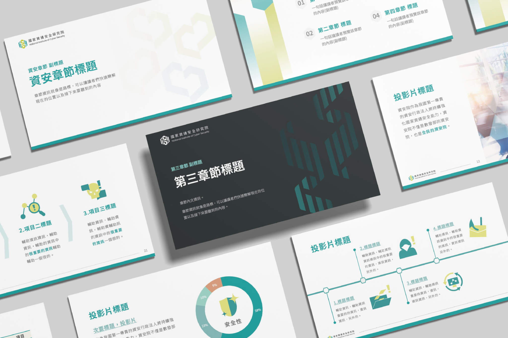
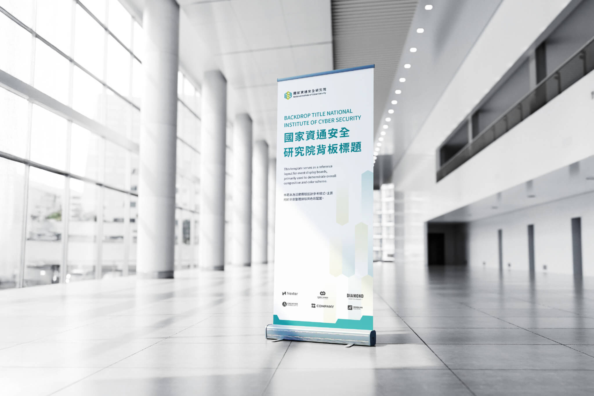
Hand-Heart Design Firm created the brand application design for the National Institute of Cyber Security (NICS), a project completed in 2025. Without changing the existing logo, we built a supporting graphic system from its hexagon, drawing on four images: a protective shield, a security chain, hands and a heart. The aim was to express the rational, technical side of cybersecurity as a warmer sense of protection. The system extends to a colour plan, pictograms, book layouts and presentation guidelines, giving NICS a consistent brand application system built for long-term use.

Design Concept

The National Institute of Cyber Security (NICS) is a public institution responsible for strengthening Taiwan’s cybersecurity capabilities and advancing cybersecurity research, development and applications. The institute already had a logo, which was not designed by Hand-Heart. Our task was to fix the visual identity’s lack of a technological, contemporary feel without altering that logo. Starting from the essence of the brand, we reworked its communication strategy so that “technology and expertise”, “approachability for the public” and “safety and peace of mind” became more than ideas: a visual language that people can see and feel.
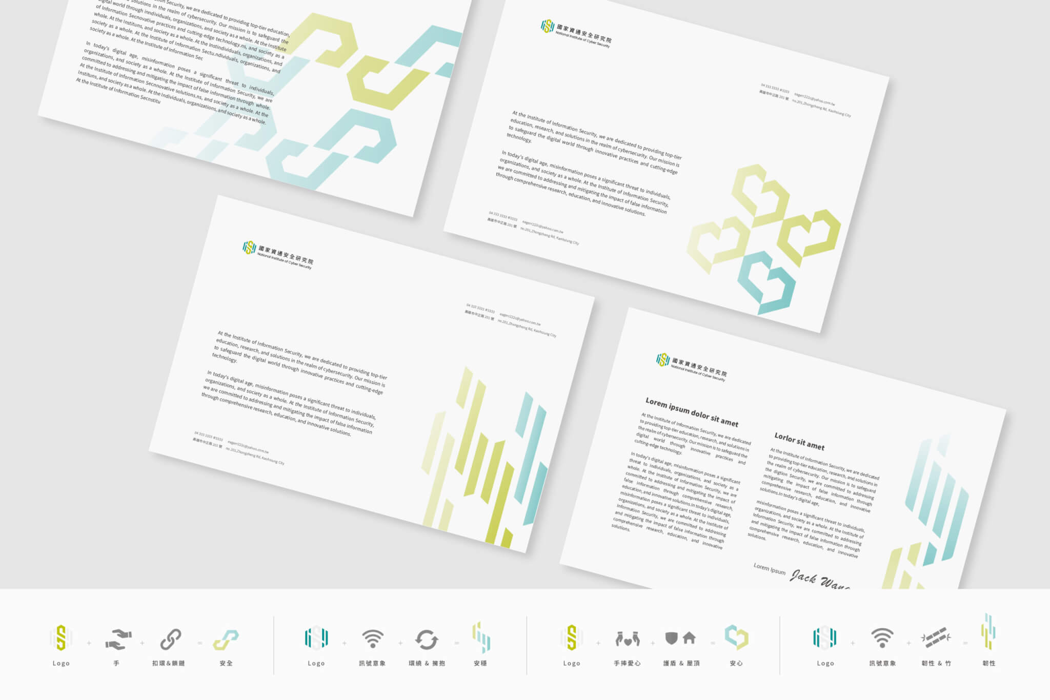
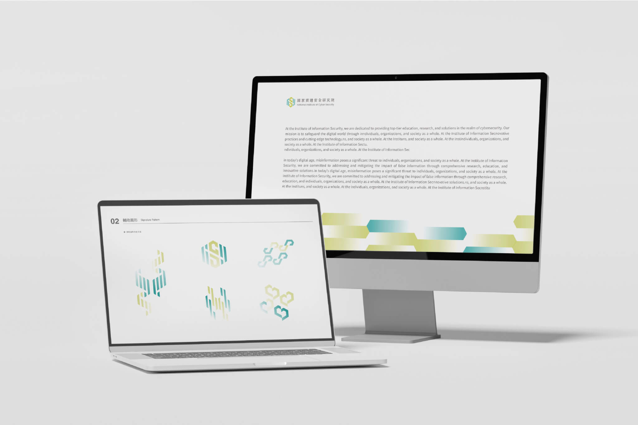
Government agencies have long been seen as traditional and serious. To move away from that image, we took the hexagon of the existing logo as our starting point and used gradients and structural variations to give it a visual rhythm with a high-tech feel. We combined this with two pairs of images, a protective shield with a security chain and hands with a heart, to build a supporting graphic identity system. It gives rational cybersecurity concepts and the institute’s logo a warmer, protective feel, and leaves the brand room to grow. The system goes beyond a single graphic and can respond to different situations, so the values of reassurance, safety, stability and resilience come across clearly and consistently in every application.
What we built for NICS is more than a set of visual elements: it is a brand application system designed for long-term use. It covers the colour plan, supporting graphics and pictograms, as well as book layouts and presentation guidelines. The identity feels consistent while taking many forms, so the brand keeps the same recognisable, approachable presence across different media and situations.

What did NICS need to address without changing its logo?

NICS had three issues to address: a logo that would stay as it was, a visual identity that looked dated, and a traditionally serious image that had to sit alongside the need to feel approachable to the public.

  • NICS already had a logo, not designed by Hand-Heart, and the project started from the premise that it would not change.
  • The first draft of the supporting graphics, from August 2024, began by setting out how the existing graphics needed to change, for example by giving them a stronger technological feel.
  • Government agencies have long been seen as traditional and serious, and NICS’s brand applications also needed to feel approachable to the public.

How were NICS’s brand application needs defined?

Through initial interviews and research, we first grouped NICS’s needs into three themes: technology and expertise, approachability for the public, and safety and peace of mind. Each was mapped to the institute’s five core values: security, technology, initiative, resilience and trust. These three themes became the criteria for reviewing every supporting graphic that followed. The first draft started from visual codes associated with information technology, such as technology panels, information chains and gradients, and used design thinking to turn them into four supporting graphics.

How did two directions for the supporting graphics become one system?

The second draft, in August 2024, put forward two directions. Option A, “Building Trust Together, Connecting Securely”, reshapes the brand’s hexagon and uses gradients to give it a personality that connects with the public. It pairs the logo with hands, a clasp and a chain to express “safety”, with an embracing ring and signals to express “stability”, and with a roof-like shield and hands holding a heart to express “peace of mind”. Option B, “Connecting Generations, Ensuring Security”, breaks the original shape into units and reassembles them into digital symbols, conveying protection for the digital generation.

In the final work shown on this page, you can see icons that combine the logo with hands, chains and a heart, along with graphics developed from the hexagon gradient. The final system retains Option A’s hexagon gradient and its three images of safety, stability and peace of mind.

How were the guidelines and presentation templates developed, version by version?

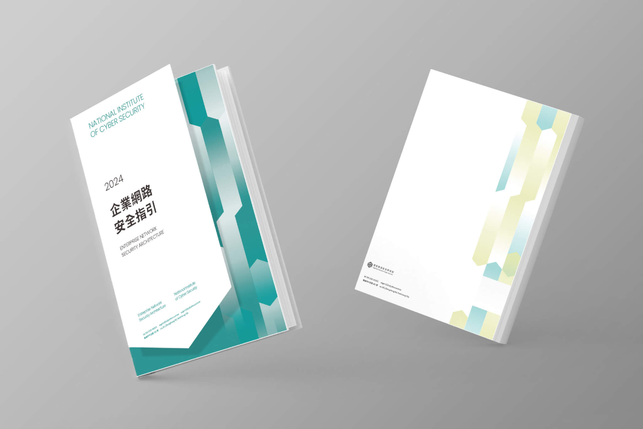
Once the supporting graphics were in place, we combined the supporting graphic guidelines, the brand colour plan and the book guidelines into a single set of guidelines. The first version was completed at the end of August 2024 (based on file dates). The September version added presentation templates, and by early October the guidelines had reached their fifth version. Along the way, we also tested book cover layouts and advertising mock-ups. The applications visible on this page include document layouts, the cover of the book Enterprise Cybersecurity Guidelines, presentation templates, web pages and display stands.

What do NICS’s supporting graphics and guidelines each do?

NICS’s supporting graphics respond to the need for a technological feel and for approachability, while the guidelines keep applications such as books and presentations consistent.

  • The supporting graphics build on the hexagon of the existing logo, adding gradients and structural variations to address the visual identity’s lack of a technological feel.
  • In the proposal, Option A reshapes the hexagon and uses gradients to connect with the public, with the aim of moving away from the rather cold image of IT companies.
  • In the final work, the system retains Option A’s three combined images, which express “safety”, “stability” and “peace of mind” respectively.
  • Options A and B were both designed around the three needs of technology and expertise, approachability, and safety and peace of mind; the proposal states that Option A was meant to convey a sense of peace of mind, safety and stability.
  • The supporting graphic guidelines, colour plan and book guidelines were combined into one document that also includes presentation templates, to keep the identity and its approachability intact across different media.

Which agencies and public bodies can learn from the NICS approach?

If your agency or organisation is in any of the following situations, the approach taken for NICS may be a useful reference:

  • If you need to keep your existing logo but your documents and slides look dated, you can develop supporting graphics from a shape already in the logo.
  • If your work is technical and your image comes across as rational, yet you want the public to find you approachable, consider first grouping your needs into a few themes and then making each graphic respond to them.
  • If different people produce your books, presentations and web pages, one option is to bring the supporting graphics, colour plan, book guidelines and presentation templates together in a single set of guidelines.

A sequence to follow: define the needs, develop the supporting graphics, check each graphic against those needs, and finally bring the colour, book and presentation guidelines together.

How we extend an existing logo with supporting graphics and application guidelines is explained on our corporate identity system (CIS) design page.

品牌應用設計|國家資通安全研究院 National Institute of Cyber Security|手心設計事務所(作品圖 2)
品牌應用設計|國家資通安全研究院 National Institute of Cyber Security|手心設計事務所(作品圖 3)
品牌應用設計|國家資通安全研究院 National Institute of Cyber Security|手心設計事務所(作品圖 5)
品牌應用設計|國家資通安全研究院 National Institute of Cyber Security|手心設計事務所(作品圖 1)
品牌應用設計|國家資通安全研究院 National Institute of Cyber Security|手心設計事務所(作品圖 6)

Completed General Manager Project Planner Lead Designer Designers

2025.12 Chih-yang Hsu Wan-Chih Hsiao, I-Chia Lu I-chen Lee, Dong Pan Jun-Xian Wu, Yin-Chan Huang, Hsin-I Hsieh, Elmer Wang

Information Design|United Way of Taiwan

Design Concept

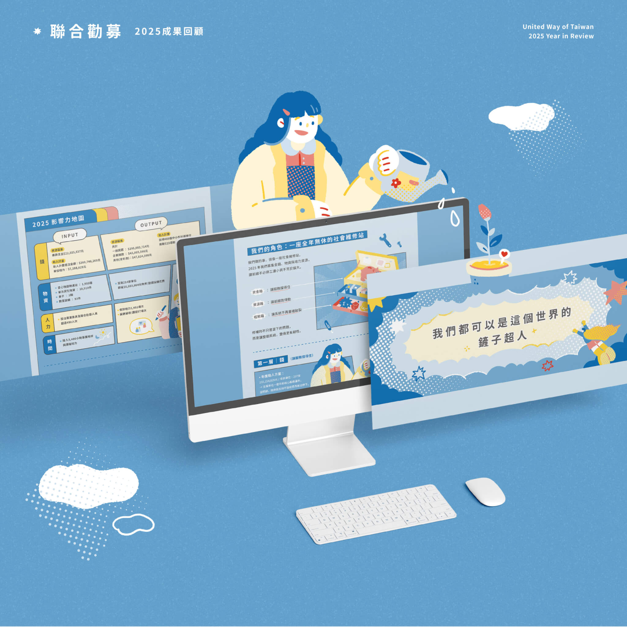
Hand-Heart Design Firm handled the information design for United Way of Taiwan’s 2025 Annual Review, the fifth consecutive year of our partnership. The theme was “We Can All Be Shovel Heroes for This World”. The year’s action and results are divided into four chapters, and the infographics and reading hierarchy are organised with superhero comic panels, hand-drawn characters and a yellow-and-blue palette.

Panel by Panel, Making Every Act of Support Visible

For the fifth year running, we worked with United Way of Taiwan to turn a year of impact into stories that are easier to see and understand. Taking this year’s theme of “Shovel Heroes” as our cue, we drew on the visual language of classic superhero comics, so that a year of achievements unfolds panel by panel like a hero’s story.

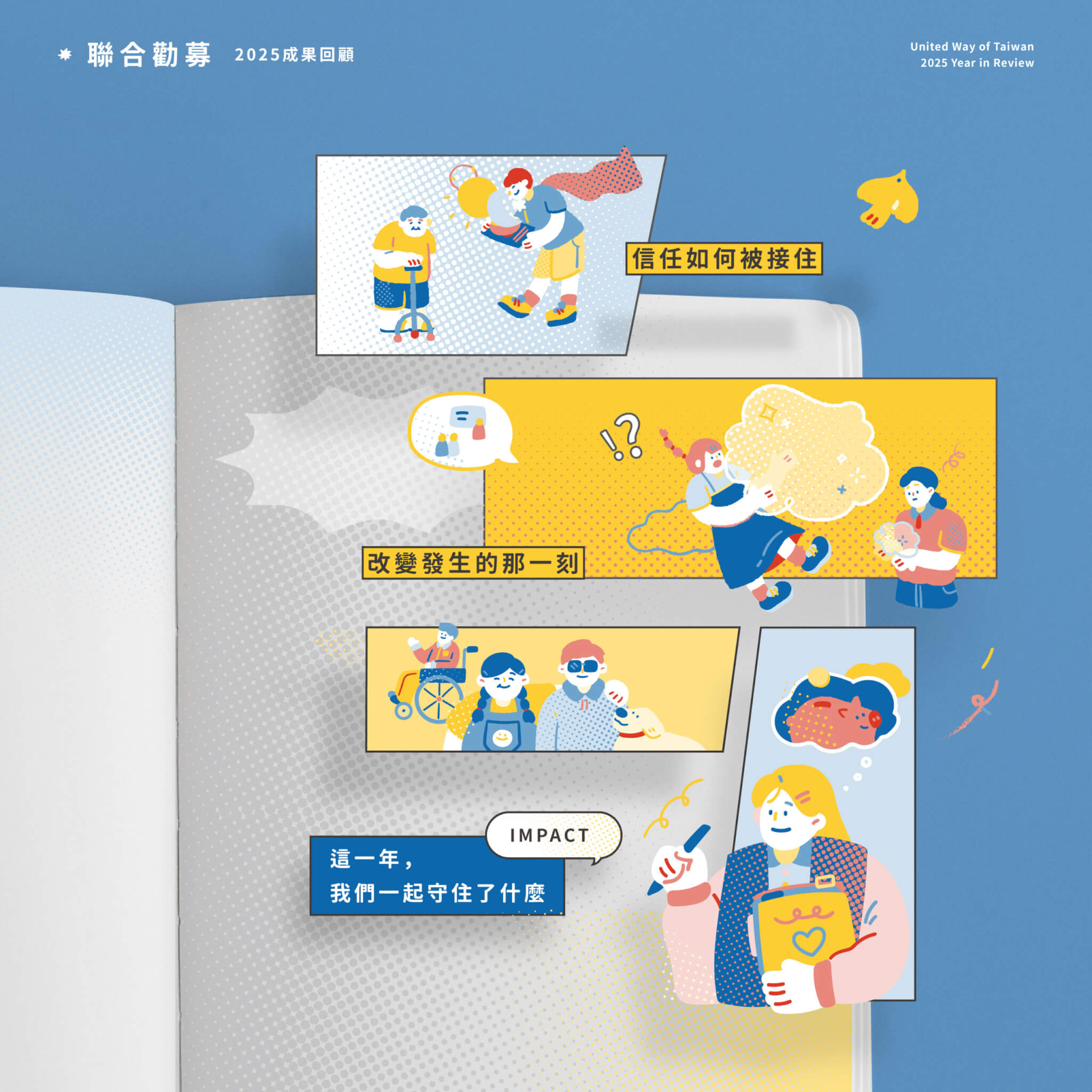
資訊視覺化 設計|聯合勸募 United Way of Taiwan|手心設計事務所(作品圖 2)

How is the Annual Review divided into chapters?

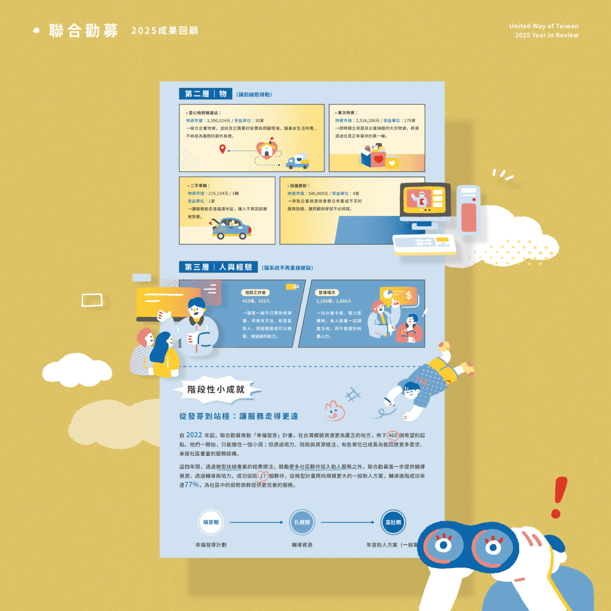
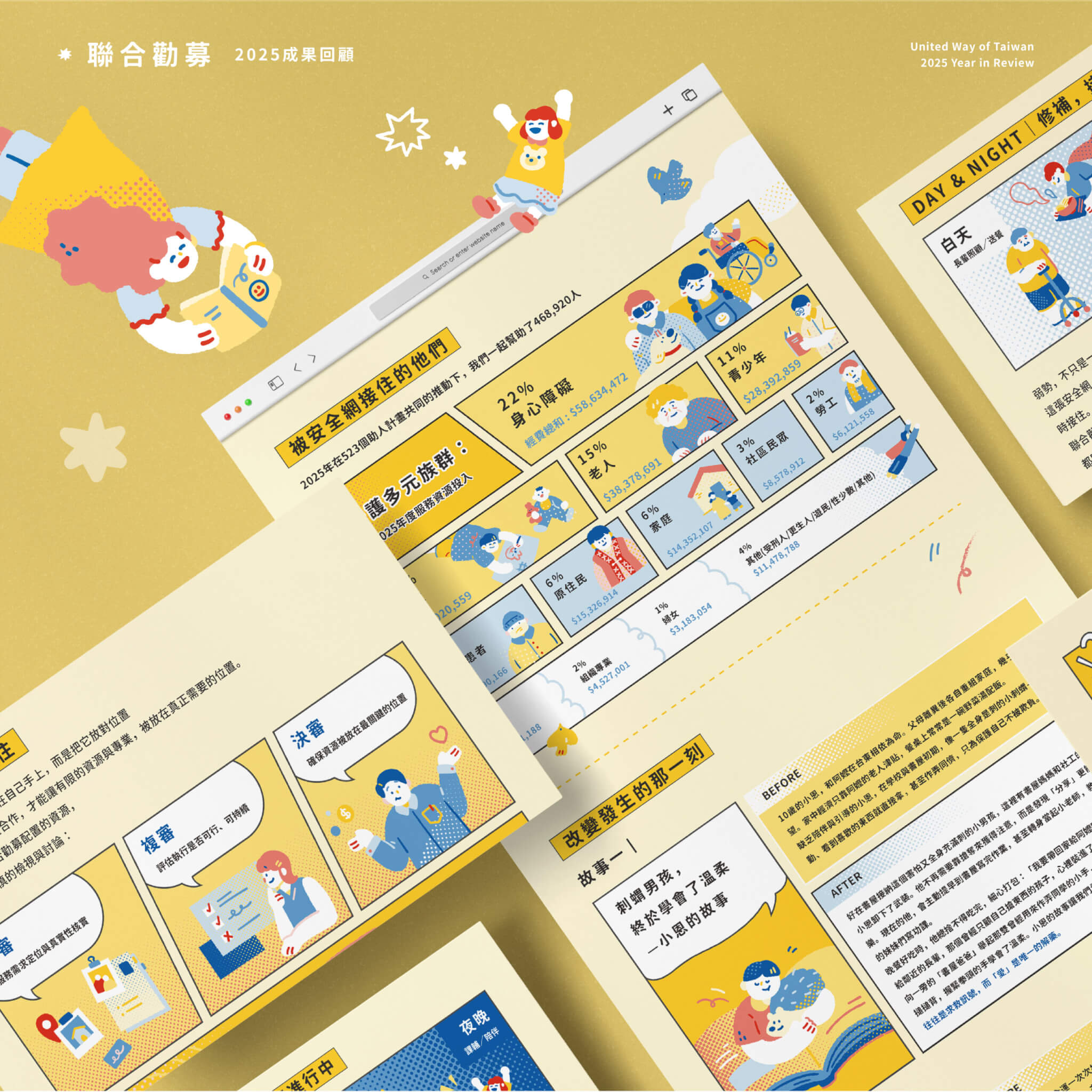
The proposal divides the content into four chapters. Chapter 1, “Before the Abyss Forms”, is about the people who quietly fill the gaps every day before problems turn into an abyss. Chapter 2, “How the Social Repair Station Works”, covers 365 days of support and of stepping in where help is needed. Chapter 3, “After Help Arrives”, is about keeping bad situations from getting worse. Chapter 4, “2025: Social Repairs Completed”, closes with an overview of the year’s results and an impact map.

To organise a large amount of data and service information, we used comic panels, cross-panel spreads, speech bubbles and infographics to build a clear reading hierarchy. Halftone dots, speed lines, hand-drawn characters and a vivid yellow-and-blue palette give the information a storyline and a rhythm, making it more intuitive and engaging to read.
資訊視覺化 設計|聯合勸募 United Way of Taiwan|手心設計事務所(作品圖 3)

How did the design take shape, step by step?

The sketch proposal of 2 April 2026 (based on file dates) laid out the panels and illustrations for all four chapters as greyscale line drawings, noting that colours would later be used to distinguish the sections. The first-draft proposal of 27 April used yellow, blue and other colours to separate the chapters; at that point, the illustrations for Chapters 3 and 4 were marked as due in the next proposal. By the version of 15 May, all four chapters had their illustrations, and the project was completed in May 2026.

We believe design should do more than make information easier to read—it should make reading the starting point for understanding. From every donation to every real change, we hope information design will make each act of support, and the change it brings, easier to see.

Who can learn from this project?

If either of these applies to your annual review, the approach taken for United Way of Taiwan may help:

  • If you need a fresh idea for your annual review every year, you can borrow the panels and hand-drawn characters of superhero comics.
  • If you are still defining the design scope of your review, the four-chapter structure, the infographics and the year-end results overview make a useful reference.

A practical order: divide the content into chapters first, then work out the infographics and the reading hierarchy.

The chapter structure and infographics of an annual review are one application of our visual design work.

資訊視覺化 設計|聯合勸募 United Way of Taiwan|手心設計事務所(作品圖 5)

Completed
Project Manager
Lead Designer
Designer


2026.05
Lien-chieh Su
I-chen Lee
Pin-chen Lee