Graphic Design|Hand-Heart 2025 Year of the Snake Greeting Card

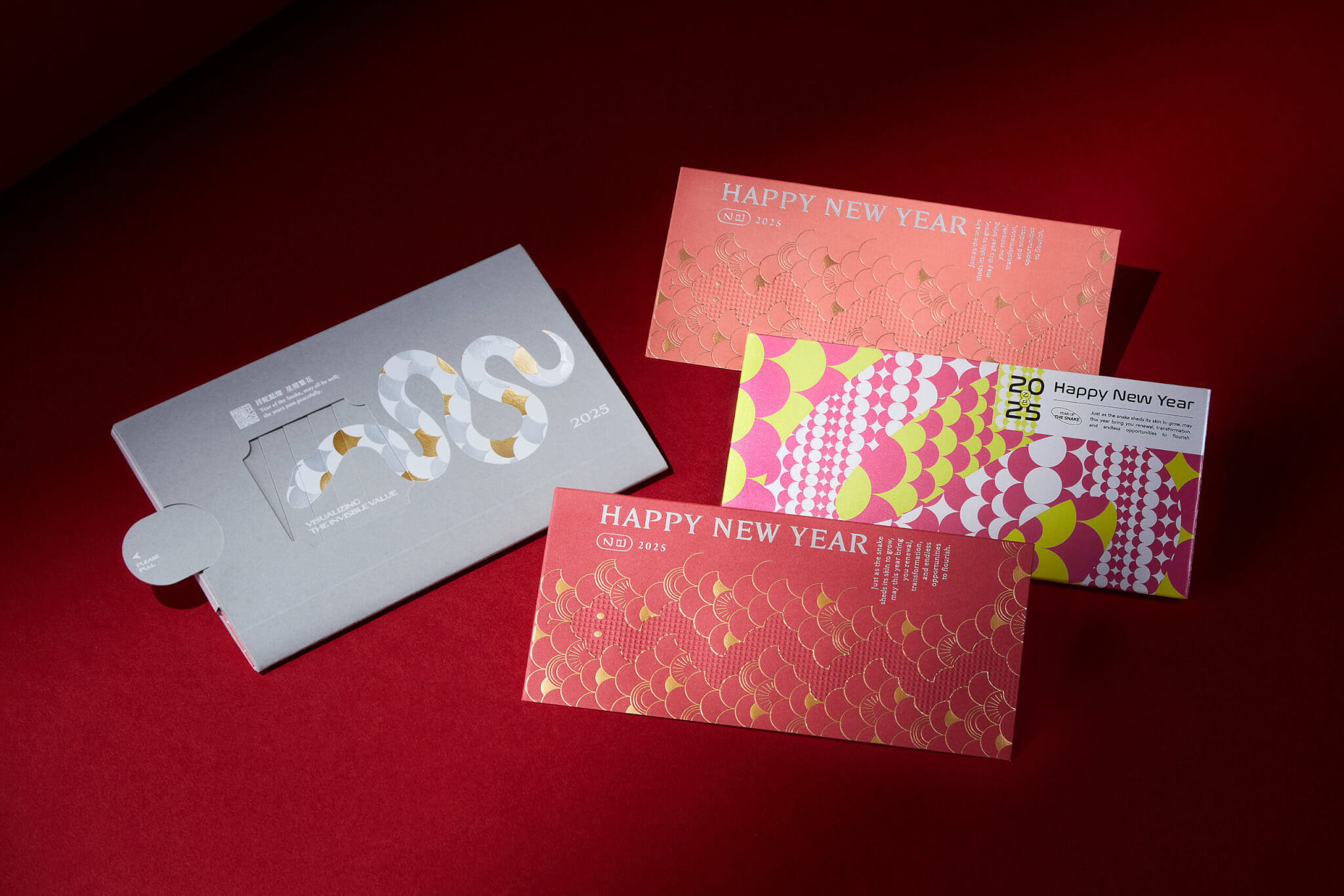
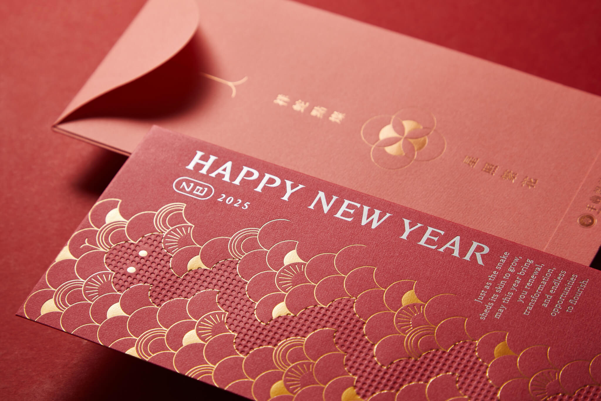
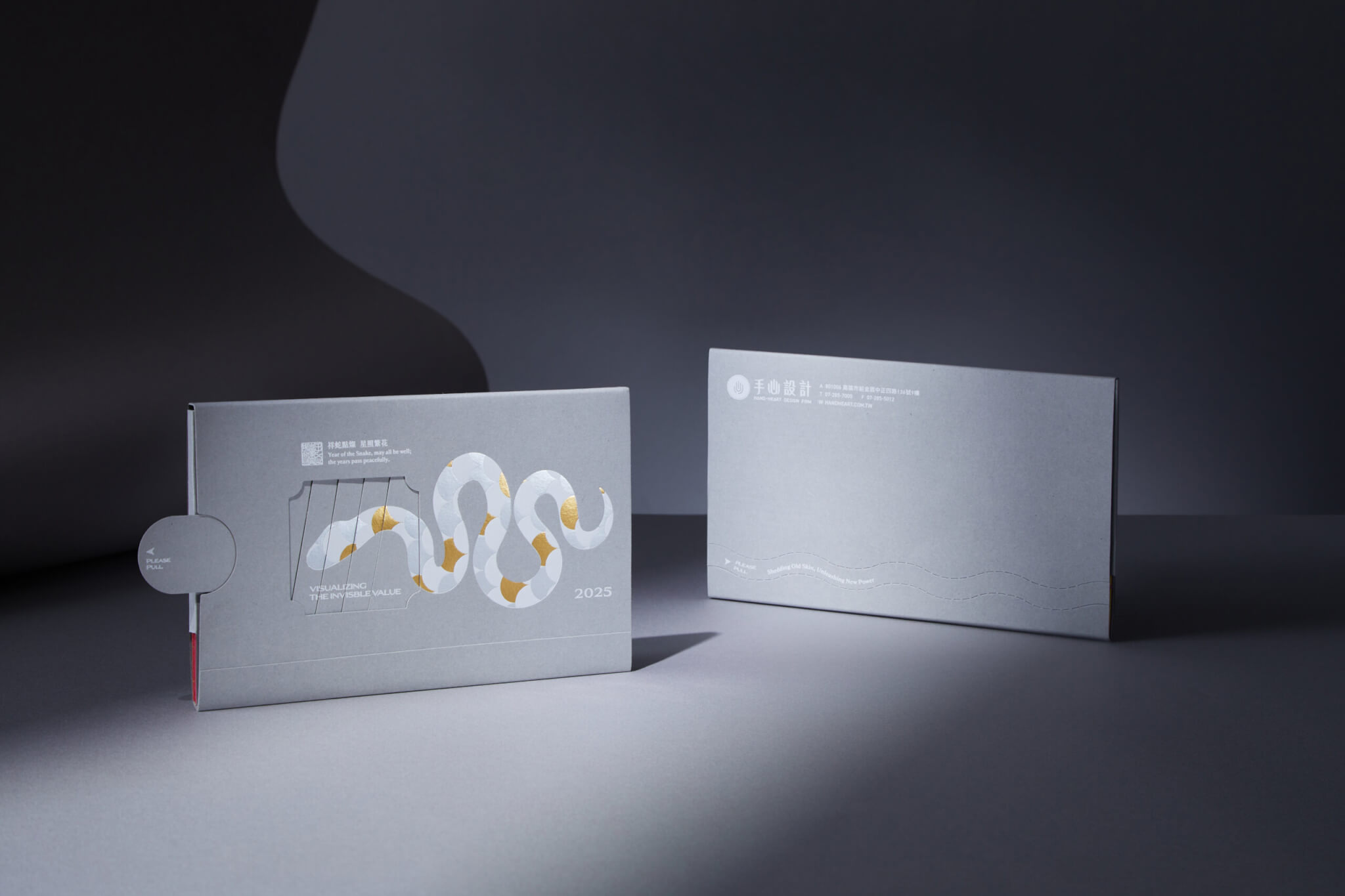
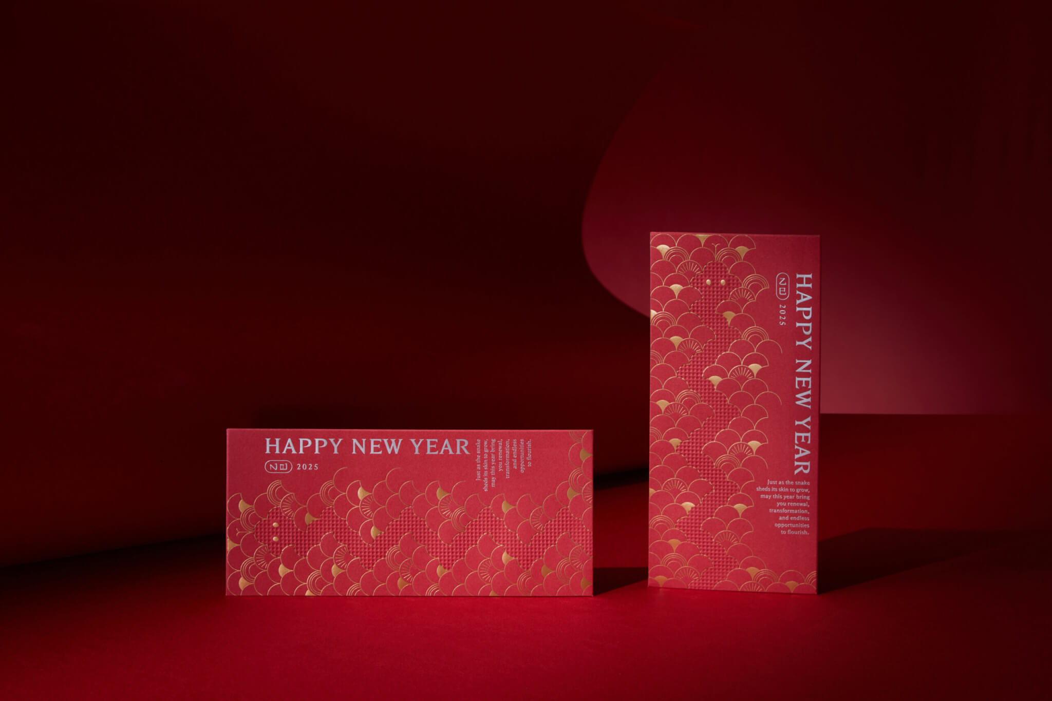
The 2025 Year of the Snake greeting card by Hand-Heart Design Firm received the Red Dot Design Award 2026. The work takes the shedding of the snake as its core image: a pull-out sleeve shows the snake shedding its skin and renewing itself, and three red envelopes inside carry the same scale pattern. Gold foil and clear colours stand for blessing, warmth and a breakthrough, so that the card becomes an extension of energy into the new year.

reddot winner 2026 Red Dot Design Award winner label

Red Dot Design Award 2026, Red Dot Winner
This project received the Red Dot Design Award 2026. Hand-Heart holds every project to the same standard: an annual greeting card is checked step by step in the same way as a large identity project, from the concept and the choice of materials to the printing craft.See Hand-Heart’s full award record →

Design Concept

Looking back at 2025, Hand-Heart Design Firm’s New Year greeting set centered on the snake as its core motif. Through the pull-out interaction of the card sleeve, the design captures the moment of shedding and transformation. The layered evolution of the snake patterns reflects how we navigated challenges that year, continually deconstructing, reshaping, and moving forward.

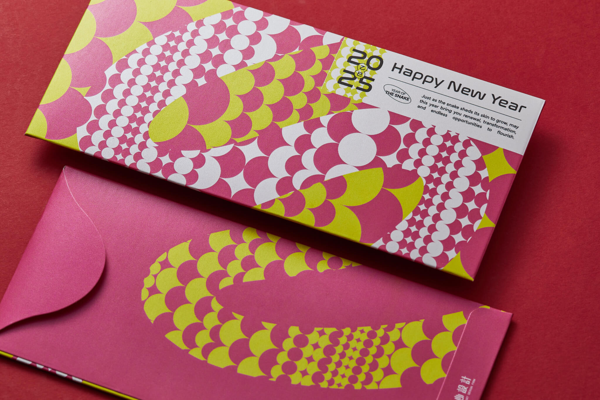
Inside, three red envelopes extend the snake-scale visual language, each expressed through a distinct color palette to reflect our vision for 2025. Red tones paired with gold foil convey warmth and blessings, while bold, vivid patterns point toward breakthrough, creativity, and the unknown. The gesture of blessing moves beyond form and becomes an energy that carries into the year ahead.

平面設計|手心設計 2025年 蛇年賀卡 Hand-Heart Design Lunar New Year Card Design|手心設計事務所(作品圖 1)
平面設計|手心設計 2025年 蛇年賀卡 Hand-Heart Design Lunar New Year Card Design|手心設計事務所(作品圖 2)
平面設計|手心設計 2025年 蛇年賀卡 Hand-Heart Design Lunar New Year Card Design|手心設計事務所(作品圖 3)
平面設計|手心設計 2025年 蛇年賀卡 Hand-Heart Design Lunar New Year Card Design|手心設計事務所(作品圖 6)

Case Closed
General Manager
Project Planner
Designer
Fonts

2024.12
Chih-yang Hsu
Ivy Wang
Guan-Shian Wu、Xiao-wen Su、Zhi-hao Yeh
Morisawa Arphic
 

Brand Application Design|National Institute of Cyber Security

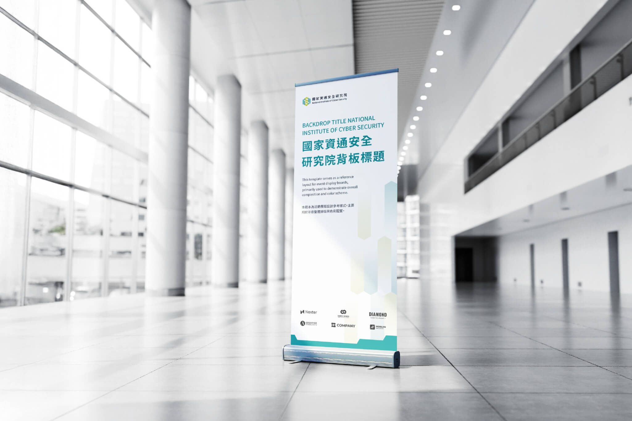
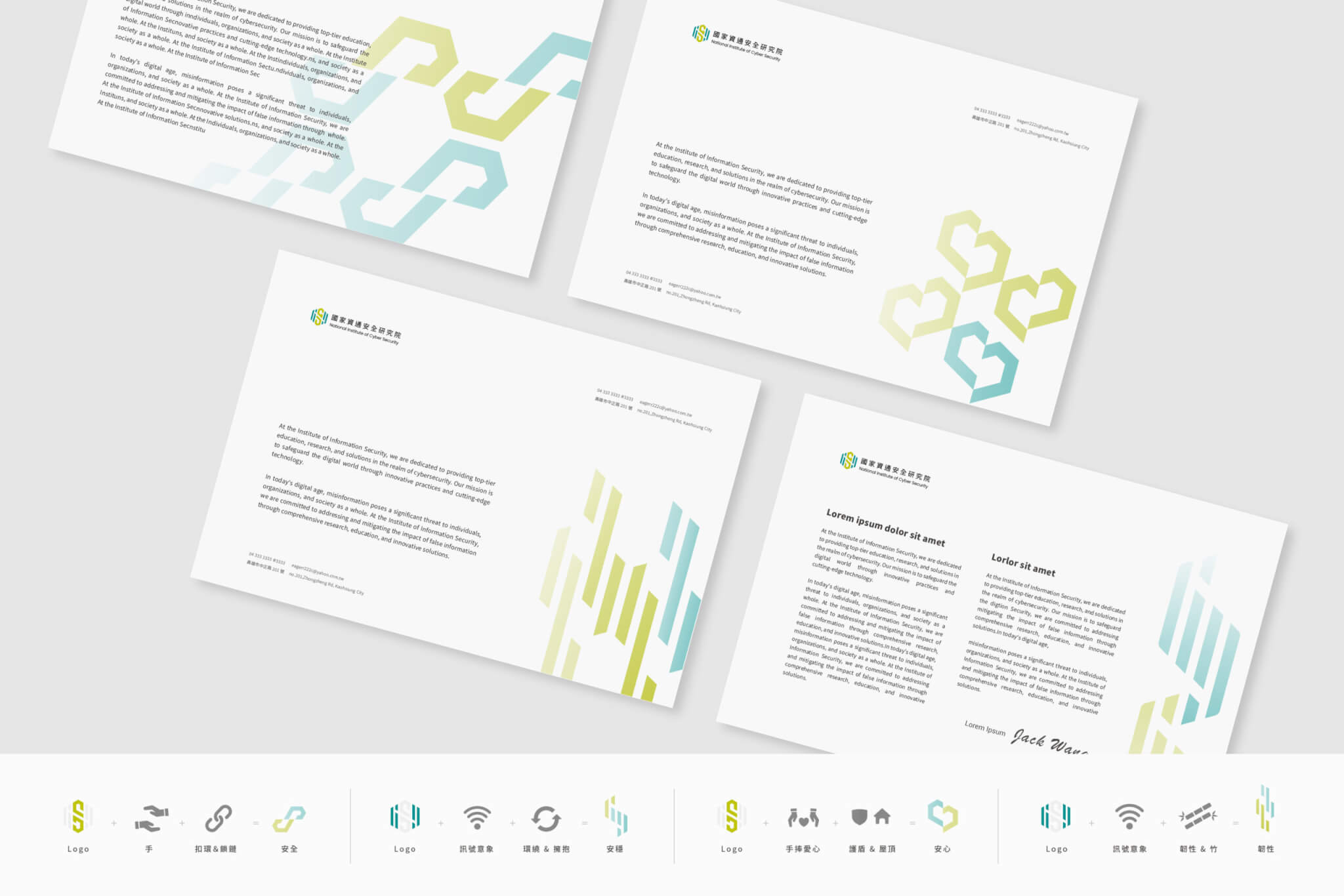
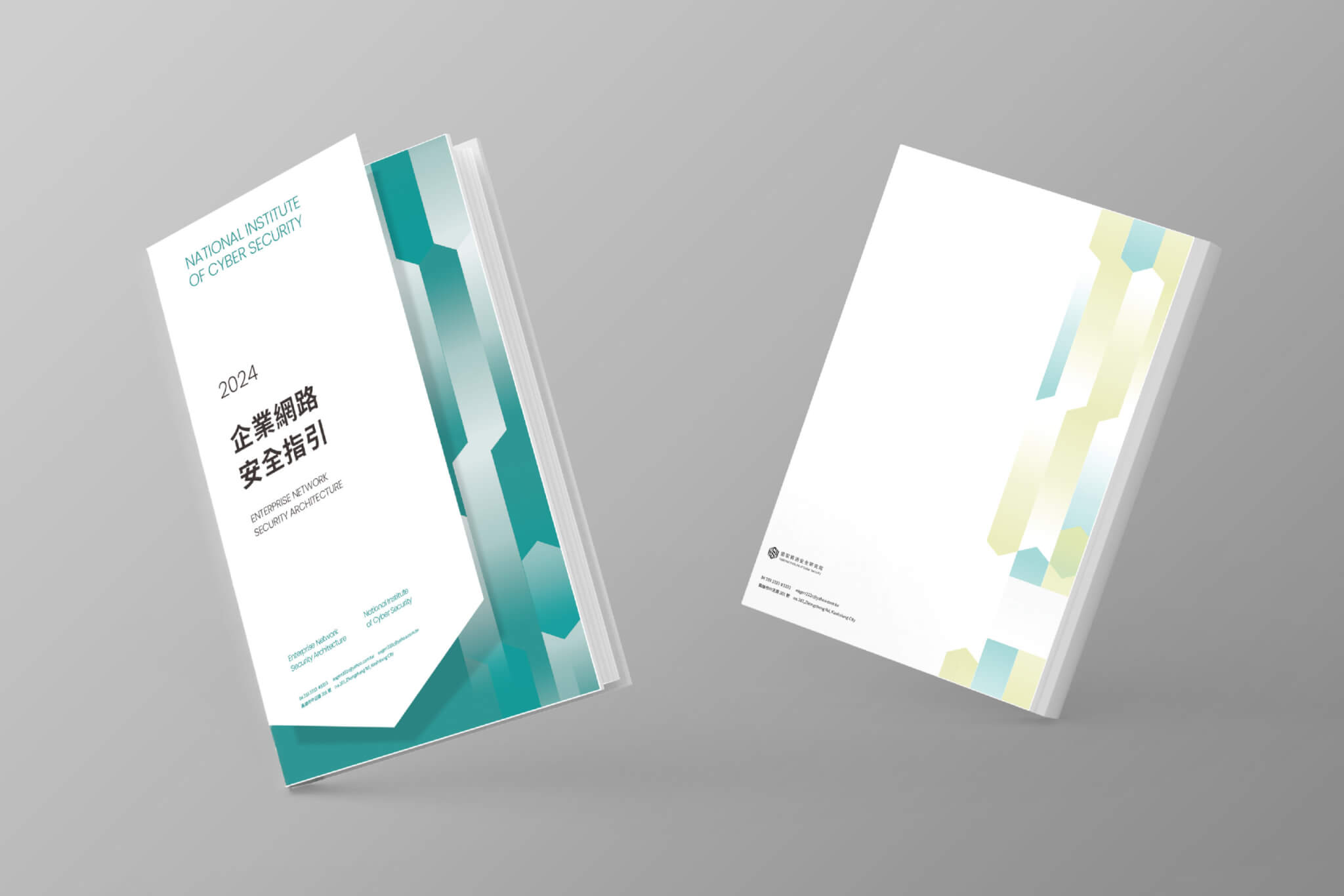
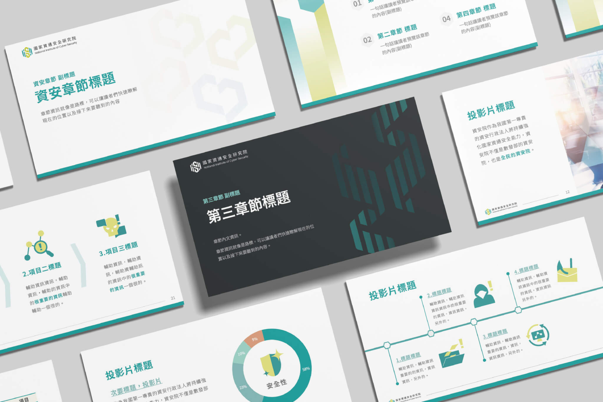
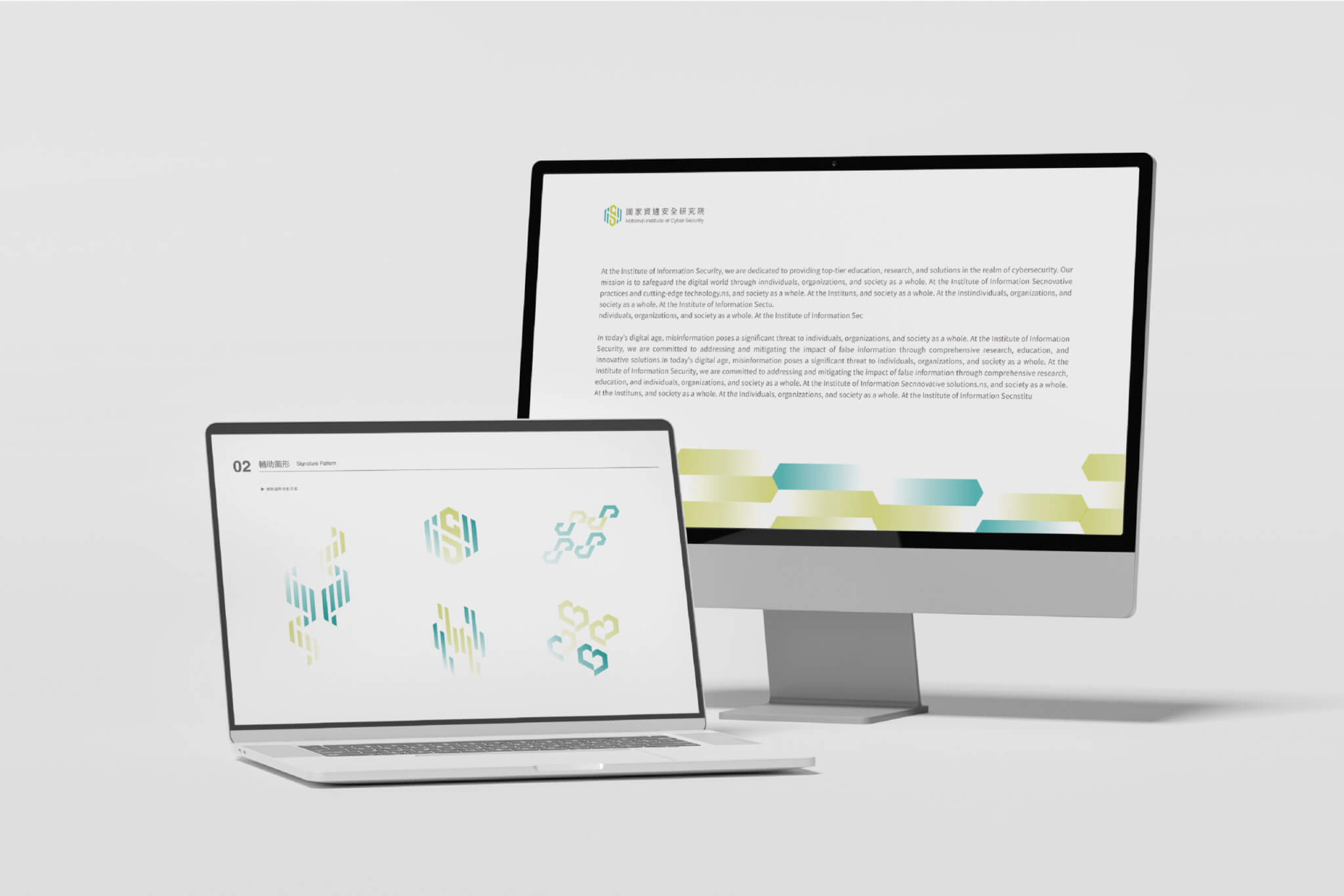
Hand-Heart Design Firm developed the brand application design for the National Institute of Cyber Security (NICS), completed in 2025. Without changing the existing logo, we built a supporting graphic system from its hexagon, drawing on the images of a protective shield, a security chain, hands and a heart, so that the rational expertise of cybersecurity reads as a warmer sense of protection. The system extends to the colour plan, pictograms, book layout and presentation guidelines, giving NICS a consistent brand application system that can be used over the long term.

Design Concept

The National Institute of Cyber Security (NICS) is a public institution dedicated to strengthening Taiwan’s cybersecurity capabilities and advancing cybersecurity research, development, and applications. As the institute already had an existing logo (existing logo not designed by Hand-Heart Design), our task was to address its previous lack of technological sophistication and contemporary appeal without altering the original mark. Starting from the brand’s core values, we redefined its communication strategy and translated the ideas of technology and innovation, public accessibility, and safety and security into a visual language that can be clearly seen, understood, and experienced.
To move beyond the traditionally formal image often associated with government institutions, we developed a supporting identity system based on the hexagonal form of the existing logo. Through gradients, structural variations, and the integration of protective shields, security chains, caring hands, and heart motifs, we transformed rational cybersecurity concepts into a warmer and more approachable expression of protection and trust. Rather than creating a single graphic element, we built a flexible system that can adapt to various contexts while consistently communicating the values of security, reassurance, stability, and resilience.
More than a collection of visual assets, we established a long-term brand application system for NICS. From color strategies and supporting graphics to pictogram design, editorial layouts, and presentation guidelines, the system was designed to deliver both consistency and flexibility, enabling the brand to maintain a cohesive, approachable, and recognizable presence across a wide range of media and applications.
品牌應用設計|國家資通安全研究院 National Institute of Cyber Security|手心設計事務所(作品圖 2)
品牌應用設計|國家資通安全研究院 National Institute of Cyber Security|手心設計事務所(作品圖 3)
品牌應用設計|國家資通安全研究院 National Institute of Cyber Security|手心設計事務所(作品圖 5)
品牌應用設計|國家資通安全研究院 National Institute of Cyber Security|手心設計事務所(作品圖 1)
品牌應用設計|國家資通安全研究院 National Institute of Cyber Security|手心設計事務所(作品圖 6)

Case Closed General Manager Project Planner Lead Designer Designer

2025.12 Chih-yang Hsu Wan-Chih Hsiao、I-Chia Lu I-chen Lee、Dong Pan Jun-Xian Wu、 Yin-Chan Huang、 Hsin-I Hsieh、Elmer Wang

Rebranding|RAYFU × Chen Nan Iron Wire

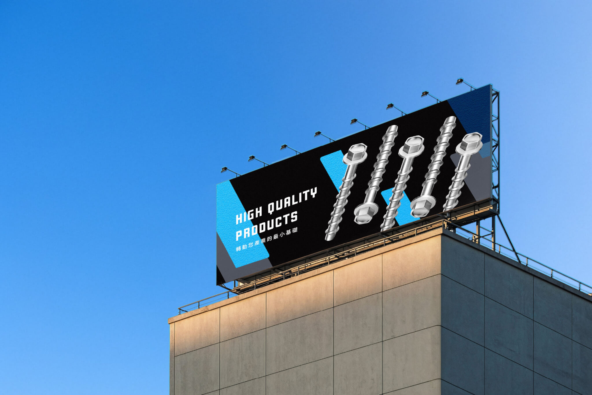
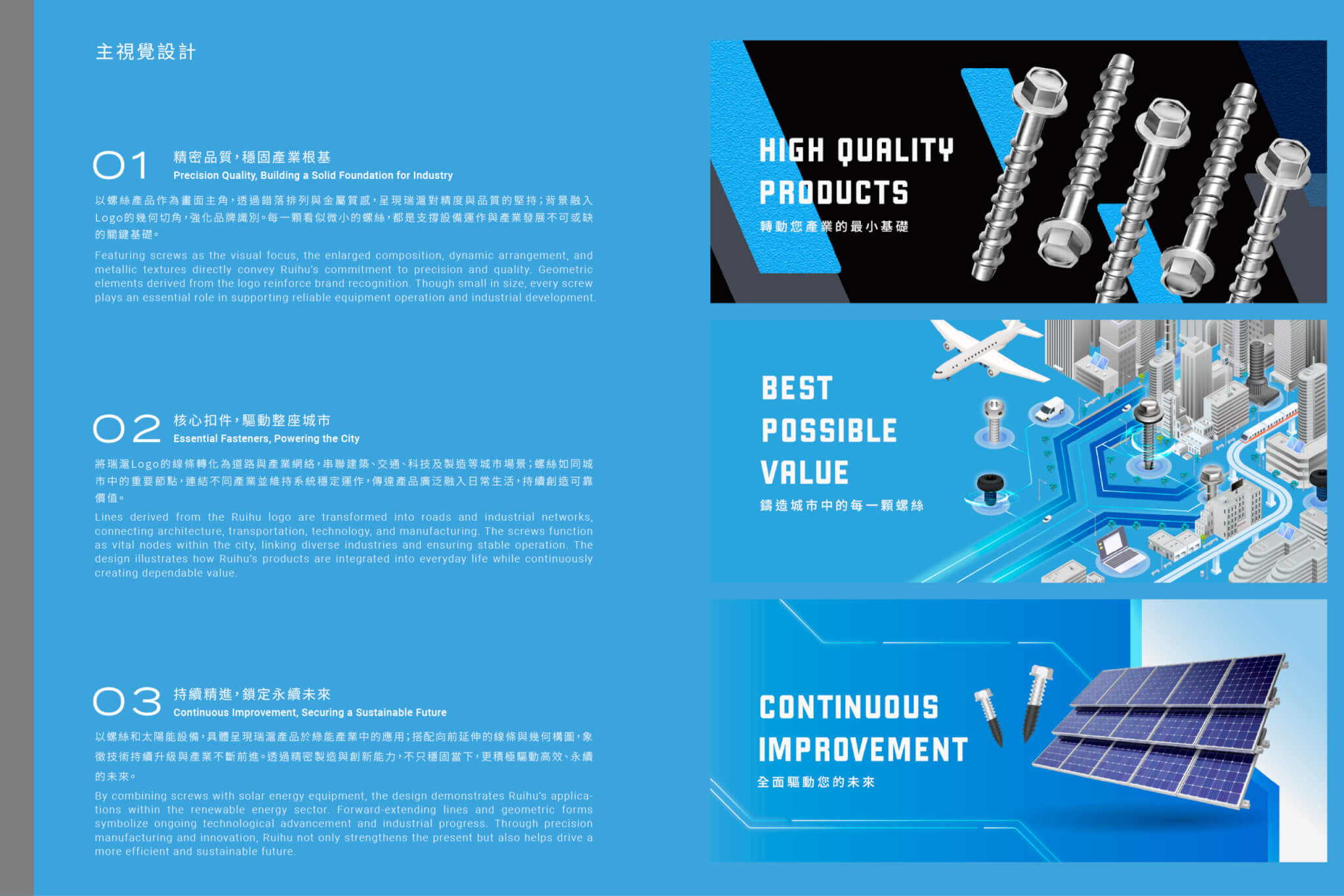
Hand-Heart Design Firm updated the brand identity of RAYFU and Chen Nan Iron Wire. Brand workshops restated the core values of the company, and “quality first, dedicated service, continuous improvement” was translated into a new wordmark and a new brand visual system, so that a manufacturer of more than thirty years moves from a recognised supplier to a clearly recognisable brand.


Design Concept

RAYFU has specialized in the fastener industry for more than three decades, establishing a fully integrated supply chain spanning wire production, screw manufacturing, and global export. As the company expanded internationally, its existing trademark and brand assets no longer reflected the scale, professionalism, and future positioning of the business. Through brand workshops and in-depth interviews, we redefined the company’s core values and developed a renewed identity system aligned with its long-term vision.

品牌識別更新|瑞滬企業 × 震南鐵線 RAYFU × Chen Nan Iron Wire Rebranding|手心設計事務所(作品圖 1)

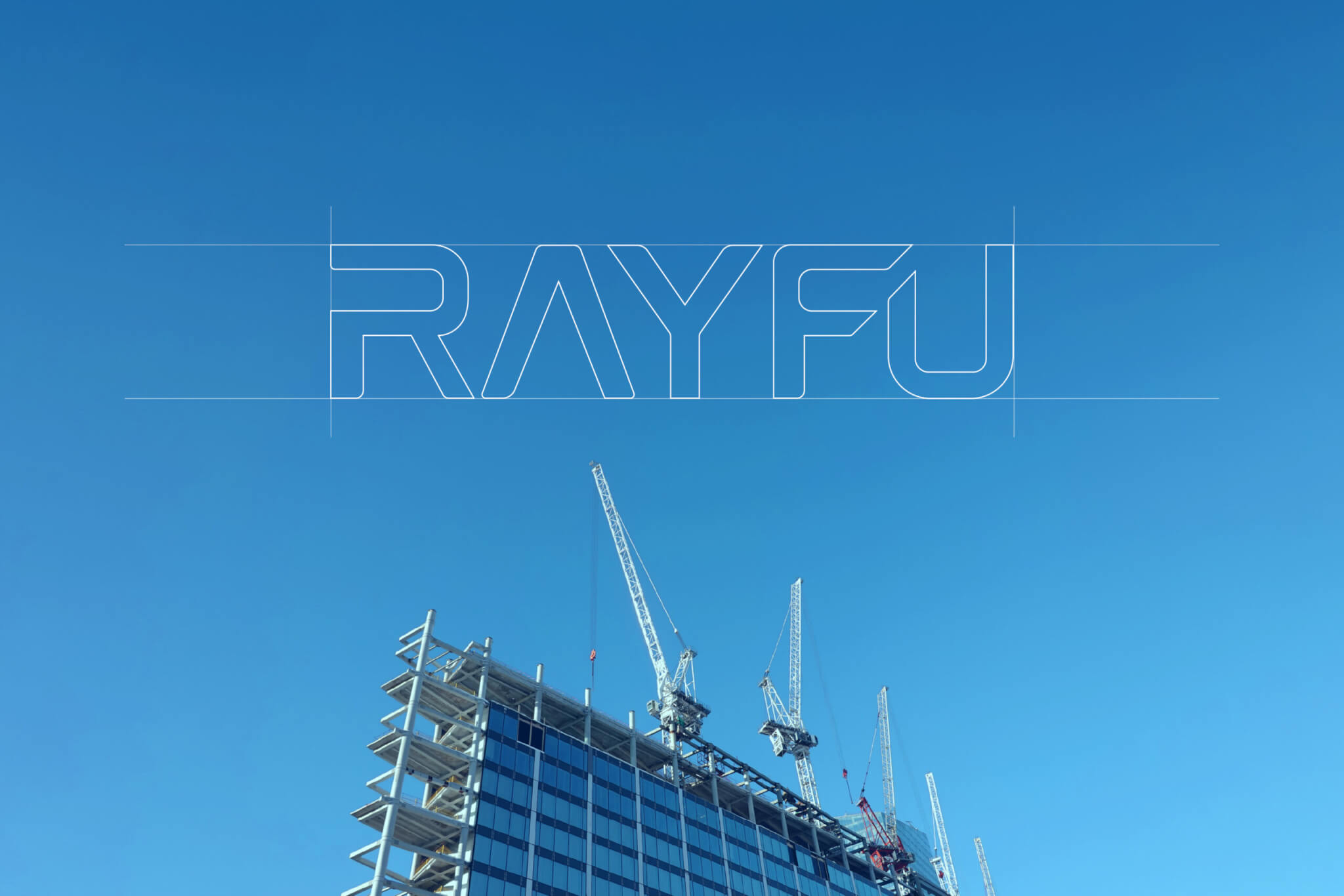
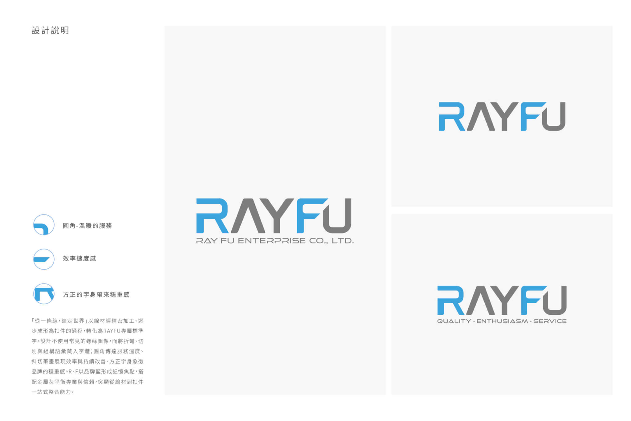
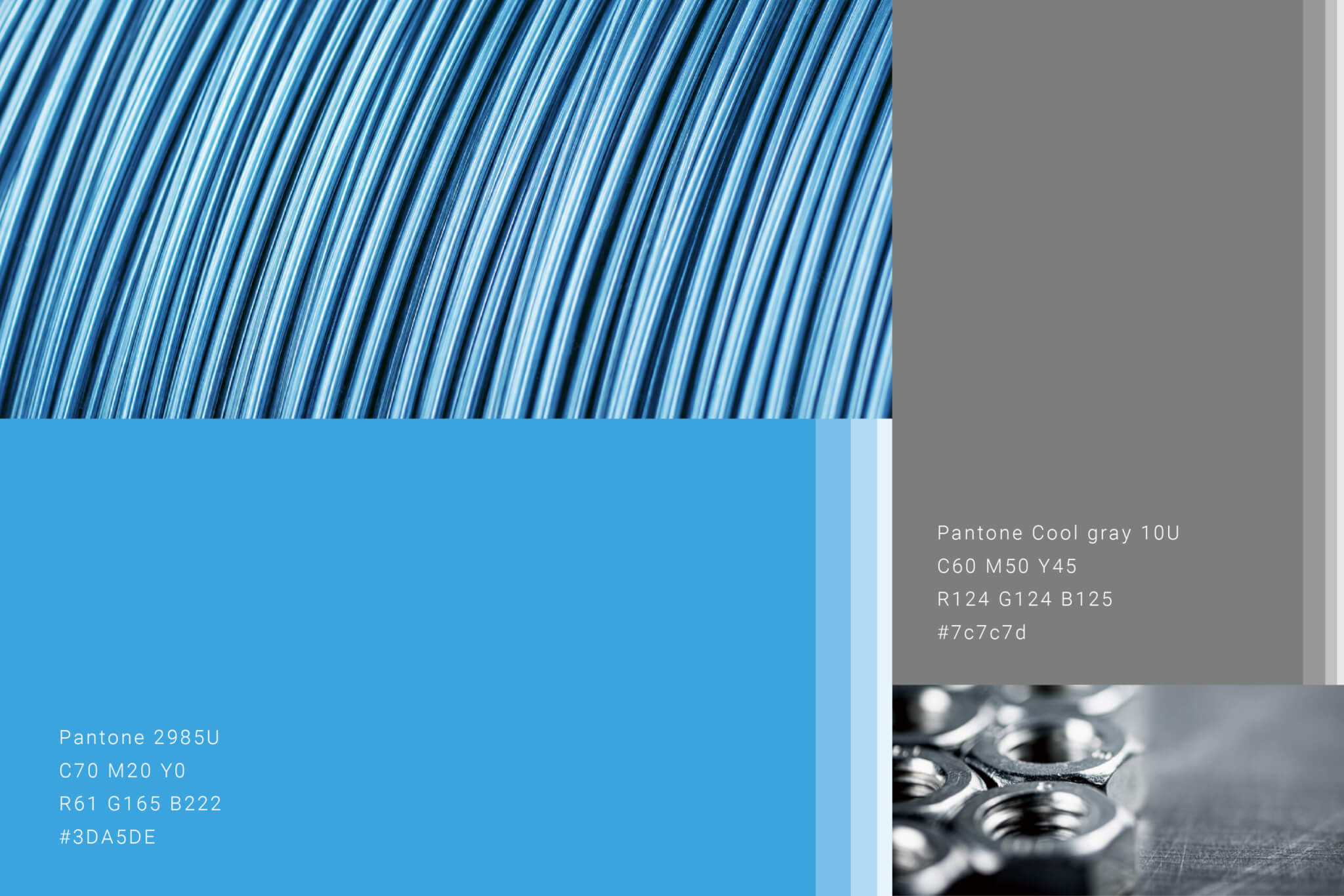
Our research revealed that RAYFU’s strengths extend beyond manufacturing expertise to a deeply rooted corporate culture built on uncompromising quality, responsive customer service, and continuous improvement. These qualities were distilled into three core brand values—Quality First, Dedicated Service, and Continuous Improvement—which became the foundation of the new visual identity. The custom wordmark features a stable geometric structure to communicate precision and reliability, softened with rounded details to express approachability. Subtle references to wire forms from the fastener industry are integrated into the typography, while a refined RAYFU Blue reinforces the brand’s trustworthy and international character.

The project goes beyond redesigning a wordmark; it transforms more than thirty years of expertise, quality, and trust into a recognizable and enduring brand asset. By establishing a clearer and more consistent identity, the renewed system enables RAYFU to evolve from a respected manufacturer into a globally recognizable brand with long-term strategic value.

品牌識別更新|瑞滬企業 × 震南鐵線 RAYFU × Chen Nan Iron Wire Rebranding|手心設計事務所(作品圖 2)
品牌識別更新|瑞滬企業 × 震南鐵線 RAYFU × Chen Nan Iron Wire Rebranding|手心設計事務所(作品圖 7)
品牌識別更新|瑞滬企業 × 震南鐵線 RAYFU × Chen Nan Iron Wire Rebranding|手心設計事務所(作品圖 5)
品牌識別更新|瑞滬企業 × 震南鐵線 RAYFU × Chen Nan Iron Wire Rebranding|手心設計事務所(作品圖 4)
品牌識別更新|瑞滬企業 × 震南鐵線 RAYFU × Chen Nan Iron Wire Rebranding|手心設計事務所(作品圖 3)

Case Closed
Project Planner

Lead Designer
Designer

2025.01
Lien-chieh Su、 Ivy Wang、Wan-Chih Hsiao
Dong Pan
Chien-ying Yang、Nina Lin

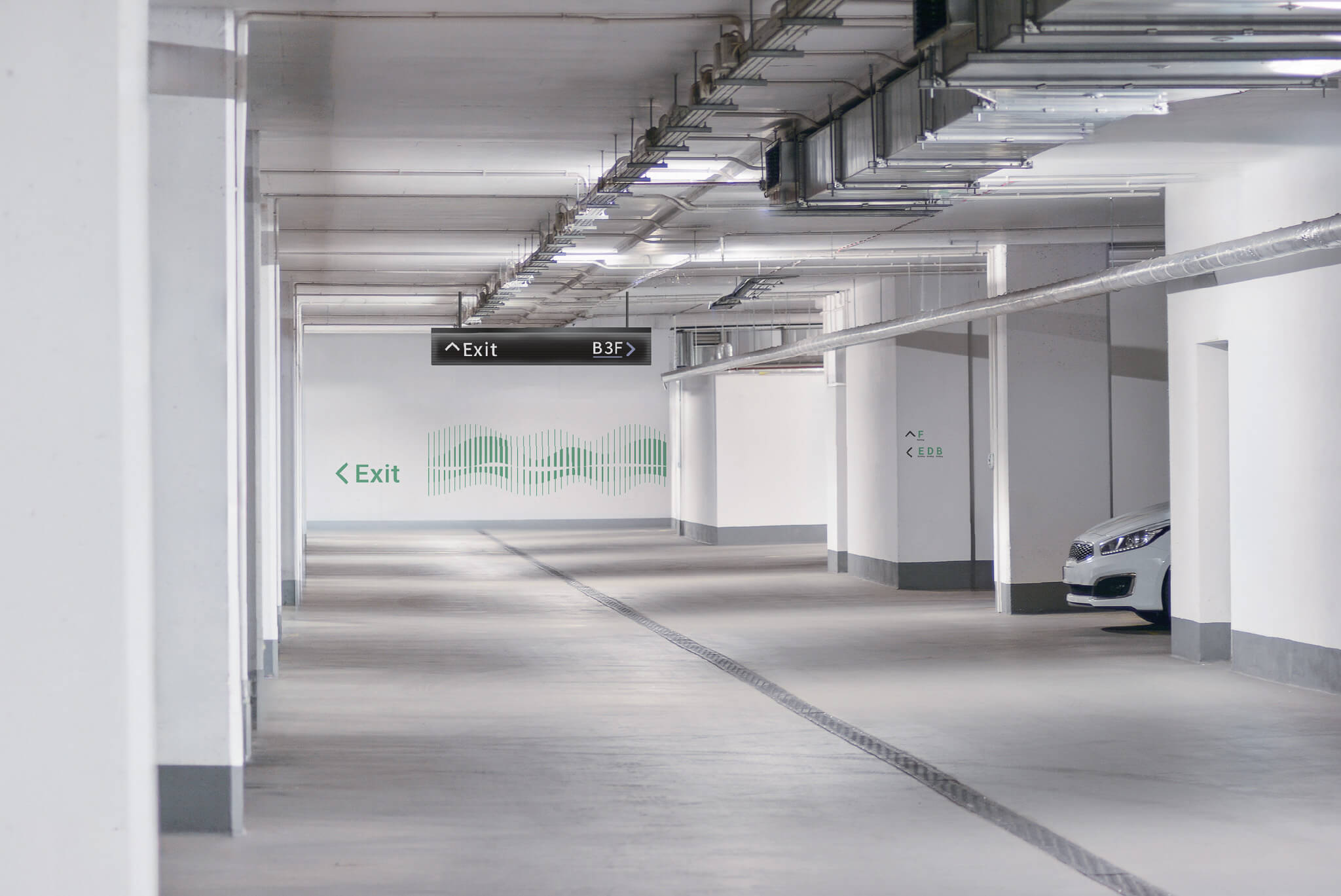
Wayfinding System Design|SanFar Property

Design Concept

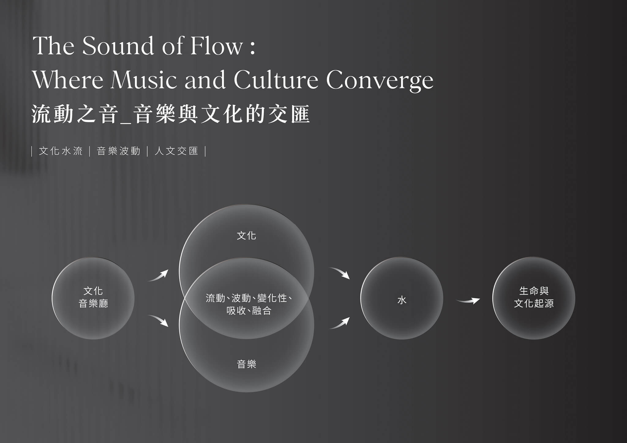
The Flowing Sound: Where Music and Culture Converge

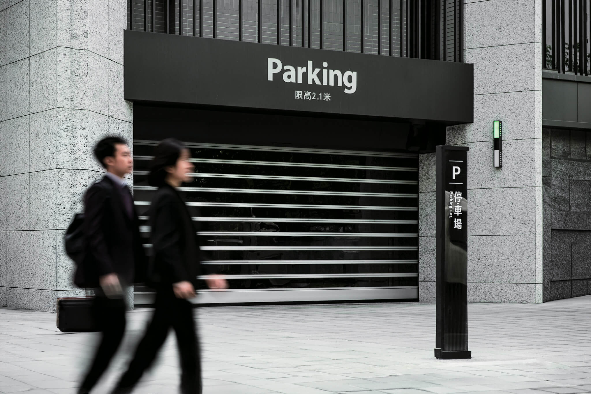
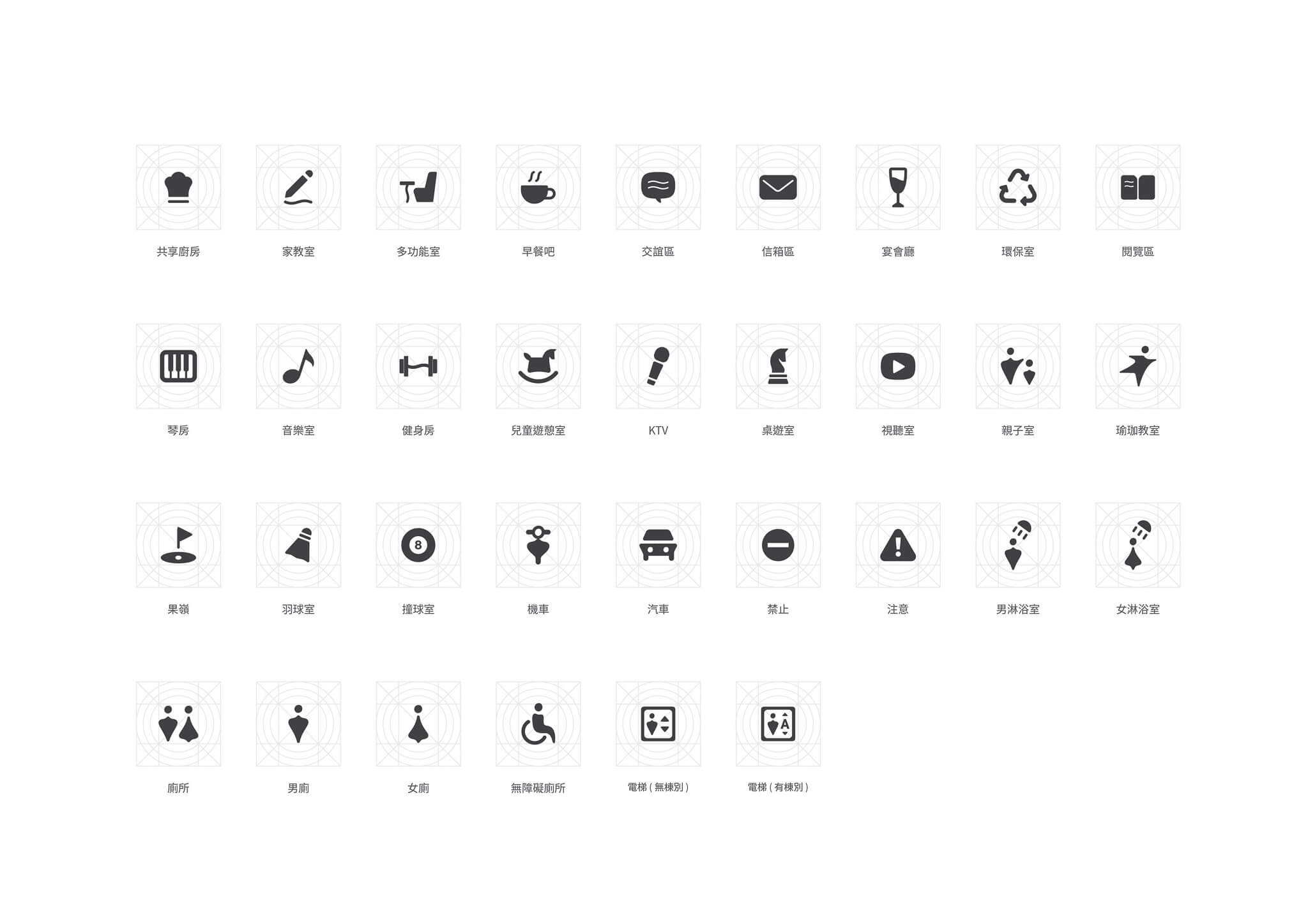
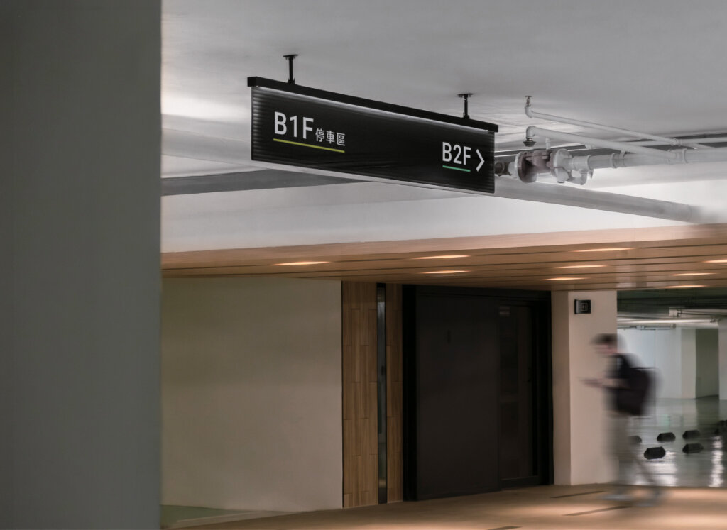
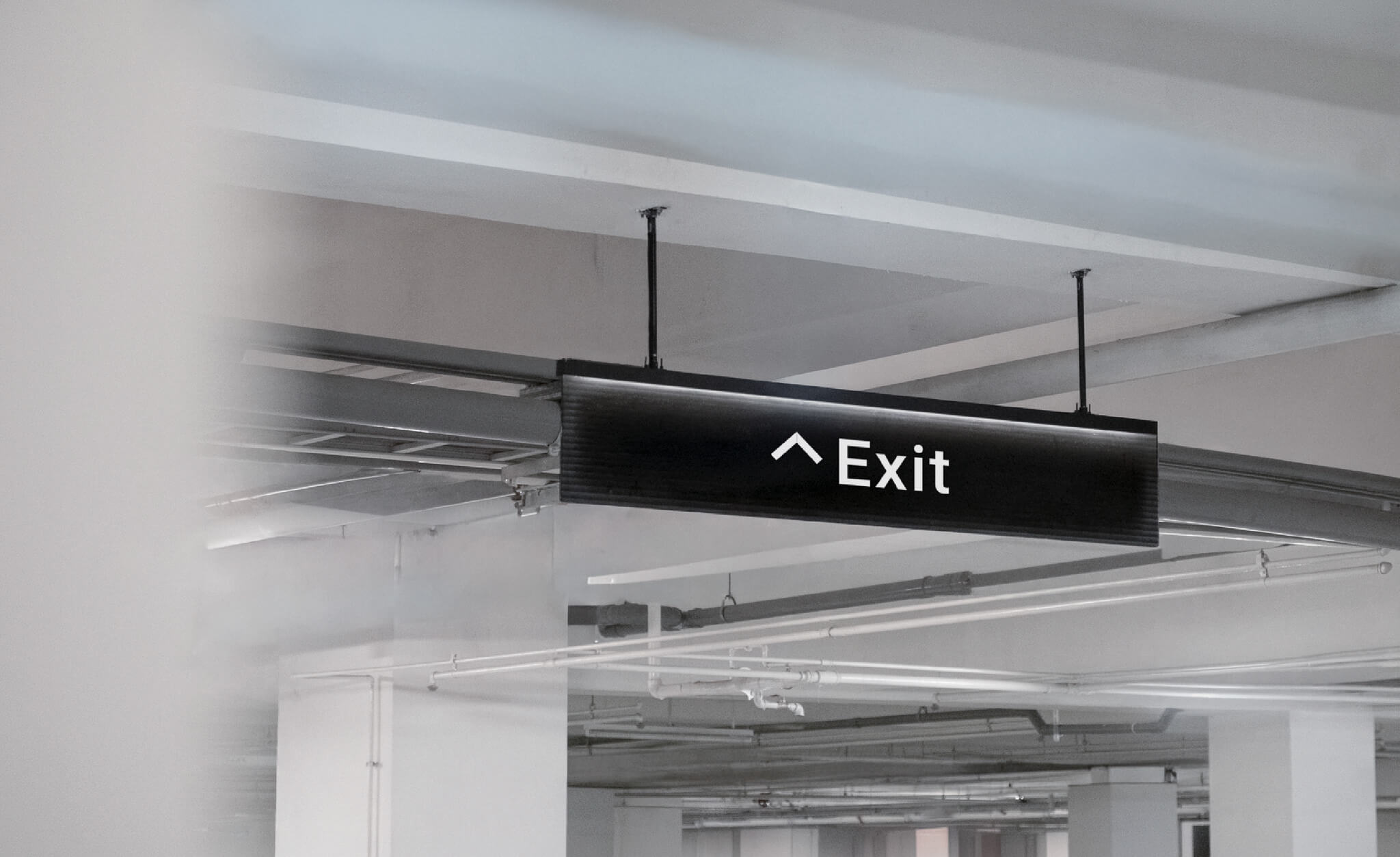
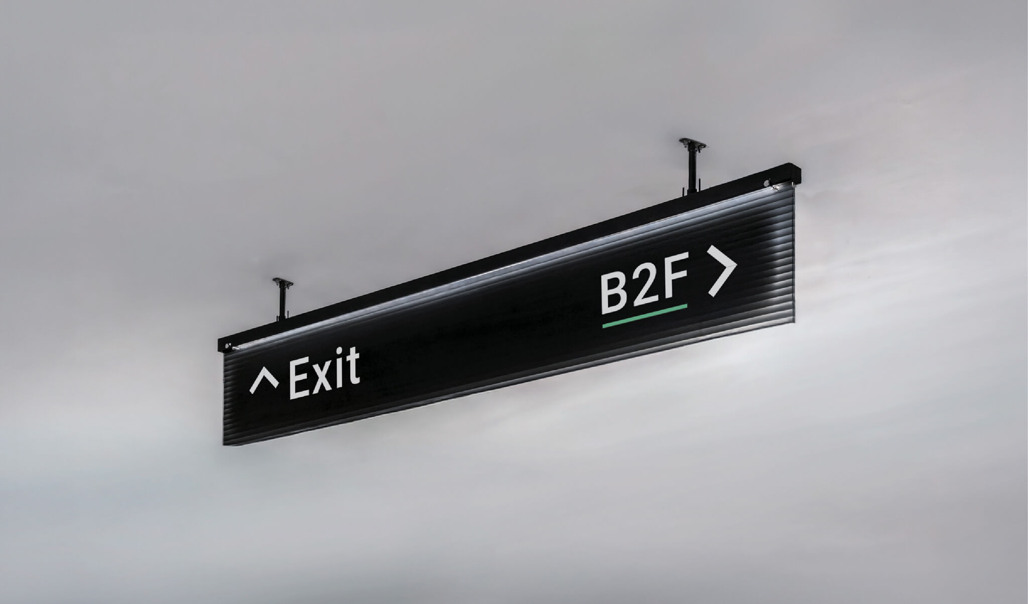
In everyday urban life, music flows like water—intangible yet continuous—connecting culture, space, and shared memories. Inspired by this idea, we adopted “music” and “water” as the core visual languages of the wayfinding design, symbolizing the ongoing exchange, integration, and continuity of culture within the city. The concept also reflects Sanfar Construction’s commitment to comfort and security, transforming residential space into a living environment that carries culture and emotion.

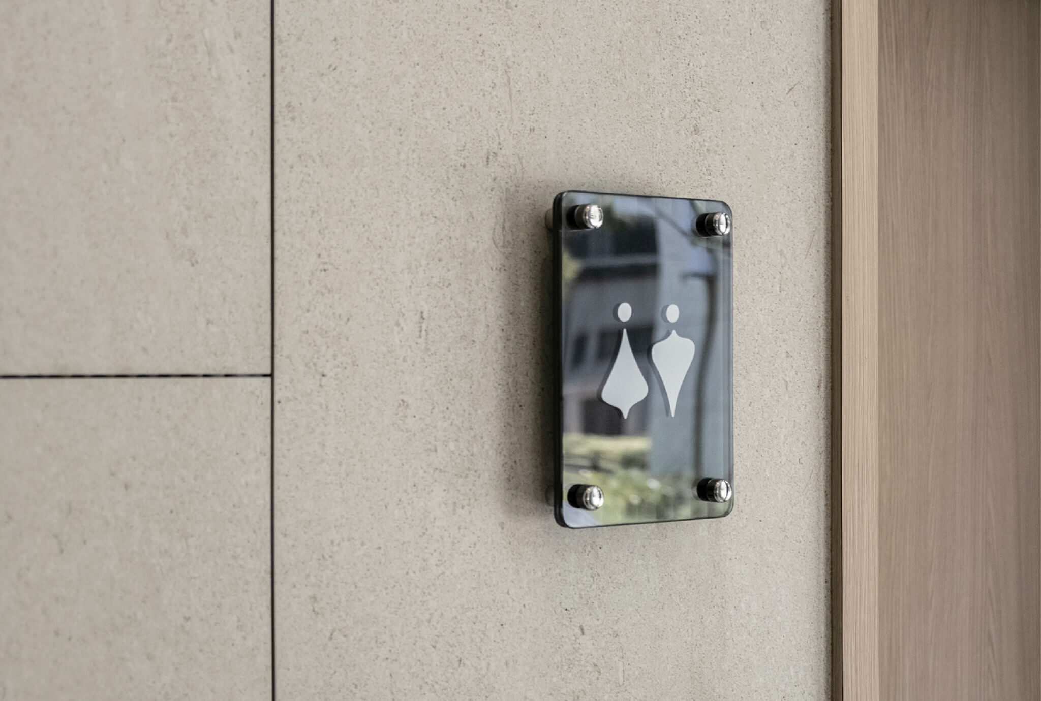
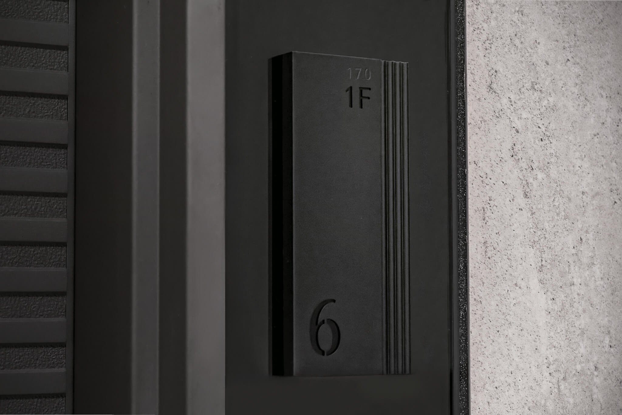
sanfar wayfinding system-2
sanfar wayfinding system-3
sanfar wayfinding system-4

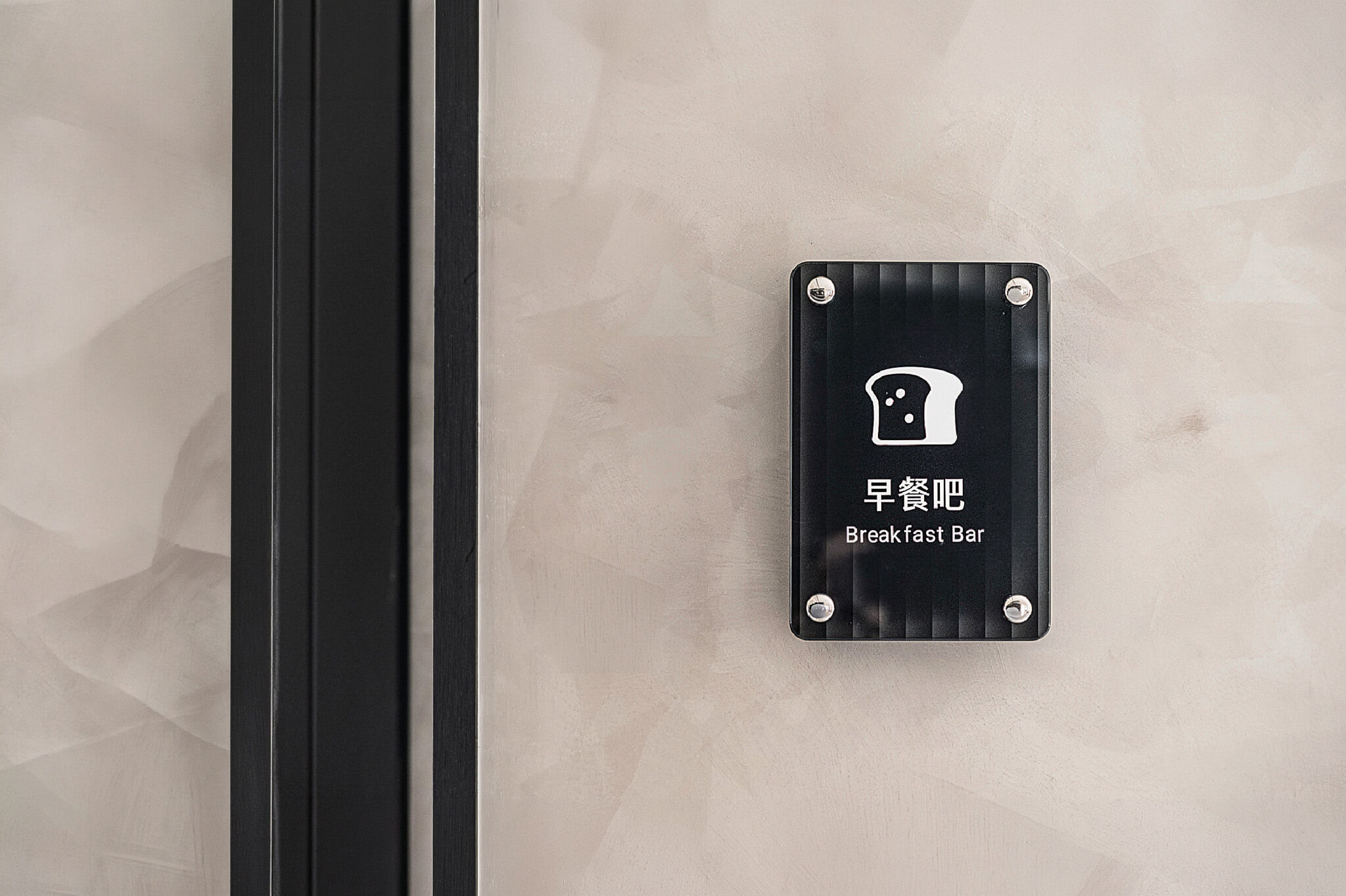
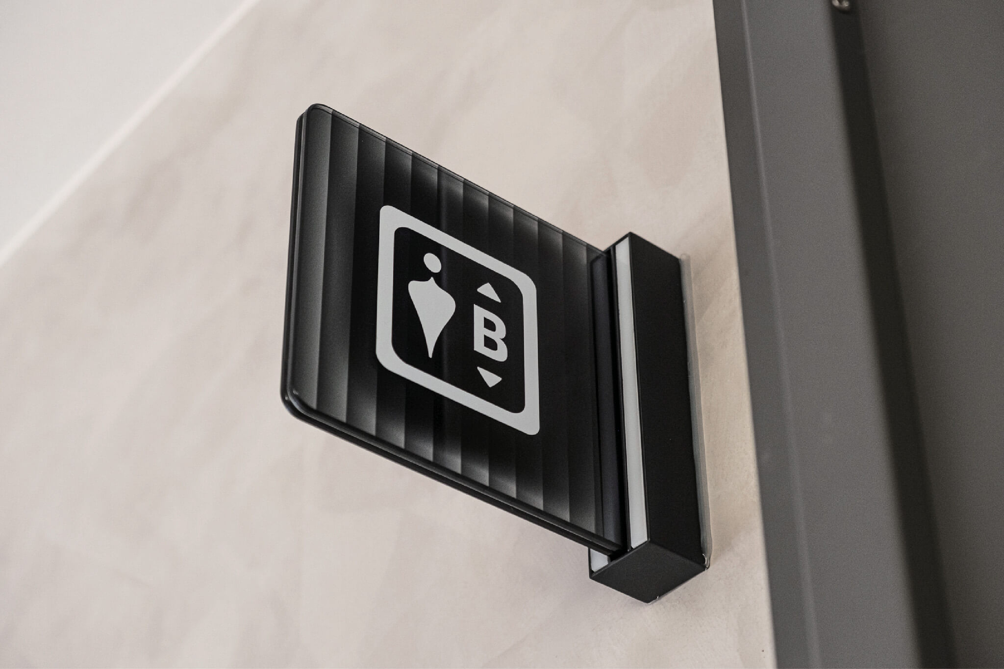
Glass as an Interpretation of Flow and Resonance

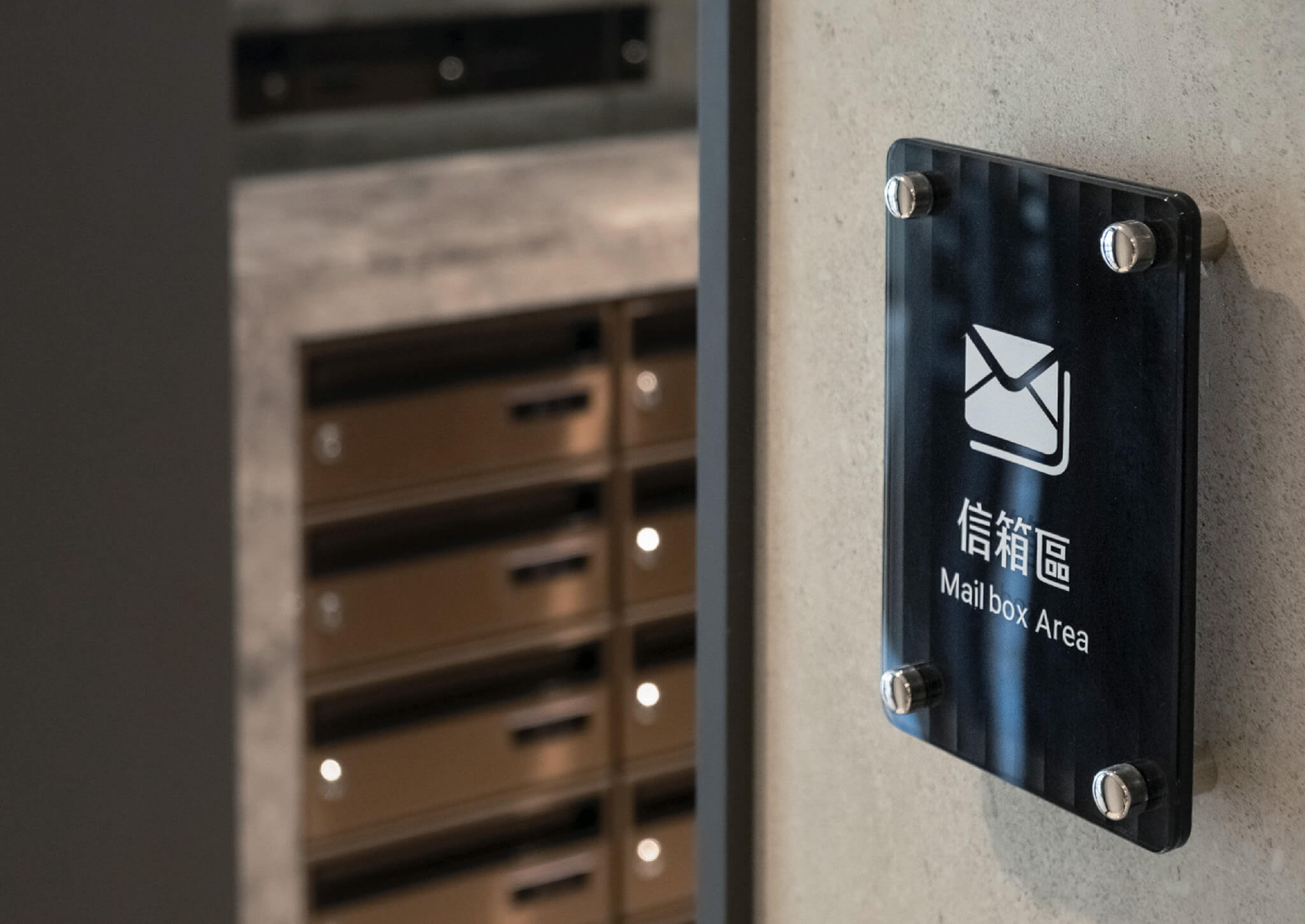
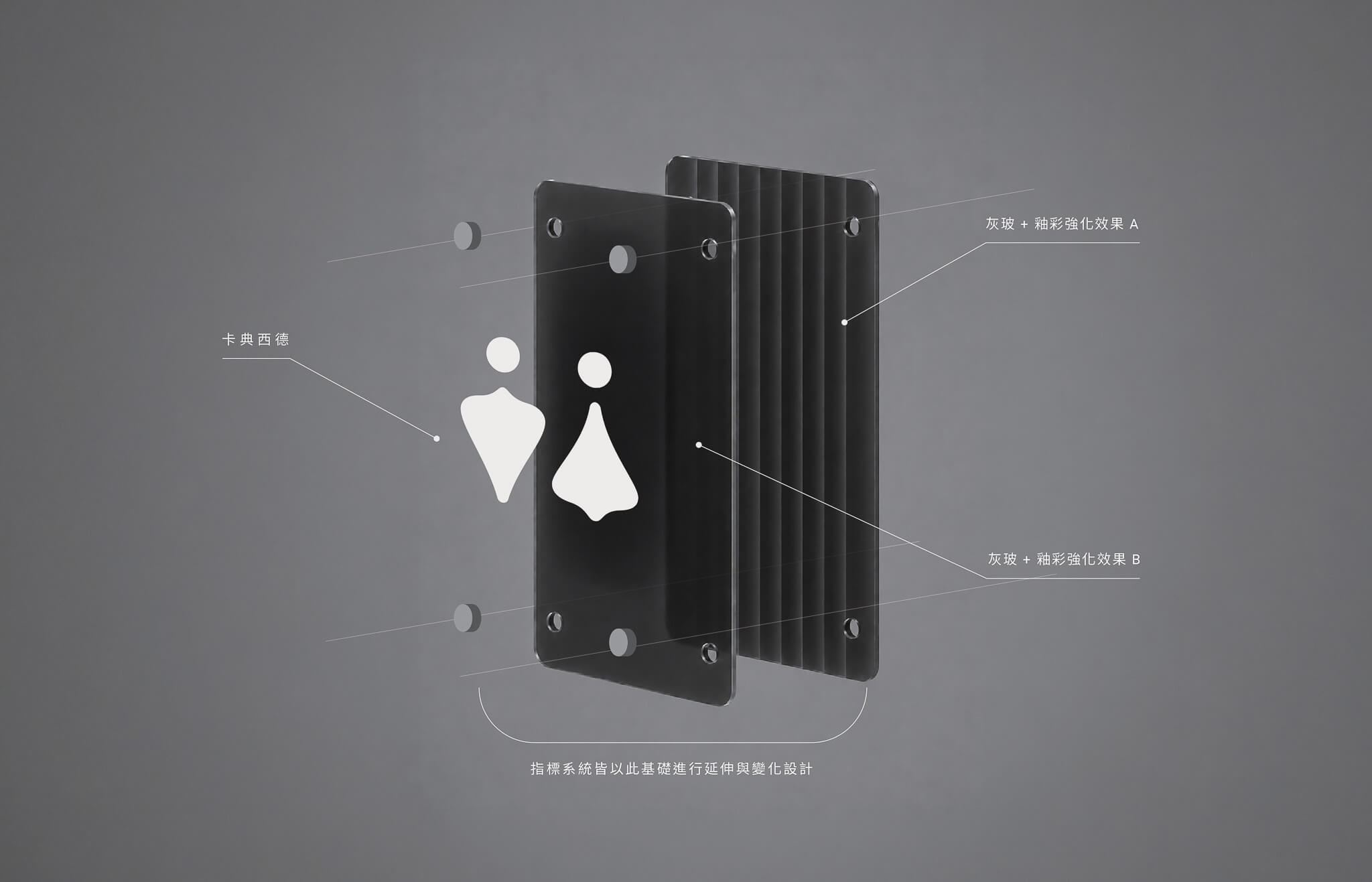
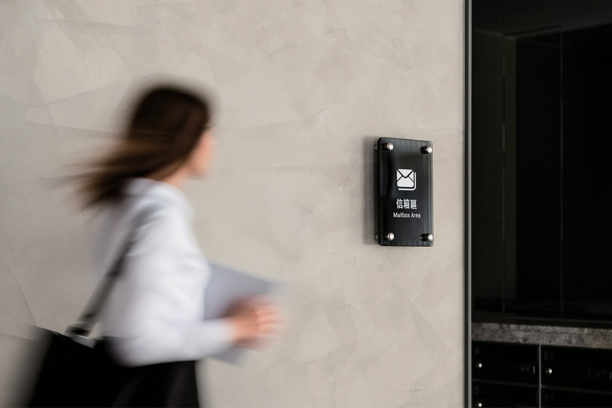
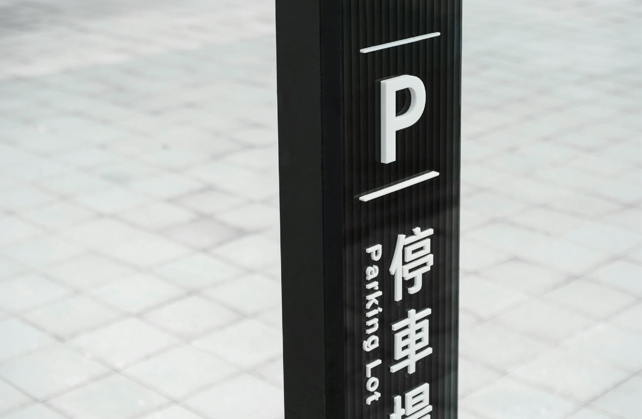
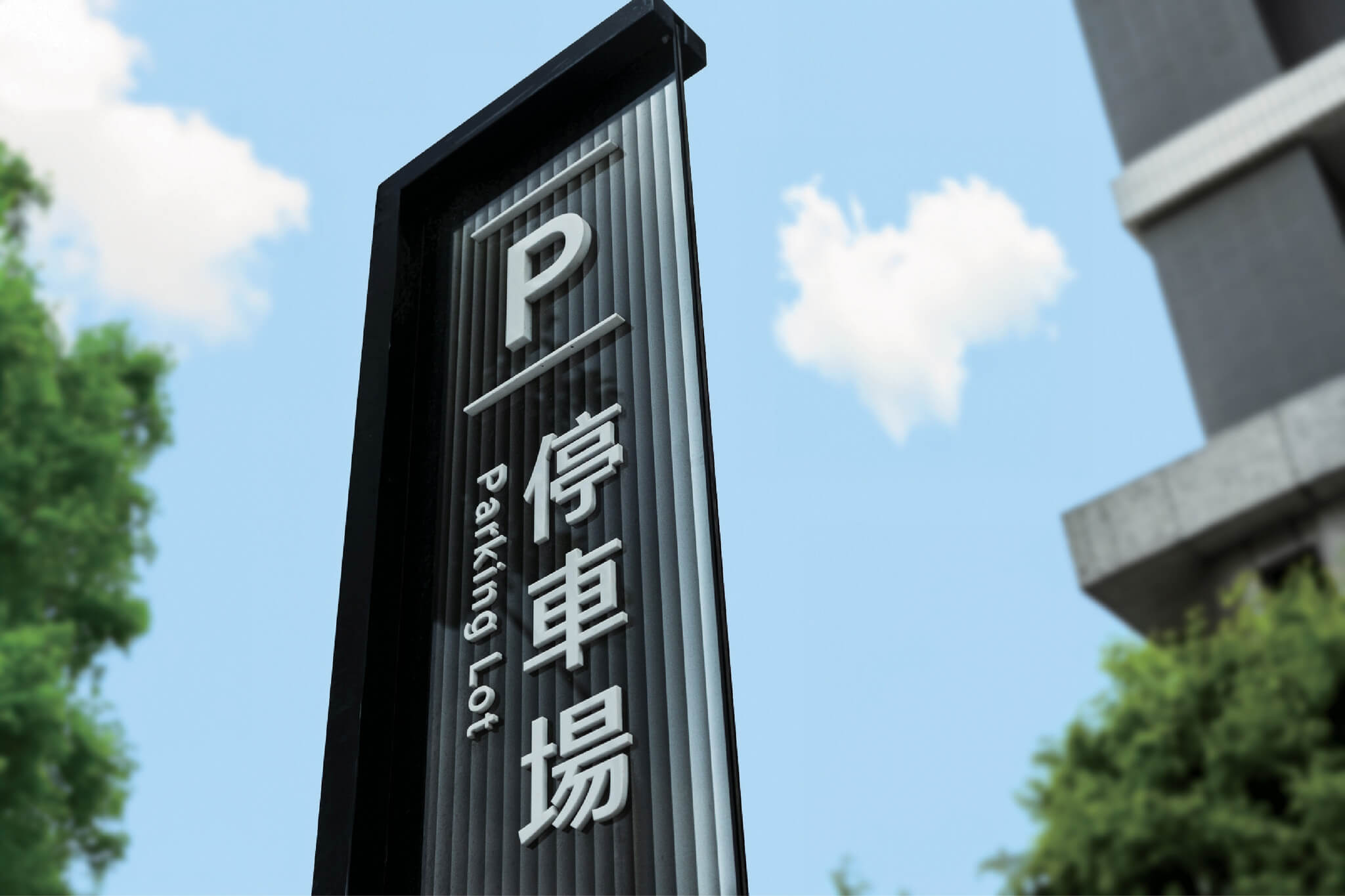
The transparency and layered qualities of glass connect music, culture, and the origins of life. Through overlapping glass, refracted light, and shifting shadows, the signage evokes the resonance of water waves and sound waves. More than guiding movement, each sign becomes part of the architectural environment, expressing the vitality and flow of culture.

sanfar wayfinding system-5
sanfar wayfinding system-6
sanfar wayfinding system-7
sanfar wayfinding system-8
sanfar wayfinding system-9
sanfar wayfinding system-10

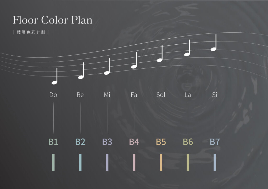
Building a Spatial Melody with Color

The color plan grows out of the perceived link between sound and color. Working from the idea of chromesthesia, each floor is given its own color identity with its own rhythm. As people move through the building, the colors unfold like notes and form a spatial melody in which sight and feeling are interwoven. This sharpens recognition within the wayfinding system and enriches the experience of the whole environment.

sanfar wayfinding system-14
sanfar wayfinding system-15
sanfar wayfinding system-16
sanfar wayfinding system-17
sanfar wayfinding system-18

From Testing to Delivery: Every Step Made for the Experience

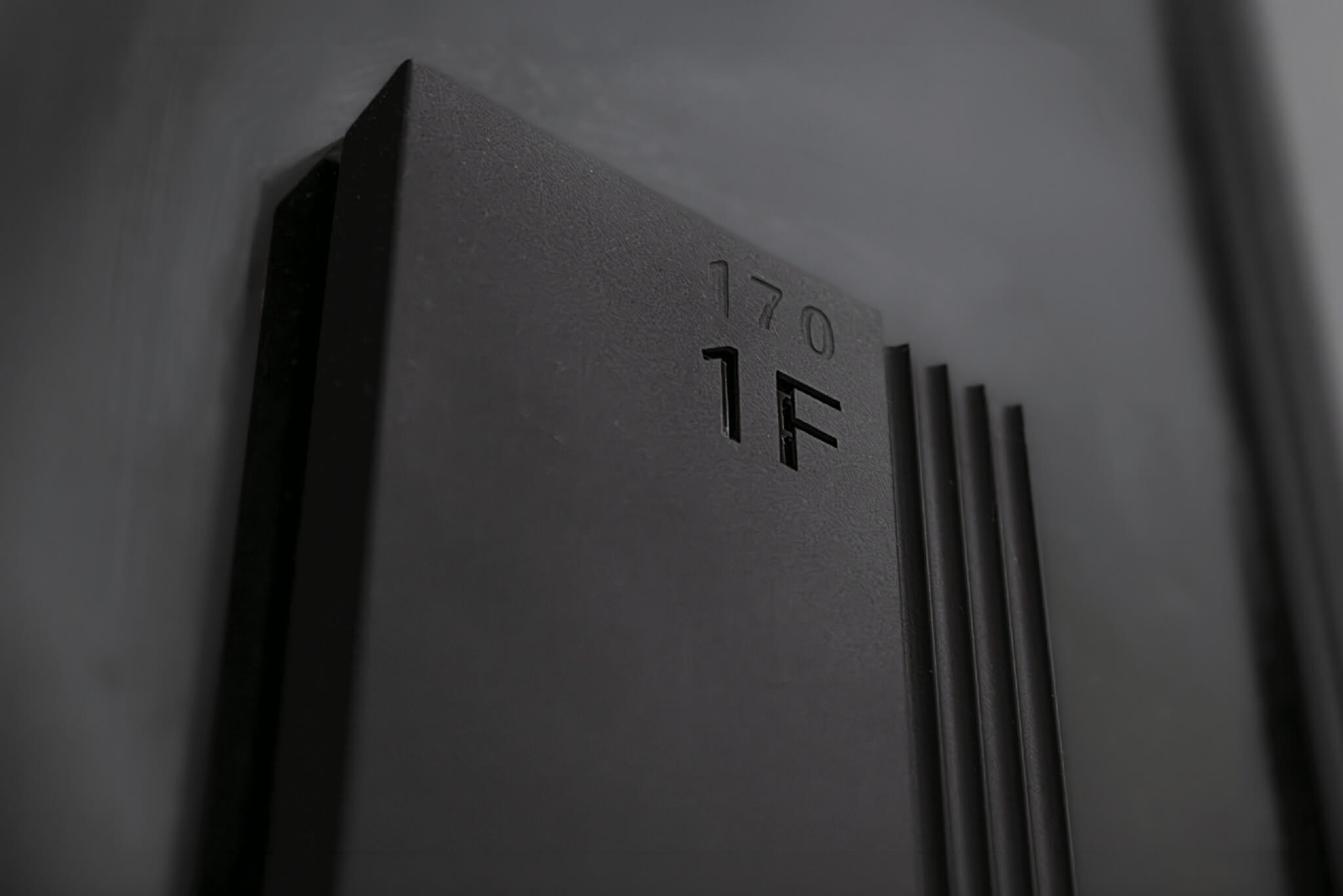
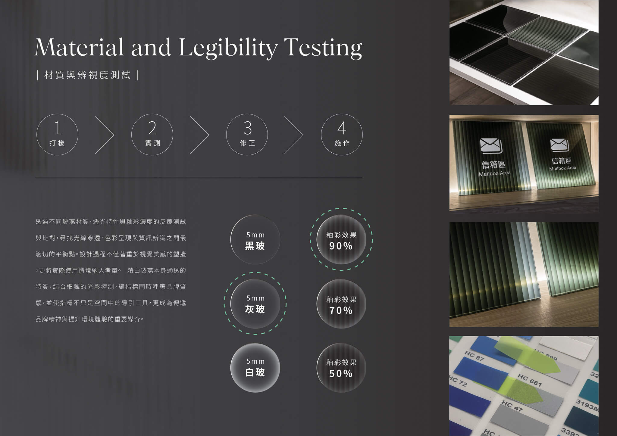
To fully realize the concept, we conducted multiple rounds of material sampling and on-site testing. Different glass types, glaze concentrations, firing temperatures, and layering methods were evaluated for their effects on light, color, and legibility. This process achieved a careful balance between visual expression, brand quality, and wayfinding functionality, ensuring that each sign delivers both design impact and an intuitive user experience.

sanfar wayfinding system-19
sanfar wayfinding system-21
sanfar wayfinding system-20

Case Closed
Project Manager
Lead Designer
Designer
Partner
Fonts
 

2025.10
Lien-chieh Su
I-chen Lee
Jun-xian Wu, Zhi-hao Yeh, Pin-chen Lee
San-Mei Art Glass Crative
Morisawa Arphic
Does your space need a wayfinding system?

Send us your floor plan and the problems you are running into. Hand-Heart offers a free site visit, a circulation review and an assessment of sign locations, and tells you honestly whether you need a complete system or whether a few adjustments are enough.

Book a free circulation review →

Or call us on 07-285-7000|[email protected]

Information Design|United Way of Taiwan

Design Concept

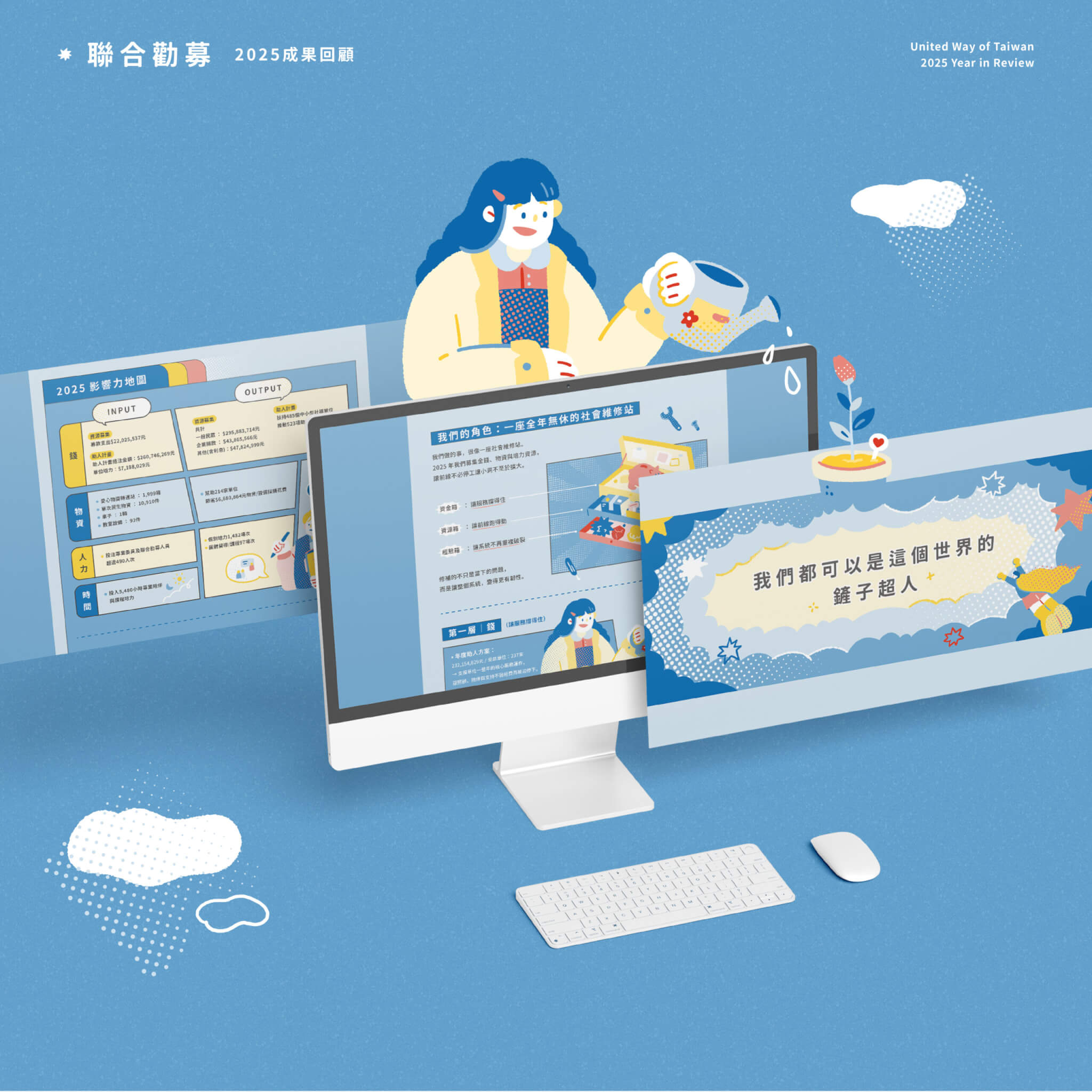
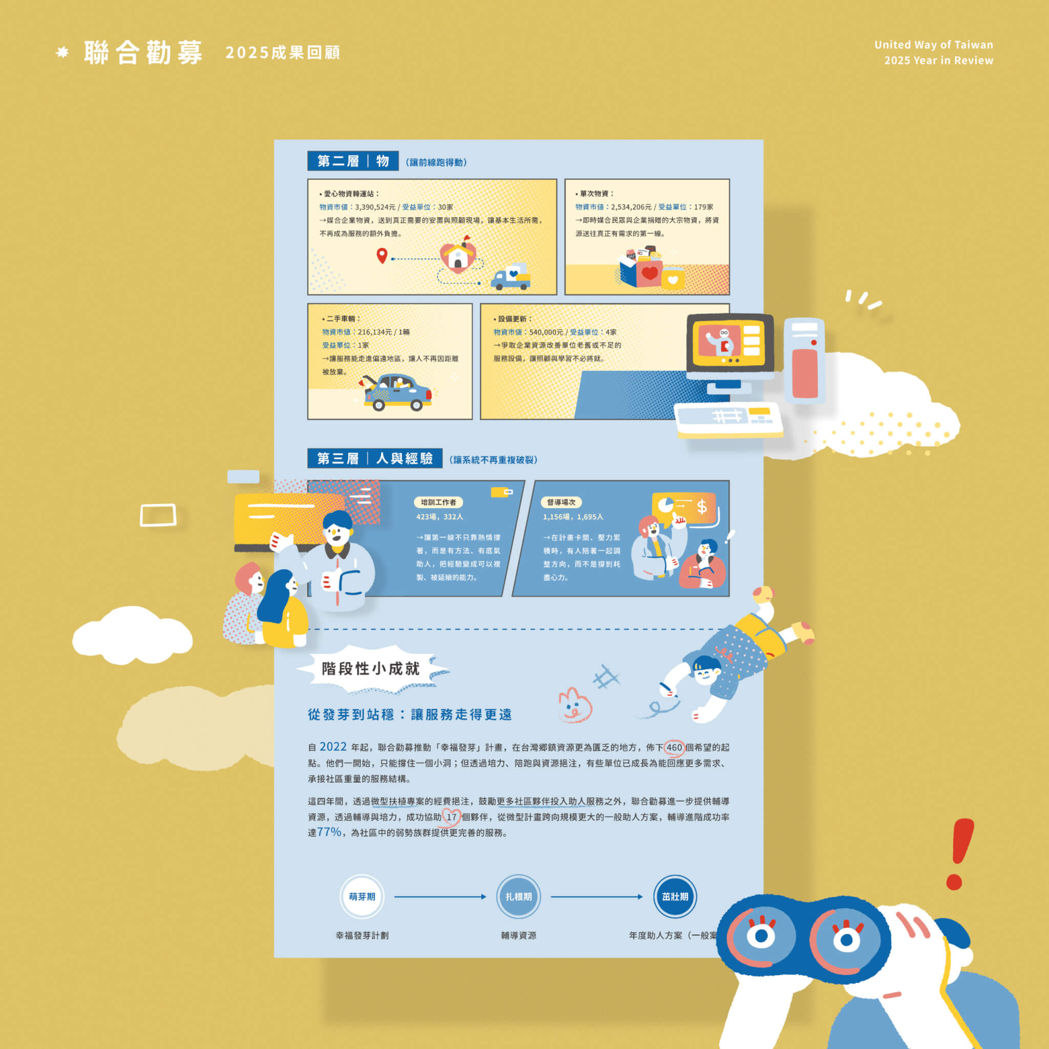
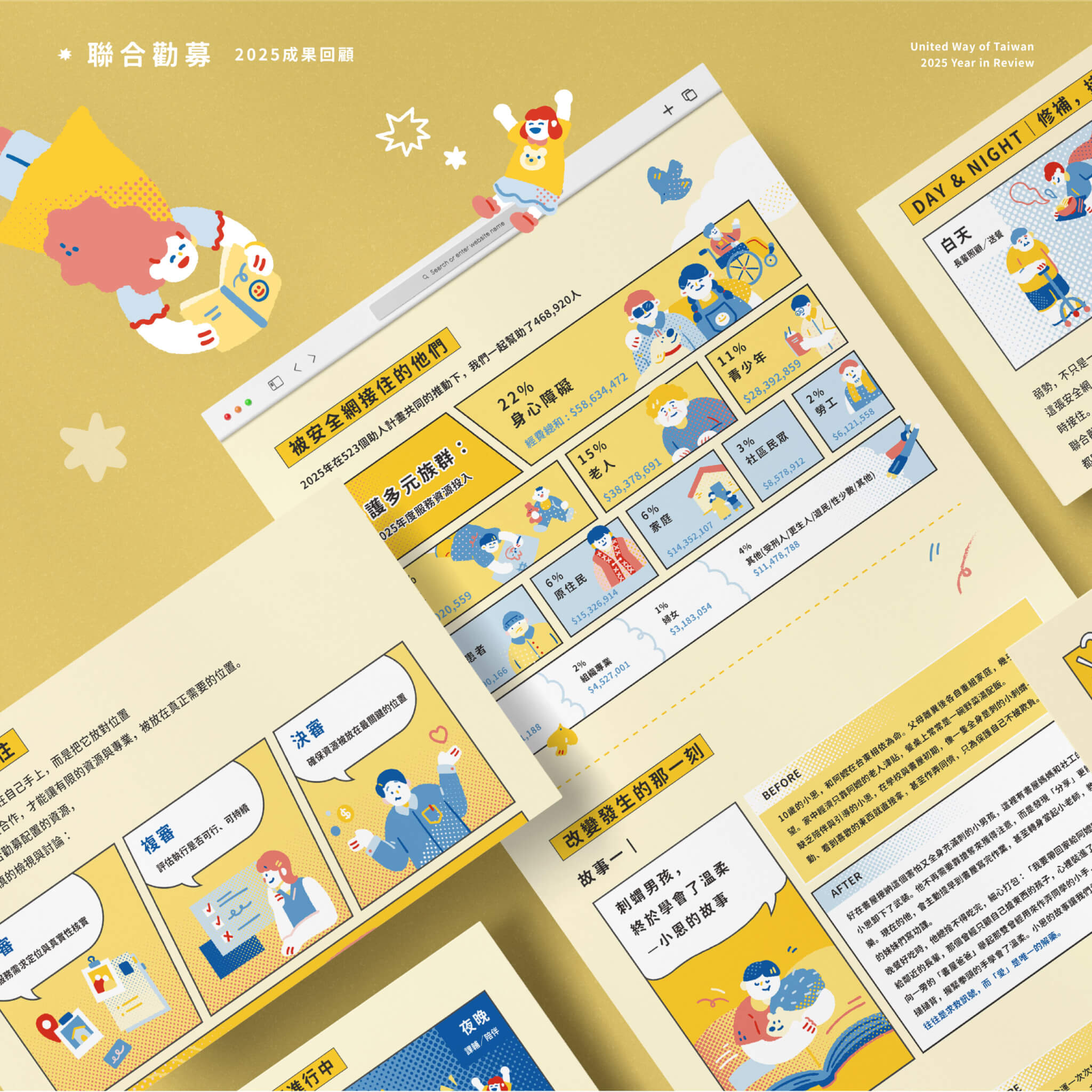
Panel by Panel, Making Every Act of Support Visible

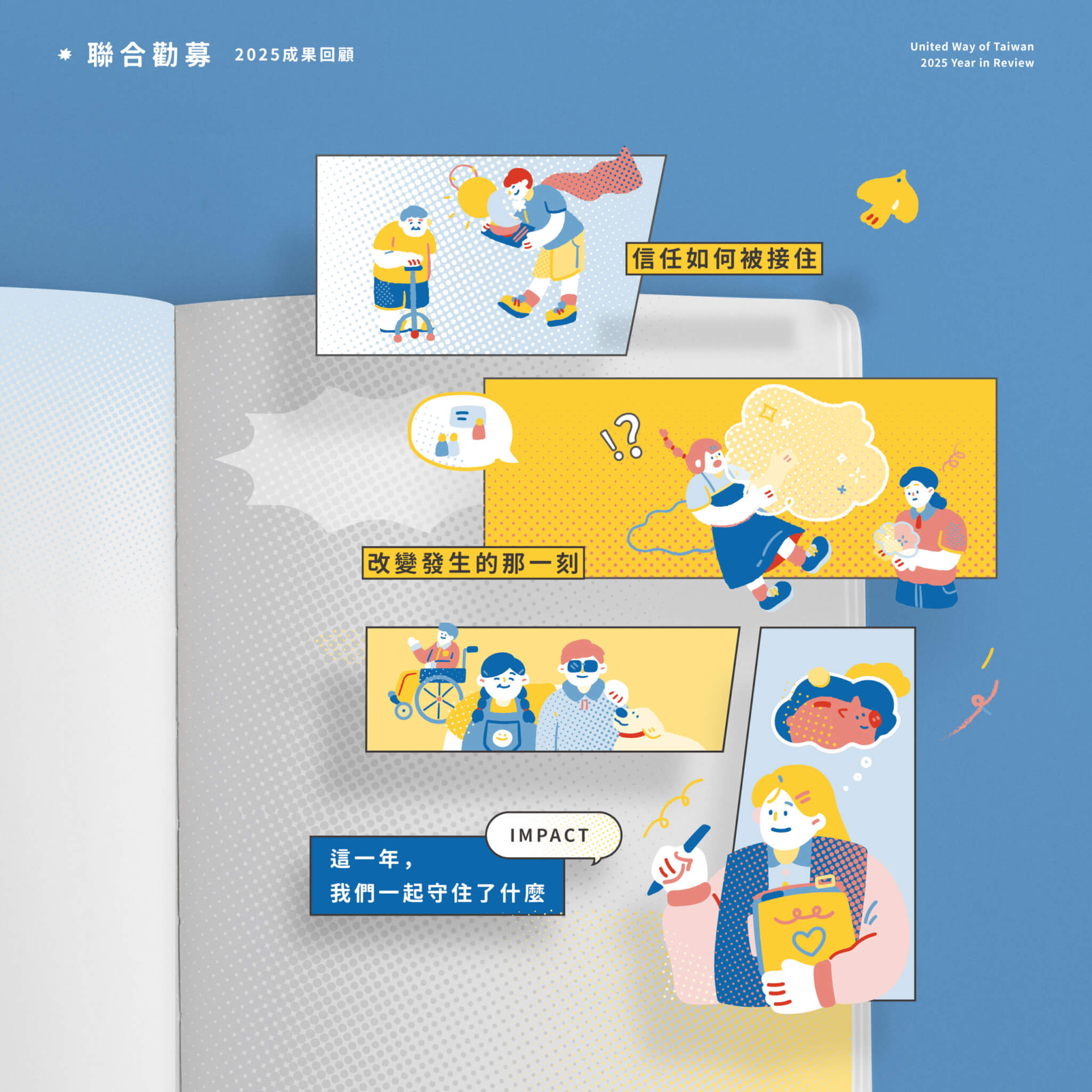
For five consecutive years, we’ve worked with United Way of Taiwan to transform a year of impact into stories that are easier to see and understand.  Inspired by this year’s “Shovel Heroes,” we drew from the visual language of classic superhero comics, turning a year of achievements into a story that unfolds panel by panel.
資訊視覺化 設計|聯合勸募 United Way of Taiwan|手心設計事務所(作品圖 2)

To organize complex data and service information, we used comic panels, cross-panel compositions, speech bubbles, and infographics to create a clear reading hierarchy. Halftone textures, speed lines, hand-drawn characters, and a bold yellow-and-blue palette bring narrative and rhythm to the information, making it more intuitive and engaging.
資訊視覺化 設計|聯合勸募 United Way of Taiwan|手心設計事務所(作品圖 3)

We believe design should do more than make information easier to read—it should make reading the beginning of understanding. From every donation to every meaningful change, information design helps make each act of support and its impact more visible.
資訊視覺化 設計|聯合勸募 United Way of Taiwan|手心設計事務所(作品圖 5)

Case Closed
Project Manager
Lead Designer
Designer


2026.05
Lien-chieh Su
I-chen Lee
Pin-chen Lee


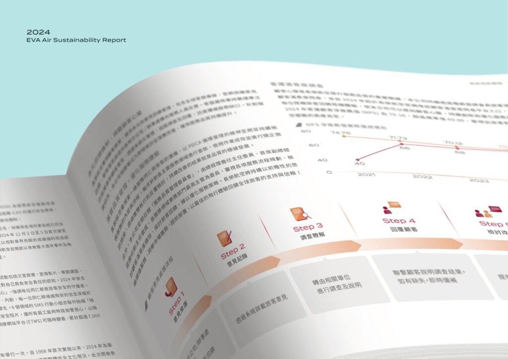
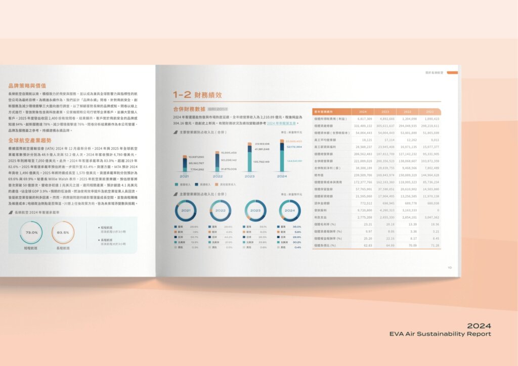
Sustainability Report Design|EVA Air 2024

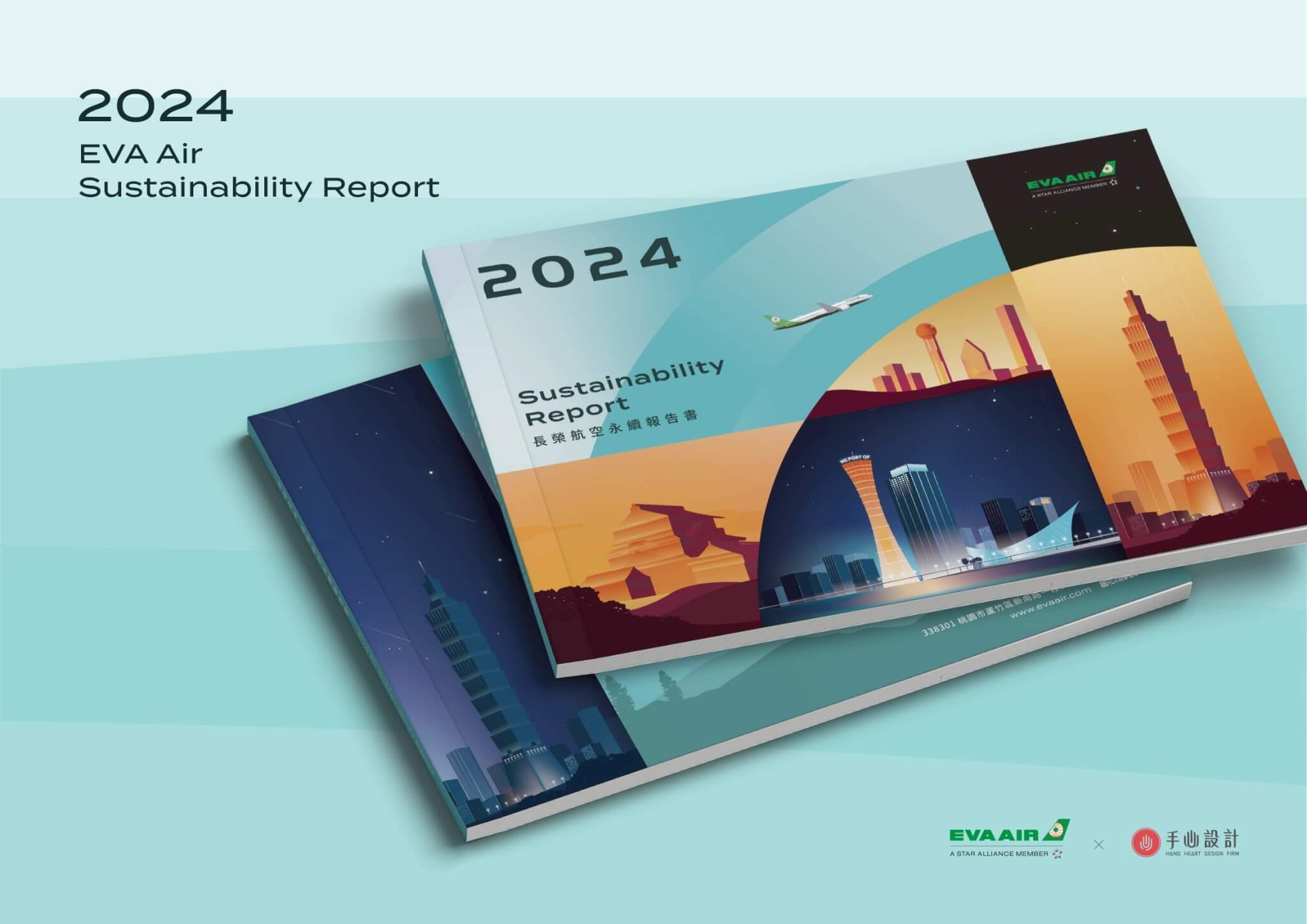
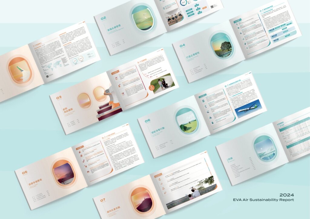
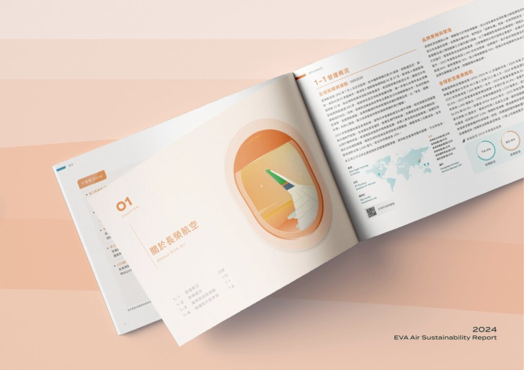
Hand-Heart Design Firm designed the sustainability report of EVA Air for a second year running (2024 edition). The cover uses hand-drawn illustration and geometric colour blocks to show the movement of flight paths, taking in landmarks from Ehime, Kobe, Houston, Dallas and Taipei 101. Inside, a dual-tone system based on the brand green runs through the chapters, so that sustainability information reads more simply and fluently.

For the second year in a row, we designed EVA Air’s Sustainability Report. Building on the brand’s global vision and professional identity, this year’s cover features hand-drawn geometric forms that evoke the movement of flight paths and the connections between destinations.


Landmarks from Ehime, Kobe, Houston, Dallas, and Taipei 101 appear beneath skies of shifting light—capturing EVA Air’s journey across time zones and landscapes.

A refined dual-tone palette inspired by the brand’s signature green carries through the interior, creating a clean, cohesive, and fluid reading experience.


Case Closed
General Manager
Project Manager
Designer

2025.08
Chih-yang Hsu
Amanda Huang
Wendy Zhang、Eric Hsu