
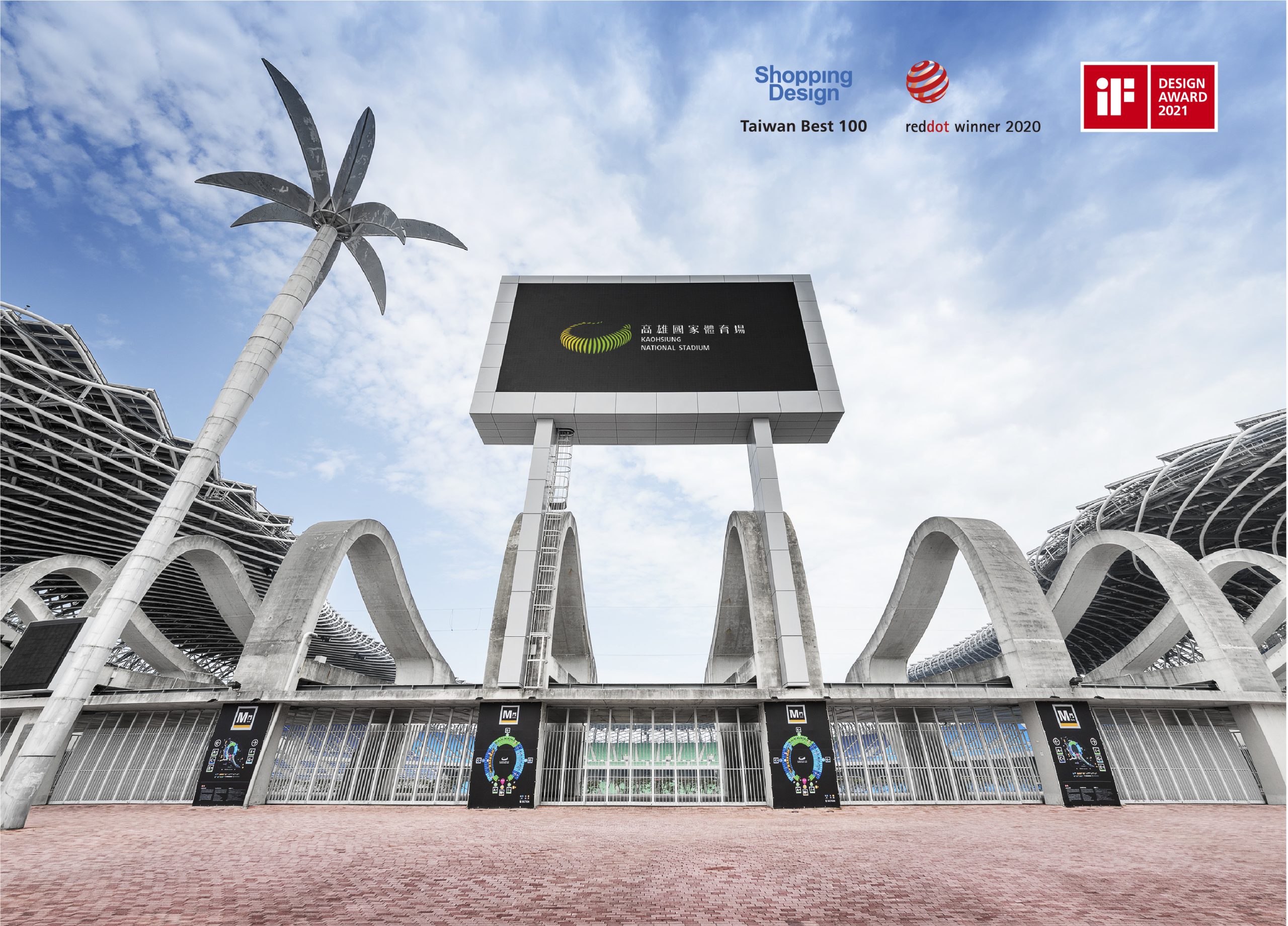
手心設計事務所為高雄國家體育場(2009 世界運動會主場館、建築師伊東豊雄設計)規劃全場館指標系統(Wayfinding System):分析舊有指標問題、重建色彩分區系統,並以科學化流程驗證視認性,讓觀眾由遠至近依色彩、圖案、英文、數字快速找到座位與出入口。本案獲德國紅點設計獎與 iF 設計獎雙料肯定,是台灣大型場館指標設計的代表案例。
緣起
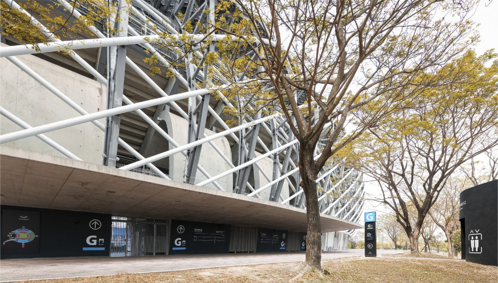
高雄國家體育場,為2009年世運主場館,是目前台灣最大、最重要的體育場館,出自由國際知名建築師伊東豊雄之手,是世界第一座有開口的體育場。卸下世運重責大任的它,依然是各種國際大型運動賽事與活動的舉辦地,更是民眾休憩、旅遊、享受大型育樂活動的重要地點。為保有場館的溫度與生命力,同時提升品牌價值,手心團隊特別針對視覺識別及環境識別進行wayfinding syetem指標設計 。
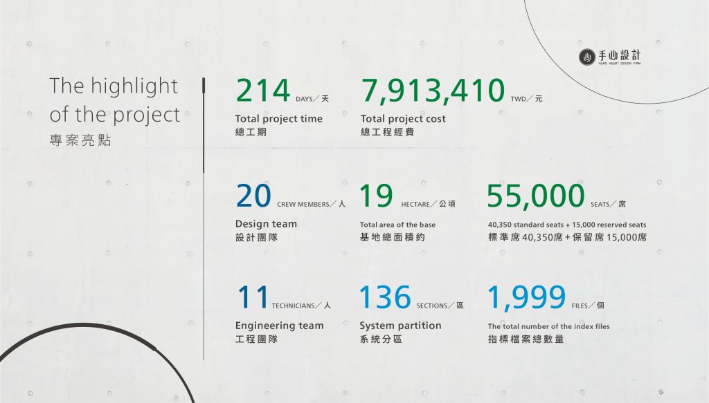
依業主 2019 年 3 月的需求說明書,新的指標系統要讓全區指示牌與管理牌誌達成一致、符合建築物無障礙設施設計規範、營造國際友善環境,也要針對日曬、降雨、鹽蝕與風化等條件選擇合適的材質;需求也涵蓋導覽摺頁、入口意象與選手區的環境美化。
The stadium initially built starting in 2009 due to the occasion of World Games in 2009 and also invited the well-known global architect- Toyo Ito to design the stadium with unique appearance and features.
The development of the stadium head to the multiple angles once the World Games was well accomplished; in addition to having various professional and worldwide sports and games taken place, it also good for having some art performance, music concert, the public activities in large scale provided as a fine public open area.
The scenery space outside of the stadium has also become a good choice for the general public spending time as leisure.


設計方法
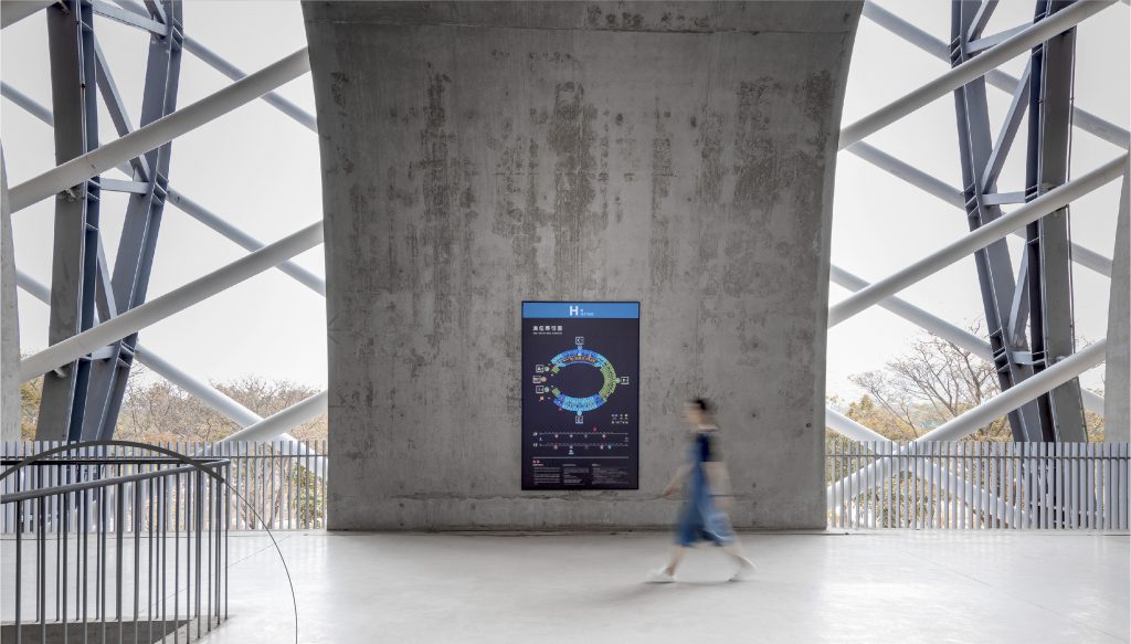
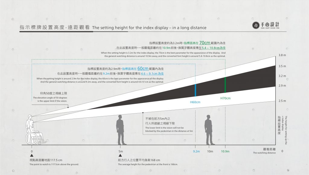
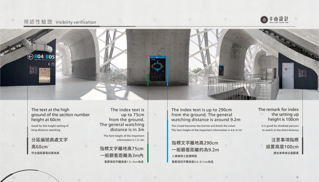
為了更深入了解問題並進行系統性的規劃,手心團隊分析了場館舊有的指標設計 問題並進行資料收集,經過一連串的概念發想與現場驗證後,激盪出各種關於場館的識別概念元素,經統整歸納,制定了指標設計規範。將空間的層級與資訊進行分類:由外而內、由大至小、由少至多,重新建構出新的分區系統,並透過科學化的流程驗證指標視認性並進行整體指標系統設計,打造出一套資訊簡潔、邏輯明確的指標系統、空間導引與動線規劃,讓使用者可依據可視距離由遠至近,輕易地透過色彩、圖案、英文、數字依序尋找相關資訊,有效縮短民眾透過指標找尋目標地點的時間。
Our team analyzed the index issue in the old facility, and also to summarized it.
They categorized and layered the space information and to resume and to construct the brand new seat number and partition system,
to lead to the appropriate height setting, the size of the font,
and also to execute the overall design over the index system through the visibility formula which can help the user to find the required information from distant to nearby,
and follow the sequence of color, pattern, English letter, numbers to find the required information and tremendously reduce the time that the audience to find their target.



這套指標系統包含哪些標牌?日後要怎麼維護?§
在 2019 年 4 月的服務建議書裡,手心先做了舊有指標的現況問題列表與項目清點,再把全場館的標牌整理成七大類:營運管理空間標牌、識別性標牌、引導性指示標牌、停車場標牌、公共空間告示、其他空間標示牌,以及環境美化設計;同時進行「視角與視距」與指標高度的研究,作為字高與設置高度的依據,也為 1F、2F 與 B1、B2 樓層訂出色彩編碼。
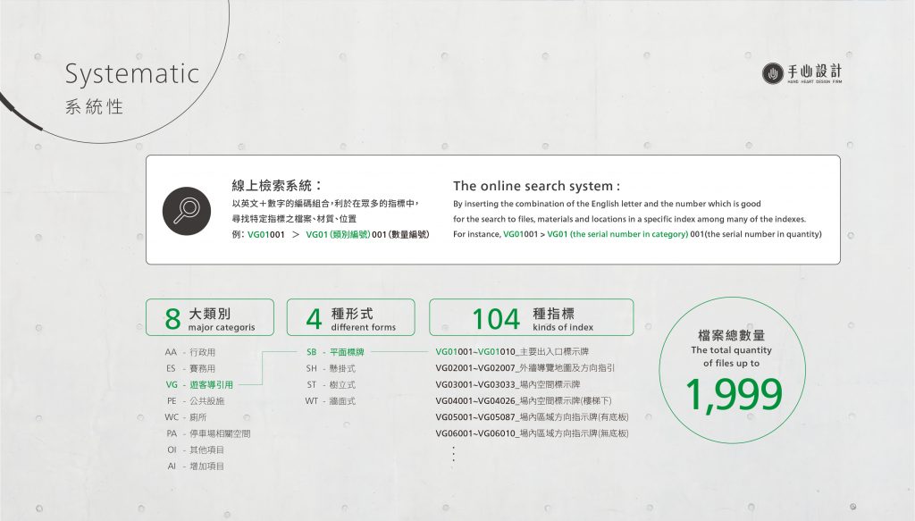
定案後的系統,依作品圖上的整理共分 8 大類別、4 種形式(平面、懸掛、樹立、牆面)與 104 種指標,每一面標牌都有「英文+數字」的編碼(例如 VG01001),方便從上千個檔案中查回對應的牌面、材質與位置。座位分區的顏色以電腦調色漆料維持一致,牌面則建議採用容易替換的材質,讓日後更新資訊時降低維護成本。
限制與挑戰
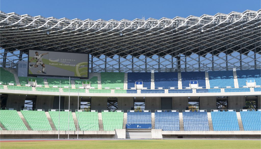
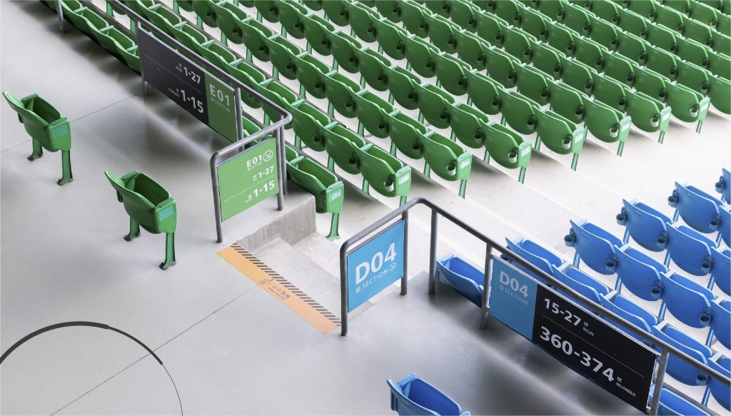
由於場館內原有的四萬張座椅無法更改色彩,手心團隊將這個侷限的條件轉換為設計特色,以座椅色彩作為座位分區系統,為了搭配建築本體「清水模」的材質特性,同時強化資訊的視認性,因此選用無彩色的底色,期望能弱化指標對原有建築的影響,同時保有指標設計高度的環境識別與指標視認機能,營造出具有活力、現代化、律動的視覺意象。
There are 40,000 old seats in the stadium with the trouble to alter the color; the team turns the design constrain around to become a special design feature by categorizing the color of the seat in a bigger number as the seat partition and to categorizing the partition with a smaller number.
And to match up the feature of the building itself -the Fair-faced concrete mold, and to enhance the visibility of the information to pick up non-color as the base color and anticipate that it is able to have the index and the original building with a better match and in the meantime to maintain high consciousness of environmental identification and the index visibility function.



展望與發展
透過此次設計更新,我們為高雄國家體育場打造出清晰而具識別度的國際化識別系統與指標設計,使場館印象在來訪者心中歷久彌新,並留下深刻而清晰的印象,未來我們也將針對本案的其他設計項目陸續進行更詳細的設計說明與成果分享,期待嶄新的環境識別設計能讓大家體驗到高雄國家體育場的新氣象。
The role-playing for the National Stadium will accompany with the citizens in Kaohsiung City and even to all the fellow people in the country to step forward to a very long term future, and it’s about time to think about how we’re going to establish a long-lasting, energetic, modern, and also bear high readability of the brand name identifying system for the National Stadium.
We expected the visual indication and the brand name can deliver and implant deeply into the heart of the people through the design of the brand name identification; it can not only sustain the glory and the success of the World Games but also bring up the general public with the multiple angels of the healthy and energetic sporty image of the brand-name and also to fulfill more energy and power to the location of the stadium, the nearby area, space, and the people concentration.



哪些場館適合參考高雄國家體育場的指標系統?§
如果您的場館有以下情況,高雄國家體育場這個案例的做法可以參考:
- 如果您的座位分區多、座椅顏色不能改,可以依座椅色彩分區。
- 如果您的牌面多、日後需更新資訊,可以逐面編碼並選用易替換材質。
可以參考的順序是:先分類空間層級與資訊,再依視角與視距訂定字高與設置高度,最後逐面編碼。
場館指標從分區、視認性驗證到編碼維護的做法,整理在指標系統設計。
結案時間 Completion Time – 2020.01
指標系統與視覺識別系統設計 Designer – 徐志揚 Chih-yang, Hsu、林宜慧 Yi-huei, Lin、李奕臻 I-chen, Lee、潘東 Dong, Pan、盧臆雯 I-wen Lu、周一潔 Yi-jie Zhou、劉家溱 Jia-qin, Liu、江珮瑜 Pei-yu, Chiang、王彥筑 Yen-chiu, Wang、劉又瑄 Yo-xuan, Liu、黃庭莉 Ting-li, Huang、莊淳喻 Chun-yu, Chuang、邱若寧 Re-ning, Chiu、李其晉 Chi-jin, Lee、蘇上棋 Shang-qi, Su、謝奇彣 Chi-wen, Hsieh
專案顧問 Project consultant – 李億勳 Yi-hsun, Lee、洪明宏 Ming-hong, Hong、蔡頌德 Sung-te, Tsai
設計總監 Design Director – 徐志揚 Chih-yang, Hsu
專案管理 Project Manager – 蘇連捷 Lien-Chieh, Su
攝影 Photographer – 王大衛 David Wang
—
#高雄國家體育場 #世運主場館 #指標設計 #視覺識別系統設計 #環境識別系統設計 #導視系統 #設計策略分析 #設計管理 #視覺辨識 #視認性 #人因工程 #手心設計
你的空間也需要一套指標系統嗎?
把平面圖與遇到的問題交給我們。手心提供免費現場場勘、動線診斷與指標點位評估,並誠實告訴你:需要的是一套完整系統,還是局部調整就夠。
預約免費動線診斷 →或直接來電 07-285-7000|[email protected]