
Design Concept
三發地產(三發建設)的住宅建案指標系統,由手心設計負責公設空間標牌、電梯與樓層標示,以及地下停車場的車道導引與色彩計畫。這套系統規劃供多個建案共用。設計以「流動之音」為核心概念,運用層疊的釉彩玻璃與依樓層變化的色彩。
三發的住宅建案,指標系統設計要處理哪些問題?§
三發住宅建案的指標系統要處理跨建案共用、地下停車場導引與公設空間辨識。
- 同一套規範用在多個建案,棟別立體字等材質與停車格總長寬須依各建案調整。
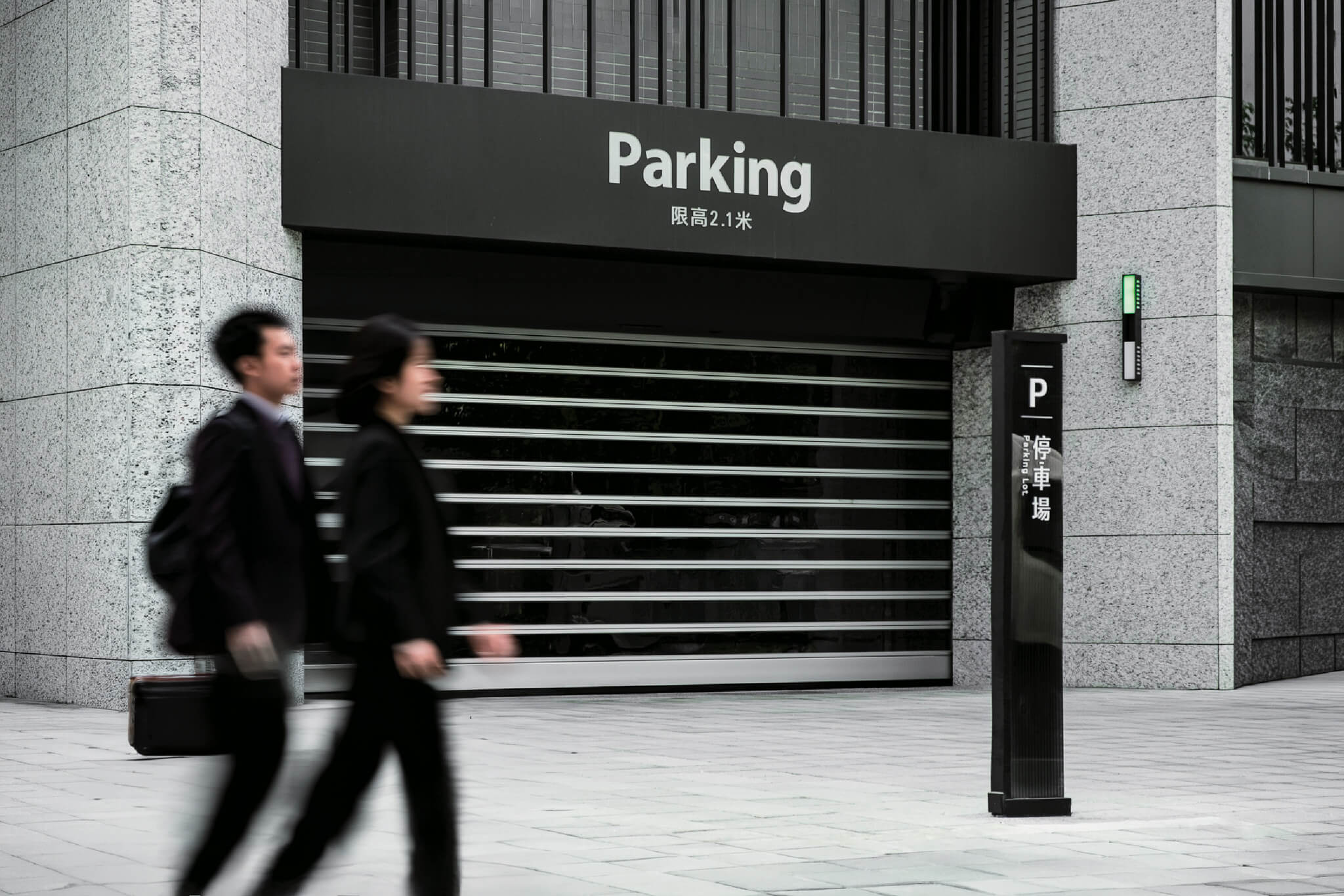
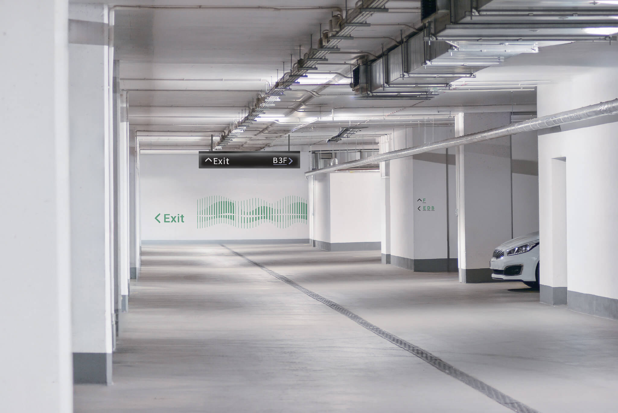
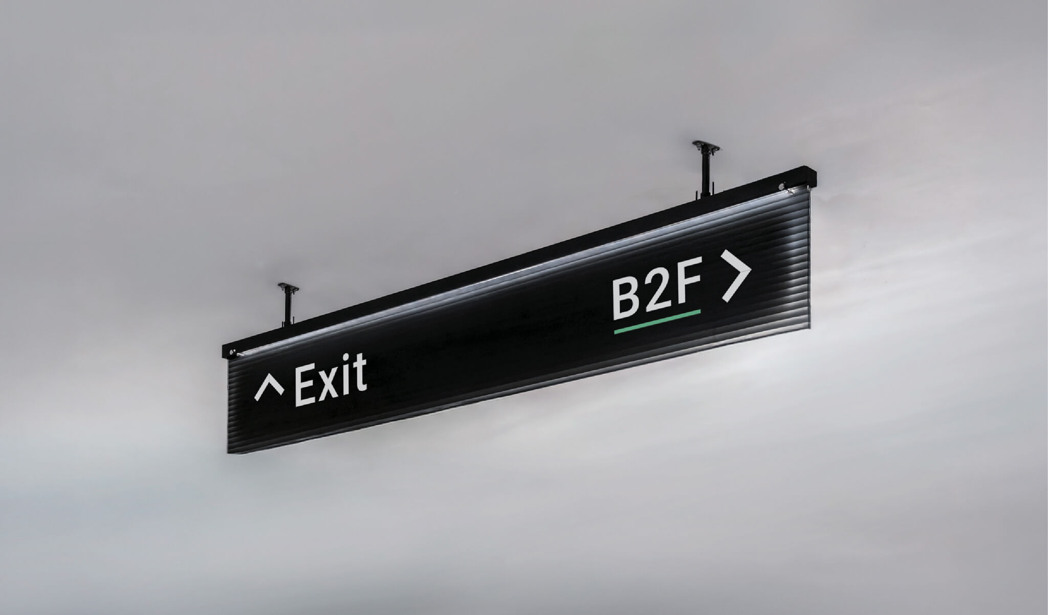
- 地下停車場包含車道下懸式標牌與車道紅綠燈,B1 到 B7 各有對應的樓層色。
- 健身房、宴會廳、琴房、分享廚房與親子室等公設空間,另有一組圖標。
三發的指標系統從什麼概念出發?§
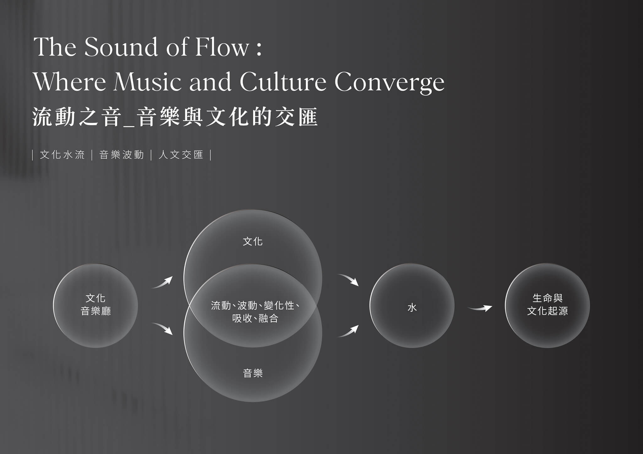
流動之音,音樂與文化的交匯
在城市的日常裡,音樂如同流水,無形卻持續流動,串聯文化、空間與人們的生活記憶。我們以此為發想,將「音樂」與「水」共同作為指標系統的設計語彙,象徵文化在城市中不斷交流、融合與延續,也呼應三發建設所倡導的安心居住精神,讓空間不只是居所,更成為承載文化與情感的生活場域。
The Flowing Sound: Where Music and Culture Converge
In everyday urban life, music flows like water—intangible yet continuous—connecting culture, space, and shared memories. Inspired by this idea, we adopted “music” and “water” as the core visual languages of the wayfinding design, symbolizing the ongoing exchange, integration, and continuity of culture within the city. The concept also reflects Sanfar Construction’s commitment to comfort and security, transforming residential space into a living environment that carries culture and emotion.
2024 年 3 月 7 日的初稿,從音樂、文化、安心、永續四個品牌關鍵字發展出三個方向:A「建築中的音樂響應」、B「音樂與建築交織,點亮生活軌跡」、C「流動之音:音樂與文化的交匯」。2024 年 6 月 4 日的精稿只保留 C「流動之音」,將音樂與水共有的流動、波動、變化性、吸收與融合整理成設計語彙。
以玻璃詮釋流動與共鳴
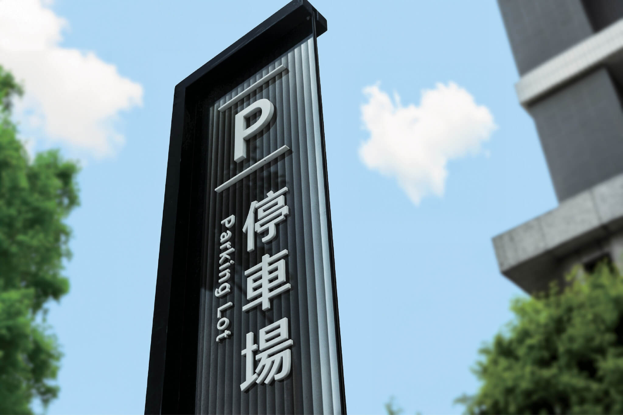
設計運用玻璃通透且富有層次的材質特性,將音樂、文化與生命起源相互連結。透過玻璃層層堆疊、光線穿透後形成的折射與光影變化,描繪水波與音波交織共鳴的流動意象,使指標不僅引導方向,更成為建築空間中的一部分,持續傳遞文化流動的生命力。
The transparency and layered qualities of glass connect music, culture, and the origins of life. Through overlapping glass, refracted light, and shifting shadows, the signage evokes the resonance of water waves and sound waves. More than guiding movement, each sign becomes part of the architectural environment, expressing the vitality and flow of culture.
三發指標系統包含哪些標牌?§
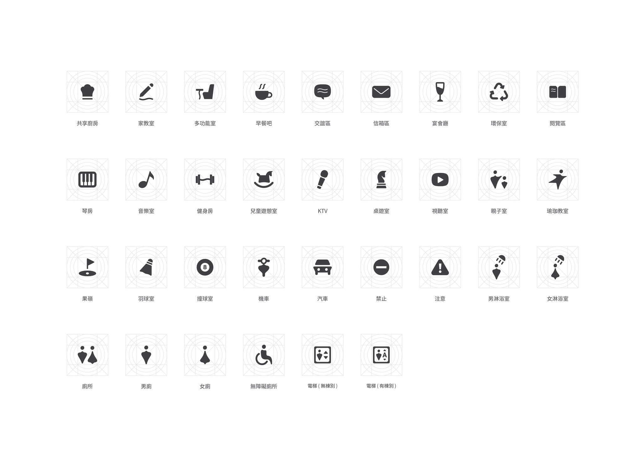
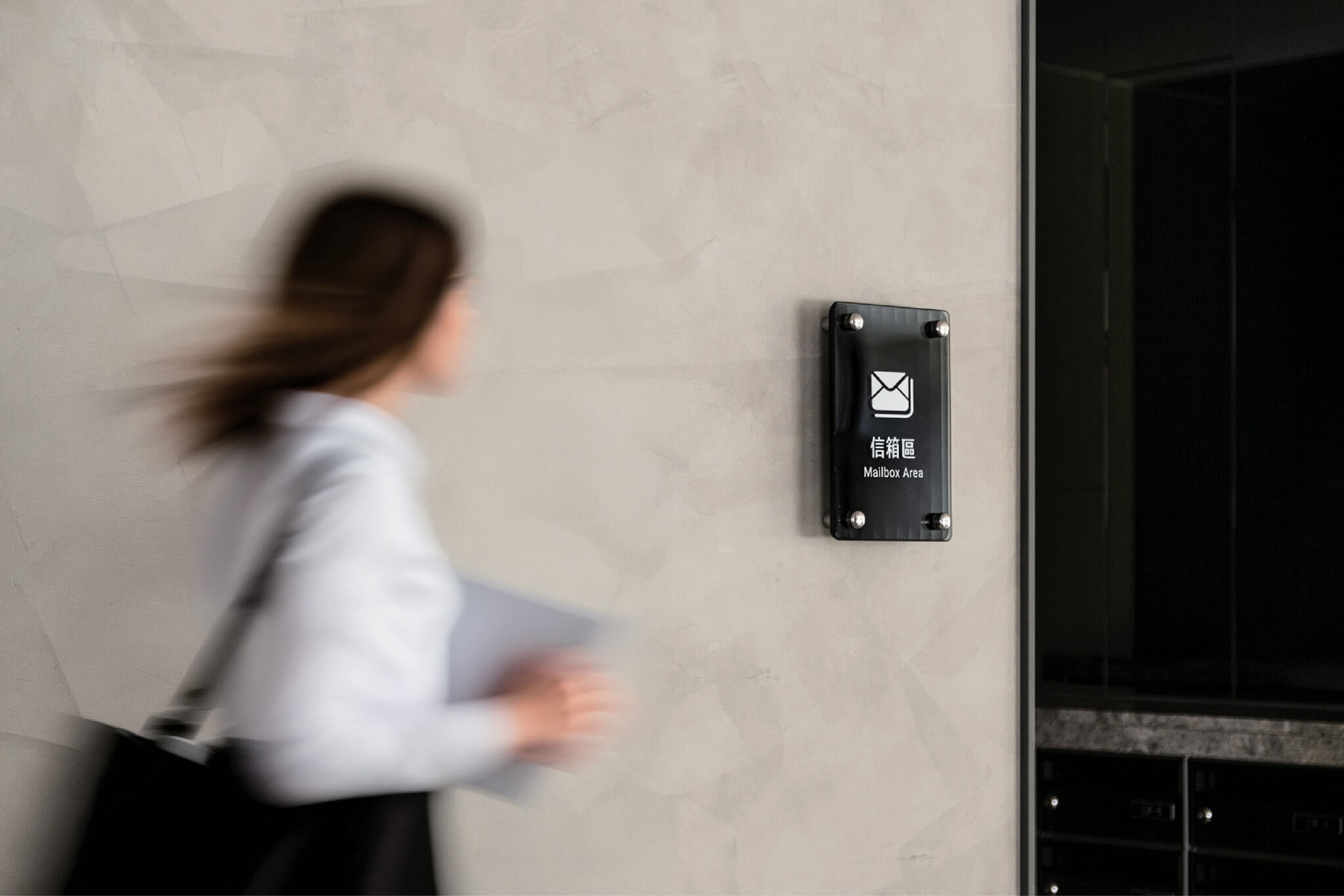
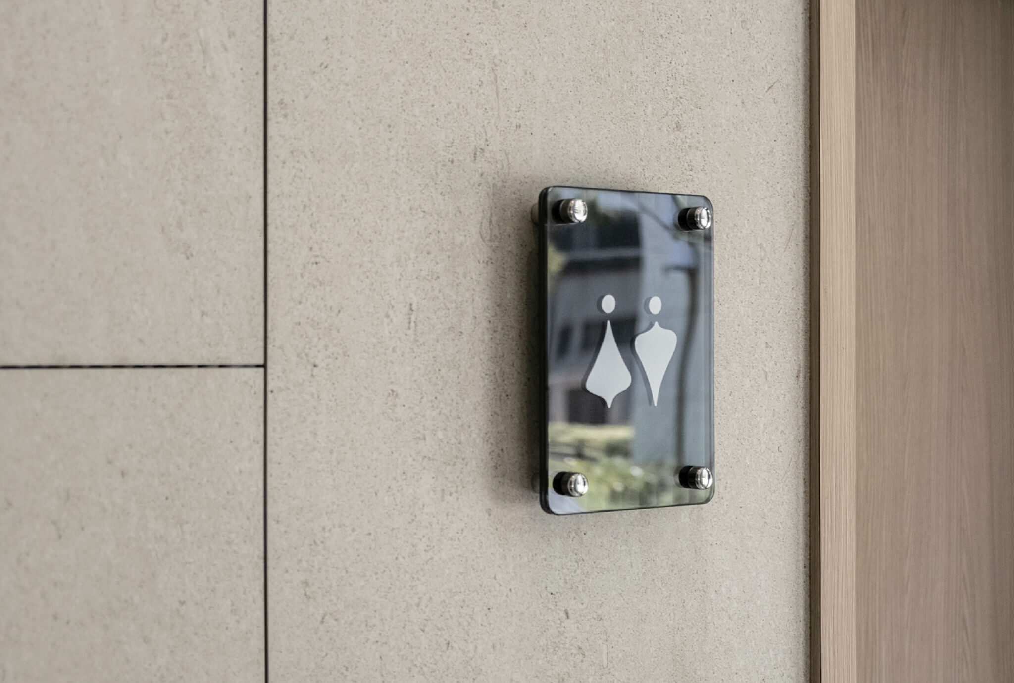
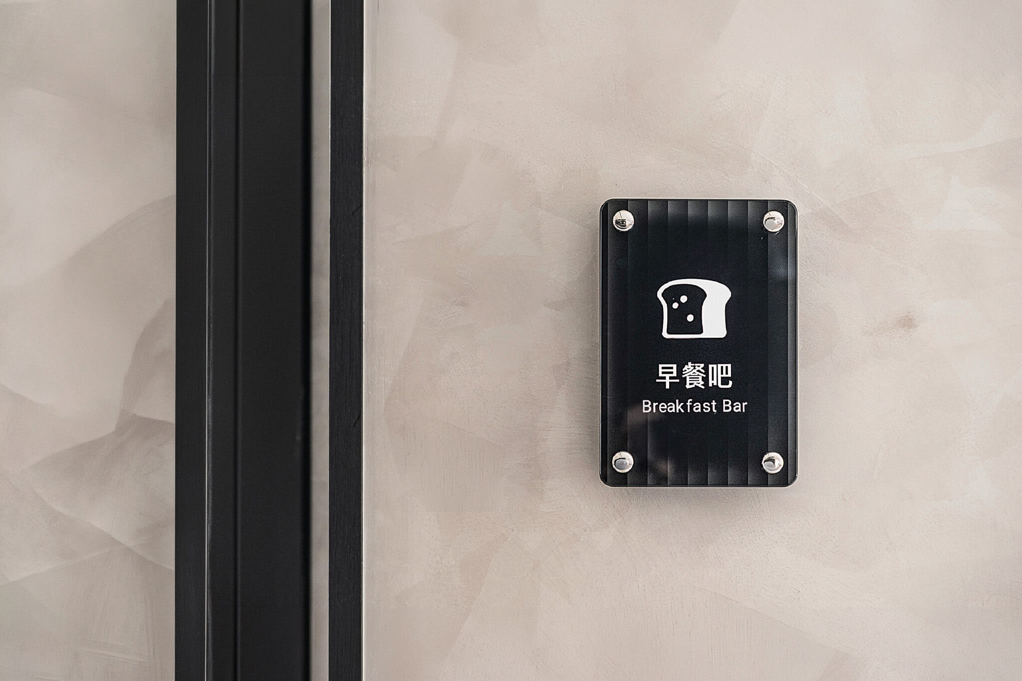
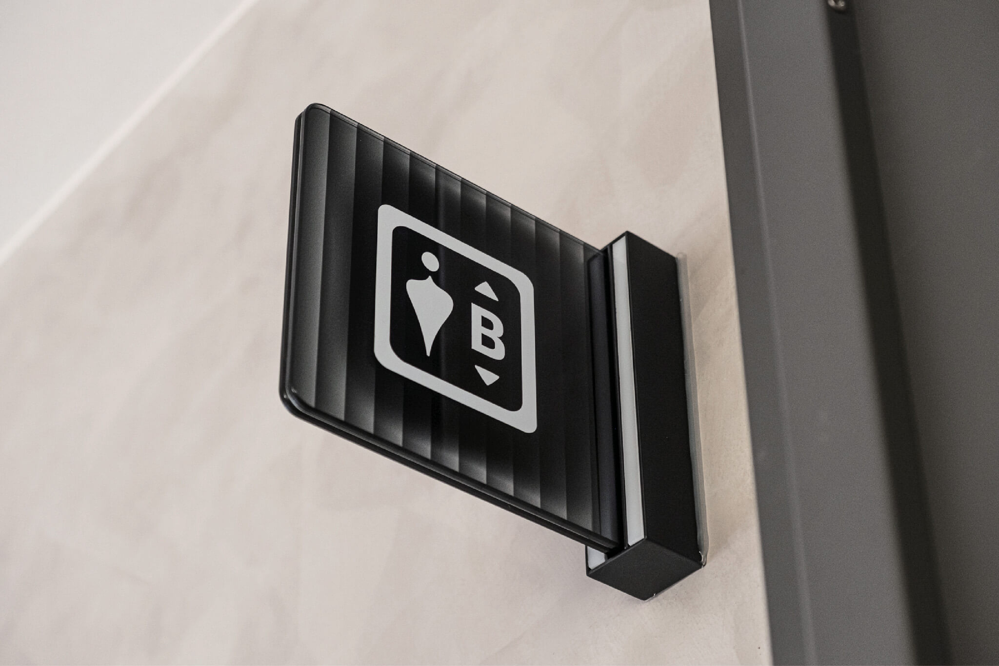
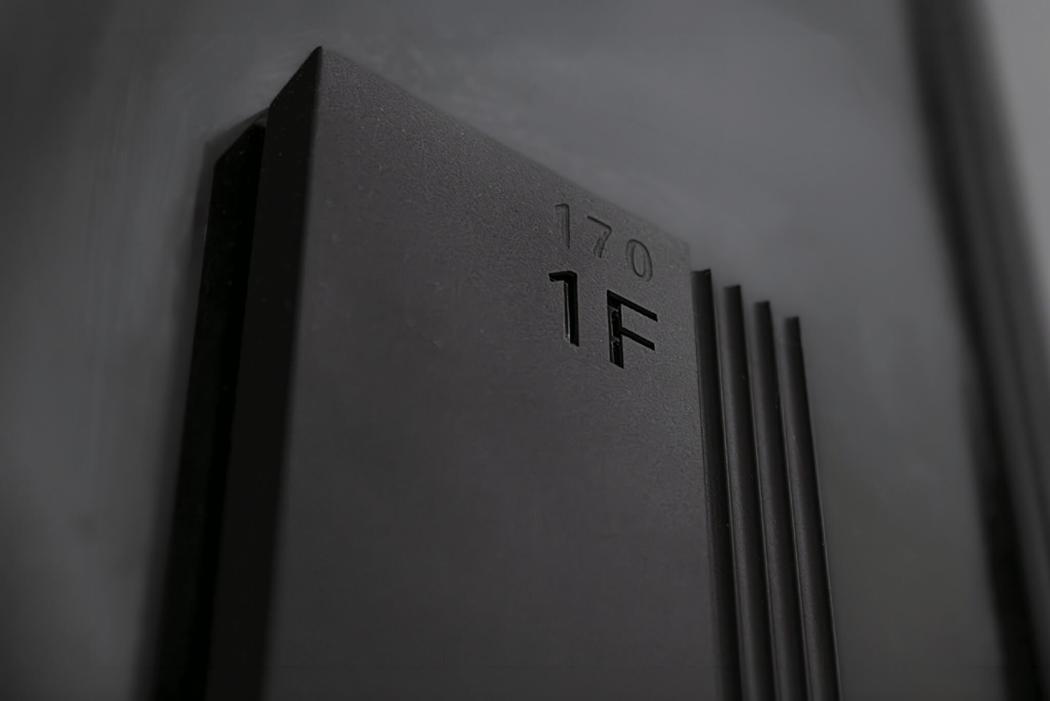
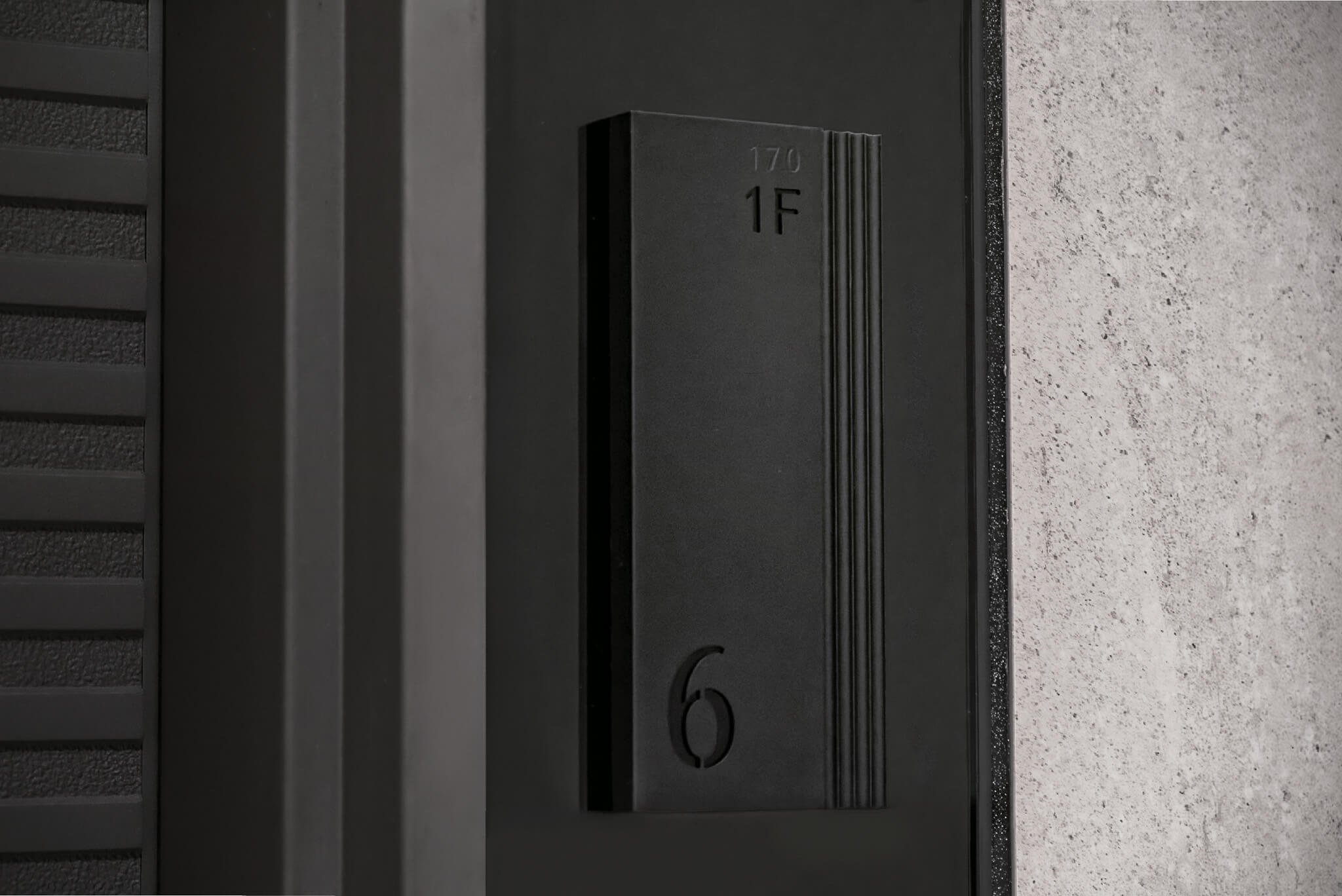
整套系統依位置與用途分成 A 到 K 共十一種形式:地下室入口的樹立式標牌、車道上方的下懸式方向指引、公共空間牆面式標牌、電梯側懸式標牌、後勤空間牆面式標牌,以及樓層立體字、棟別立體字、柱面指引、兩種牆面引導與車道紅綠燈。公設空間另外設計了一組圖標,涵蓋健身房、宴會廳、琴房、KTV、分享廚房、親子室、閱覽區、兒童遊憩室等空間。
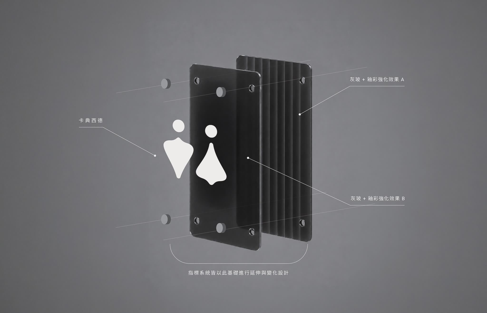
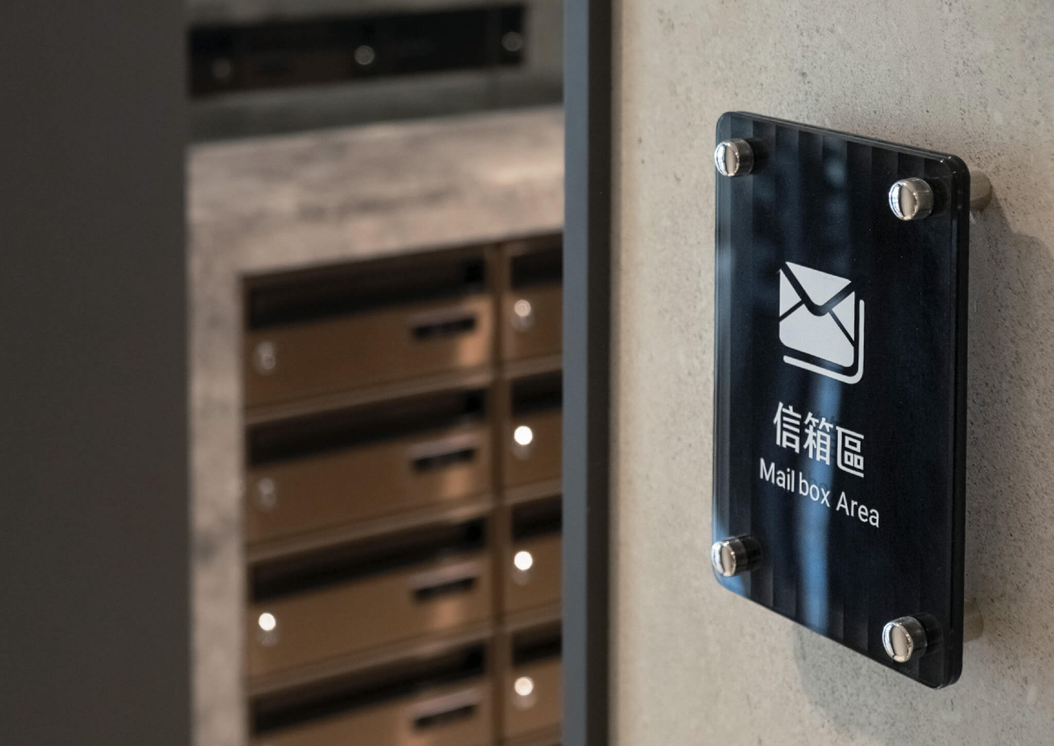
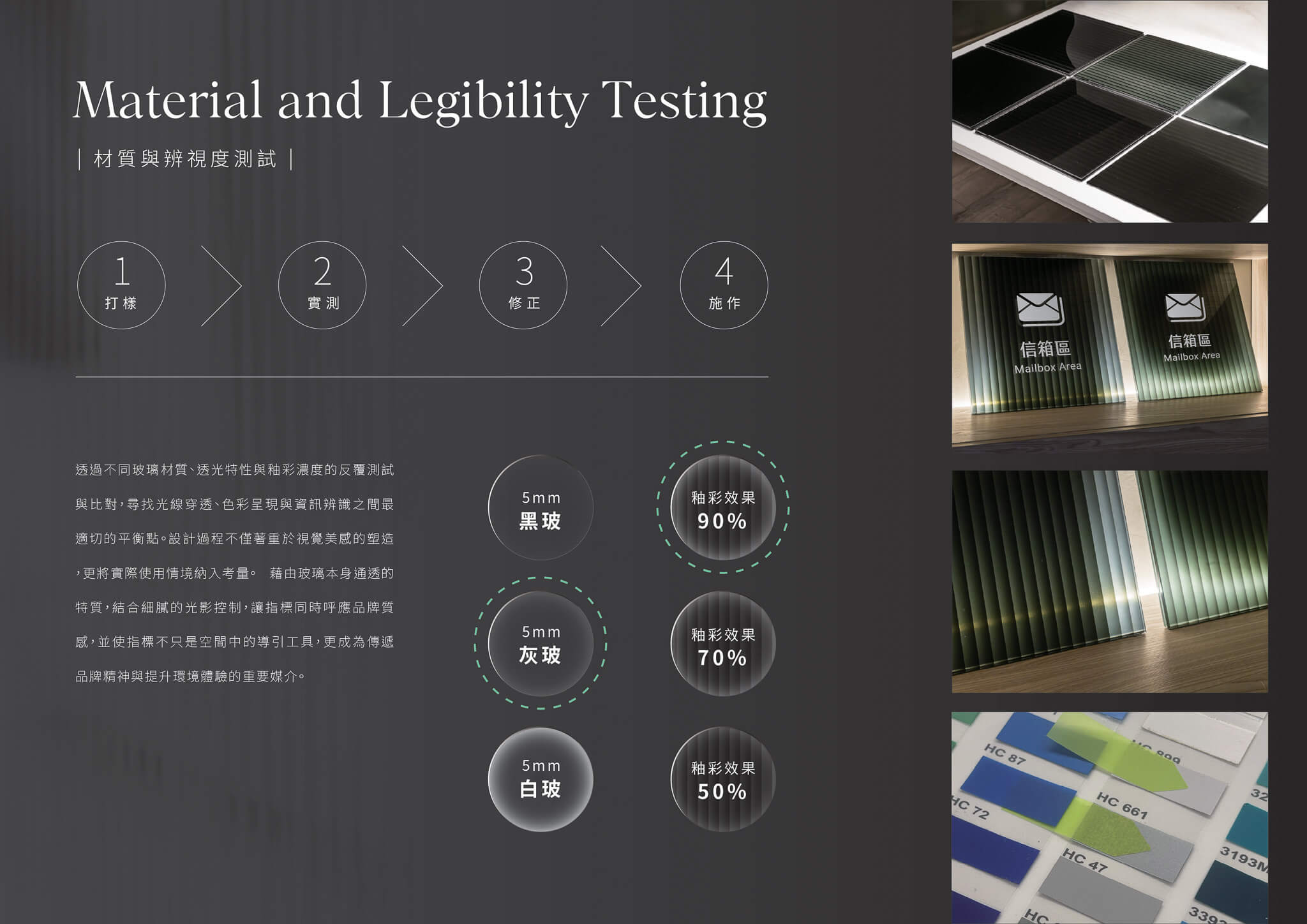
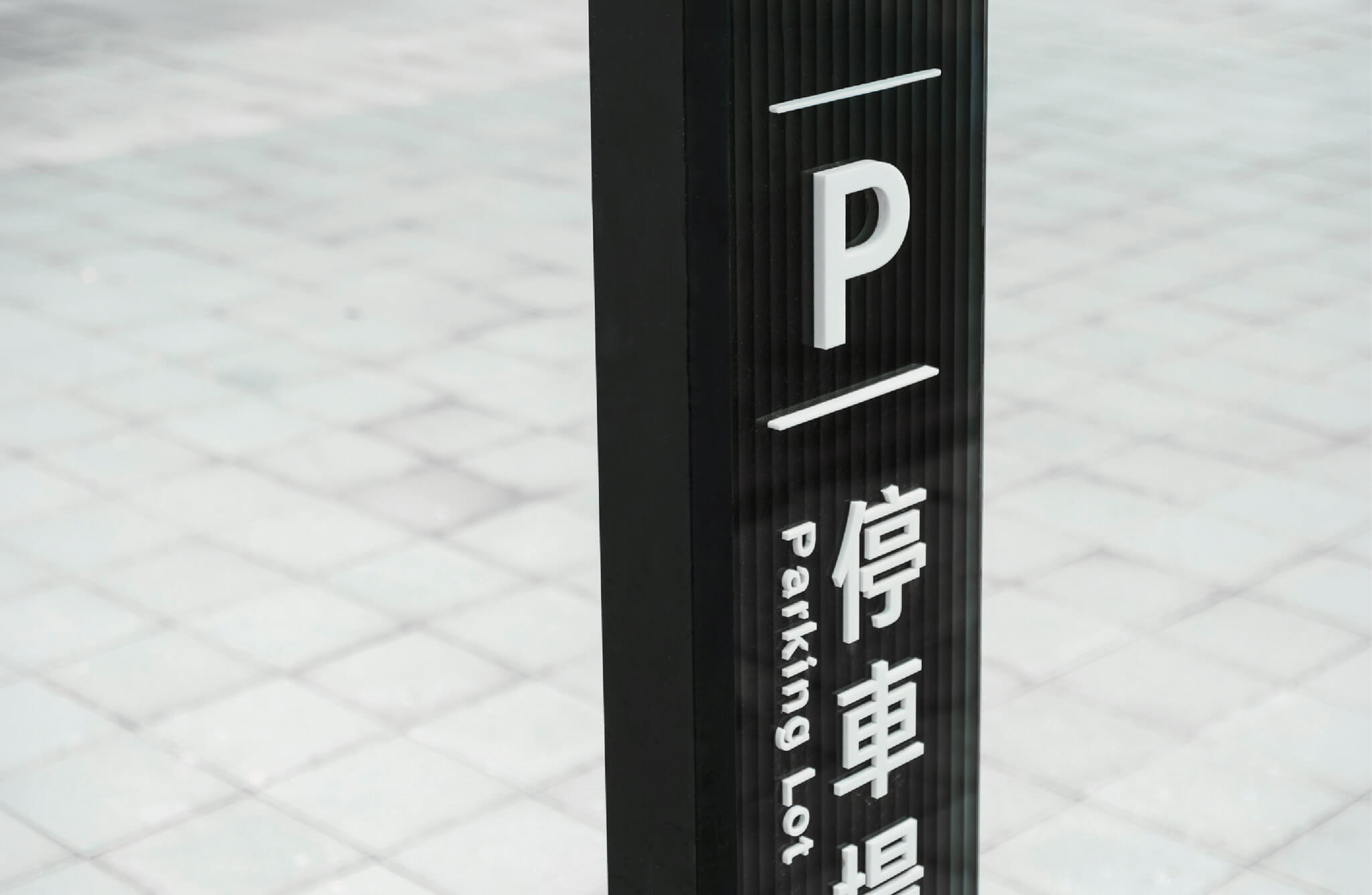
玻璃標牌由兩片 5mm 灰玻各自施作數位釉彩後膠合,釉彩面朝內收在膠合層中,再由內嵌暖白燈條的黑色金屬件固定。
以色彩構築空間旋律
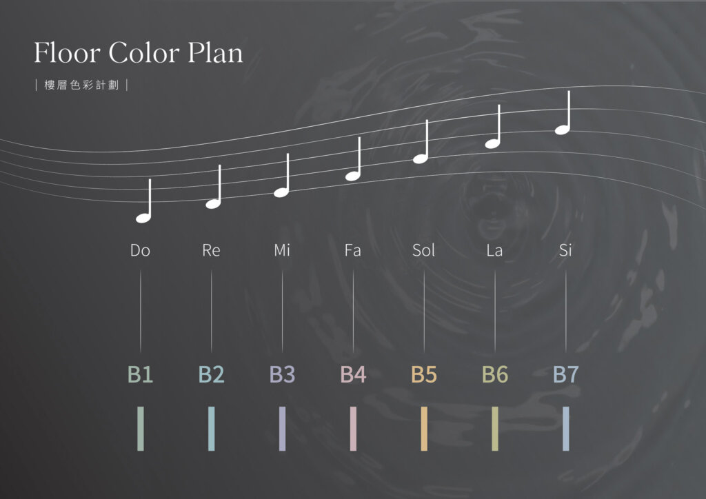
色彩規劃源自「聲音與色彩」之間的感知連結,透過色聯覺的概念,將不同樓層賦予獨立而富有節奏感的色彩識別。當人們穿梭於空間之中,色彩如同音符般緩緩展開,在移動的過程中形成視覺與情感交織的空間旋律,提升指標系統導引辨識的同時,也豐富整體環境體驗。
To fully realize the concept, we conducted multiple rounds of material sampling and on-site testing. Different glass types, glaze concentrations, firing temperatures, and layering methods were evaluated for their effects on light, color, and legibility. This process achieved a careful balance between visual expression, brand quality, and wayfinding functionality, ensuring that each sign delivers both design impact and an intuitive user experience.
不同樓層的顏色是怎麼決定的?§
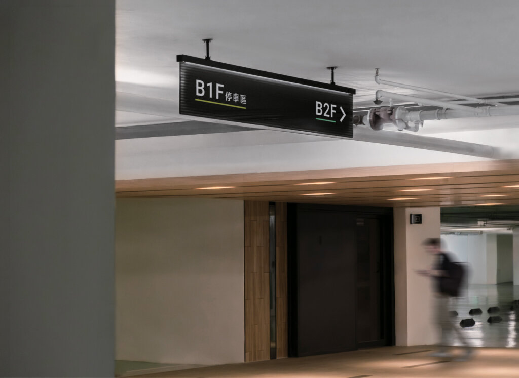
色彩計畫運用「聽到不同音符,會感受到不同色彩」的聯覺概念:地下室 B1 到 B7 各對應一個音名(C、D、E、F、G、A、B)與一個顏色,再配合整體環境適度降低彩度,讓顏色有引導性,也不破壞空間的視覺感受。文字方面,中文使用文鼎方新書、英文使用 Roboto,並規範單向指示時文字置中、雙向指示時分別靠左與靠右。
從測試到落實,每一道工序皆為體驗而生
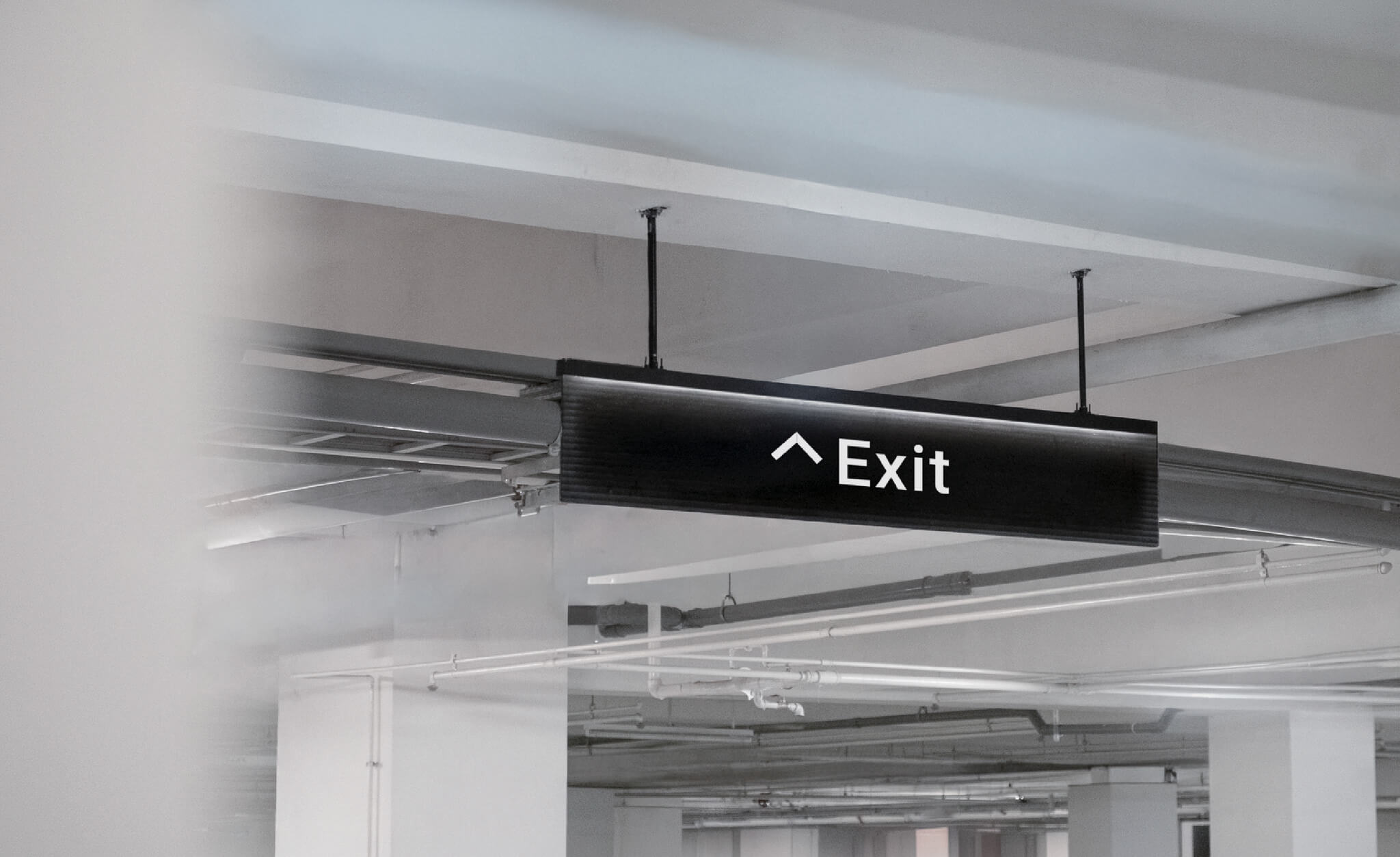
為了讓設計理念完整落實於實際場域,我們歷經多次材質打樣與現場測試,反覆驗證不同玻璃材質、釉彩濃度、燒製溫度及堆疊方式對光線、色彩與資訊辨識的影響。最終,在視覺美感、品牌質感與指標系統功能之間取得最佳平衡,讓每一面指標都兼具設計表現與使用體驗。
To fully realize the concept, we conducted multiple rounds of material sampling and on-site testing. Different glass types, glaze concentrations, firing temperatures, and layering methods were evaluated for their effects on light, color, and legibility. This process achieved a careful balance between visual expression, brand quality, and wayfinding functionality, ensuring that each sign delivers both design impact and an intuitive user experience.
同一套指標系統,怎麼用在不同建案?§
精稿整理成一份規範,安裝建議包含車道下懸式標牌下緣離地不低於 215 公分、公共空間標牌優先裝在門的左側,以及樓層立體字置中於兩部電梯之間的對面牆。棟別立體字等材質依各建案外觀風格更動,停車格總長寬依個別建案的車格規格調整;規範延伸到停車格與防撞條設計,並逐一標出各建案地下室的指標落點。這些規範是參考方向,實際會因應資訊內容及現場狀況微幅調整,安裝時須再評估現場狀況。
樓層色與共用規範各有哪些設計考量?§
三發指標系統以樓層色的引導性與視覺美觀為色彩考量,規範則列出現場調整方式及文字編排規則。
- 樓層色配合整體環境適度降低彩度,提案寫明用意是讓色彩具有引導性,又不破壞視覺美觀。
- 規範列出的做法是參考方向,可因應資訊內容與現場狀況微幅調整;安裝時須再評估現場狀況。
- 棟別立體字等材質依各建案的外觀風格更動,停車格總長寬則依個別建案的車格規格調整。
- 文字編排依指示方向區分:單向指示時文字置中,雙向指示時分別靠左與靠右。
哪些建案適合參考這個案例?§
如果您要共用指標規範、區分樓層或標示公設,可以參考這個案例。
- 如果您有多個建案,可以參考材質與車格依各建案調整的規範。
- 如果您的地下停車場樓層多,可以參考各樓層對應顏色的做法。
- 如果您的公設空間種類多,可以參考整組圖標的設計。
可以參考的順序是先看標牌形式,再看樓層色與安裝建議。
指標系統從規劃、設計到施工的做法,整理在指標系統設計。
結案時間
專案管理
設計組長
設計師
協力廠商
字體
2025.10
蘇連捷
李奕臻
吳俊賢、葉子豪、李品蓁
三美藝術玻璃
森澤文鼎字型
Case Closed
Project Manager
Lead Designer
Designer
Partner
Fonts
2025.10
Lien-chieh Su
I-chen Lee
Jun-xian Wu, Zhi-hao Yeh, Pin-chen Lee
San-Mei Art Glass Crative
Morisawa Arphic
你的空間也需要一套指標系統嗎?
把平面圖與遇到的問題交給我們。手心提供免費現場場勘、動線診斷與指標點位評估,並誠實告訴你:需要的是一套完整系統,還是局部調整就夠。
或直接來電 07-285-7000|[email protected]