
Hand-Heart Design Firm created the brand application design for the National Institute of Cyber Security (NICS), a project completed in 2025. Without changing the existing logo, we built a supporting graphic system from its hexagon, drawing on four images: a protective shield, a security chain, hands and a heart. The aim was to express the rational, technical side of cybersecurity as a warmer sense of protection. The system extends to a colour plan, pictograms, book layouts and presentation guidelines, giving NICS a consistent brand application system built for long-term use.
Design Concept
What did NICS need to address without changing its logo?
NICS had three issues to address: a logo that would stay as it was, a visual identity that looked dated, and a traditionally serious image that had to sit alongside the need to feel approachable to the public.
- NICS already had a logo, not designed by Hand-Heart, and the project started from the premise that it would not change.
- The first draft of the supporting graphics, from August 2024, began by setting out how the existing graphics needed to change, for example by giving them a stronger technological feel.
- Government agencies have long been seen as traditional and serious, and NICS’s brand applications also needed to feel approachable to the public.
How were NICS’s brand application needs defined?
Through initial interviews and research, we first grouped NICS’s needs into three themes: technology and expertise, approachability for the public, and safety and peace of mind. Each was mapped to the institute’s five core values: security, technology, initiative, resilience and trust. These three themes became the criteria for reviewing every supporting graphic that followed. The first draft started from visual codes associated with information technology, such as technology panels, information chains and gradients, and used design thinking to turn them into four supporting graphics.
How did two directions for the supporting graphics become one system?
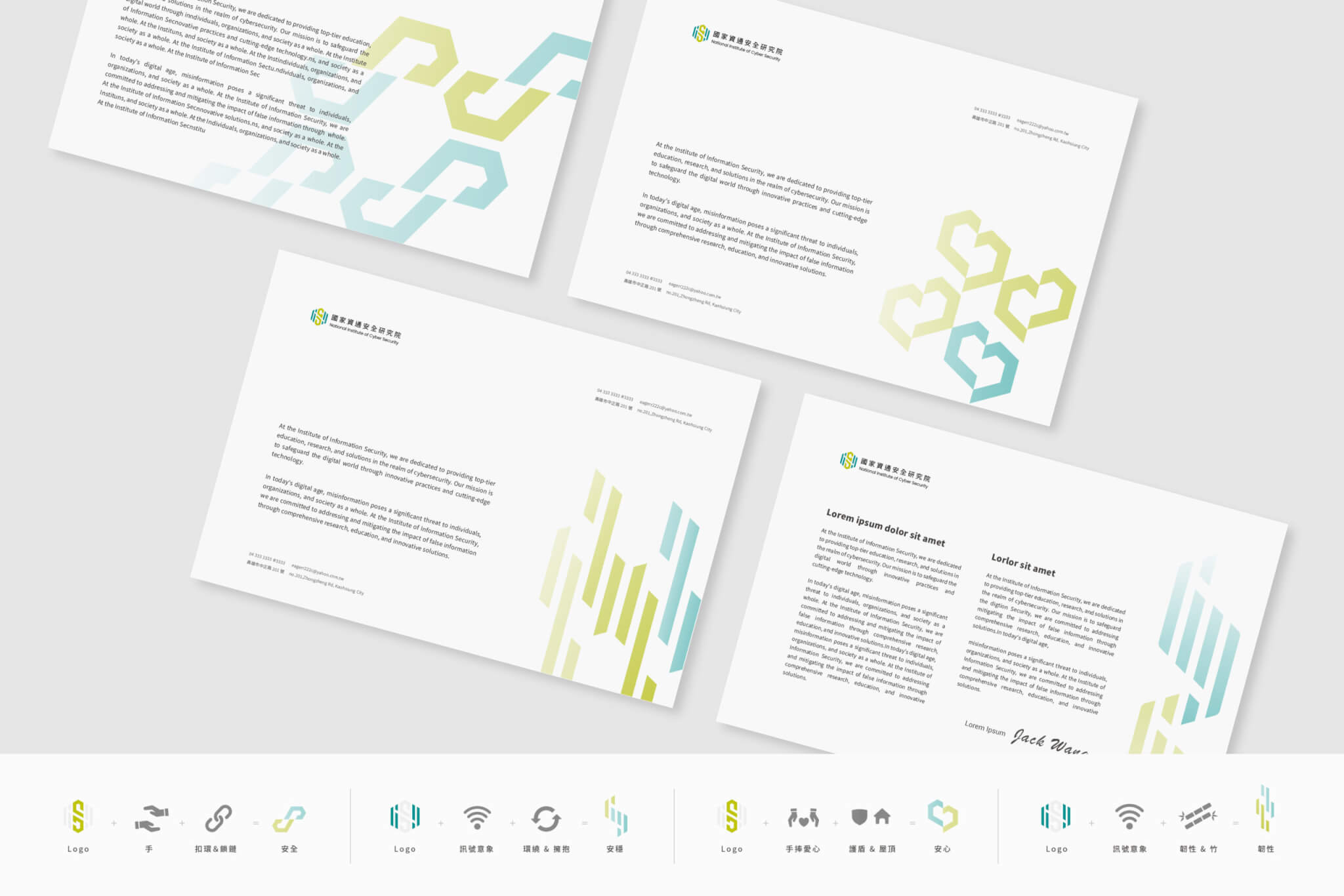
The second draft, in August 2024, put forward two directions. Option A, “Building Trust Together, Connecting Securely”, reshapes the brand’s hexagon and uses gradients to give it a personality that connects with the public. It pairs the logo with hands, a clasp and a chain to express “safety”, with an embracing ring and signals to express “stability”, and with a roof-like shield and hands holding a heart to express “peace of mind”. Option B, “Connecting Generations, Ensuring Security”, breaks the original shape into units and reassembles them into digital symbols, conveying protection for the digital generation.
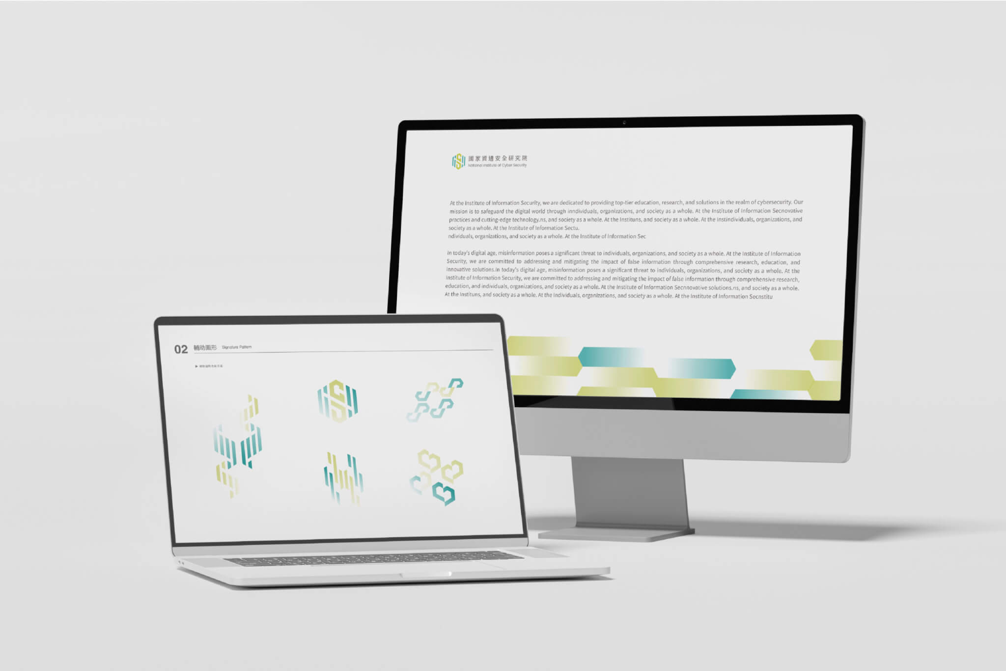
In the final work shown on this page, you can see icons that combine the logo with hands, chains and a heart, along with graphics developed from the hexagon gradient. The final system retains Option A’s hexagon gradient and its three images of safety, stability and peace of mind.
How were the guidelines and presentation templates developed, version by version?
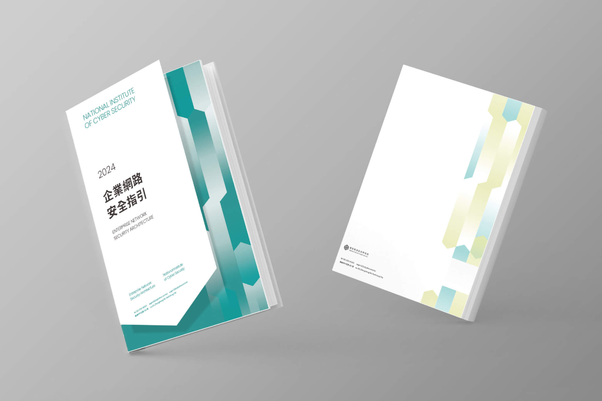
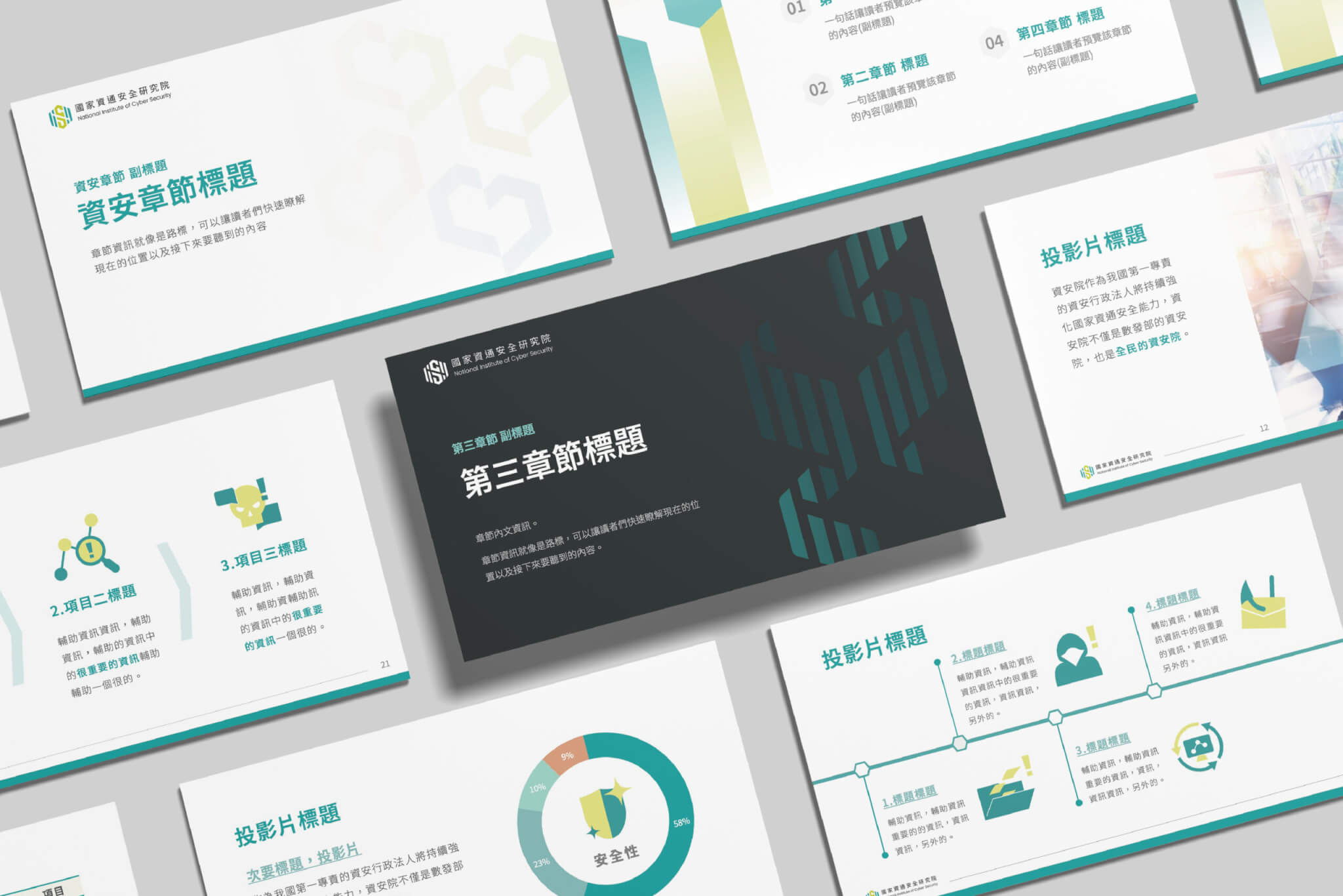
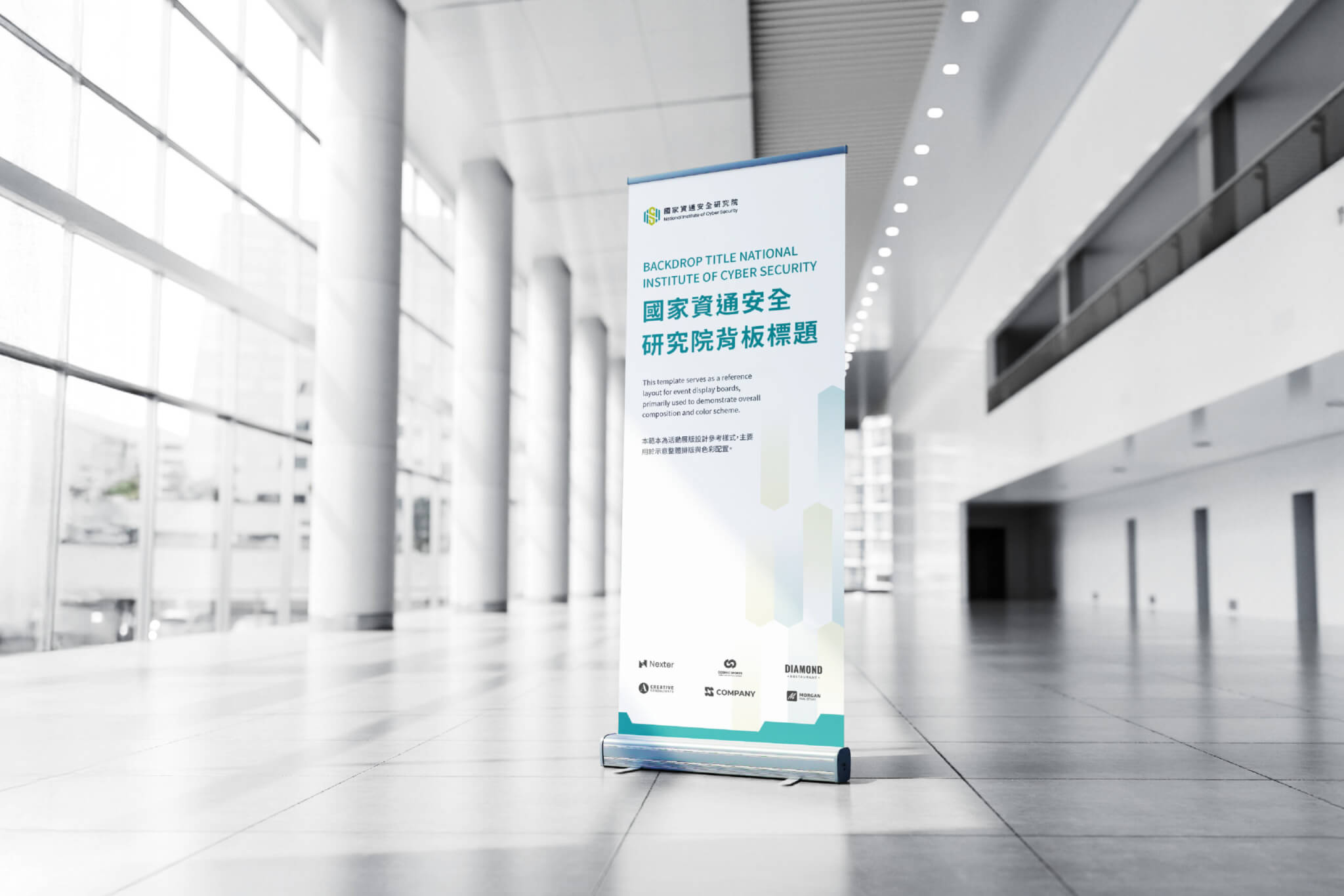
Once the supporting graphics were in place, we combined the supporting graphic guidelines, the brand colour plan and the book guidelines into a single set of guidelines. The first version was completed at the end of August 2024 (based on file dates). The September version added presentation templates, and by early October the guidelines had reached their fifth version. Along the way, we also tested book cover layouts and advertising mock-ups. The applications visible on this page include document layouts, the cover of the book Enterprise Cybersecurity Guidelines, presentation templates, web pages and display stands.
What do NICS’s supporting graphics and guidelines each do?
NICS’s supporting graphics respond to the need for a technological feel and for approachability, while the guidelines keep applications such as books and presentations consistent.
- The supporting graphics build on the hexagon of the existing logo, adding gradients and structural variations to address the visual identity’s lack of a technological feel.
- In the proposal, Option A reshapes the hexagon and uses gradients to connect with the public, with the aim of moving away from the rather cold image of IT companies.
- In the final work, the system retains Option A’s three combined images, which express “safety”, “stability” and “peace of mind” respectively.
- Options A and B were both designed around the three needs of technology and expertise, approachability, and safety and peace of mind; the proposal states that Option A was meant to convey a sense of peace of mind, safety and stability.
- The supporting graphic guidelines, colour plan and book guidelines were combined into one document that also includes presentation templates, to keep the identity and its approachability intact across different media.
Which agencies and public bodies can learn from the NICS approach?
If your agency or organisation is in any of the following situations, the approach taken for NICS may be a useful reference:
- If you need to keep your existing logo but your documents and slides look dated, you can develop supporting graphics from a shape already in the logo.
- If your work is technical and your image comes across as rational, yet you want the public to find you approachable, consider first grouping your needs into a few themes and then making each graphic respond to them.
- If different people produce your books, presentations and web pages, one option is to bring the supporting graphics, colour plan, book guidelines and presentation templates together in a single set of guidelines.
A sequence to follow: define the needs, develop the supporting graphics, check each graphic against those needs, and finally bring the colour, book and presentation guidelines together.
How we extend an existing logo with supporting graphics and application guidelines is explained on our corporate identity system (CIS) design page.
Completed General Manager Project Planner Lead Designer Designers
2025.12 Chih-yang Hsu Wan-Chih Hsiao, I-Chia Lu I-chen Lee, Dong Pan Jun-Xian Wu, Yin-Chan Huang, Hsin-I Hsieh, Elmer Wang