手心設計事務所為國家資通安全研究院(NICS)規劃品牌應用設計(2025 年結案):在不改變既有 Logo 的前提下,以其六角形為基礎發展輔助圖形識別系統,融合「防護盾、保護鏈、雙手與愛心」意象,讓資安的理性專業轉譯為有溫度的守護感受,並延伸至色彩計畫、Pictogram、書籍編排與簡報規範,建立一致且可長期運作的品牌應用系統。
Design Concept
國家資通安全研究院為肩負提升國家資通安全科技能力、推動資通安全科技研發及應用的行政法人組織。國家資通安全研究院已有既存之Logo(本案Logo非手心設計作品),為了解決過去視覺上面臨缺乏科技感與現代感的困境,在不改變原有Logo的前提下我們從品牌本質出發,重新梳理品牌溝通方向,讓「科技與技術」、「友善大眾」以及「安全與安心」不只是理念,而是能被看見與感受的視覺語言。
The National Institute of Cyber Security (NICS) is a public institution dedicated to strengthening Taiwan’s cybersecurity capabilities and advancing cybersecurity research, development, and applications. As the institute already had an existing logo (existing logo not designed by Hand-Heart Design), our task was to address its previous lack of technological sophistication and contemporary appeal without altering the original mark. Starting from the brand’s core values, we redefined its communication strategy and translated the ideas of technology and innovation, public accessibility, and safety and security into a visual language that can be clearly seen, understood, and experienced.
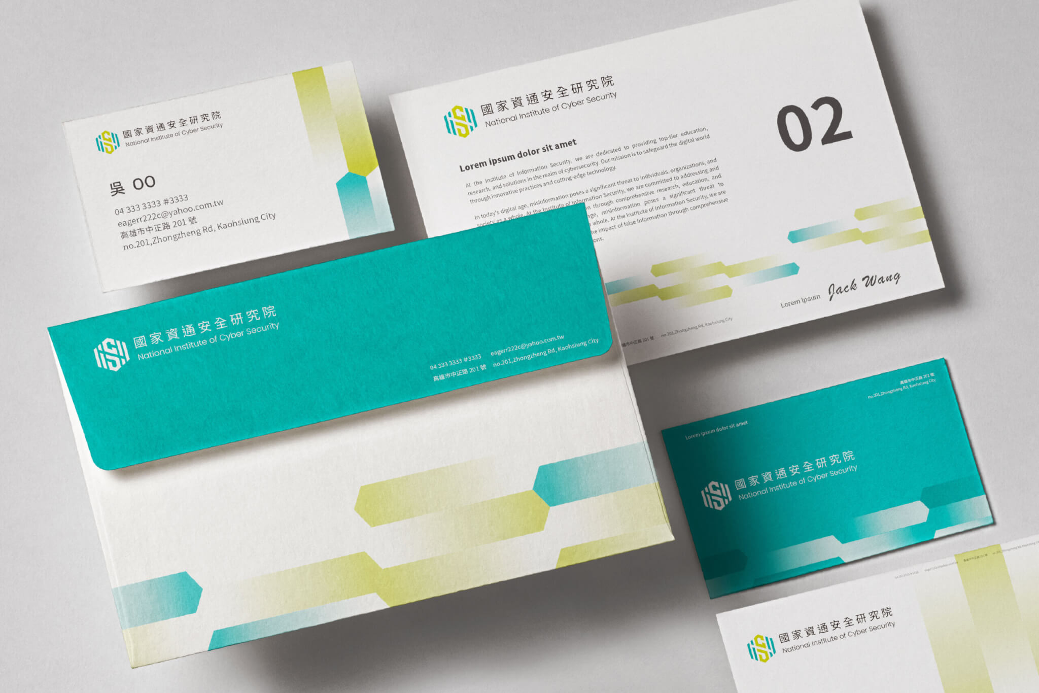
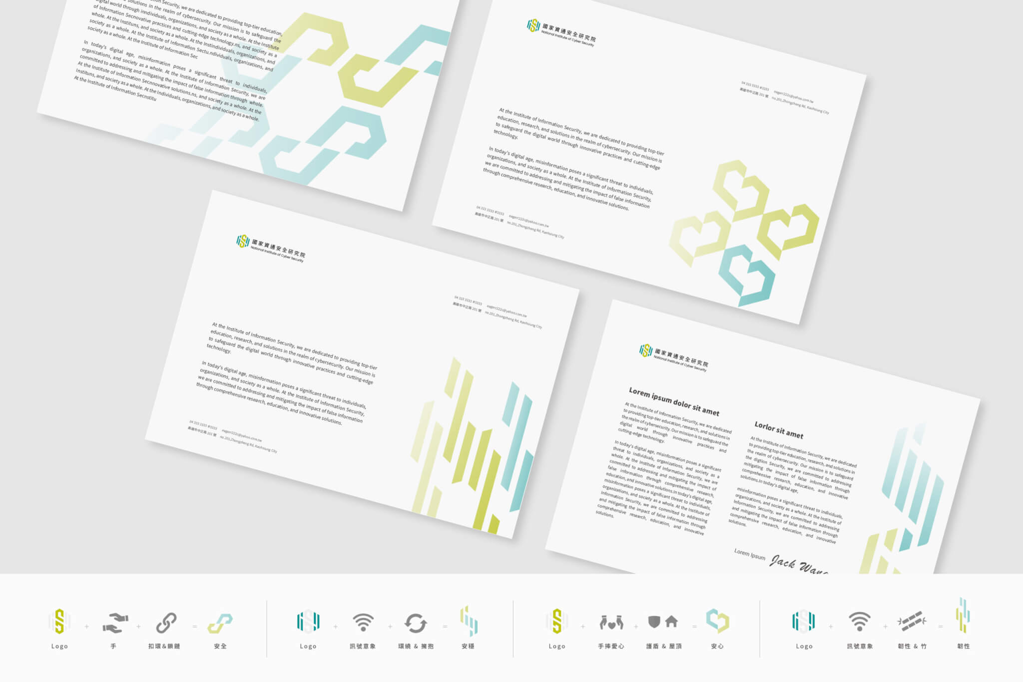
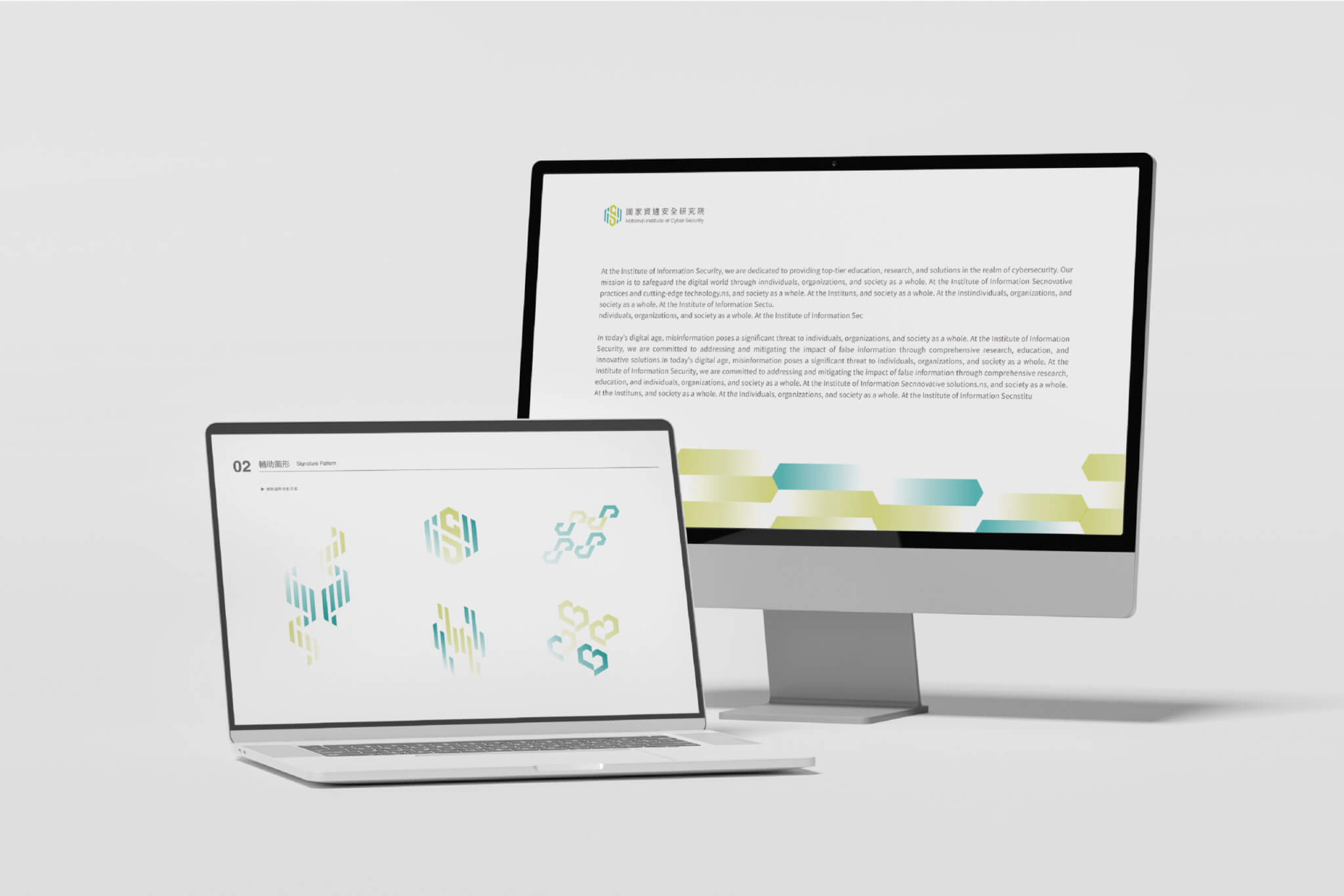
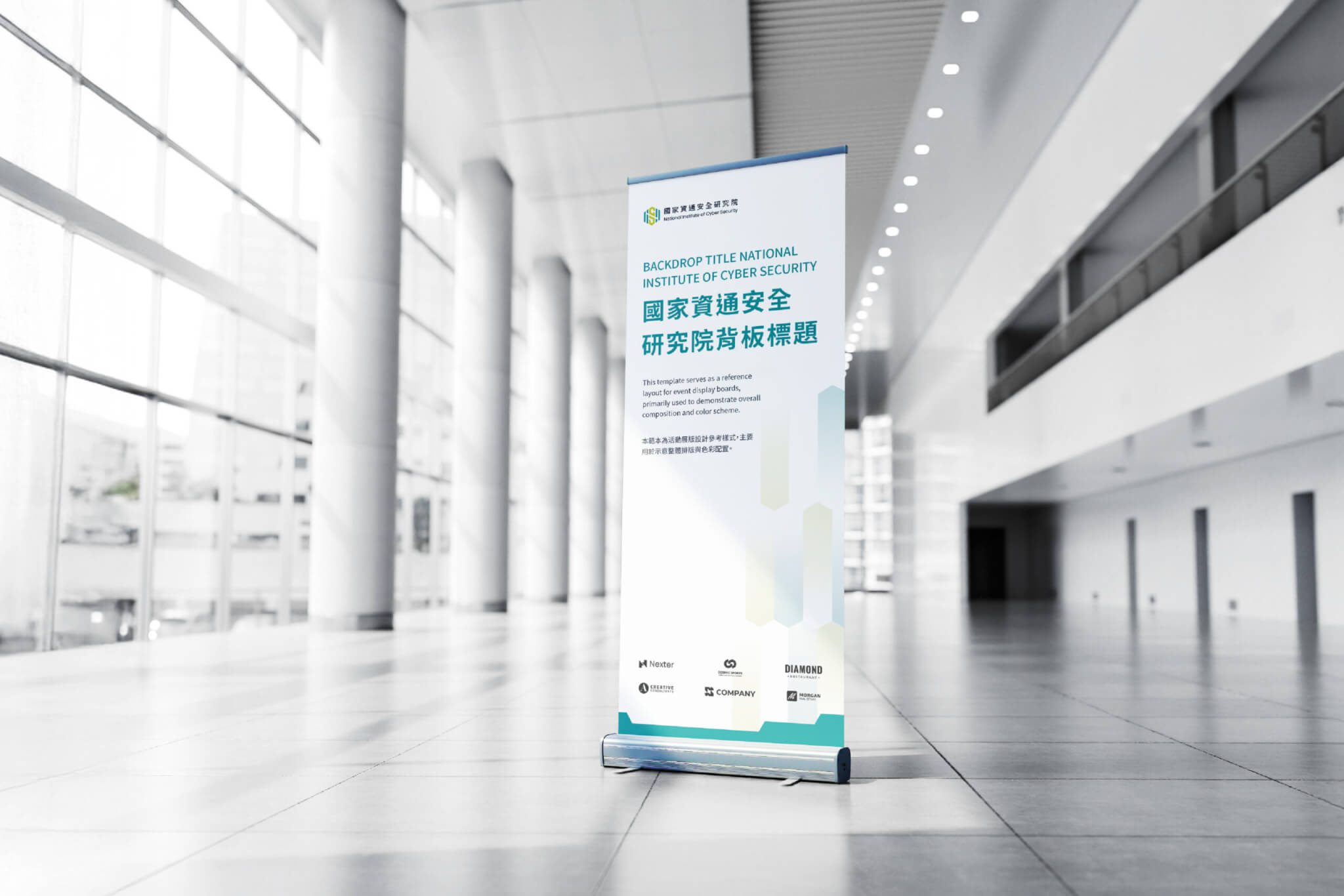
為打破政府部門過往給人較為傳統嚴肅的印象,我們以既有 Logo 的六角形為基礎,透過漸層與結構變化,轉化出具有科技感的視覺節奏,同時融合「防護盾與保護鏈」以及「雙手與愛心」的意象,建立一套輔助圖形的識別系統,讓原本偏向理性的資安概念與機關LOGO,轉譯為具有溫度的守護感受並具備品牌延展空間。這套語彙不只停留在單一圖形,而是發展為可對應不同情境的系統,讓「安心、安全、安穩與韌性」價的值能在各種應用中透過輔助圖形的品識別系統之建構,得以被一致且清楚地傳達。
To move beyond the traditionally formal image often associated with government institutions, we developed a supporting identity system based on the hexagonal form of the existing logo. Through gradients, structural variations, and the integration of protective shields, security chains, caring hands, and heart motifs, we transformed rational cybersecurity concepts into a warmer and more approachable expression of protection and trust. Rather than creating a single graphic element, we built a flexible system that can adapt to various contexts while consistently communicating the values of security, reassurance, stability, and resilience.
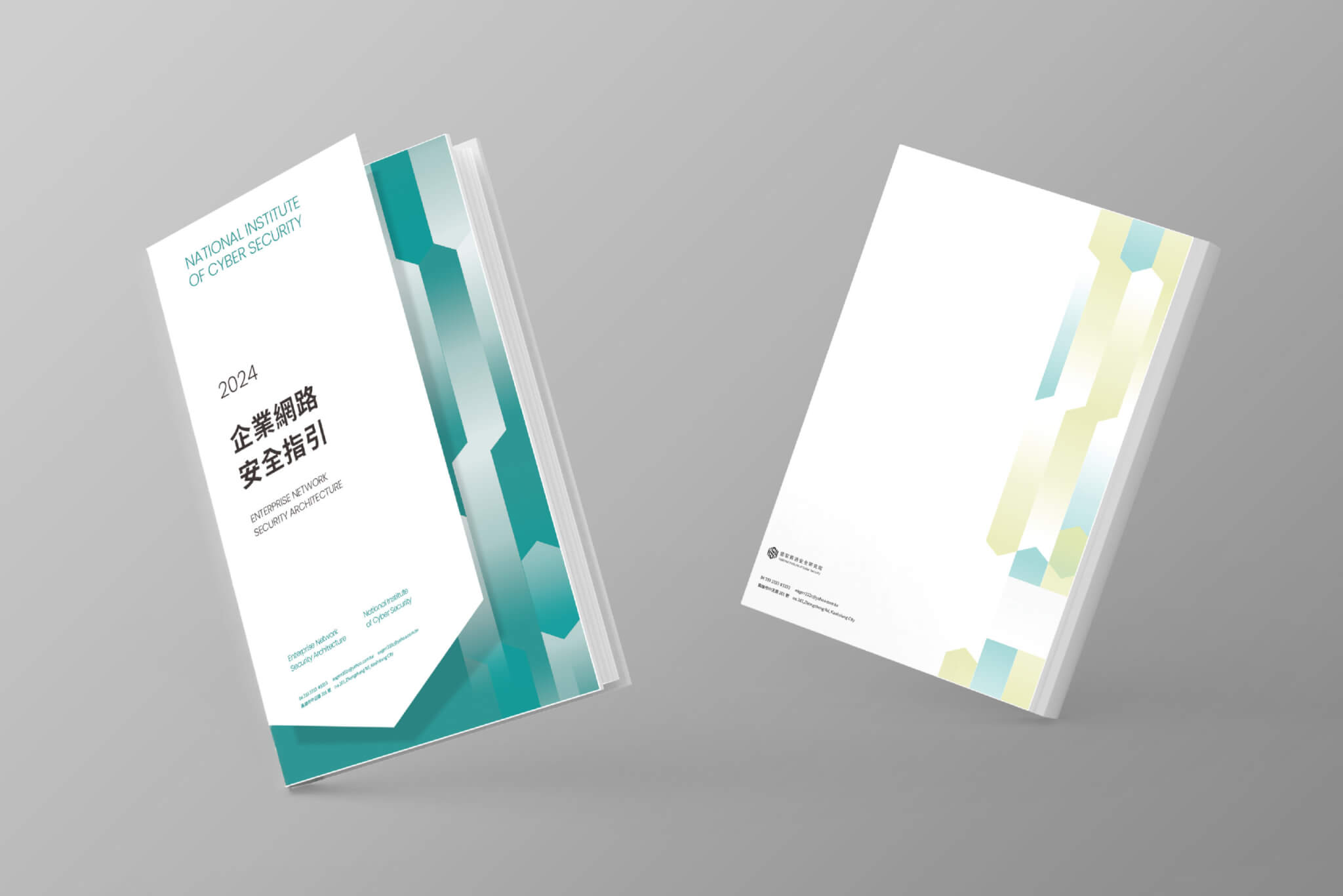
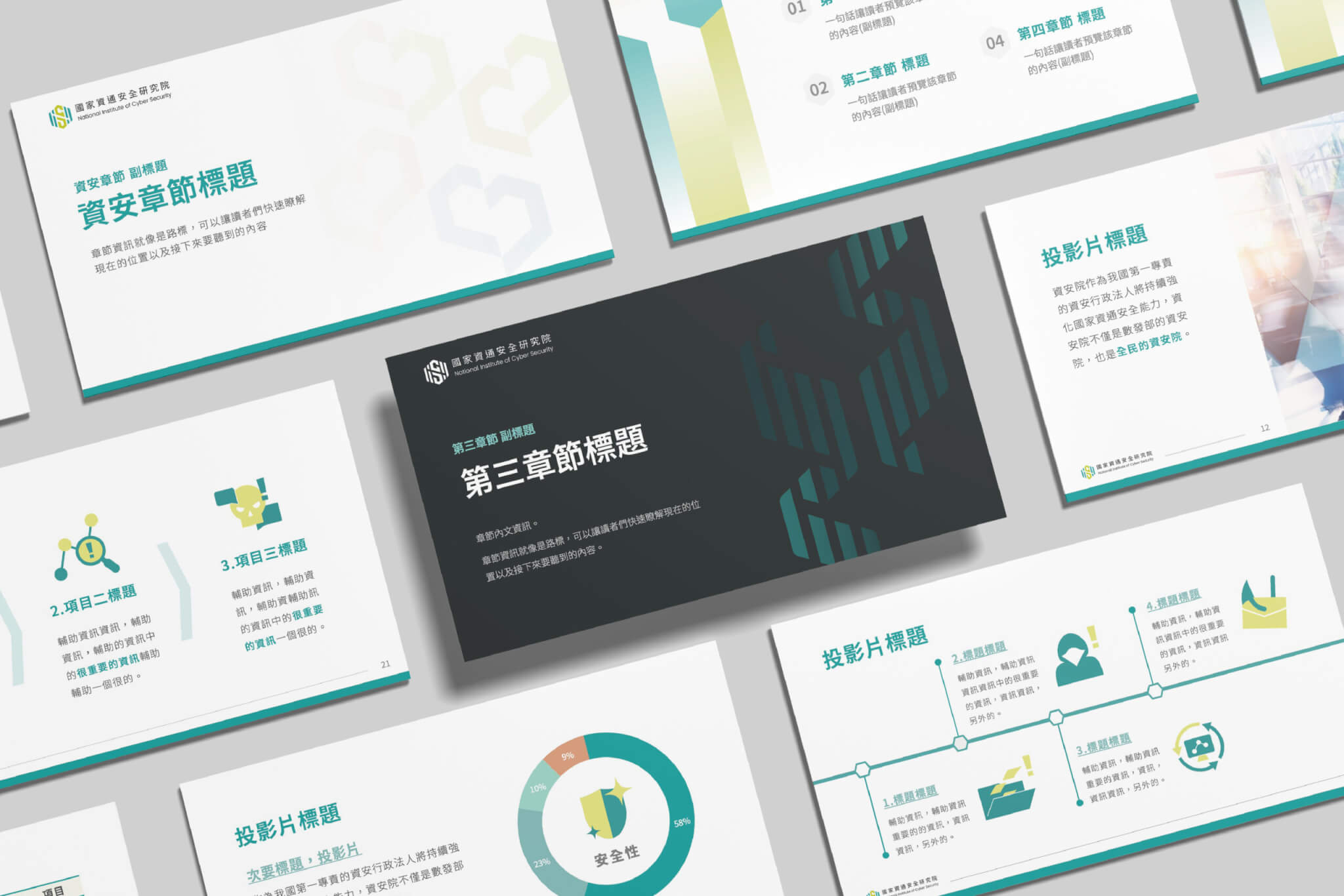
我們為資安院建立的不只是視覺元素,而是一套能長期運作的品牌識別應用系統,從色彩計畫、輔助圖形再到Pictogram的設計,無論書籍編排或簡報規範,透過感受一致但呈現多元的識別系統設計,讓品牌在不同載體與應用情境下都能維持一致的識別與親和力。
More than a collection of visual assets, we established a long-term brand application system for NICS. From color strategies and supporting graphics to pictogram design, editorial layouts, and presentation guidelines, the system was designed to deliver both consistency and flexibility, enabling the brand to maintain a cohesive, approachable, and recognizable presence across a wide range of media and applications.
結案時間
總經理
專案企劃
設計組長
設計師
2025.12
徐志揚
蕭婉智、呂宜家
李奕臻 、潘東
吳俊賢、黃胤展、謝心怡、王啓明
Case Closed
General Manager
Project Planner
Lead Designer
Designer
2025.12
Chih-yang Hsu
Wan-Chih Hsiao、I-Chia Lu
I-chen Lee、Dong Pan
Jun-Xian Wu、 Yin-Chan Huang、 Hsin-I Hsieh、Elmer Wang