

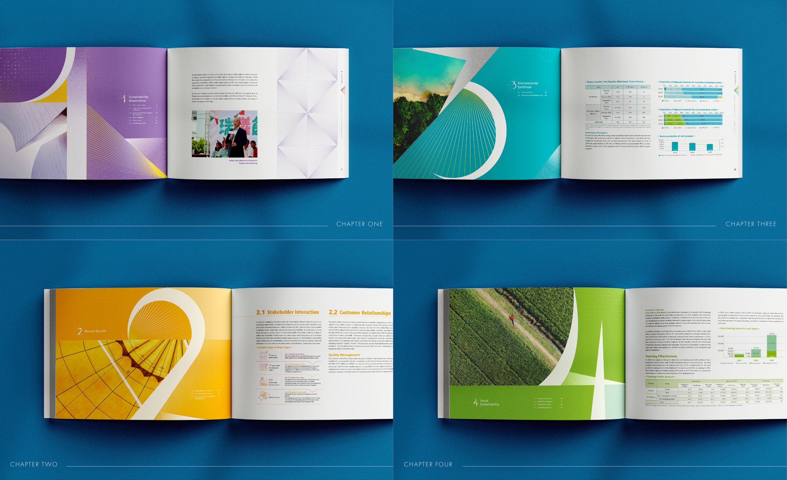
瑞儀光電 2020 企業社會責任報告書,是手心負責瑞儀光電 CSR 報告書設計的第六年,這一年也正逢瑞儀成立 25 週年。手心以漸變、堆疊的「光芒四射」作為主軸,從封面延伸到章節頁、輔助色系、icon 與表格,讓整本報告書維持一致的系統,也更簡明易讀。
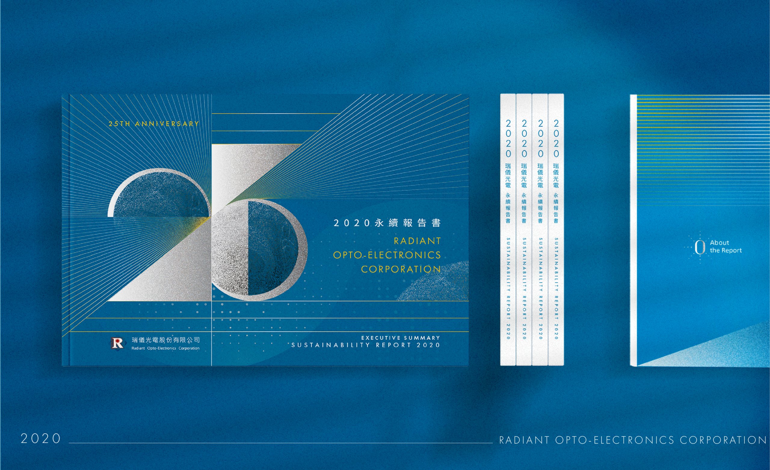
2020年適逢瑞儀光電成立25週年,也是手心承蒙企業肯定,負責瑞儀光電CSR企業責任報告書設計的第六年,我們不斷思考,該如何與熟悉的合作夥伴再次碰撞出更多創新的概念與表現。
2020 is the 25th anniversary of the establishment of Radiant Opto-Electronics Corporation. Hand-Heart has been responsible the design of the Radiant Opto-Electronics Corporation CSR for six years. We keep thinking, how to excite with familiar partner again to create more innovative concepts.
25 週年的報告書,為什麼以「光芒四射」為主視覺?§
在來回討論與腦力激盪下,本次設計環繞著25週年的主軸,並帶入持續前進、突破的意象,以漸變、堆疊的光芒四射象徵了企業持續成長,並與社會共存共榮的美好願景,俐落的視覺語彙更與企業嚴謹、遠見、專業的理念精神相呼應,呈現瑞儀繼往開來,穿越25年歷程的能量累積與未來期許。
Under the back and forth discussion and brainstorming. This design revolves around the main point of 25th anniversary and present the image of continuous progress and breakthrough. The gradual and stacked radiance symbolizes the continuous growth of Radiant Opto-Electronics Corporation and hope to create the beautiful vision of coexistence and co-prosperity with society. The neat visual vocabulary echoes the corporate philosophy of rigorous, foresight, and professionalism. It presents the energy accumulation of Radiant Opto-Electronics Corporation through the 25 years and the expectation for the future.
落到封面上,銀色幾何塊面與半圓組成「25」字形,金色放射線條由此向外展開,並標上「25TH ANNIVERSARY」,讓週年的主題與光芒的意象同時被看見。
章節頁、色彩與 icon 如何延續封面的光芒?§
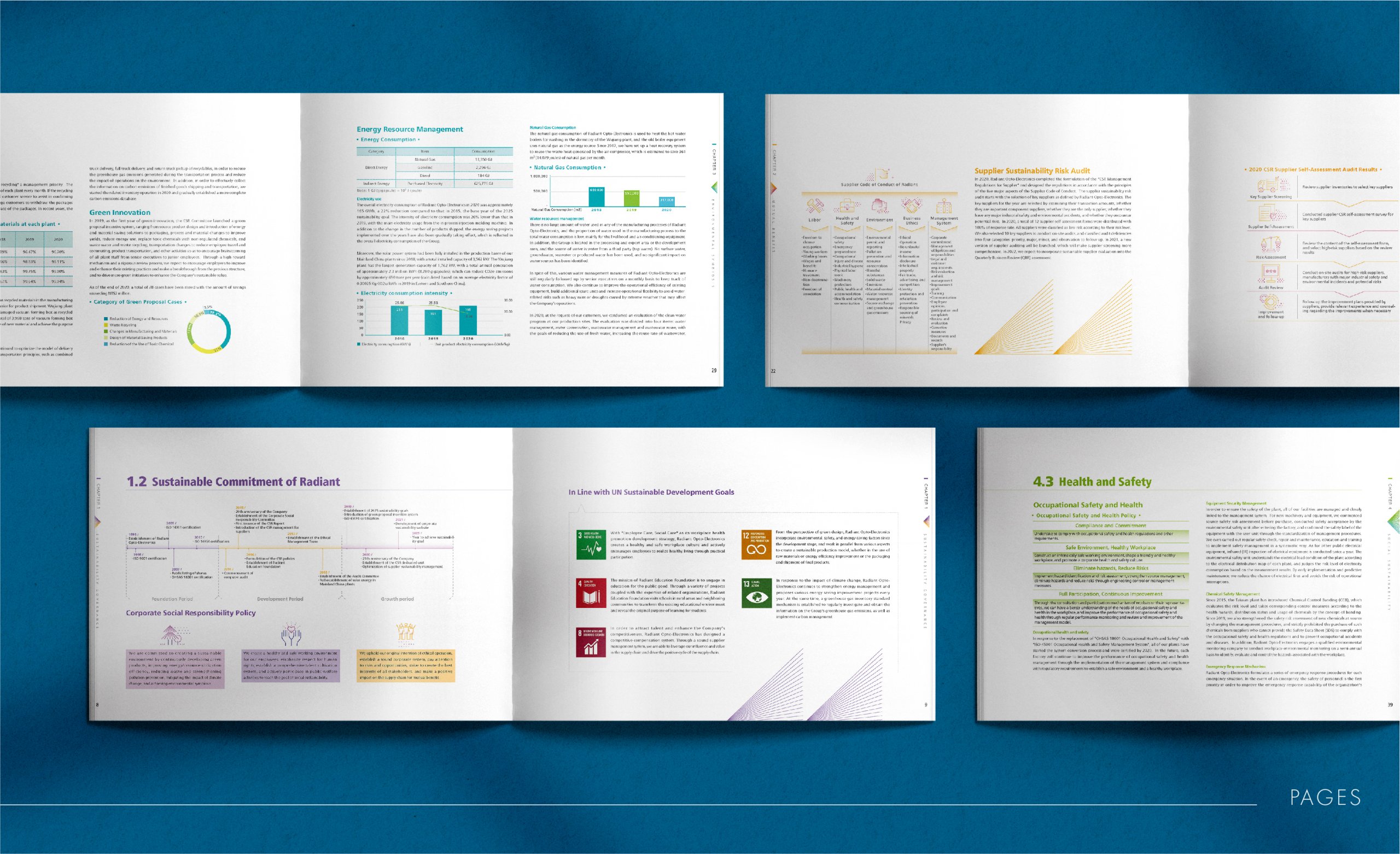
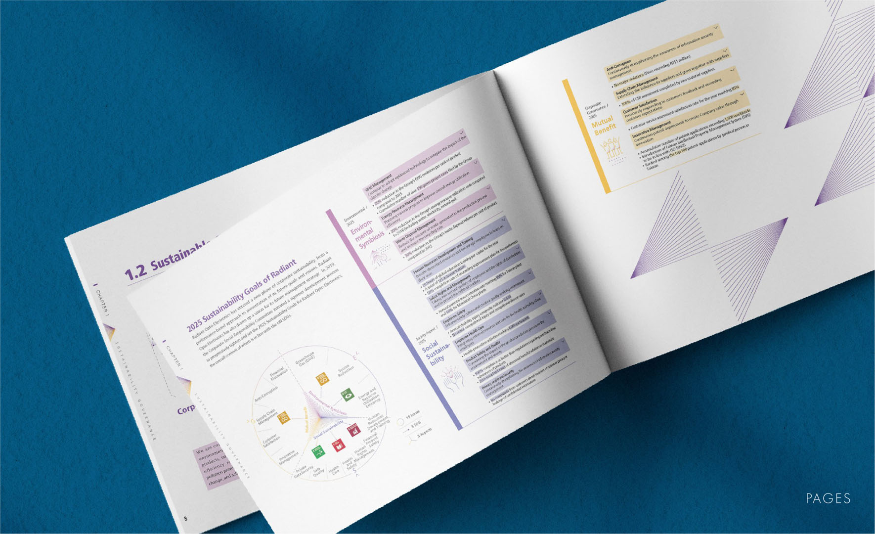
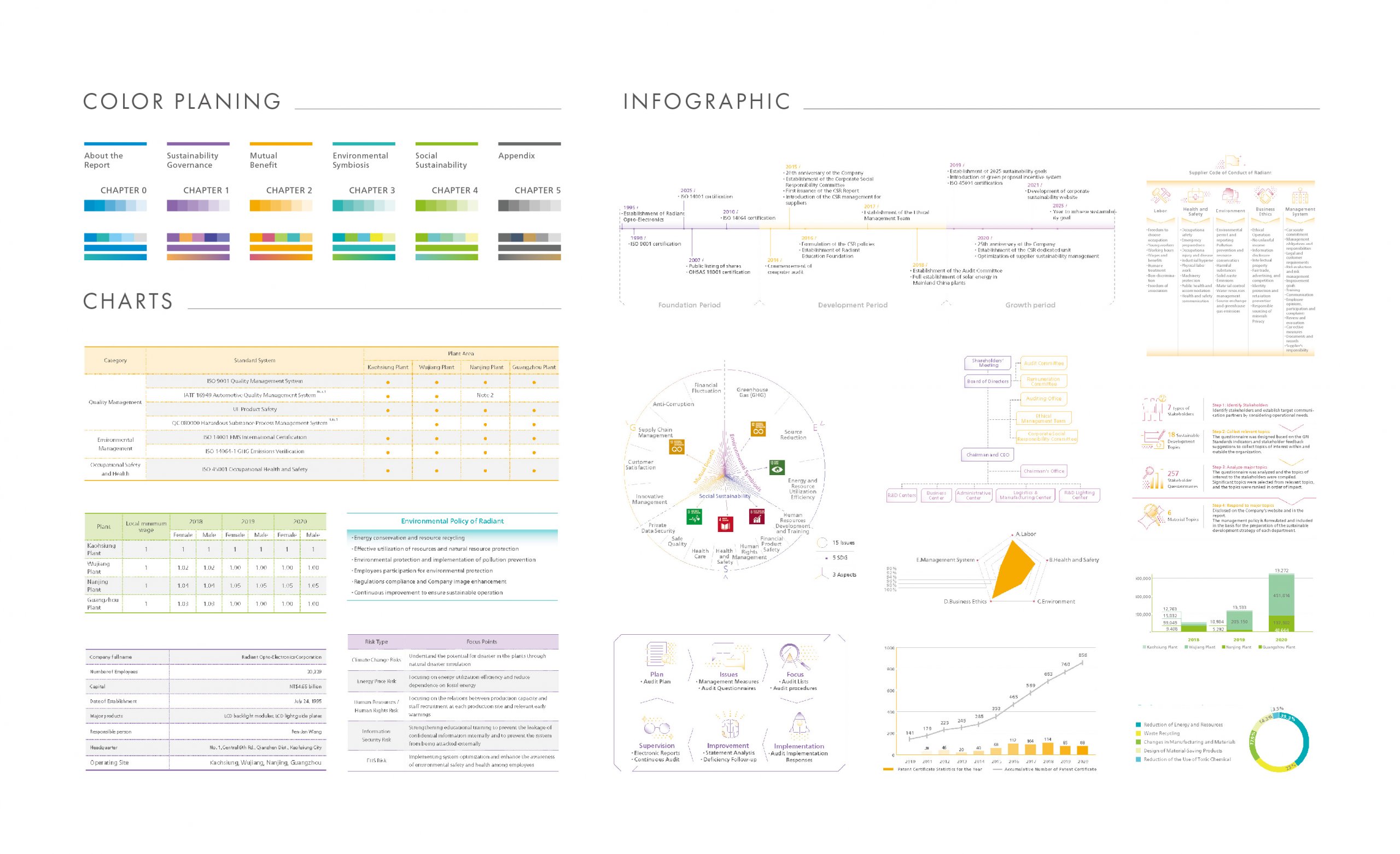
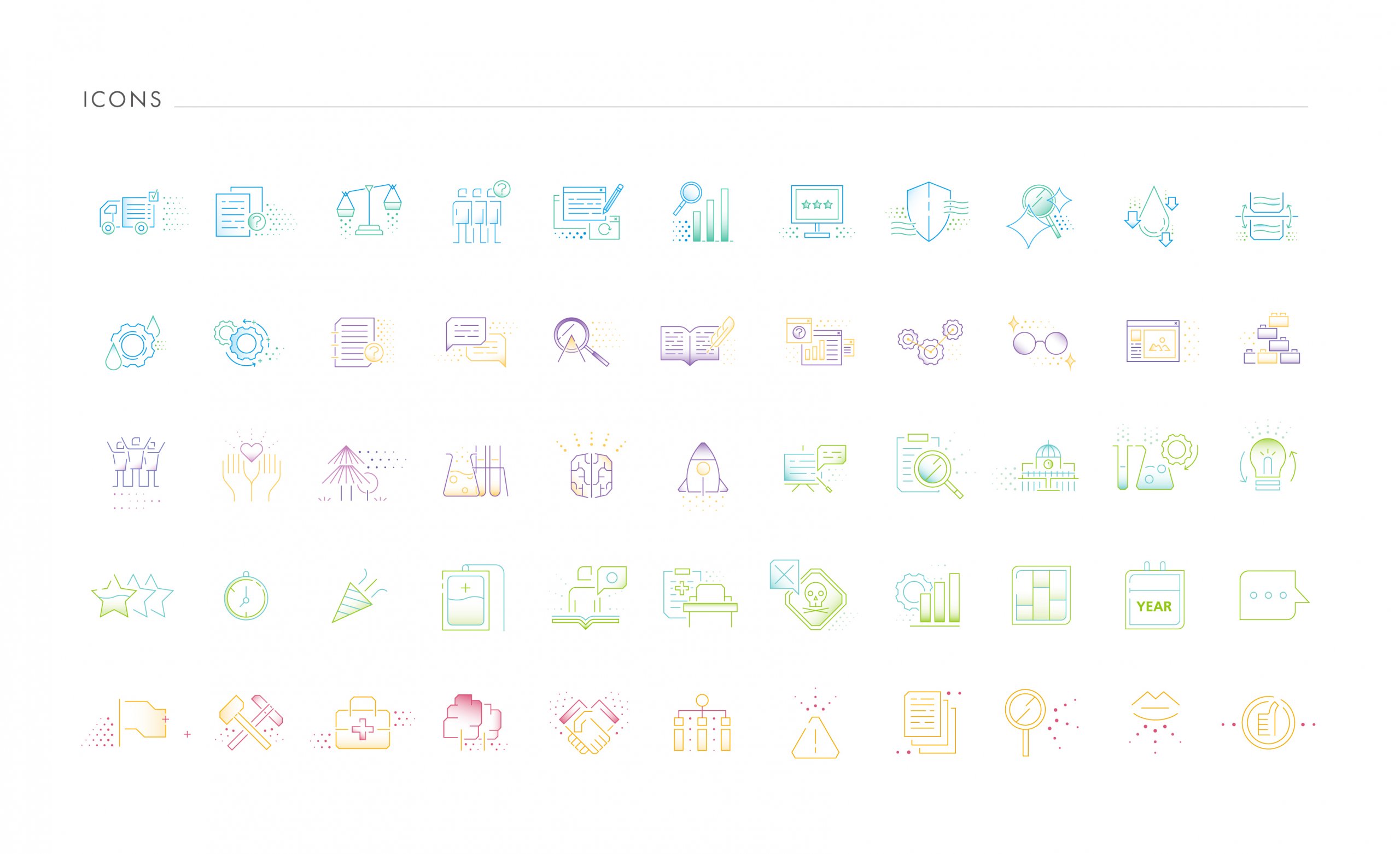
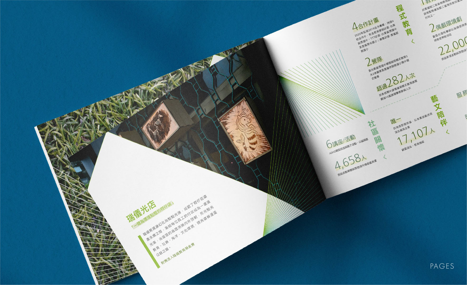
每個章節頁以影像呼應該章節的主題內容,並延伸了封面的視覺元素,以達成整本報告書的整體性及一致性,同時利用各章節的色彩延伸出輔助色系,增加章節間差異性,也避免整體顏色過於繽紛可愛;icon與表格的表現同樣承襲封面「光芒、漸變」的元素,除了強化企業責任報告書的系統性,也使其更加簡明、易讀。
Each chapter page echoes the subject content of the chapter with an image, and extend the visual elements of the cover, to achieve the integrity and consistency of the entire report. At the same time, use the colors of each chapter to extend the auxiliary color system. Increase the differences between chapters, also avoid the overall color is too colorful and cute. The performance of the icon and the table also inherits the elements of light, gradient on the cover. In addition to strengthening the system of the report, it also makes it more concise and easier to read.
從版面規範可以看到,報告書依 Chapter 0 到 Chapter 5 規劃了藍、紫、橘黃、青綠、綠、灰六組章節色系,每組再延伸出深淺漸層與搭配色;icon 也以同樣的漸變線條繪製。
哪些永續報告書適合參考瑞儀光電的做法?§
如果您的永續報告書有以下情況,瑞儀光電這個案例的做法可以參考:
- 如果您的企業今年適逢週年,可以參考以幾何塊面組成週年數字的封面。
- 如果您的報告書章節多、擔心顏色太花,可以參考從各章色彩延伸輔助色系的做法。
可以參考的順序是:先看週年數字如何呈現在封面,再看章節主色與輔助色的搭配。
如果您正規劃整本報告書,可以參考 ESG 永續報告書設計。
—
完成時間 – 2021.05
設計總監 – 徐志揚
企劃&專案管理 – 王士豪、王彥筑
設計師 – 李奕臻、盧臆雯
#CSR #企業社會責任報告書 #瑞儀光電 #平面設計 #編排設計 #資訊視覺化 #手心設計