
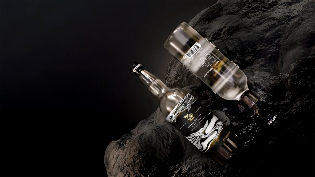
傳說中龍掌管著江河海水,有著祥瑞、高貴之意
此款一露領先高粱酒便是用以感謝全體員工的匠人精神,奉獻一生職志成就金門酒廠而生產的員工專供酒。
Legend has it that dragons control rivers and oceans, carrying auspiciousness and nobleness. This Kaoliang liquor is specially crafted for the employees of the Kinmen Kaoliang Liquor (KKL) as a tribute to their dedication, artisan spirit, and the lifetime they’ve committed to their profession.
重新詮釋經典形象
包裝設計 上,手心團隊嘗試在保留金門酒廠標誌性的雙龍形象的同時,以跳脫傳統的呈現方式,重新詮釋品牌多年的經典形貌;除了調整龍的形態,使其更有掌管天地萬物的祥瑞姿態,也將水的意象結合其中,波紋般的流動感代表著金門酒廠得天獨厚的天然泉水,以及酒液的柔順、清澈,而細密精緻的龍紋、水紋則傳遞了金酒釀造的極致工藝。
While preserving the iconic twin dragon imagery of KKL, we attempted to reinterpret the brand’s classic look in a fresh manner, moving away from traditional representations. Not only did we refine the dragons’ shape to embody an aura of overseeing the universe, water imagery was also integrated. The ripple-like fluidity represents the KKL’s distinct natural spring water, and the smoothness and clarity liquor itself. The finely detailed patterns of the dragon and water convey the ultimate craftsmanship of brewing and distilling.
外盒的 包裝設計 透過木紋壓紋將匠人的情感融入其中,展現金門酒廠的歷史與文化,也象徵著每一瓶酒都是經過時間的沈澱與安定,才得以釀造出美酒。
The box interprets the craftsmen’s emotions through wood grain embossing, showing history and culture of KKL. It symbolizes each bottle of wine has undergone a period of setting and maturation, resulting in a fine liquor.


結案時間
設計師
專案管理
設計總監
2022.05
李奕臻
王彥筑
徐志揚
Case Closed
Designer
Project Manager
Design Director
2022.05
I-chen, Lee
Yen-zhu, Wang
Chih-yang, Hsu