
康舒科技的品牌重塑從哪裡出發? Project Overview§
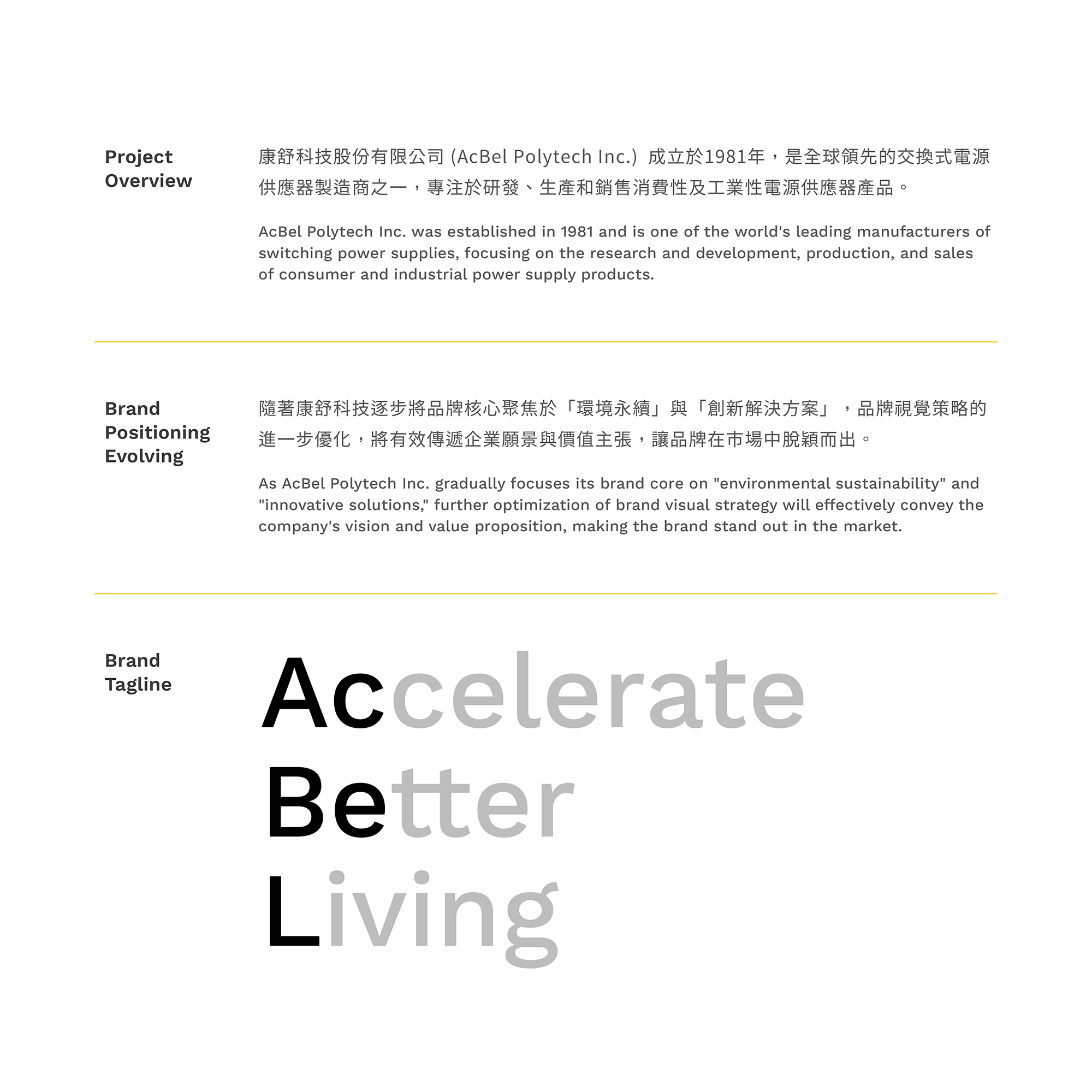
康舒科技(AcBel)以電源管理技術為核心,這次國際品牌重塑以企業願景「Accelerate Better Living」為起點。手心參與品牌標誌、造形與色彩系統及動態設計:新標誌保留原標誌的雙色塊元素,並加入「+」符號、光芒與電池意象,讓品牌的傳承與轉型在同一套識別中被看見。
股票代號:康舒6282
康舒科技 創立於1981年,以三大事業體,包含電源解決方案、智慧綠能服務,以及電動動力解決方案,將電源管理技術為核心並進入全球電源供應器產業的領導廠商之列。
Founded in 1981, AcBel Polytech Inc. operates across three key business sectors: Power Solutions, Smart Green Energy Services, and Electric Mobility Solutions. With power management technology at its core, AcBel has established itself as a global leader in the power supply industry.
「Accelerate Better Living」——促進美好生活是康舒科技的企業願景,也是這次品牌重塑的核心驅動力。手心團隊榮幸參與康舒科技品牌蛻變的過程,見證擁有40年以上深厚歷史的企業,跨越時代的轉折,邁向人工智能世代的嶄新未來。
“Accelerate Better Living” is more than just AcBel’s vision—it’s the driving force behind its transformation. We are honored to be part of this rebranding journey, witnessing a company with over 40 years of history evolve with the times and embrace an AI-powered future.


康舒的品牌重塑要傳達什麼? Strategy§
「永續發展」和「創新突破」作為本次品牌重塑的核心,重新定義了康舒在能源科技領域的角色與定位,透過全新品牌形象展現企業的全面轉型與升級,傳遞綠色未來的承諾,在高效能源解決方案中佔據領導地位。
At the heart of this transformation are sustainability and innovation, redefining AcBel’s role and positioning in the energy technology sector. The refreshed brand identity reflects a comprehensive transformation, reinforcing AcBel’s commitment to a greener future while strengthening its leadership in high-efficiency energy solutions.
康舒科技的品牌重塑,要先解決哪些問題?§
康舒科技的品牌重塑要處理三件事:標誌造型的國際化、與同業識別的差異,以及品牌意象的表達。
- 視覺策略提案將標誌造型的國際化列為課題,對應方法是整合脈絡、優化設計呈現。
- 視覺策略提案指出與同業識別同質性高,對應方法是與同業差異化。
- 視覺策略提案指出品牌意象不夠明確,對應方法是與受眾溝通品牌願景與使命。



新標誌如何傳承原識別並加入能源意象? Visual Design§
品牌標誌以現代化、流線為設計語言,帶來創新與未來感,並融入原標誌的雙色塊元素,傳承品牌經典,同時開啟未來新篇章。「+」符號,以及光芒與聚焦的意象,代表企業更新升級與潛能激發;電池元素與原Logo的雙方塊特徵,則強化品牌與能源解決方案的深刻聯繫。
The new logo embodies modernity and fluidity, symbolizing innovation and the future while retaining the signature dual-color block elements from the original design—a tribute to AcBel’s legacy as it embarks on a new chapter. The “+” symbol, along with visual elements of light and focus, represents renewal and untapped potential. Additionally, battery-inspired details and the distinctive dual-block motif from the original logo further reinforce AcBel’s strong connection to energy solutions.
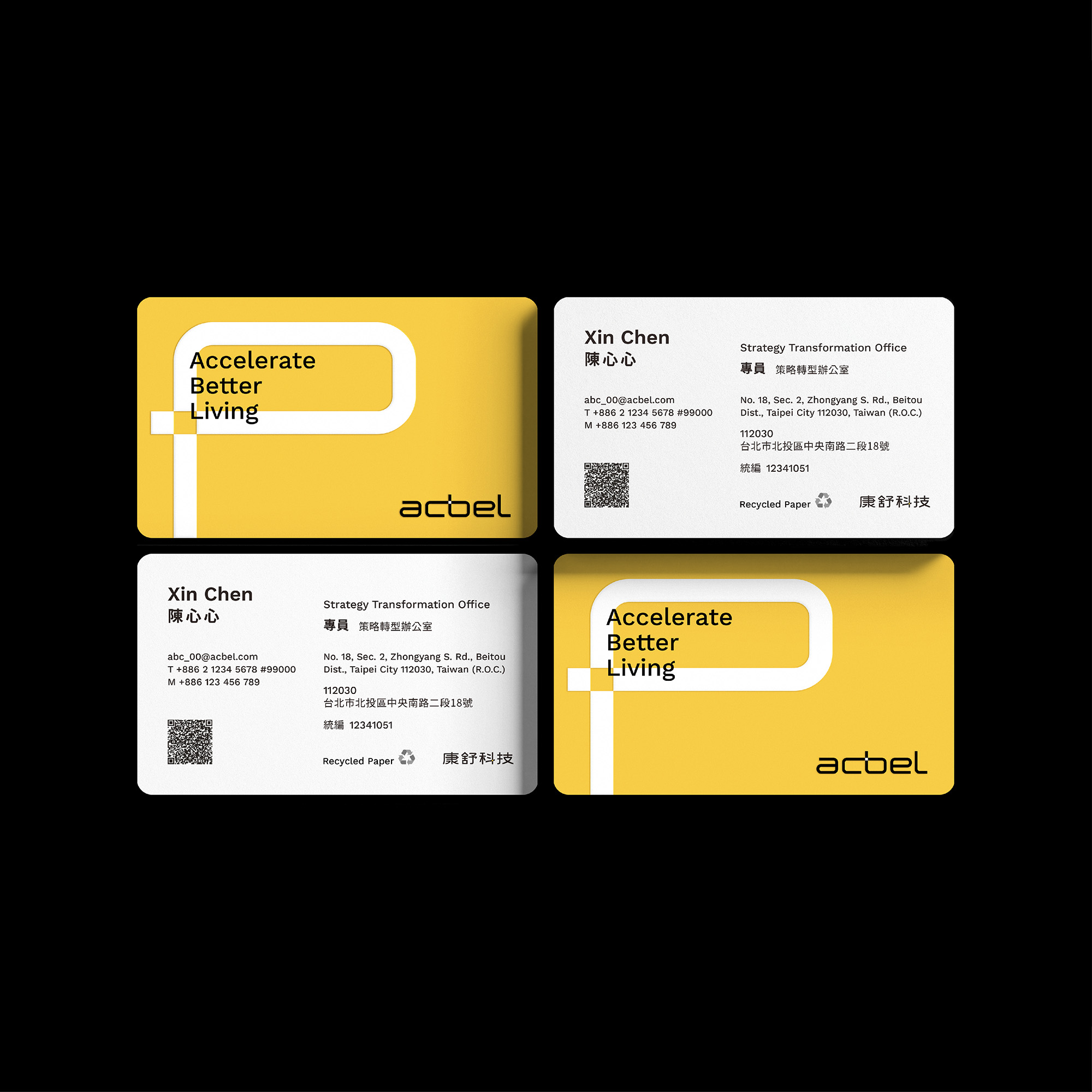
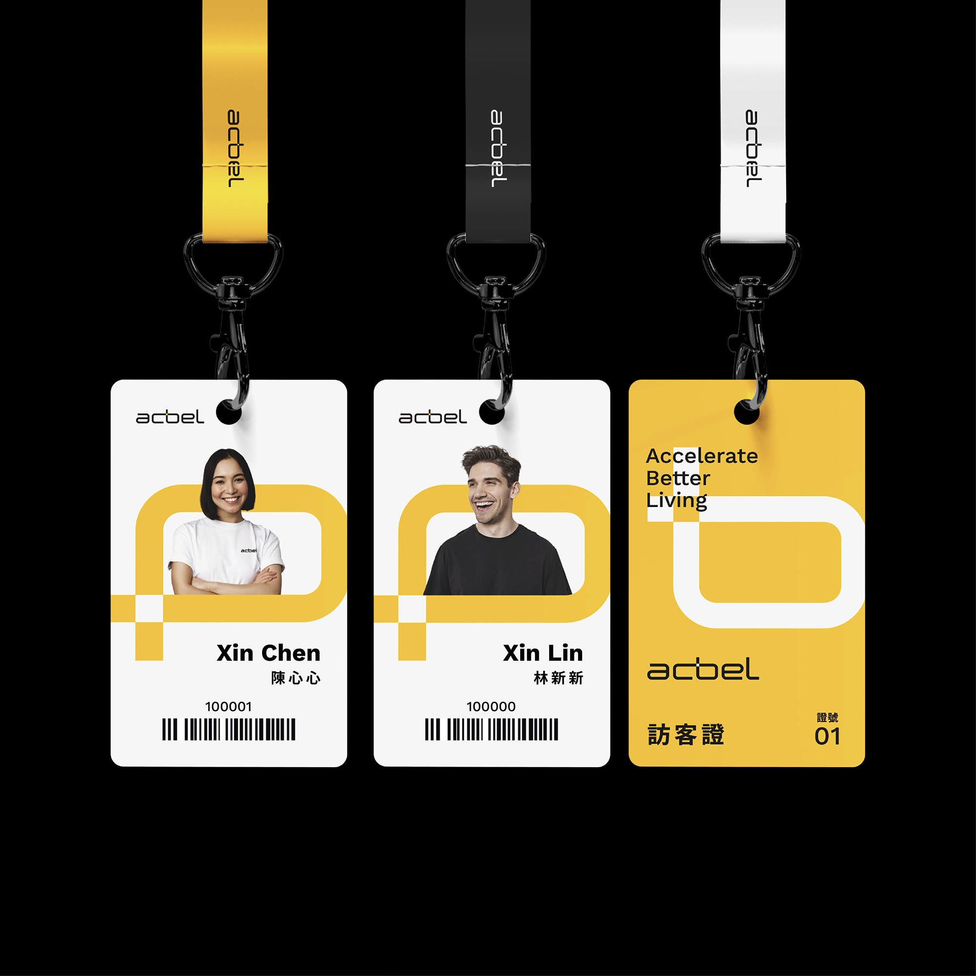
2024 年 7 月的視覺策略會議提出 ClearType、NeoTech、FrameLine 等設計方向。2024 年 8 月有標誌初稿提案與精稿提案,9 月有標準字與標誌定稿提案。2024 年 10 月整理出品牌識別規範手冊(第一階段)。第二階段延伸到名片、訪客門禁卡與環保提袋等應用物,並為官方網站首頁製作橫幅視覺。康舒科技的國際品牌重塑於 2024 年 11 月結案。
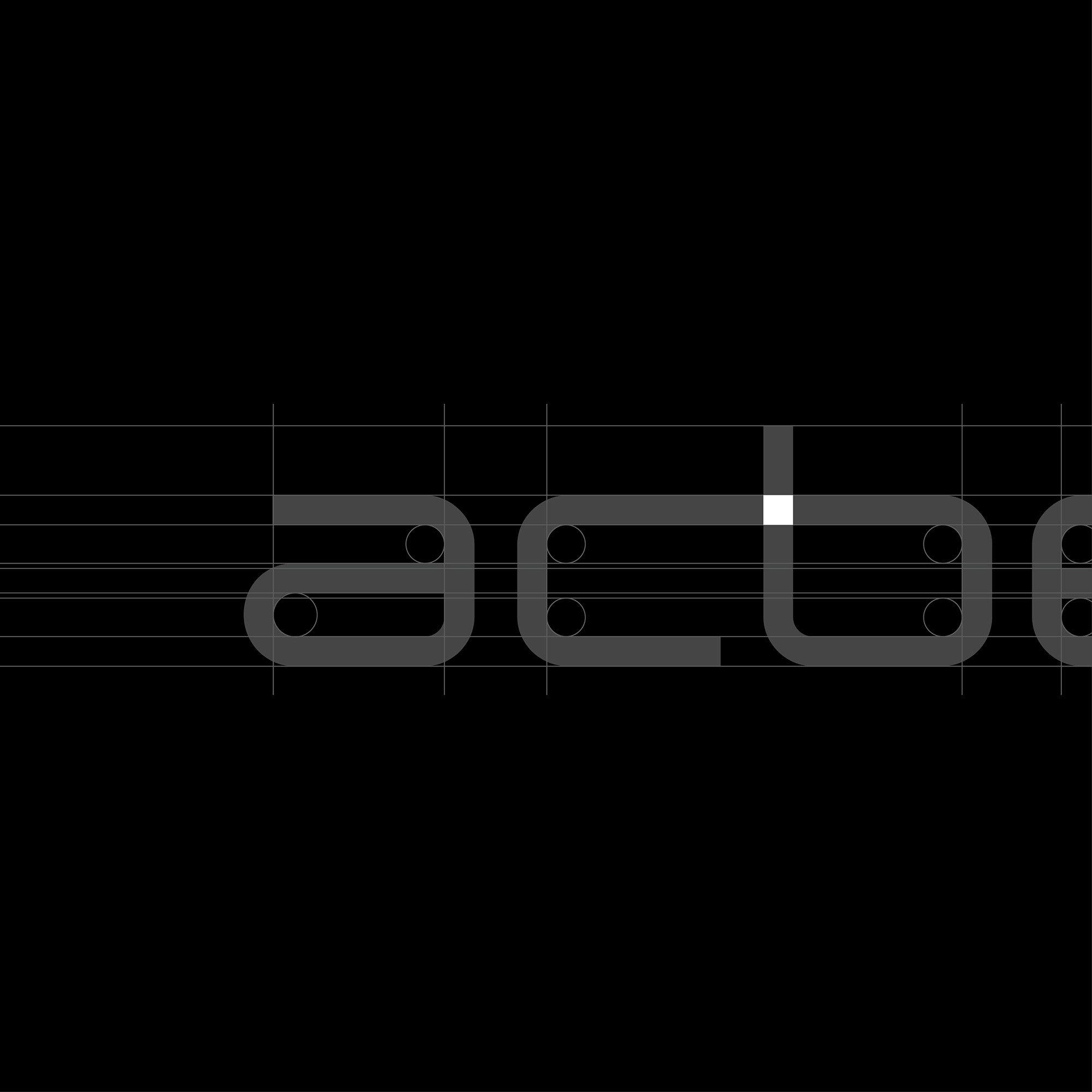

整體造形及色彩系統平衡了創新活力與專業可靠,透過動感與穩定並重的設計語言,詮釋康舒科技在技術升級過程中兼顧創意解決方案與專業實力的企業特質。
The overall design and color system strike a balance between innovation, dynamism, and professional reliability. With a design language that seamlessly blends motion and stability, the new brand identity reflects AcBel’s ability to integrate creative solutions with cutting-edge technology as it continues to evolve.
這些設計選擇分別對應什麼目標?§
康舒科技的提案與標誌設計,對應延續品牌基因、標誌差異化、識別延展與能源意象的表達。
- 品牌傳承:提案提出延續品牌基因、提煉並傳承原標誌特色;新標誌融入原標誌的雙色塊元素。
- 標誌差異化:提案建議避免以藍色單一色系作為主要色彩,並規範可單獨使用的圖標版及其使用情形。
- 識別延展:提案將便於延展的識別圖樣列為重點,並以深化品牌形象為目標。
- 能源意象:「+」符號與光芒、聚焦意象代表企業更新升級與潛能激發;電池元素呼應能源解決方案。
什麼樣的企業可以參考康舒科技的做法?§
如果您正規劃企業識別重塑,可以參考以下做法。
- 如果您要走向國際,可以參考現行標誌與同業識別分析。
- 如果您想保留原標誌元素,可以參考雙色塊的延續方式。
- 如果您要分階段延伸識別,可以參考從規範到應用物與網站橫幅的做法。
可以參考的順序是現況分析、策略、識別規範,再延伸應用。
品牌重塑從現況分析、策略到識別規範的做法,整理在品牌重塑。



結案時間
總經理
品牌總監
專案經理
設計組長
設計師
動態設計
2024.11
徐志揚
蘇昱安
王彥筑
蘇筱雯
吳冠賢、張嘉育
鄭智鴻
Case Closed
General Manager
Brand Director
Project Manager
Lead Designer
Designer
Motion Designer
2024.11
Chih-yang Hsu
Ivy Wang
Xiao-wen Su
Guan-shian Wu, Wendy Chang
Zhi-hong Cheng
看見設計如何動起來§
這段作品影片呈現康舒的設計與動態表達,可對照本頁的設計說明一起觀看。
想為自己的品牌做識別設計?