

美商傑明(Stantec)在 2020 年迎來在台灣的 30 週年,手心設計為這次紀念活動規劃主題,並設計活動 Logo 與主視覺。主題定為《詠續・永聚》,Logo 用簡約線條融入水、社區、環保等意象,主視覺則以水紋與字首 S 的曲線單元排出數字 30。
Stantec深耕台灣水利發展,以「社區」為每個專案的設計理念,仔細評估地區需求並連結專業,提供最適切的解決方案,透過每一次的專案執行,幫助全球社區改善生活品質。2020年為Stantec在台灣的30週年紀念,伴隨台灣走過30個年頭,Stantec與這片土地的羈絆將不斷延續,以社區為根,執行的每個專案皆以使用者的感受出發,展演設計 主題以《詠續・永聚》對應Stantec「以人為本」的企業精神,以永續為出發點,打造能夠永聚的和樂家園。
Stantec dedicates water resources development in Taiwan and with community as every case’s design idea to program. It evaluates carefully customer’s requirement and offers them the suitable way. Helping global area improve the quality of life.
In 2020, 30th anniversary of the founding of Stantec Taiwan. Stantec grow up with this land. The community is our root and home. Hand-Heart designs based on “sustainable and assemble”. Stantec’s business spirit is “people oriented” and believes that taking sustainable as the point can build an eternal homeland.
《詠續・永聚》這個主題是怎麼來的?§
2020 年 4 月 20 日的主題企劃先整理 Stantec 的品牌價值——以社區為設計理念、深耕 30 年陪伴台灣水利發展——再列出水、社區、人、愛、永續等品牌與 30 週年關鍵字,接著提出四個主題名稱方向。和完稿對照,活動最後以《詠續・永聚》為題,搭配英文標語 SUSTAINING TAIWAN TOGETHER;作品圖左下的四個圓形線條圖示,則分別標示人、水、環境與社區。

Logo使用簡約的線條表現畫面感,融入水、社區、環保等意象,除了象徵專業服務與企業核心之外,也呼應主題《詠續・永聚》勾勒出的美好家園形象,其中隱藏國字「滿」,也代表著Stantec對於自身與台灣圓滿、完滿的期許及祝福。配色使用象徵溫暖、歡欣的暖橘,搭配代表水及專業的湛藍,以及充滿活力與希望的亮黃,傳遞豐富而美好的社區意象。
The logo designed with concise lines with elements of water, community, and environmental protection. To present professional and philosophy of business also respond to the theme” sustainable and assemble”. It draw the outline of the sweet homeland and the conceal Chinese word “滿” [mǎné] means a blessing for Taiwan and themselves from Stantec.
It uses warm and gleeful orange, the azure represents water and professional pairs up energetic and hopeful bright yellow, to present an abounding, wonderful imagination.
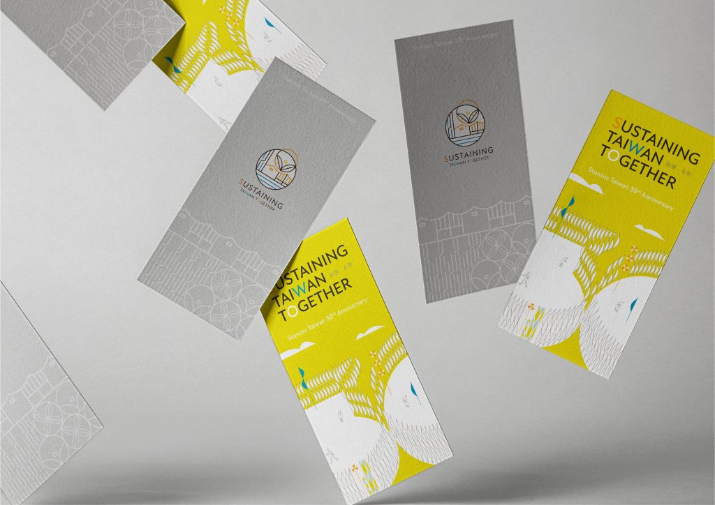

主視覺以代表水紋以及企業字首S的曲線單元排列成具透視感的數字30,運用虛實變化創造流動旋轉的視覺效果,帶出永續、循環的主題理念,在此架構下,融入社區、能源、建築等與Stantec連結的元素,象徵Stantec致力於永聚家園、永續土地的關注與使命。
Hand-Heart designs this logo with water wave and the S form Stantec to show the perspective number 30 in the key vision. Creating floating and swiveling effect to show the sustainable and circulation idea. Combining Stantec with community, energy resources and structures. It symbolizes Stantec will continue devoting to sustainable and assemble.
Logo 與主視覺經過哪些設計階段?§
Logo 在 2020 年 4 月 30 日先提出草圖,5 月 14 日以黑白稿提案;5 月 15 日 Logo 初稿與主視覺草圖一起提出,5 月 29 日再同步提出 Logo 精稿與主視覺初稿,主視覺精稿在 6 月 4 日、6 日、10 日三度提案,6 月 19 日 Logo 與主視覺一起完稿,也就是兩者錯開一個階段、並行推進。

哪些活動主視覺設計需求適合參考美商傑明案例?§
如果您的週年活動有以下需求,可以參考美商傑明的做法:
- 如果您尚未確定活動主題,可以參考整理品牌價值與關鍵字的做法。
- 如果您希望主視覺呼應企業名稱,可以參考以字首曲線排列週年數字的做法。
可以參考的順序是:如果您要規劃週年活動主題,先整理品牌價值,再列出關鍵字、提出主題名稱方向。
如果您正規劃週年活動的 Logo 與主視覺,可參考視覺設計服務說明。
—
完成時間 – 2020.06
設計總監 – 徐志揚
設計師 – 劉家溱(主視覺設計)、李奕臻(logo設計)
企劃 – 王彥筑
專案管理 –王彥筑
#美商傑明#Stantec#活動Logo設計#活動主視覺設計#Logo設計#手心設計