

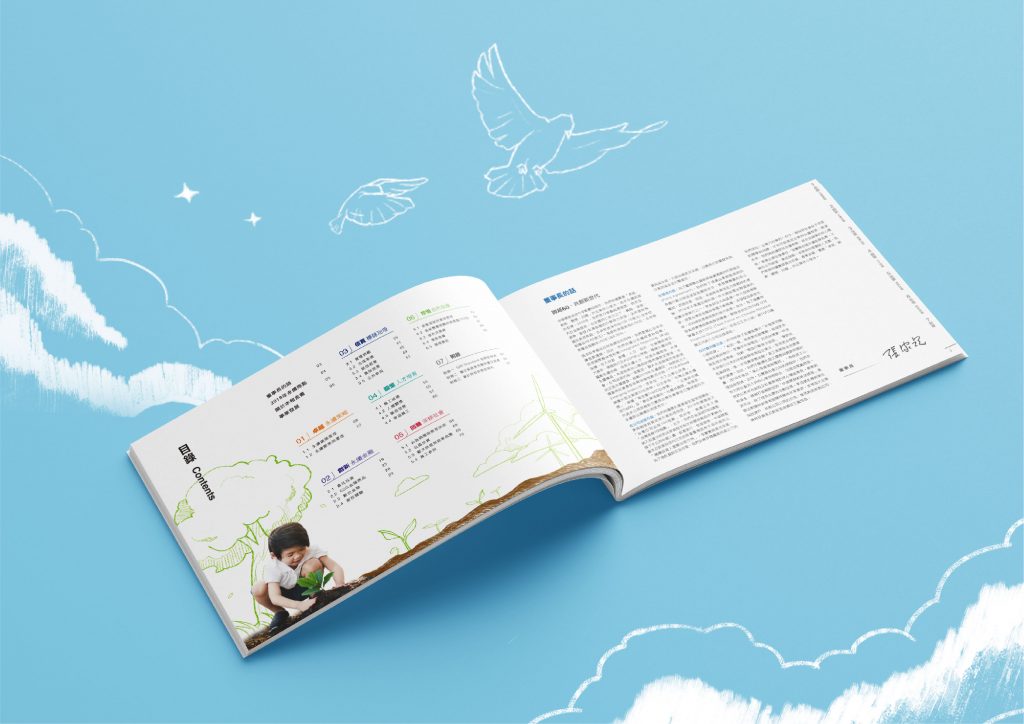
中華開發金控 2018 企業社會責任報告書由手心設計負責封面設計、編排設計與插畫設計,主題是「共創新世代」。封面以孩童、飛機、藍天與白鴿的影像搭配手繪感插圖,目錄頁延續封面的影像加手繪風格,章節頁以不同色彩與代表影像區分,章節數字旁線條、圖文交界小箭頭與頁籤則取自中華開發金控 logo 的造型。
封面的孩童、飛機與白鴿代表什麼?§
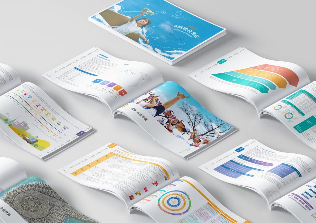
以簡約的影像方式呈現本次 企業社會責任報告書 的主題:共創新世代,畫面中的孩童與飛機、藍天與白鴿,象徵著新世代與未來卓越的意象,封面封底的畫面上皆使用了手繪感的插圖,呈現中華開發金控創新與人文關懷的味道。
The theme of this corporate social responsibility report is presented with simple images: creating new generations together. The children and airplanes, the blue sky and the white doves in the picture symbolize the image of excellence in the new generation and the future. Hand-painted illustrations are used on the cover and back cover of the picture, showing the innovative and warm-hearted of China Development Financial Holdings.

目錄頁與章節頁如何延續封面並帶入 logo?§
目錄頁的部分延續封面設計風格,將影像與手繪感的方式結合,以灌溉作為主要影像營造,代表中華開發金控對於企業本身總是不斷的向前、對於社會總是盡一份心力。
The catalog page continues the design style of the cover, combining images with hand-painted, and using irrigation as the main image to create, which represents the continuous breakthrough of China Development Financial for their own company and always contributes to the society.
章節頁的系統除了安排有不同的色彩外,更因應各章節所敘述的內容,進而選擇適當的影像作為各章節頁的代表圖。
In addition to the different colors for the chapter pages, appropriate images are selected as the representative images of each chapter page according to the content described in each chapter.

在設計的細節上,也將中華開發金控的logo特色結合進書中,如章節頁數字旁的線條、圖片右下方圖文交界的小箭頭,以及貫串整本報告書的頁籤設計,造型皆取自中華開發金控logo的設計延伸,除了具有屬於企業獨有的特色外,更將本次企業社會責任報告書的剛柔並濟良好地表現出來。
In the details of the design, the logo features of China Development Financial are also incorporated into the CSR book, such as the lines next to the numbers on the chapter pages, the small arrow at the bottom right of the picture, and the design of the labels that run through the entire CSR book. All the details are from the extension of the China Development Financial logo. In addition to the unique characteristics of the company, it also demonstrates the rigidity and flexibility of this corporate social responsibility report.


這本報告書經過哪些提案步驟?§
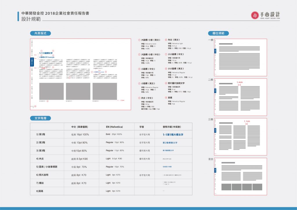
主要提案包括 2019 年 1 月 22 日的 CSR 風格提案,以及 1 月 30 日與 2 月 14 日的草圖提案、2 月 19 日到 3 月 4 日的三版初稿提案、3 月 7 日的內頁版型規範+內頁試排提案、3 月 18 日的目錄頁、章節頁、頁籤提案,以及 3 月 29 日的章節頁影像提案;封面精稿提案則有 3 月 26、27 日的第一版與 5 月 29、30 日的第二、三版(以上為部分提案)。其中內頁版型規範提案先訂出左頁、右頁的內文編排範圍、中英文標題與內文的字型字級,以及一欄、二欄、三欄的欄位規範,再用實際內容試排內頁。
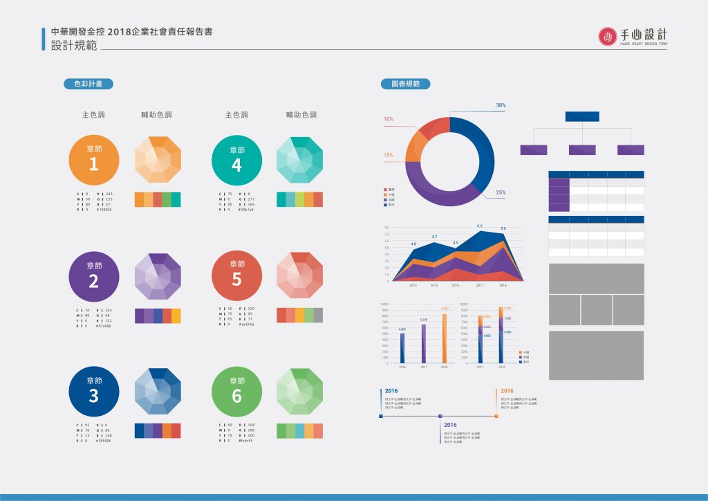
和完稿對照,下方的設計規範圖可以看到六個章節各有主色與輔助色(橘、紫、深藍、藍綠、紅、綠),以及圖表規範、文字階層與一欄、二欄、三欄、混合的欄位版式。
內頁的文字、圖片與欄位有哪些編排原則?§
中華開發金控報告書的內頁版型規範提案,寫明了圖文編排的用意與欄位使用原則:
- 文字放在規範區域內,插圖與照片可視情況排在區域外或跨頁,提案寫明用意是提升整本手冊的豐富性。
- 欄位分成一欄、二欄、三欄,提案註明這是基本規範,實際編排可配合圖像需要調整欄位長度或做文繞圖。
什麼情況適合參考中華開發金控報告書的做法?§
如果您的永續報告書有以下情況,中華開發金控這個案例的做法可以參考:
- 如果您想把品牌帶進章節細節,可以參考以 logo 造型延伸線條與頁籤的做法。
- 如果您的報告書章節多,可以參考以不同色彩與代表影像區分章節頁的做法。
可以參考的順序是:先整理品牌造型與章節色,再訂內頁規範並試排。
如果您正規劃永續報告書,可參考ESG 永續報告書設計。
中華開發金控 2018 CSR 線上觀看 2018 CSR of China Development Financial download
https://www.cdibh.com/Upload/Files/CTCsr/2018CSRReportCh_hzlega2a.pdf
結案時間 Case Closed-2019.07
封面設計Cover Design-徐子皓 SYU,ZIH-HAO、藍啟睿 LAN,CI-RUEI、劉又瑄 LIOU,YOU-SYUAN
編排設計 Layout Design-李奕臻 LI,YI-JHEN、林玉真 LIN,YU-JHEN、潘柔慈 PAN,ROU-CIH、徐子皓 SYU,ZIH-HAO、張甫正 JHANG,FU-JHENG
插畫設計 Illustration Design -林玉真 LIN,YU-JHEN
專案企劃 Project Planning-蘇連捷 SU,LIAN-JIE
設計總監 Executive Design Director-徐志揚 HSU,CHIH-YANG