
Project Overview§
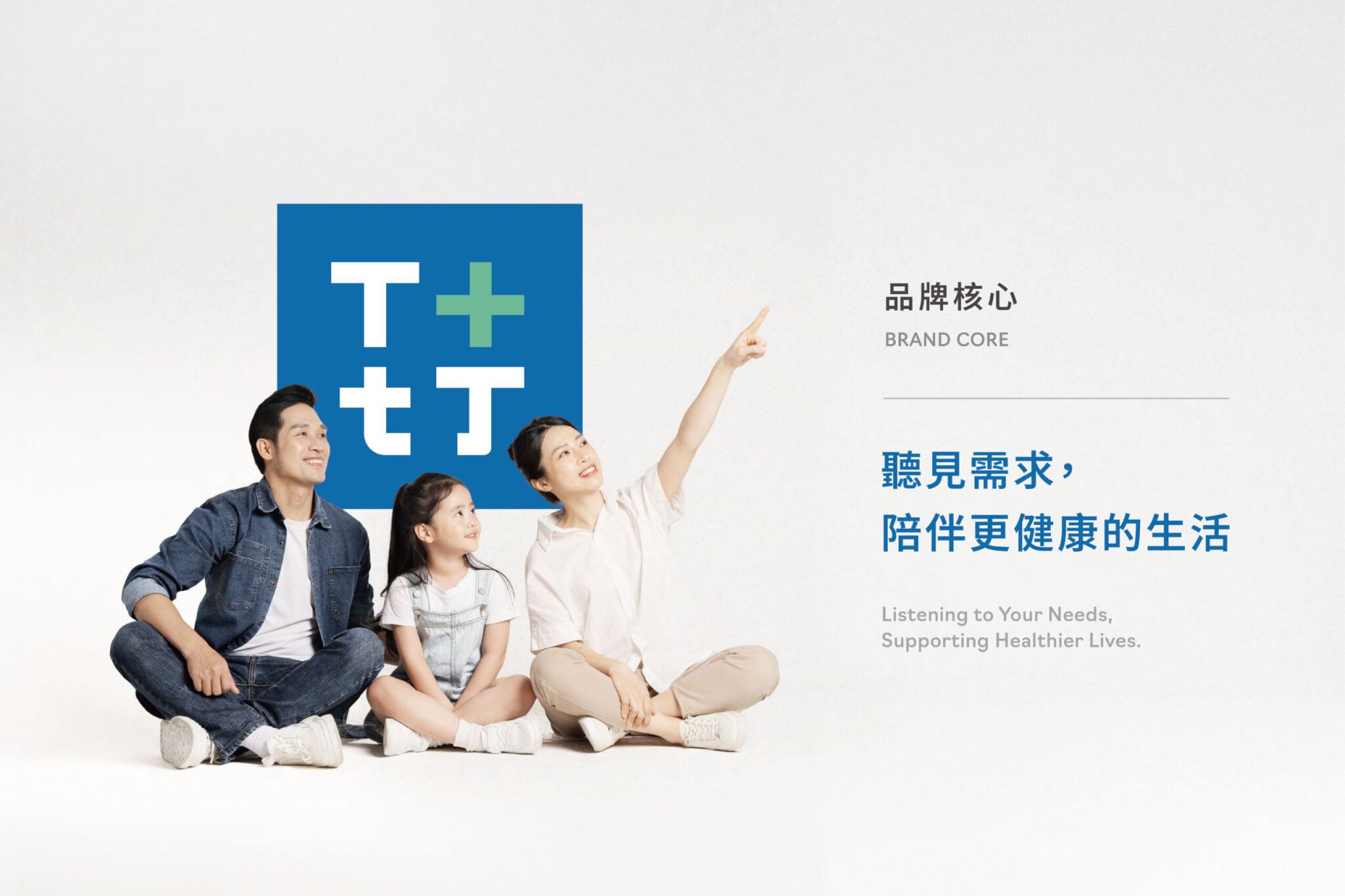
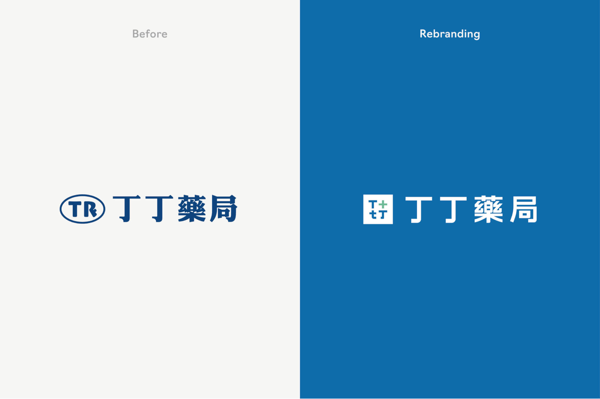
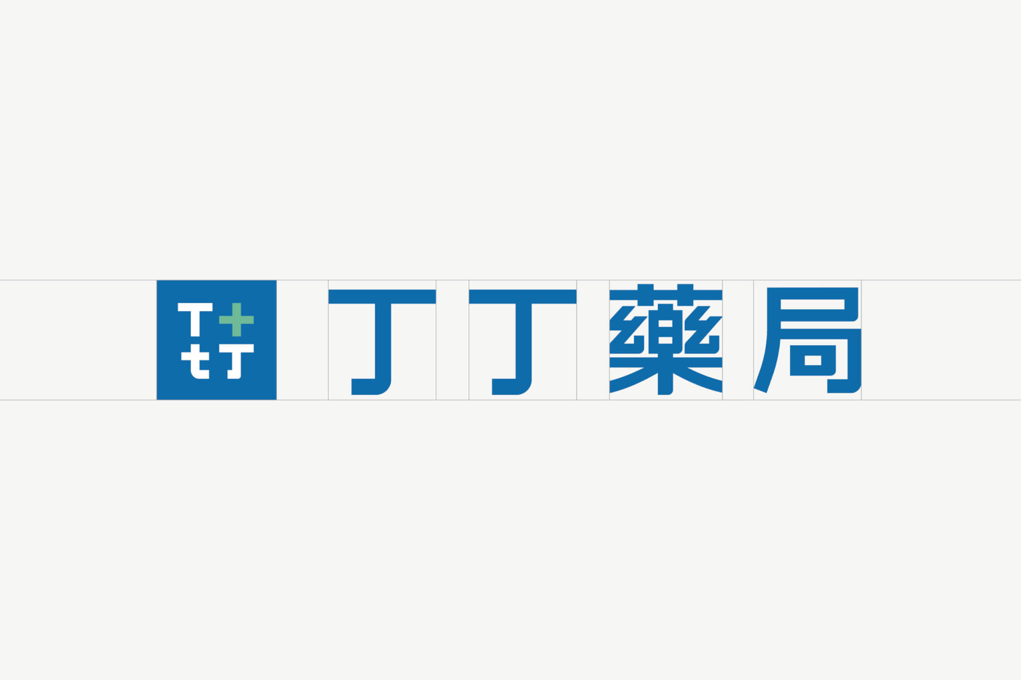
丁丁藥局是從婦嬰用品出發、服務延伸到樂齡族群的連鎖藥局。為了讓品牌從「社區熟悉的藥局」走向一致好認的連鎖識別,手心設計從跨層級訪談與品牌策略梳理開始,完成新 Logo、色彩計畫、輔助圖形與品牌識別規範,並延伸到門市招牌、網頁主視覺與廣告帆布。新 Logo 以大寫 T、小寫 t 與醫療十字組成,收進方塊外框,以丁丁藍為主色。
股票代號:諾貝兒(6844)
丁丁藥局 從婦嬰到樂齡,服務橫跨多元族群。在長期發展下,「陪伴」這項核心價值依然存在,當品牌從「社區熟悉的藥局」,走向「多據點連鎖體系」,如何被快速辨識、被一致理解,成為關鍵課題!
TinTin Drugstore faced a key challenge: its core value of companionship remained strong, but its brand identity had become unclear and inconsistent. As the business expanded from a neighborhood pharmacy to a multi-location retail chain, the need for clear recognition and consistent communication became critical.
Strategy§
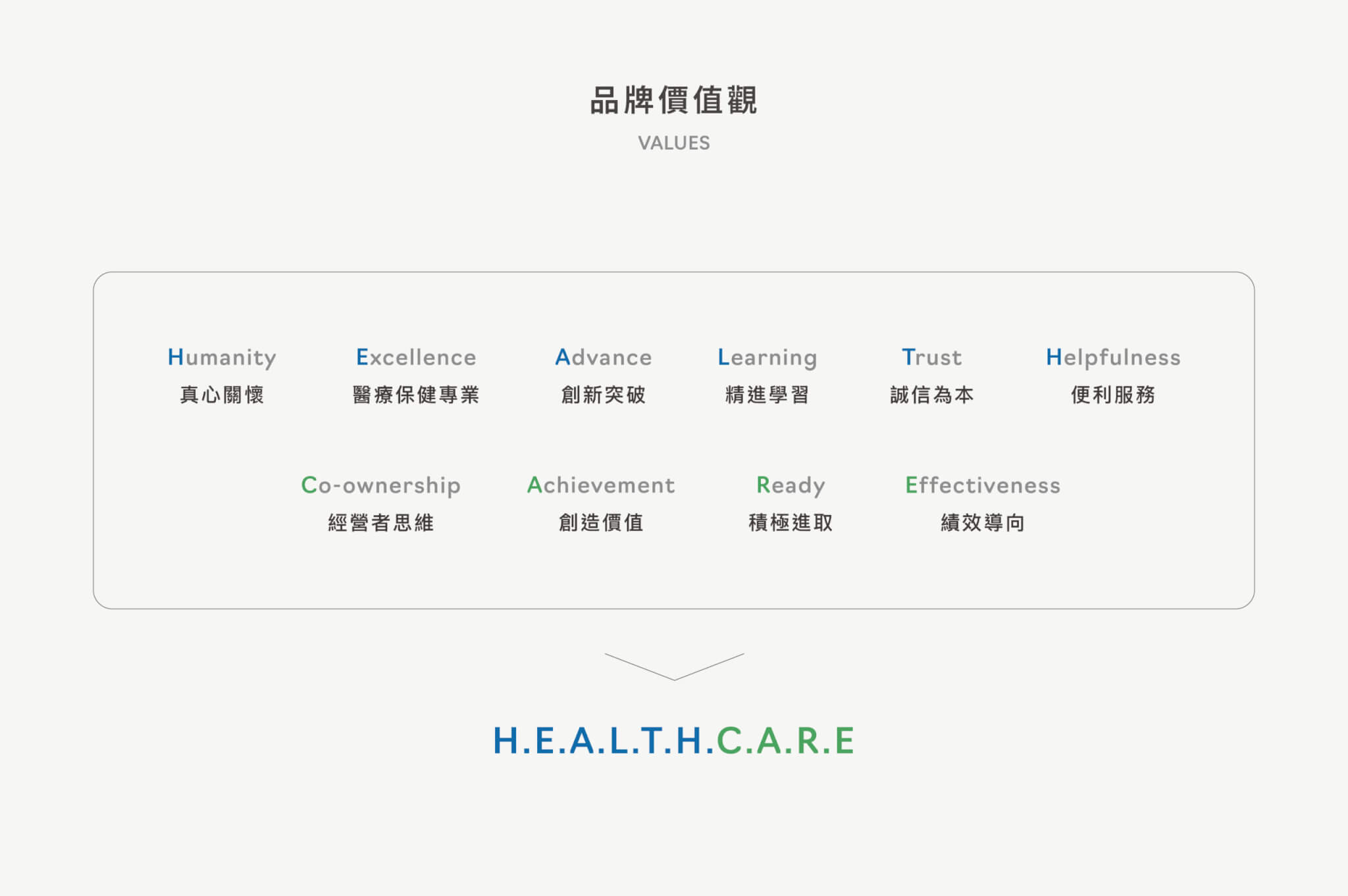
在本次品牌識別優化中,我們並非直接從視覺設計出發,而是從「組織與使用者的認知落差」進行拆解。透過跨層級訪談(決策層 × 部門主管 × 第一線藥師),重新梳理品牌長年累積但未被系統化的核心價值:
・信任 ・團隊 ・陪伴
並進一步轉化為一套可被辨識、可被延展的品牌識別系統。
We approached this project from a strategic perspective, starting with the gap between internal understanding and user perception. Through interviews across all levels of the organization, we defined three core values:
・Trust ・Team ・Companionship
These were translated into a scalable brand identity system.
丁丁藥局的品牌重塑,要先回答哪些問題?§
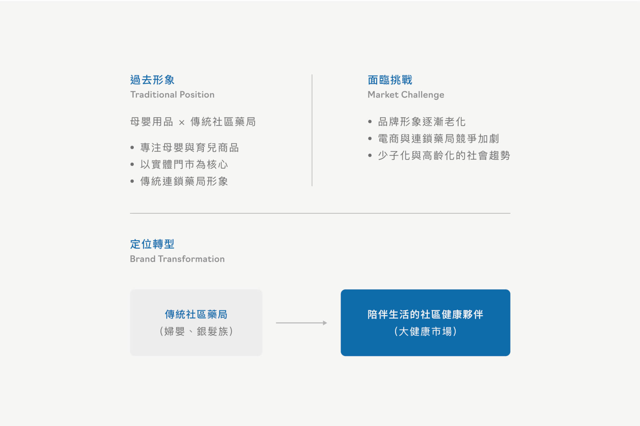
2024 年 10 月的設計策略提案整理出訪談與問卷的結論:品牌理念沒有被有效傳遞、過去的價值核心已不足以支撐品牌擴張,也缺少鮮明的品牌印象。設計策略提案寫明,這次品牌重塑是在現有的基礎上加強部分比例,並非全面轉型。
定位上,丁丁從專注婦嬰與銀髮族的傳統社區藥局,走向「陪伴生活的社區健康夥伴」。提案把設計要回答的問題收斂成三個:「親和專業」有沒有新的傳達方式?消費者在丁丁購物的情境是什麼?發展新版圖的同時,如何鞏固既有客群?為了回答第二題,提案沿著需求產生、爬文比價、停車進店、藥師介紹、挑選結帳到離開店面的預期消費旅程,逐站檢視品牌識別要在哪裡被看見、被讀懂。
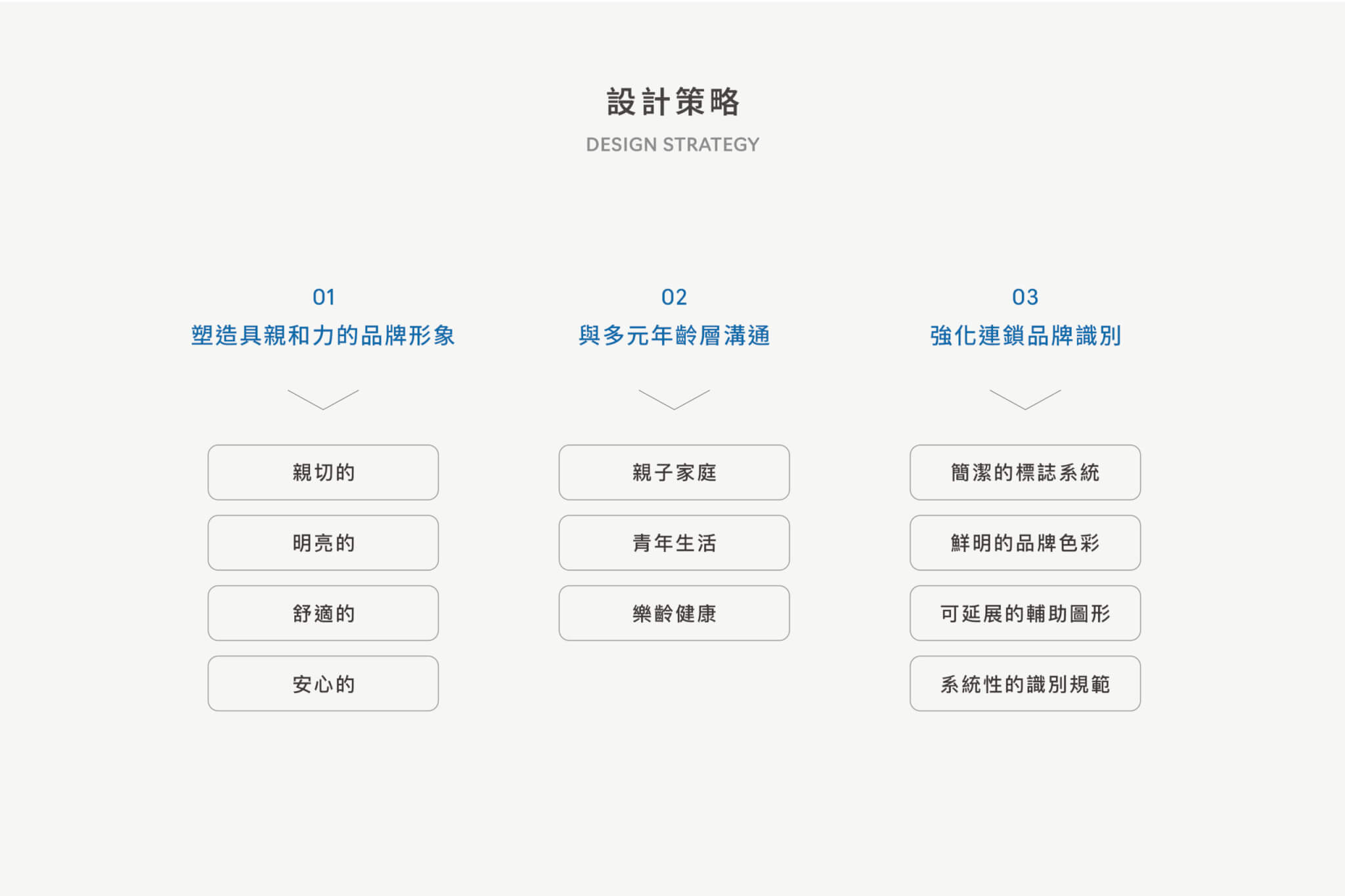
這些討論最後歸納成三個設計策略:塑造具親和力的品牌形象、與多元年齡層溝通、強化連鎖品牌識別。
Visual Design§
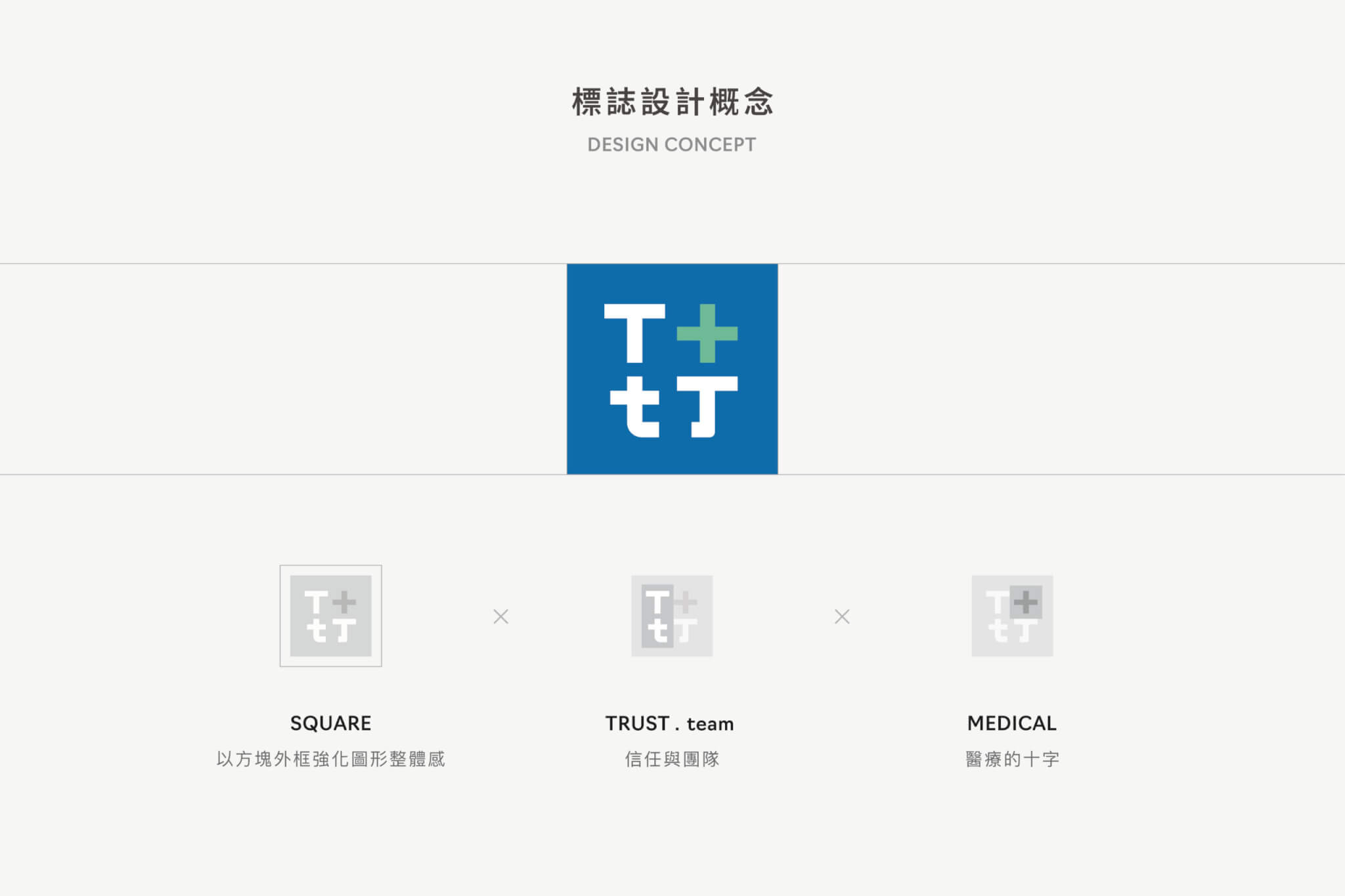
我們建立具有「語意結構」的符號語言:
・大寫 T:象徵 TinTin 與 Trust ・小寫 t:代表 team ・融合醫療十字與「丁」字語彙,建立專業識別基礎
讓品牌在不同通路與應用場景中,都能維持一致的意義與識別力。
The logo system is built on a clear visual language:
・Uppercase T for TinTin and Trust ・Lowercase t for team ・Integrated with the medical cross and the Chinese character “丁”
This allows the brand to maintain consistent meaning and strong recognition across different channels and applications.
丁丁藥局新 Logo 的方向是怎麼決定的?§
動手畫 Logo 之前,手心先做了「視覺十字分析」:用色彩(暖色/冷色、柔和/鮮豔)、字體(筆畫粗細、個性化/標準化)、造型(簡潔/繁複、圖形/文字)三組座標,觀察台灣藥局與藥妝品牌、以及國外藥局品牌參考案例的落點,再提出「專業清晰」、「親切溫暖」、「健康活力」三個識別方向,作為 Logo 草稿討論的起點。
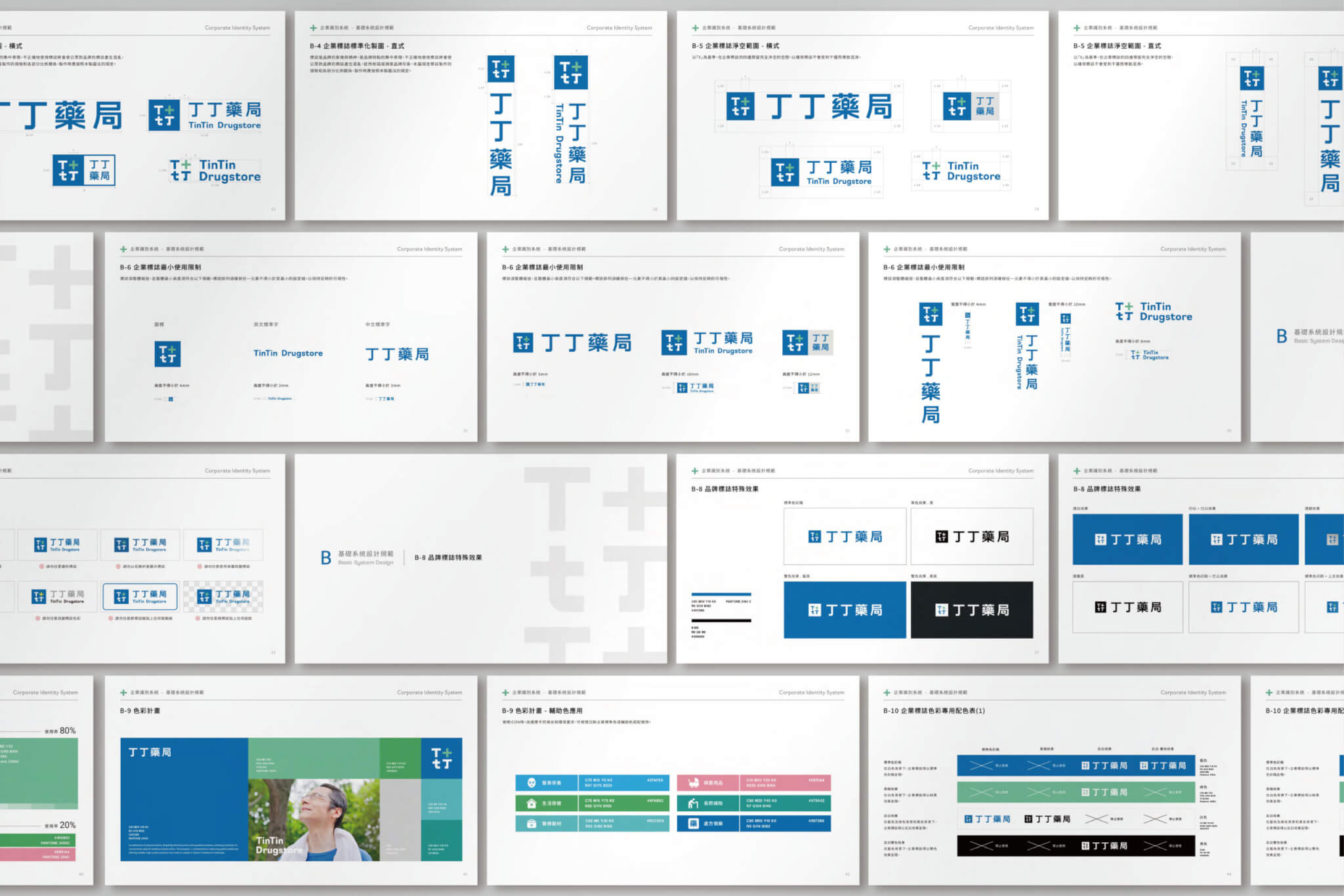
2024 年 10 月中有 Logo 草圖,10 月 22 日有初稿設計提案,11 月有精稿設計提案,精稿階段同時提出門市招牌與門框設計。定稿的 Logo 把代表 TinTin、Trust 與 team 的 T 與 t、醫療十字與「丁」字語彙放進同一個方塊外框;規範寫明,方塊外框的用意是強化圖形整體感。標誌備有橫式、直式與特殊排列樣式,分別對應橫式招牌與名片、關東旗與直式招牌,以及特殊招牌或國際場合。
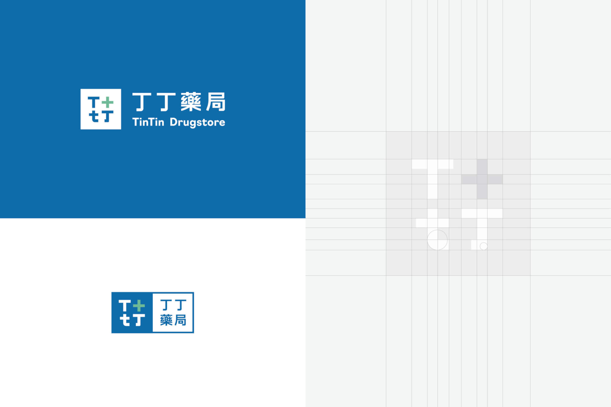
同時,我們重新建構色彩與視覺系統,解決過往識別混亂與資訊分散的問題,讓品牌在門市空間、包裝與溝通介面中,能夠被快速辨識並有效傳達。
這次專案的關鍵,不只是設計一個新的視覺符號,而是完成一件更重要的事:
⇀ 讓丁丁藥局,從「被熟悉的店」,轉變為「被辨識的品牌」。
建立一套足以支撐連鎖發展的品牌基礎。
Together with a refined color system, the new identity improves clarity and consistency across stores, packaging, and brand communications. This project goes beyond designing a new logo. It transforms TinTin Drugstore from a familiar local store into a clearly recognizable brand, ready for retail expansion.
丁丁藥局的識別系統如何延伸到門市與日常溝通?§
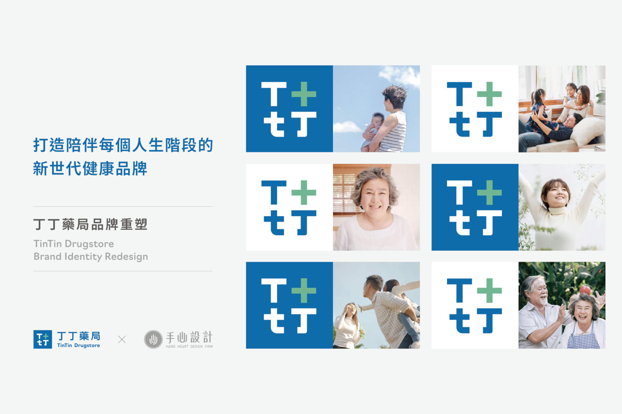
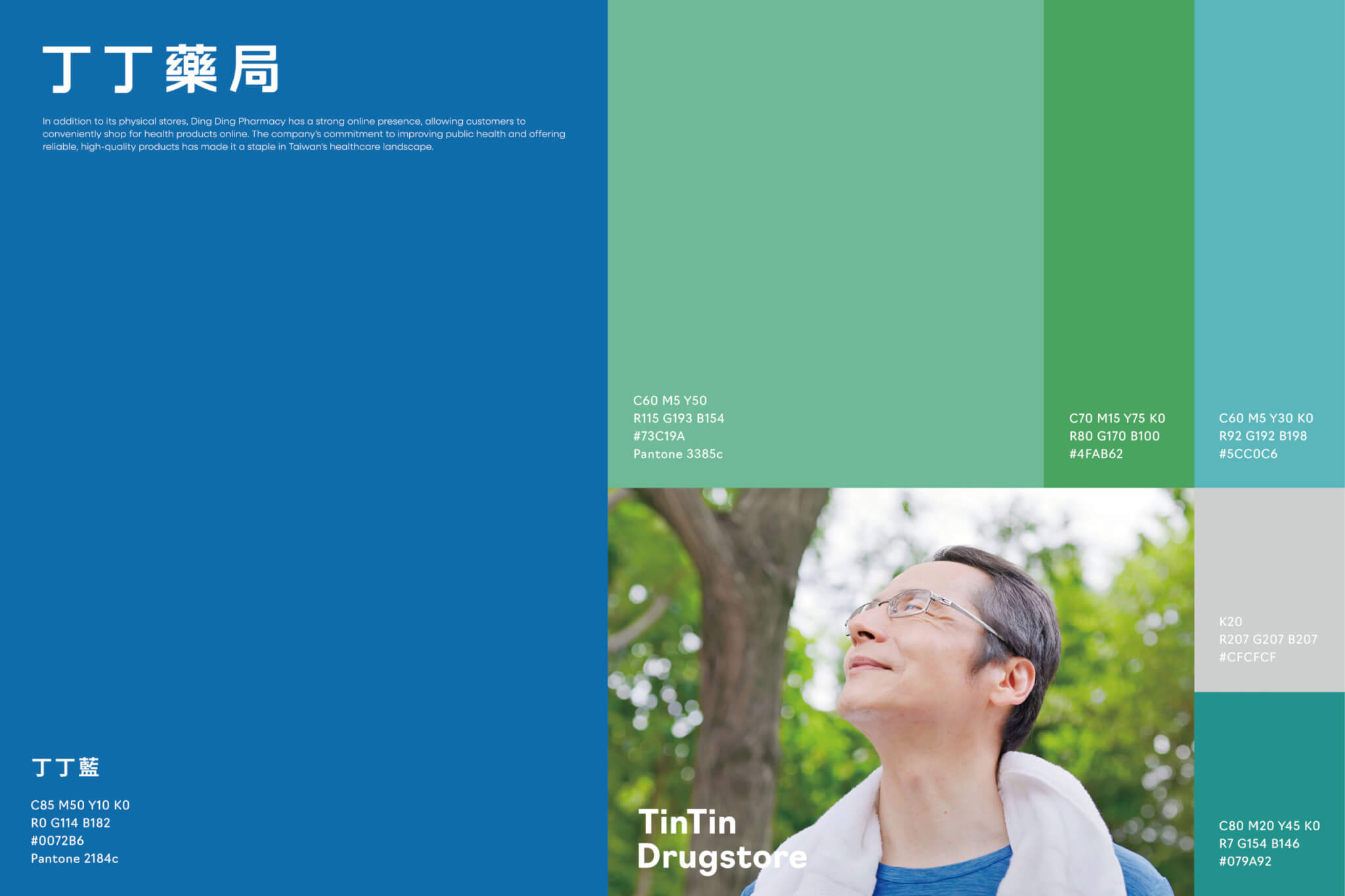
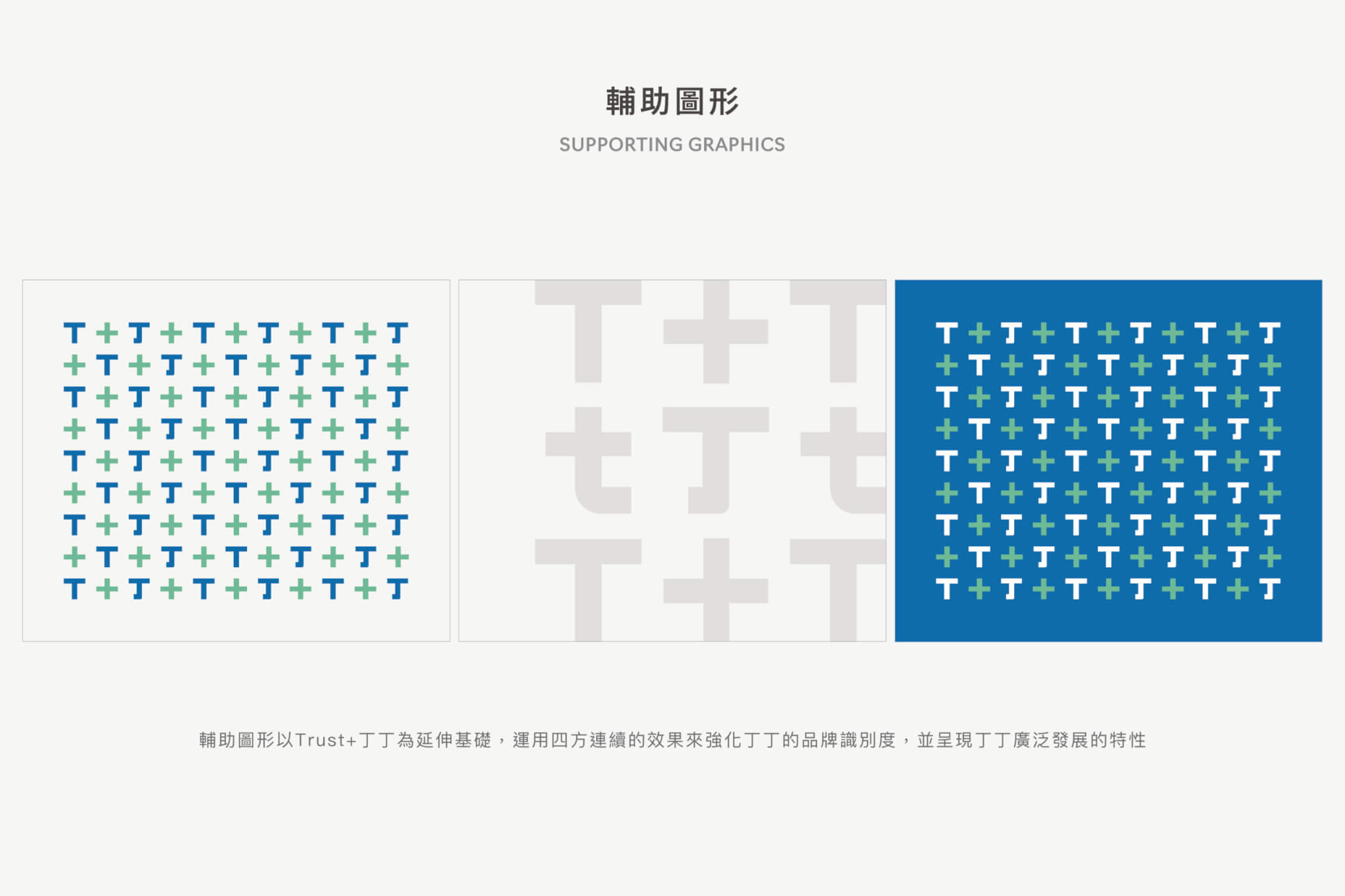
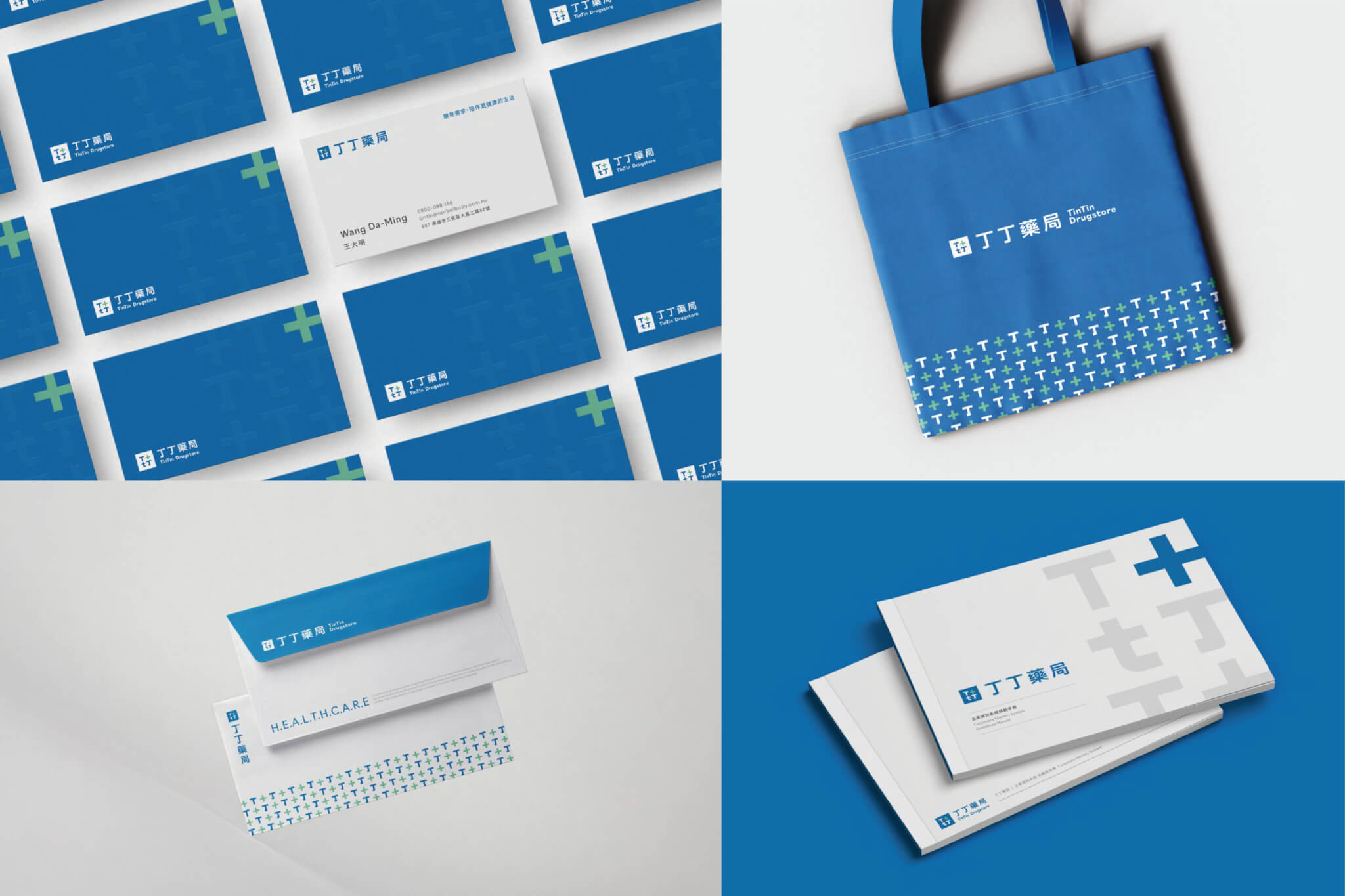
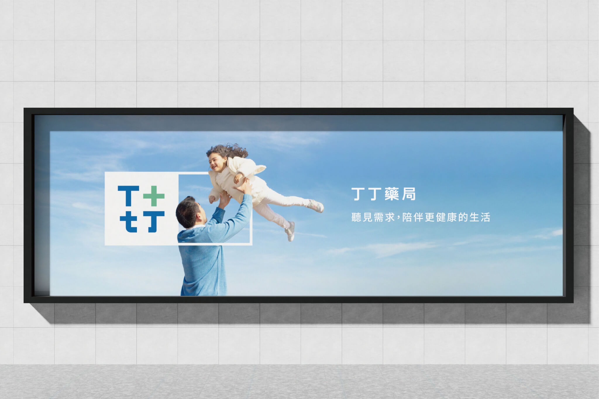
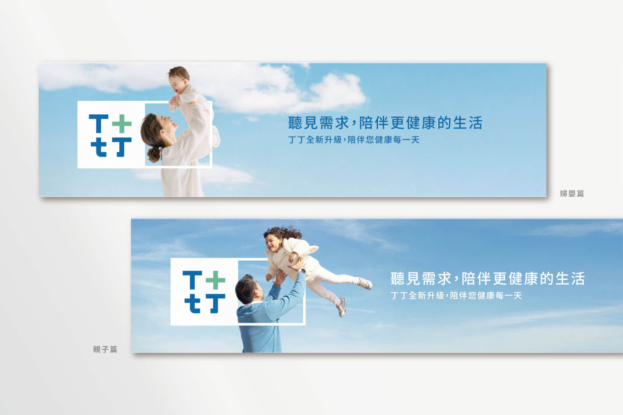
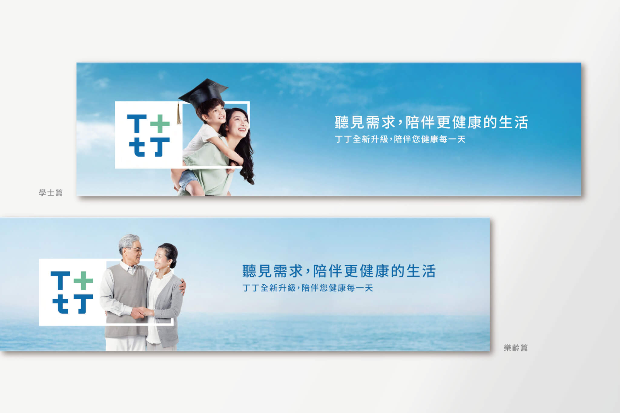
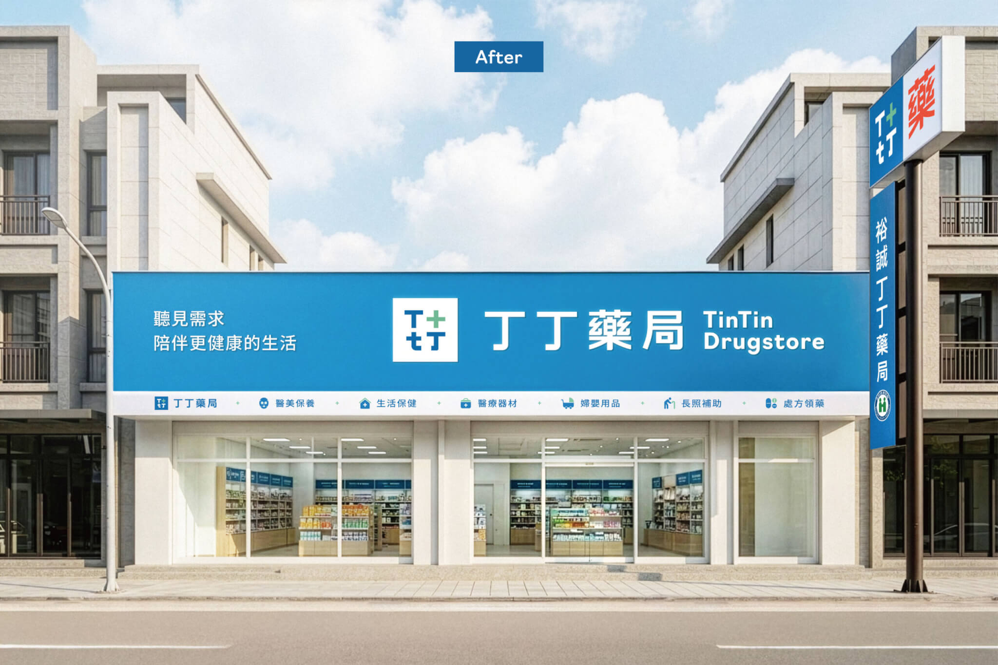
色彩計畫以丁丁藍(#0072B6)為主色、綠色系為輔,另訂一組醒目色彩;輔助色也對應到門市招牌上的服務類別圖示。輔助圖形以 T 與十字四方連續排列,用在提袋、信封與名片等應用品上。品牌標語「聽見需求,陪伴更健康的生活」和新 Logo 一起出現在門市招牌與形象主視覺上,主視覺以不同年齡的家人生活情境,對應從婦嬰到樂齡的客群。
品牌識別規範訂出標誌的標準製圖、淨空範圍、最小使用尺寸、禁用範例與背景明度規則,指定中文 Noto Sans TC、英文 Navigo 為專用字體,並收錄門市招牌的應用方式。2024 年 11 月 26 日規範完成時,另有一份給丁丁前端同仁的品牌教育訓練資料。
丁丁藥局的 Logo 與規範,各自為了什麼?§
丁丁藥局的 Logo 與規範著重圖形整體感、版型與可視性,提案另列出消費者旅程中的品牌識別與店面需求。
- 丁丁藥局 Logo 將醫療十字與「丁」字元素收進方塊外框,規範寫明用意是強化圖形整體感。
- 規範寫明,標誌的橫式排列適合橫式招牌與名片,直式適合關東旗與直式招牌,特殊排列用於特殊招牌或國際場合。
- 規範寫明,標誌四邊的淨空範圍用來避免干擾造成混淆;最小使用高度的用意是保持足夠的可視性。
- 提案沿著消費者旅程寫明,鮮明的品牌識別用來強化印象,顯眼、明亮舒適的店面用來減少藥局壓迫感。
哪些連鎖品牌適合參考丁丁藥局的做法?§
如果您正規劃連鎖品牌的識別更新,可以參考丁丁藥局的做法。
- 如果您的品牌從社區單店走向多店,可以參考先整理訪談與問卷結論的做法。
- 如果您的招牌、關東旗與名片版型不同,可以參考標誌排列的規範。
可以參考的順序是先整理品牌問題,再發展標誌,接著訂出規範與門市應用。
品牌重塑從訪談、策略到識別規範的做法,整理在品牌重塑。

總經理
品牌總監
專案經理
設計組長
設計師
動態設計
徐志揚
蘇昱安
王彥筑
蘇筱雯
吳冠賢、張嘉育、徐維志
鄭智鴻
General Manager
Brand Director
Project Manager
Lead Designer
Designer
Motion Designer
Chih-yang Hsu
Ian Su
Ivy Wang
Xiao-wen Su
Guan-shian Wu, Wendy Chang,Wei-Chih Hsu
Zhi-hong Cheng
想為自己的品牌做識別設計?