
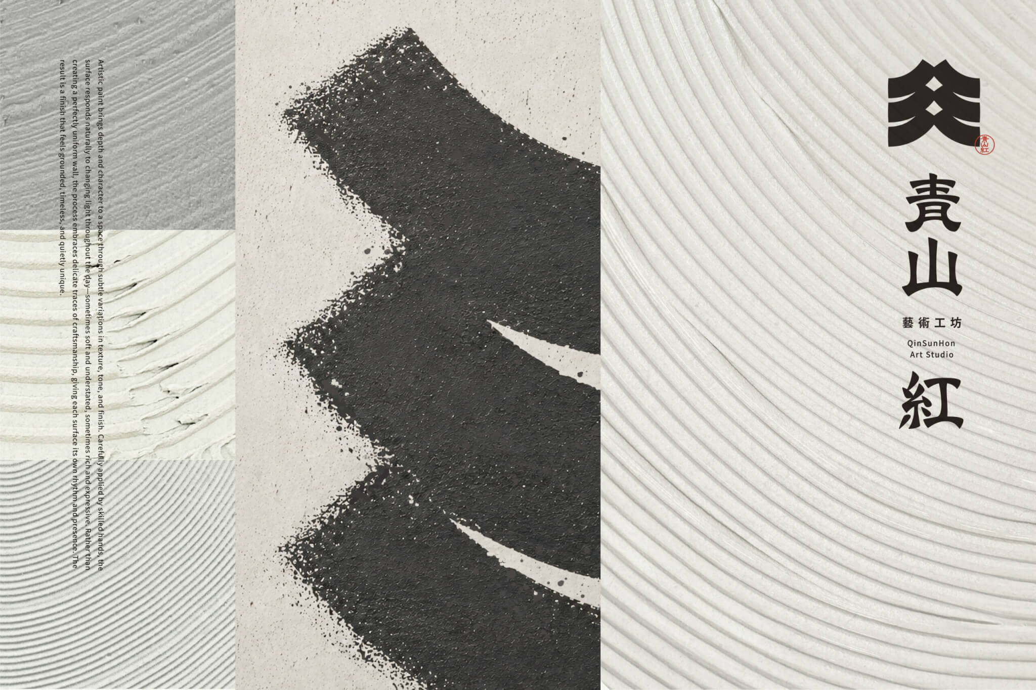
Project Overview§
青山紅藝術工坊 以塗料為媒介,將專業技藝與藝術美學融入空間,讓牆面承載質感與情感。
這份講究,來自施作過程中對力度、厚薄與肌理的細膩掌握。看似自然的紋理變化,背後是職人長年累積的技術、經驗與美感判斷。
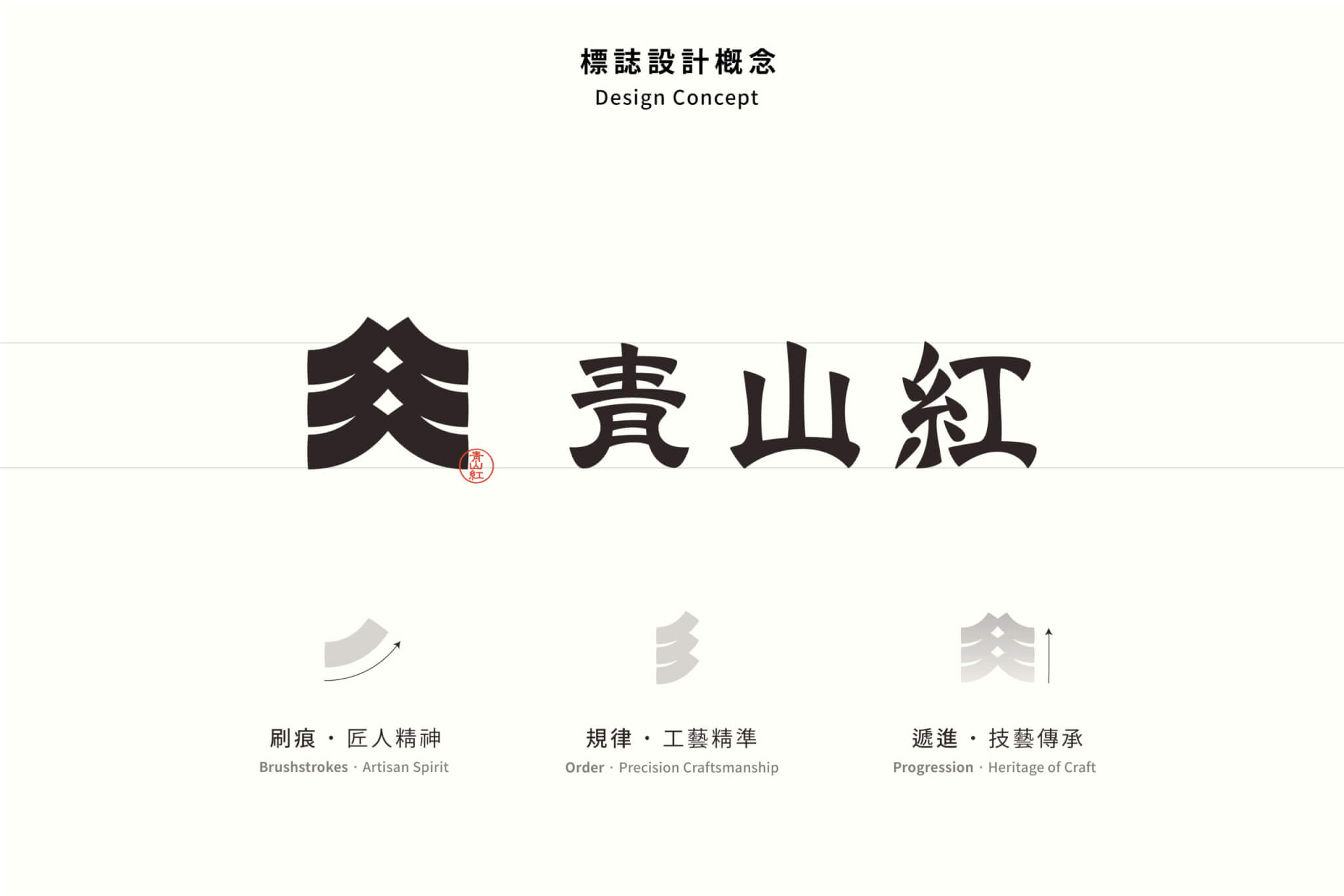
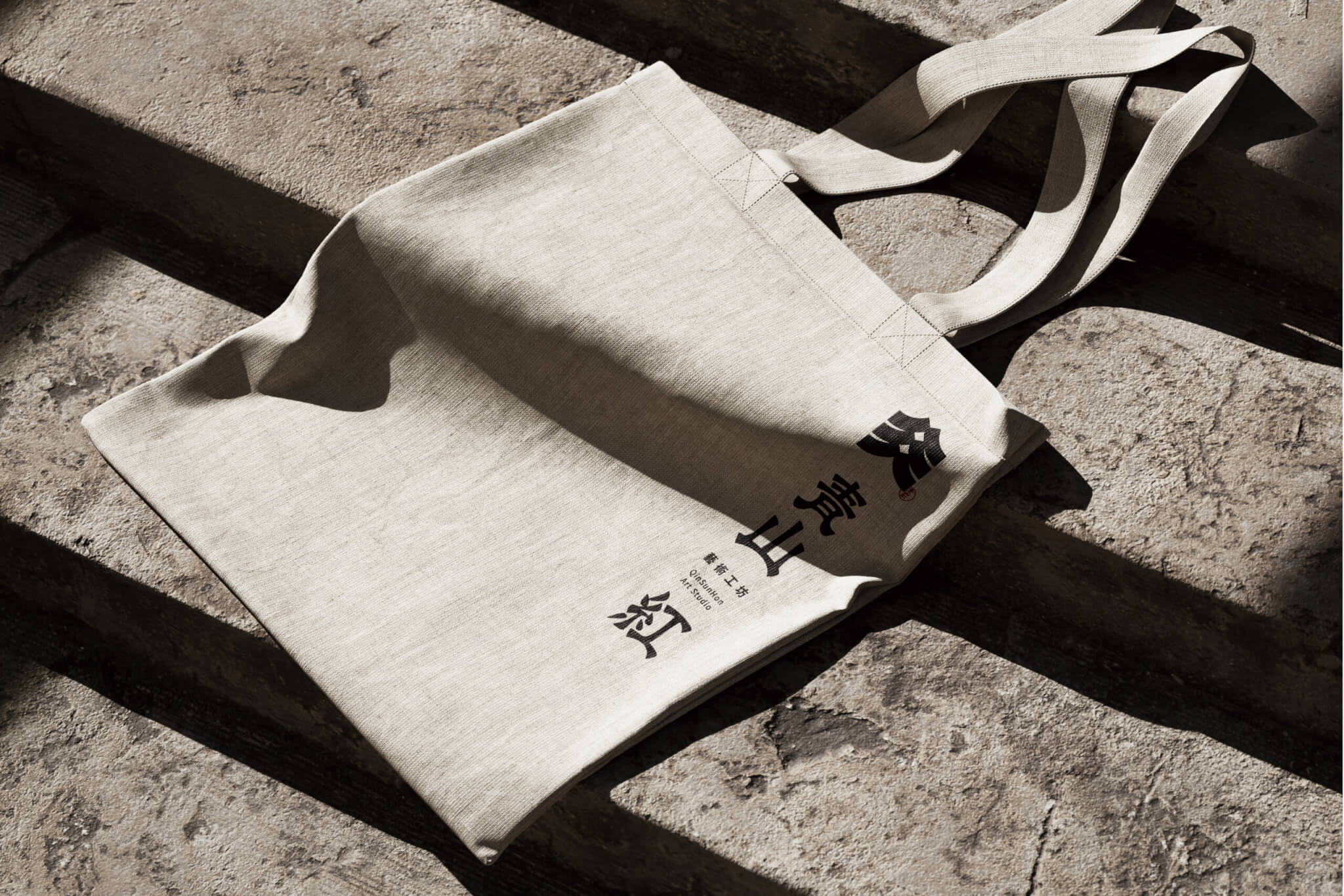
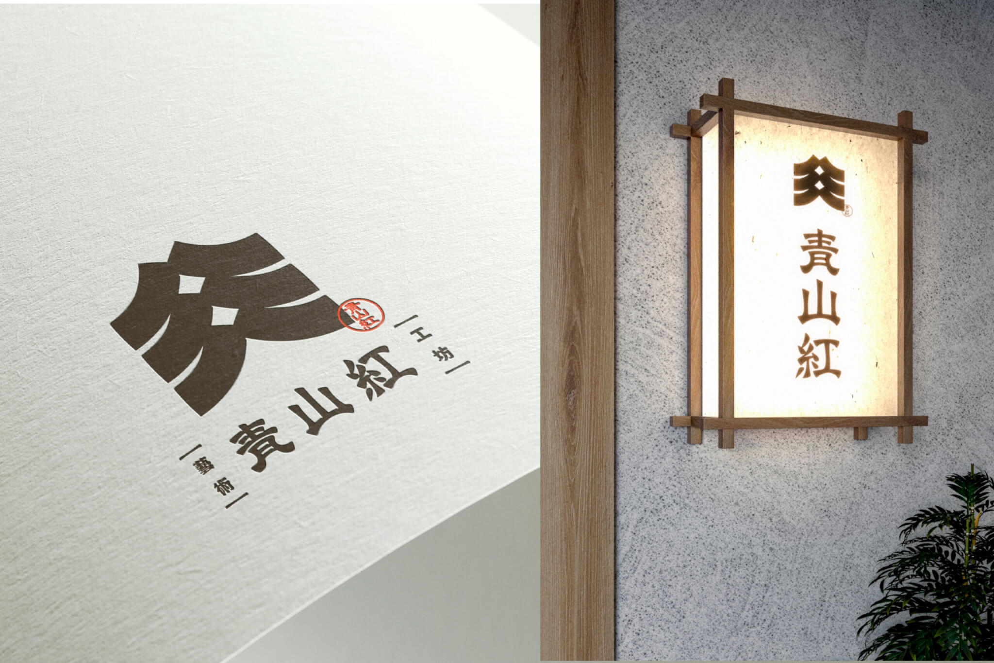
手心以「專業、匠心、精準、可靠」為核心,從塗料工藝的施作特性出發,擷取滾筒塗刷時的筆勢與層次,轉化為標誌中富有節奏的線條語彙。在規律與變化之間,呈現職人對力道、細節與質地的掌握,也讓工藝精神透過視覺形式具體展現。
Qinsunhon Art Studio brings craftsmanship and artistry into spaces through decorative coatings, transforming ordinary walls into expressive surfaces. Every texture reflects years of experience, precision, and artistic sensibility.
Inspired by the movement and layered strokes of paint rollers, we translated the spirit of craftsmanship into a rhythmic visual identity, expressing professionalism, precision, and attention to detail.
Visual Design§
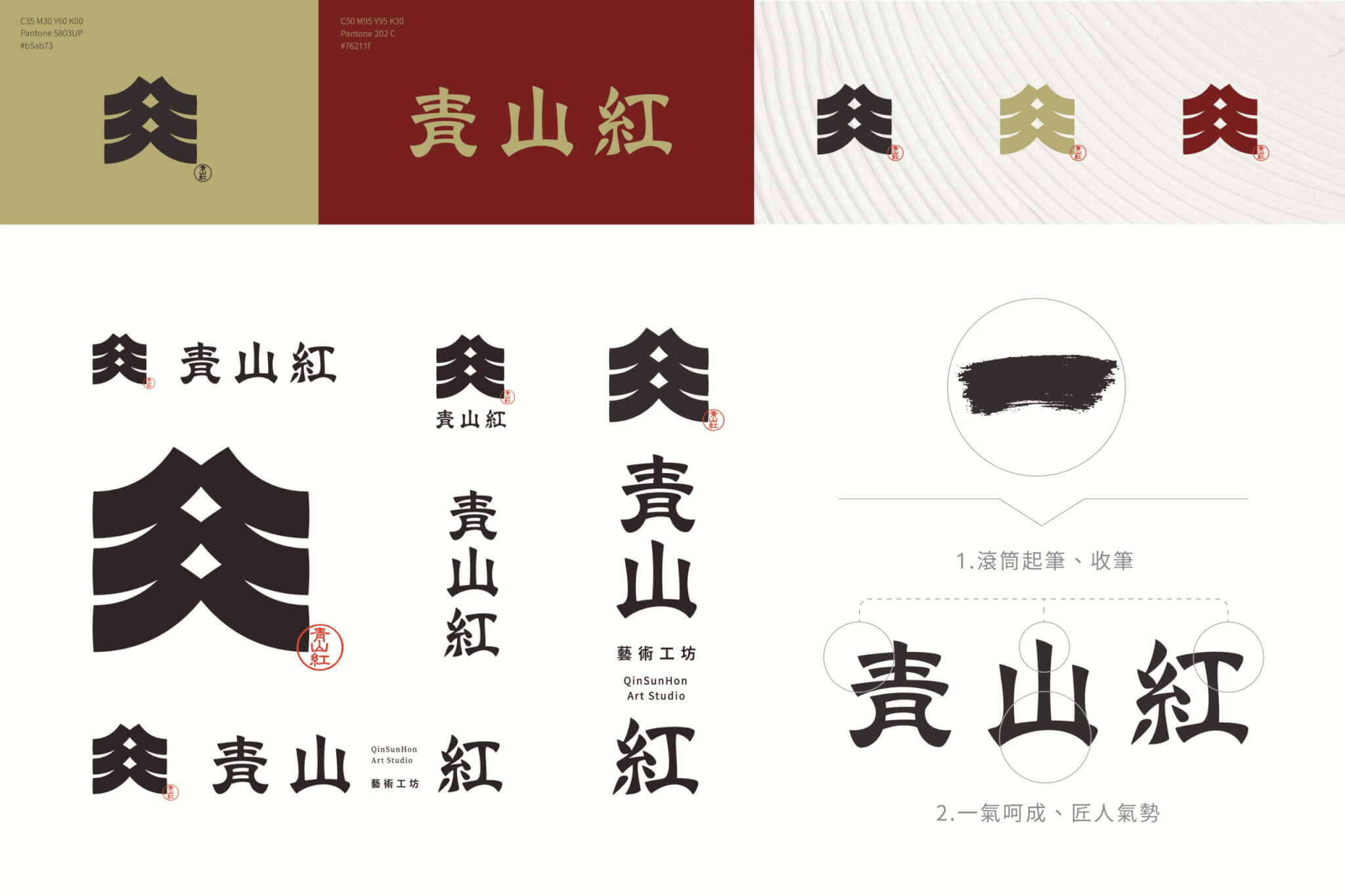
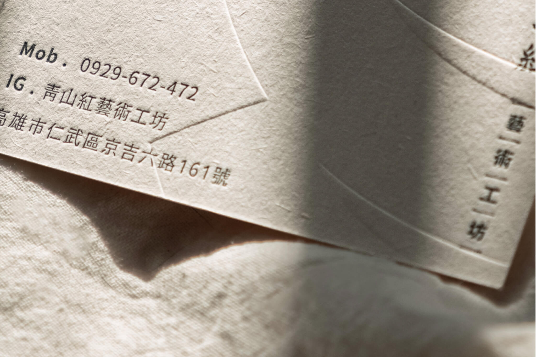
色彩則選用沉穩的「藏紅」、內斂的「雅金」與純淨的「和紙白」,搭配書法筆勢與紙張肌理,交織傳統工藝的文化韻味與當代設計的簡練美感,建立內斂而鮮明的品牌識別。
透過設計,我們希望讓青山紅對品質的堅持與藝術的追求,成為能被辨識、理解與記住的品牌印象,讓無形的職人精神,在當代視覺語言中延續。
A refined palette of Deep Crimson, Elegant Gold, and Washi White, paired with calligraphic strokes and subtle paper textures, blends traditional craftsmanship with contemporary aesthetics.
The result is a distinctive brand identity that makes the invisible spirit of craftsmanship visible, memorable, and timeless.
完成時間
專案企劃
設計組長
設計師
2025.12
黃詩涵
李奕臻
吳俊賢
Completion Date
Project Planning
Lead Designer
Designer
2025.12
Amanda Huang
I-Chen Lee
Jun-Xian Wu
想為自己的品牌做識別設計?