

台中銀行 2018 年企業社會責任報告書由手心設計,範圍包含封面插畫、章節頁、內頁版式與資訊圖表。主要的設計選擇是以向量插畫貫穿全書,把台中銀行的 LOGO 融入封面城鎮與各章插圖,並用 01 到 06 六組色彩計畫對應六個章節。
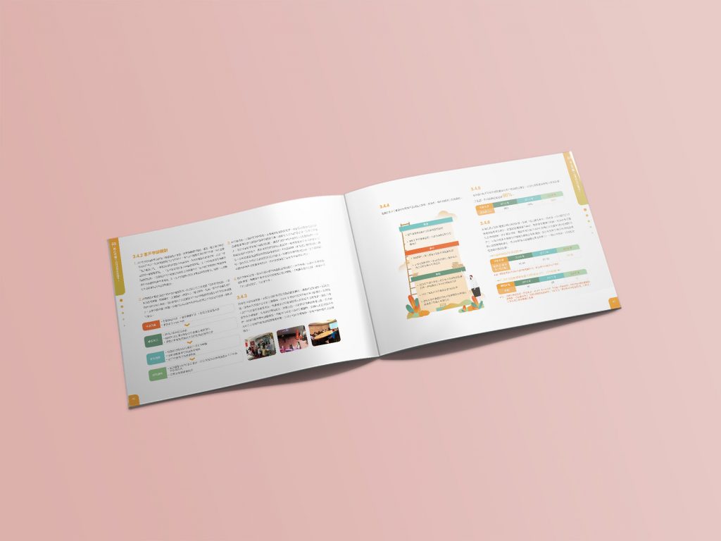
此次 台中銀行2018 CSR設計 風格以向量插畫為表現主軸,除了以具有豐沛活力的插畫貫穿整本報告書外,也特別將數據、文字以資訊視覺化方式呈現,減少讀者對大量且複雜資訊的負擔,並提升閱讀的興趣與效率。
The Taichung Bank 2018 CSR design is based on vector graphics. In addition to the energy illustrations throughout the CSR, the data and text are also presented in the Information Visualization way. It reduces the burden of readers on a large amount of complex information, and enhances the interest and efficiency of reading.
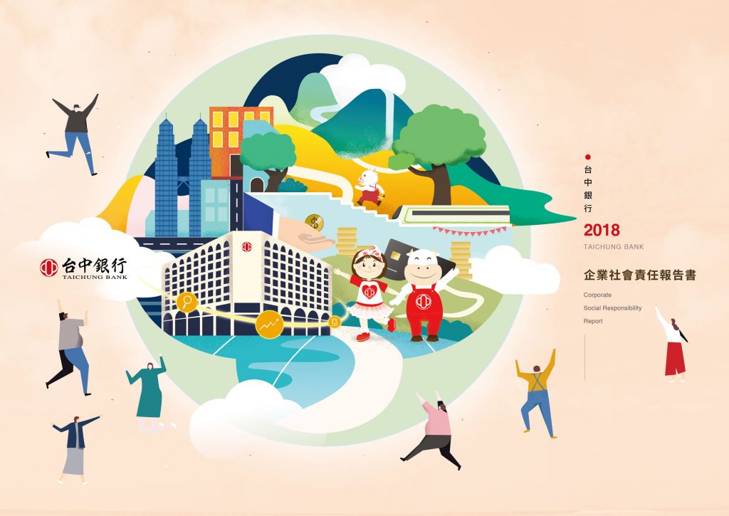
封面如何把台中銀行的 LOGO 和城市畫在一起?§
封面設計以逐漸茁壯的台中銀行所構建的城市為主題,畫面中並強調新進駐的馬來西亞分行在其中與客戶及環境一同成長。畫面前方的吉祥物-台妹、阿中寶寶也在招呼著民眾們一同參與,塑造歡樂、友善、環保、交流等視覺意象。整個城鎮造型也建構出台中銀行LOGO的視覺型態。
The cover design is based on the city buildings and the Taichung Bank, which are growing stronger and stronger. In the image, it emphasizes that the new Malaysian branch of Taichung Bank grows together with customers and the environment.
The mascots in front of the image Tai-Mei and Baby of A-Zhong are also inviting the public, creating visual images such as joy, friendliness, environmental protection, and communication. The shape of the town also constructs the visual from the logo of Taichung Bank.
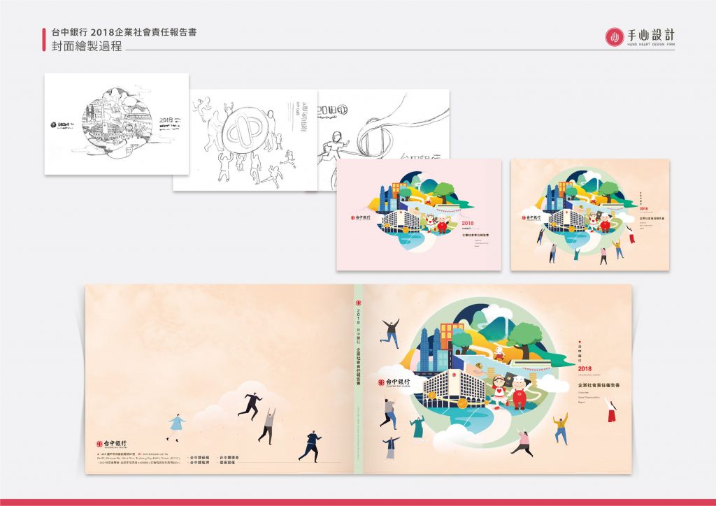
下方的「封面繪製過程」圖,排列了三張鉛筆草圖、兩張不同底色的上色稿,以及含封底與書背的封面展開圖;其中一張草圖以台中銀行 LOGO 的圓形輪廓為中心、四周圍繞著人物,可以對照上方完稿封面中城鎮與 LOGO 的關係。
章節頁與資訊圖表如何讓大量資料變好讀?§
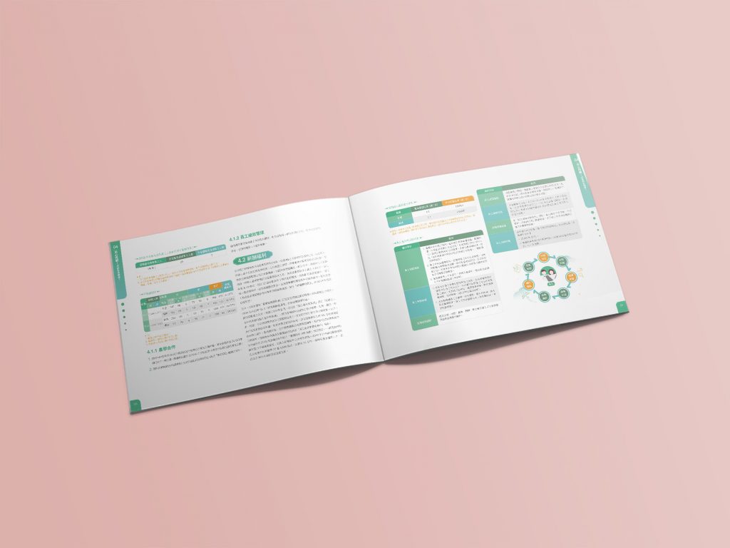
手心設計的CSR手冊著重不同篇章的統一性與識別性,透過資訊層級的分層規範,建立屬於個別專案的專屬色彩計畫,使章節頁依照該章節之內容進行配色,在章節內容中將故事及文章情節繪製插畫設計輔以說明內容,並讓台中銀行的LOGO巧妙出現於各插圖中,在進行CSR報告書的閱讀時,無形中也強化了品牌印象的傳播。
Our CSR design always focus on the unity and identification of different chapters. Through the information level system to build an exclusive color plan belonging to each project, so that each content pages pairs up different color, and the stories are placed in the chapter content with illustration way and the logo of Taichung Bank is cleverly displayed in each illustration. When reading the CSR, the dissemination of the brand image is also invisibly strengthened.
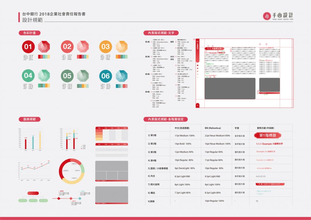
頁面後段的「設計規範」圖,可以看到這套規則的具體內容:01 到 06 六組色彩計畫、長條圖、折線圖與環形圖等圖表規範,以及從第 1 階標題、內文、照片說明到頁碼共九種文字層級的版式設定,中文使用思源黑體、英文使用 Helvetica。各章節頁也依這套配色區分,例如 01 章企業概況為紅色、03 章為橘色、06 章為藍綠色。




哪些單位適合參考台中銀行的報告書設計?§
如果您的永續報告書有以下情況,台中銀行這個案例的做法可以參考:
- 如果您的報告書資料多,可以參考資訊視覺化的做法。
- 如果您有品牌 LOGO,可以參考將它融入封面與章節插畫。
- 如果您的報告書章節多,可以參考章節配色與圖表規範。
可以參考的順序是:先看圖表與章節規範,再看插畫。
章節配色與資訊圖表的設計,可參考ESG 永續報告書設計。
2018企業社會責任報告書 金融及保險業銅獎
Bronze Awards for the 2018 CSR of financial and insurance industry.
台中銀行 2018 CSR 下載連結 Taichung Bank 2018 CSR download
https://www.tcbbank.com.tw/pdf/CSR/CSR_2018.pdf
-
結案時間 Case Closed-2019.08
設計師 Designer-潘東 PAN,DONG
專案企劃 Project Planning-蘇連捷 SU,LIEN-CHIEH
設計總監 Executive Design Director-徐志揚 HSU,CHIH-YANG