
國家級眷村文化園區以高雄黃埔新村為起始,整合全台各縣市的眷村文化及歷史。手心設計在 2021 年 11 月提出設計前端企劃,接著完成園區 Logo,並展開中英文組合、色彩與事務用品應用;Logo 把「眷」字隱含在圖形中,以圖地反轉構成房舍與棋盤狀的村落,下半部是一扇敞開的朱紅色家門。
民國38年政府播遷來台,當時隨同遷台軍民人口約百萬餘人,為了安頓軍心,政府陸續興建眷舍集中安置軍眷家屬,特殊的生活空間和多省籍的居民組成半封閉體系的眷村,相依與共的情感凝聚和圈地為安的自我認同,碰撞成為了獨特的「眷村文化」。
The government of the Republic of China moved to Taiwan in 1949. In order to settle down one million soldiers and civilians, the government successively built military residences. Special living spaces and residents from multiple provinces formed a semi-closed system of military dependents’ villages. The collision of emotional cohesion and self-identity has become a unique “military village culture.”
園區的設計方向從哪裡出發?§
設計前端企劃提案(2021 年 11 月 19 日)先寫下目標:保存歷史、珍惜和平與民主、用過去展望未來,成為旗艦型或國家級的文化園區。提案把「包容性、多元性、未來性」列為達成目標的首要條件:包容性是能涵括全台灣所有眷村的精神價值,多元性是在同一概念前提下保有各地眷村的特色,未來性則是保存歷史的同時賦予眷村新的意義。
「包容性、多元性、未來性」
國家級眷村文化園區以高雄黃埔新村為起始,整合全台各縣市的眷村文化及歷史,打造具有旗艦型或國家級的文化園區。眷村不只代表著一個時代的縮影,更像是一個不斷分裂與交融的有機體,承載著過去的歷史,綿延出現在和未來的無限榮景。
Starting from Kaohsiung Huangpu Village, the National Cultural Park of Military Dependents’ Villages aims for “inclusivity”, “diversity” and “futurity”. It integrates the culture and history of military dependents’ villages from counties and cities in Taiwan to create a flagship and national cultural park.The military dependents’ village is not just a microcosm of an era; it’s more like an organism, bearing the history and extending into the present and future’s endless splendor.
「竹籬笆的世界」這個題旨和前端提案有什麼關係?§
針對未來性,前端提案列出 A、B、C 三個方案:方案A的標語是「走入竹籬笆的世界裡,看之、品之、續之」,以時空旅行、信念結晶、國家基石為關鍵字,願景是透過讓人們看見、體會、再詮釋眷村文化,將這份信念延續下去;方案B以匯集、過往與未來的共振、共生為關鍵字;方案C以流動、共生、初始為關鍵字。對照 Logo 介紹圖上的「走入竹籬笆的世界裡,識之、品之、續之」,句型與方案A相同,「看之」在介紹圖上寫作「識之」;下方這段題旨說明裡的看見、體會、再詮釋與時空旅行,也和方案A的願景與關鍵字說明一致。
我們以「走進竹籬笆的世界裡,識之、品之、續之」為題,透過 Logo設計 期待人們能看見、體會,並且「再詮釋」眷村文化,如同一段時空旅行,從五感至精神層面體驗過往時代的記憶。
With the theme of “Step into the World of Bamboo Fences, Understanding, Appreciating, and Continued”, we hope people see, experience, and reinterpret the military village culture, like a journey through time, experiencing memories of past era from the sensory to the spiritual level.


Logo 從黑稿到完稿經過哪些階段?§
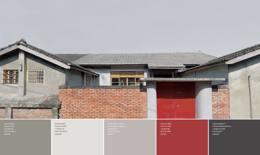
Logo 在 2021 年 11 月 30 日提出黑稿提案,12 月 17 日提出精稿提案,12 月 28 日有 Logo 完稿與展開。官網圖中的 Logo 以暖灰色房舍圖形搭配朱紅色家門,並展開成 10 種中英文組合,涵蓋上下、左右與直排排列;色彩頁把一張灰瓦、紅磚牆與紅色大門的眷村老屋照片,和灰、淺灰、暖灰、紅、深灰五組色票並列,應用則延伸到信紙、信封與名片等事務用品。
Logo設計§
將「眷」字隱含於標誌中,以圖地反轉的方式構成房舍與獨特棋盤狀的村落樣貌。標誌上半部猶如從空中俯視著整齊劃一的眷村景貌;下半部敞開的朱紅色家門,象徵走進並體驗一段時代記憶,更呼應眷村中如同家人一般,頻繁與緊密的連結。
The character “眷” (meaning ‘family’) is subtly incorporated into the logo, and the house and the unique chessboard-like village look are formed in a way of figure–ground Illusion. The upper part of the logo feels as if one is looking down from the sky onto the uniform layout of the military dependents’ village. The half open vermilion door in the lower of the logo symbolizes walking in the village and experiencing a period of memory. It also echoes the frequent and close connection of the family in the military dependents’ village.


期待藉由一段歷史的保存與延續,一齊朗誦著過去時代的故事;傳唱著各地的特色歌謠,並譜寫出屬於未來共同的新樂章。
It is expected that through the preservation and continuation of a period of history, we can recite the stories of the past era together, sing the characteristic songs of various places, and compose a new movement that belongs to the future.
哪些文化園區或跨地區計畫,適合參考國家級眷村文化園區的識別做法?§
如果您的園區識別有以下情況,國家級眷村文化園區這個案例的做法可以參考:
- 如果您的計畫涵蓋全台又需保有各地特色,可以先列明共用識別的首要條件。
- 如果您想把名稱入圖,可以參考「眷」字結合房舍的做法。
- 如果您想從老屋取色,可以參考灰瓦、紅磚與紅門的色彩。
可以參考的順序是:先列條件,再發展字形與色彩。
如果您正規劃園區識別,可參考CIS 企業識別設計。
結案時間
設計師
專案企劃
設計總監
2021.12
蘇筱雯
盧臆雯、王彥筑
徐志揚
Case Close
Designer
Project Planner
Design Director
2021.12
Xiao-wen, Su
Yu-wen,Lu / Yen-zhu, Wang
Chih-yang, Hsu