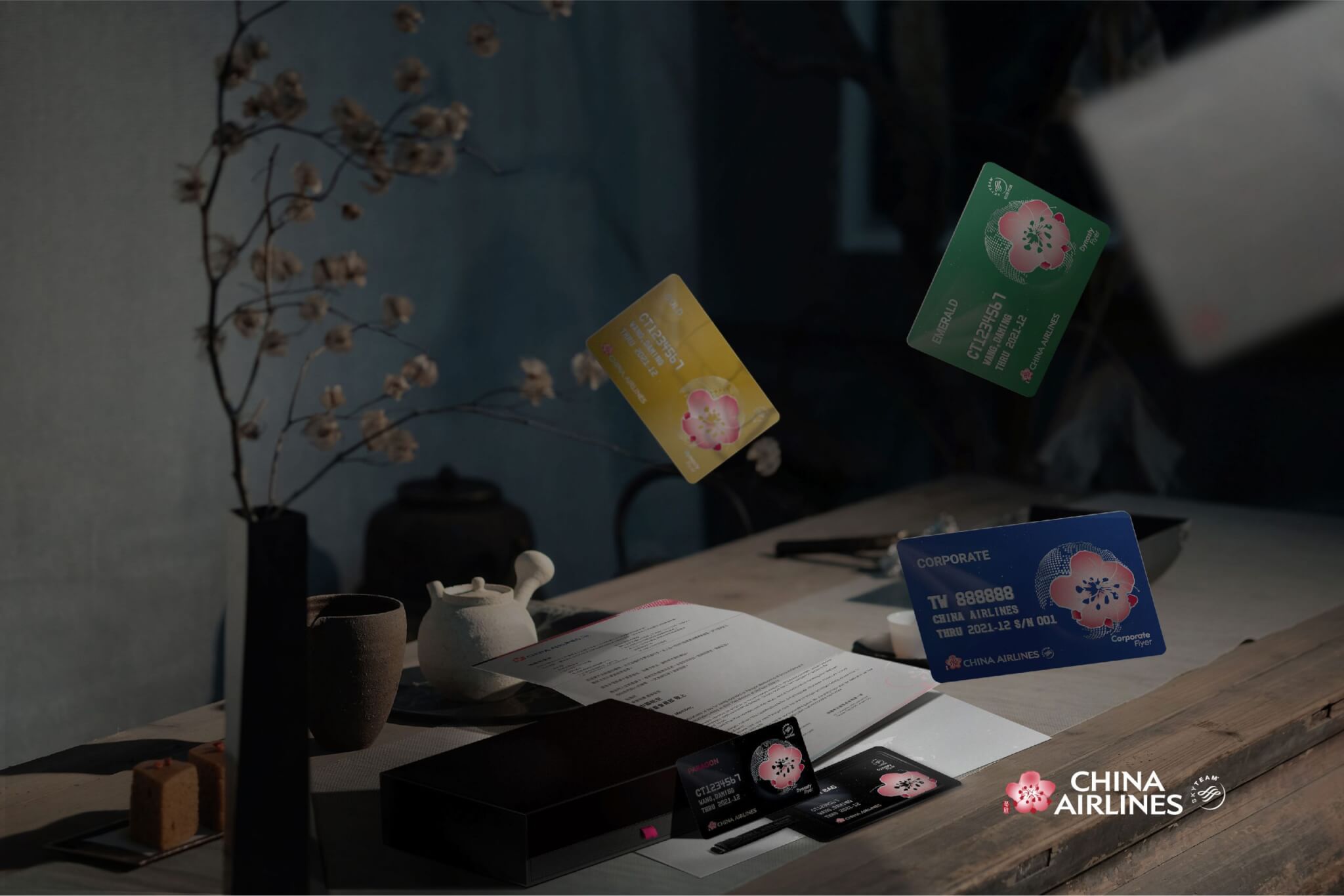
中華航空 會員卡設計 為手心設計承接〈中華航空 CIS2.0 品牌識別設計〉專案中之應用設計項目,以「相逢自是有緣,華航以客為尊」品牌標語為中心理念,立體結構的3D點狀地球象徵華航綿密航點的分佈,為凸顯獨特的台灣地理位置,特別於頂級的晶鑽卡鑲嵌水晶以顯尊榮身份,飛往各國航線的曲線以簡化交錯方式呈現綻放梅花意象,也隱含邁向全球之義;五瓣花瓣舒展為五大洲,背景星雲繚繞,呈現航行天際之宇宙浩瀚。
With the slogan “Fate brought us together, China Airlines respects customers” as the brand’s central concept. The picture of earth with 3D dotted structure to symbolize the density port of CHINA AIRLINES. To highlight the unique geographical location of Taiwan, Especially the top-notch Paragon Cards are inlaid with crystals to show their honorable status. The flight routes to every country in a curve way to present the image of blooming plum, it also implies the meaning of CHINA AIRLINES is going global. The five petals of a plum blossom represent the five continents, the background of the card show the resplendent nebula and the vastness of the universe.


材質則以霧、亮面的加工反差搭配獨特膜料,有別於一般霧膜上亮光之質感,在特定角度下可呈現細緻特殊的虹彩光澤,結合鑲嵌水晶折射出多變光彩,以色光之美帶出相逢的喜悅,亦使卡片更顯尊榮,從觸覺、視覺感官體現尊榮禮遇之悸動。
The material is pairs up a unique film with matt and bright surface in contrast. Different from the usual poly propylene coating, it shows a delicate and special rainbow-like shine in an angle. Inlaying crystal to refracts changeful color and luster.


晶鑽、翡翠會員特別設計專屬行李吊牌,真皮行李掛牌輔以烙印打凹與皮繩,使華航貴賓能將此一禮讚隨行搭配,添增了整體品牌識別意象與尊貴質感。
Paragon and Emerald member have exclusive luggage tag, pairs up leather and sear on the leather cord. So that the VIP guests of China Airlines can accompany the gift with honor and increase the brand identity image and sense of glory.

-
結案時間 Case Closed-2019.04
設計師 Designer-徐志揚 HSU,CHIH-YANG、潘東 PAN,DONG、蘇韵涵 SU,SHAO-HAN、李其晉 LI,CI-JIN、林育安 LIN,YU-AN
專案企劃 Project Planning-蘇連捷 SU,LIEN-CHIEH、林玉真 LIN,YU-JHEN
設計總監 Executive Design Director-徐志揚 HSU,CHIH-YANG
#中華航空#華航會員卡 #會員卡設計 #印刷設計 #手心設計 #商務艙 #晶鑽卡 #翡翠卡 #金卡 #企業卡 #華夏卡 #ChinaAirlines #MembershipCardDesign #ChinaAirlinesMembershipCardDesign #HandHeartDesign #TaiwanDesign