
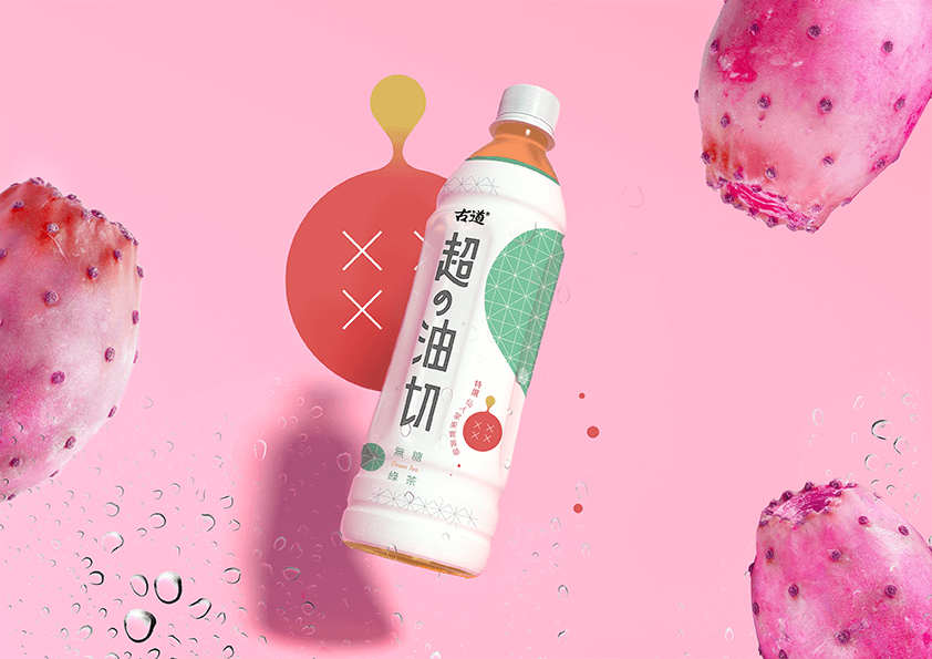
本次 包裝設計 將產品定位在機能茶:以機能優先,而後為無糖綠茶,因此在視覺意象上取用了仙人掌與仙人掌之果實作為主要的設計符號,右上角的綠色色塊為仙人掌之簡化造型,以最直觀的方式去除多餘訊息,只留下主要的尖刺特徵,帶給消費者最直接的視覺印象。紅色區域是仙人掌果實的簡化圖形,結合油切之概念,呈現的是仙人掌果實可以協助消費者將油脂分離的產品特色。
This design positions the product as functional tea: priority is given to function, followed by sugar-free green tea. Therefore, cactus and cactus fruit are used as the main design symbols in the visual image.
The green color area is the simplified shape of the cactus, which removes redundant information, leaving the thorns of cactus’s main features, giving consumers the most direct visual impression.
The red color block is the simplified graphic of cactus fruit, combined with the concept of oil cutting, it presents the product features that cactus fruit can separate oil.
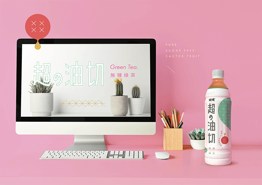
在色彩識別上,我們到各個主要銷售通路進行架位調查與研究,結合了市場調查研究分析的結果,鎖定主要客群特性,在設計上進行包裝識別設定,以期和其他同質性產品產生足夠之差異化與識別度;整體設計調性以乾淨、清爽之感受傳遞,重在強調油切及無糖意象,產品名稱則透過纖瘦、安心感、健康等作為關鍵字進行字體設計,使整體識別度更加凸顯、傳遞意象更加貼近調研分析之設定。
In the color identification, we go to various major sales channels to make the shelf surveys and researches, combine the results of market research and analysis, lock in the characteristics of the main customer groups. We set up packaging identification in the design, in order to make the enough different from other homogeneous products.
The overall design is conveyed with a clean and refreshing feeling, emphasizing the image of oil cutting and sugar-free, and the product font is designed from the key word such as slimness, safety, health etc. It can make the overall recognition more prominent and is closer to the setting of research and analysis.
-
結案時間 Case Closed-2020.05
設計師 Designer-盧臆雯 LU,YI-WEN
專案企劃 Project Planning-蘇連捷 SU,LIEN-CHIEH
設計總監 Executive Design Director-徐志揚 HSU,CHIH-YANG