
四季更迭輪轉,在每個季節都需要一杯暖心的茶、溫潤的湯。延續品牌「快節奏,慢養生」的精神,以「四季」作為包裝主題,也象徵在每個四季都有當當龜的陪伴;都能找到適合自己的產品。
The four seasons change, and every season requires a cup of warm tea and soup. Continuing the brand’s spirit of “fast-cadence, slow-health”, with “four seasons” as the packaging theme, it also symbolizes the company of DANG DANG GUEI in every four seasons; you can find products that suit you in here.
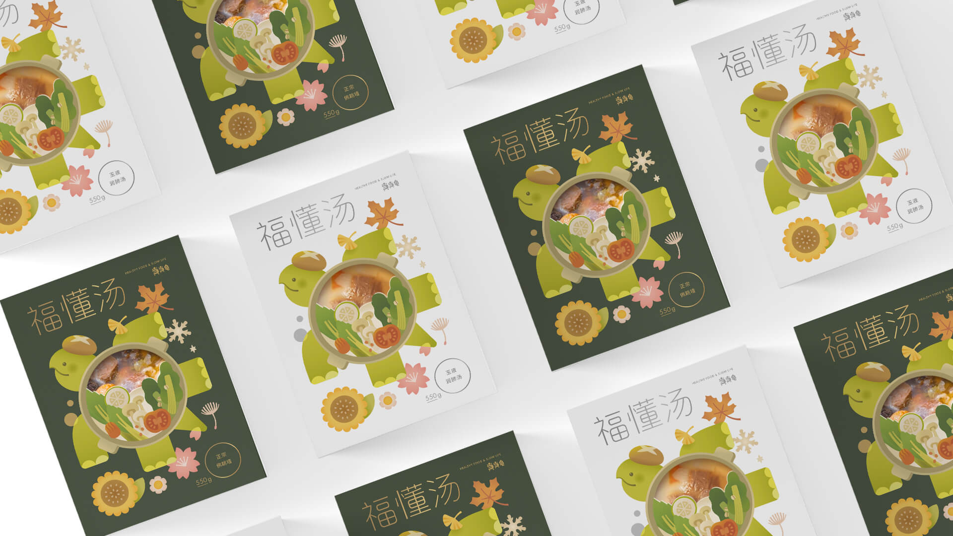
湯品包裝以品牌吉祥物烏龜為主體,龜殼上駝著充滿各式食材的湯,漫步在四季中,周圍環繞著象徵四季的花草植物(春櫻、夏葵、秋楓、冬雪),呼應四季陪伴的視覺概念。龜殼同時結合鏤空的設計,讓消費者在視覺與日常使用中都能清楚辨識湯品中的豐富食材。
The packaging of the soup is based on the brand mascot turtle. The turtle shell carries soup that full of various ingredients. Walking in the four seasons, it is surrounded by flowers and plants symbolizing the four seasons (spring: cherry blossoms, summer: sunflower, autumn: maple, winter: snow). Echoes the visual concept of the four seasons. The turtle shell is also combined with the hollow design, so that consumers can clearly identify the rich ingredients in the soup both visually and in daily use.
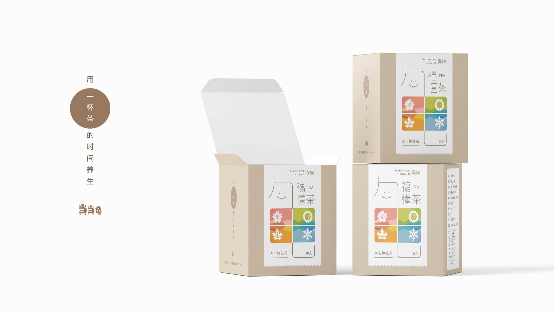
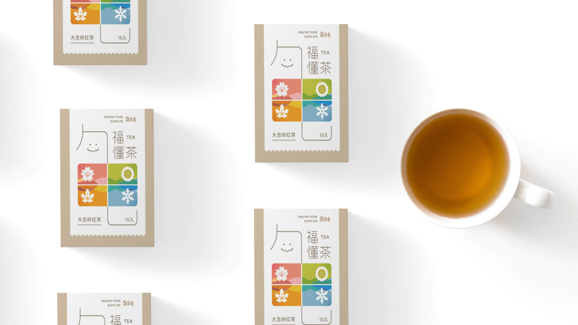
品牌名稱「当当龟」為茶品包裝靈感來源,希望消費者能在圖像與文字的結合中,強化對品牌的印象。「龟」中央的「田」,分別描繪了四個季節的景色,再次緊扣了四季的主軸——春夏秋冬都有當當龜陪伴左右。
The brand name “当当龟”( DANG DANG GUEI) is the source of inspiration for tea packaging, hoping that consumers can strengthen their impression of the brand through the combination of images and text. The “田” in the center of the “龟” depicts the scenery of the four seasons, and once again closely linked to the main axis of the four seasons – the spring, summer, autumn and winter are accompanied by DANG DANG GUEI.
-
結案時間 Case Closed-2021.03
設計師 Designer-江珮瑜 JIANG,PEI-YU、潘東 PAN,DONG
設計總監 Executive Design Director-徐志揚 HSU,CHIH-YANG