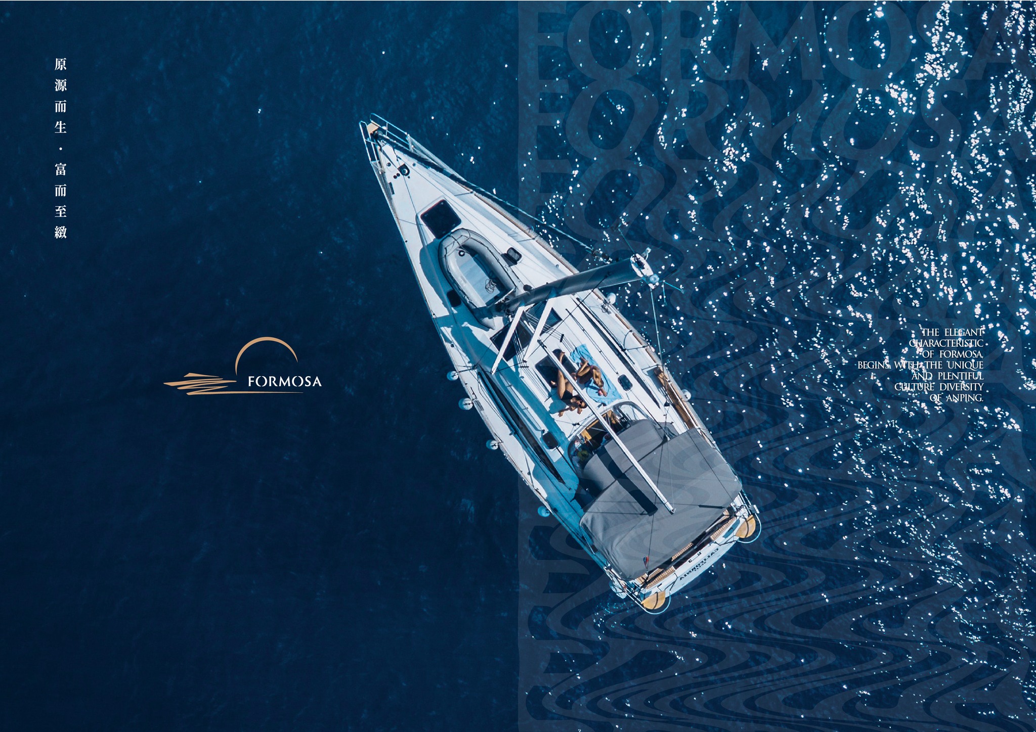
福爾摩沙的歷史,由安平開始。沿岸的海埔新生地孕育了豐富的文化底蘊,蜿蜒而出的河流構築安平的生活樣態,隨著世代推移,優雅、質感的溫潤被保存,更融合現代氛圍,交織成獨特的氣質風貌。
The history of Formosa began with Anping, Tainan. The Reclaimed Land along the coast has made a rich ecology and the winding river constructs the life style of Anping. With the passage of time, the elegant quality appearance has been preserved, blending with the modern atmosphere, and intertwined into a unique style.


而座落於安平的福爾摩沙遊艇酒店,是全台唯一擁有私人碼頭、連接海景運河的觀光酒店,鄰近台江、四草、漁光島等充滿自然風光與人文美學的文化景點,得天獨厚的地理位置讓它兼具古都閑適、悠緩的文化底蘊,與豐沛靈動的生命記憶。
The Formosa Yacht Hotel, located in Anping, is the only tourist hotel in Taiwan that has a private wharf and is connected to a sea and canal. The hotel is close to scenic spots full of natural scenery and humanistic aesthetics such as Taijiang, Sicao, Yuguang Island, etc. The geographic location has the leisurely culture and the abundant life memory.

品牌以「源」爲核心價值,期望帶領往來的旅者尋找台灣文化的根,結合湖景、碼頭、文創,提供獨具特色的住宿旅遊體驗,延伸出「水源」、「根源」、「有緣」、「團圓」、「桃花源」的五大特色,分別代表了在此地,可以同時享受獨特的遊艇水域旅程、尋根安平文化、歡聚的精緻時光、與親友團圓同聚,以及離塵不離城的區域特色。
The brand takes “source” as its core value. We hope to lead travelers to find the roots of Taiwan culture, combining lake view, wharf, and cultural creativity to provide a unique accommodation and travel experience, extending the source of water, roots, destiny, reunion and xanadu. The five characteristics respectively represent that you can enjoy a unique yacht journey, Anping history and culture, happiness time, and being away from the hustle and bustle at the same time.

Logo頂端的圓弧造型象徵團圓與歡聚,下方如同水波一般的未竟造型接續著FORMOSA品牌字樣, 隱喻在福爾摩沙的每一刻都有源源不絕的美好事情發生,如同一幅日落美景的造型,也代表著品牌與賓客一同完滿每段發生在這場域的專屬回憶。
The arc shape at the top of the logo symbolizes merry reunion, and the endless shape like a wave at the bottom is connected by the FORMOSA brand name. It is a metaphor that endless beautiful things are happening at every moment in Formosa. It just like a glamorous sunset and also means that the Formosa Yacht Resort and travelers have fulfilled every exclusive memory that happened here together.
輔助圖形將「FORMOSA」與核心概念「源」連結,創造出如水波倒影般的漸變視覺風格,使品牌形象更增添戶外休閒感且更具識別性,重複出現水波圖騰也強化旅者們來到安平福爾摩沙遊艇酒店體驗水上活動及文化藴含的美好印象。
The auxiliary graphics combine “FORMOSA” with the core concept “source” to create a gradual visual style like the reflection of water waves. It adds to the brand image a sense of outdoor leisure and is more recognizable. The recurring water wave totem symbolized that it strengthened the wonderful impression when tourists are coming to Anping Formosa Yacht Hotel to experience water activities and culture.

金色在色彩心理學上予人「獨一無二」、「充滿魅力」的感受,能充分體現福爾摩沙遊艇酒店兼具休閒與精緻的旅遊體驗;冷調深藍則強化品牌在消費者心中「具獨到見解」與「喜愛戶外活動與冒險」的湖濱渡假品牌形象,同時由Logo色彩延伸出磚牆紅及夕陽橘,達到品牌識別度的一致性。次要色彩則分成3 大類別用途,帶給人們的精緻宴會、遊艇旅程等不同層次意象。
Golden gives people a unique and charming feeling in color psychology, which can fully present the leisure and exquisite tourism experience of Formosa Yacht Hotel. Dark blue of cool colour tone strengthens the brand’s image of “unique insight” and “loving outdoor activities and adventures” in the minds of travelers. At the same time, the firebrick color and sunset color are extended from the logo to achieve the consistency of brand recognition. The secondary colors are divided into three parts, which bring people different images such as exquisite banquets and yacht journeys.
原源而生,富而致緻——期待來到福爾摩沙遊艇酒店的每位貴賓,都能感受文化、閑適、精緻並存的旅遊體驗,啟動一段不一樣的旅行。
Born from the source, rich but exquisite. We are expected that every guest who comes to the Formosa Yacht Resort will experience the culture, leisure and exquisite travel experience, and start a special journey.

-
結案時間 Case Closed-2021.08
設計統籌 Design Overall Planning-林宜慧 LIN, I-HUI
設計師 Designer-林宜慧 LIN, I-HUI、潘東 PAN,DONG、葉子豪 YE,ZIH-HAO
專案企劃 Project Planning-蘇連捷 SU,LIEN-CHIEH、王彥筑 WANG,YAN-ZHU、王士豪 WANG,SHI-HAO
設計總監 Executive Design Director-徐志揚 HSU,CHIH-YANG
協力廠商 Assistant Partner
室內設計 Interior Design-含奕室內設計 HARMONY DESIGN CO.


