
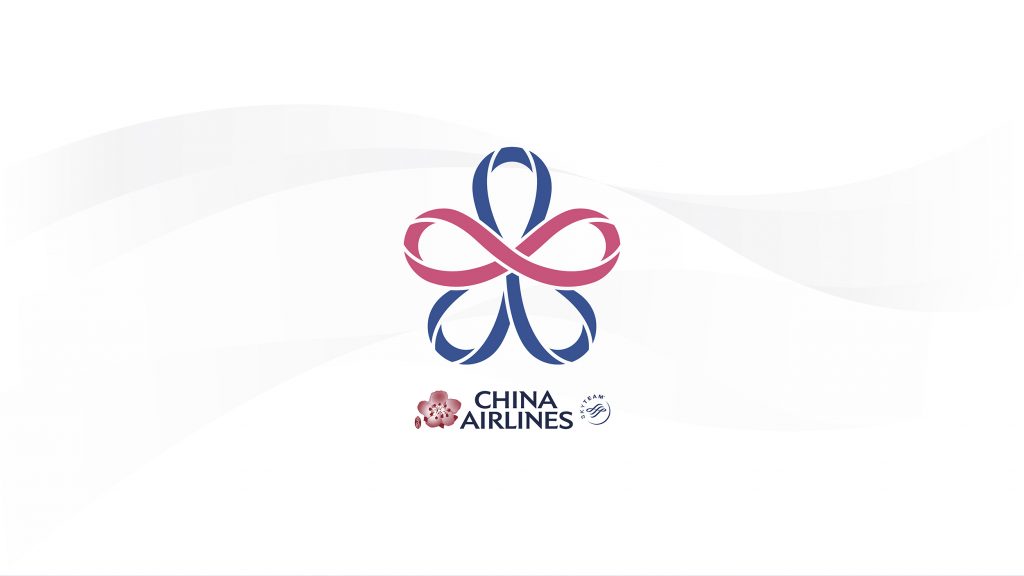
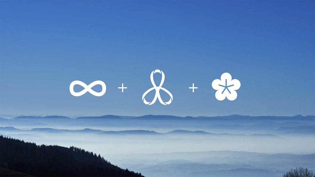
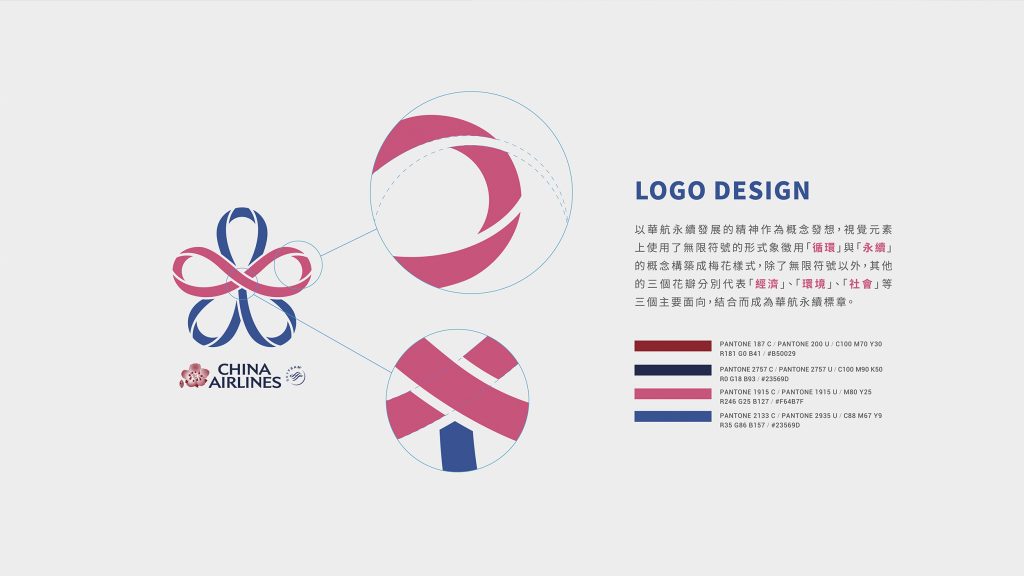
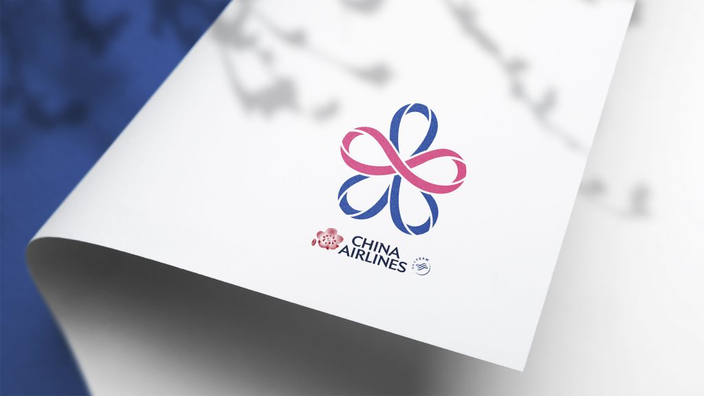
本次永續標章的 LOGO設計 以華航永續發展的精神作為概念發想,使用無限符號的形式象徵「循環」與「永續」的概念,構築成代表 華航 的梅花樣式,無限符號以外的其他三片花瓣則分別代表了「經濟」、「環境」、「社會」三個主要面向,相互結合成為了專屬華航的永續標章,不忘對社會的責任與守護,同時象徵企業永續發展、循環的概念。
The LOGO design of this sustainable mark is based on the concept of the sustainable development of China Airlines. Use the infinite symbol to symbolize the concepts of “circulation” and “sustainability” and build a plum blossom pattern representing China Airlines. The other three petals besides the infinity symbol represent the three main aspects of “economy”, “environment” and “society”. Combined into an exclusive sustainable mark of China Airlines. Not forgetting the responsibility and guardianship to the society, and symbolizing the concept of sustainable development and recycling of China Airlines.
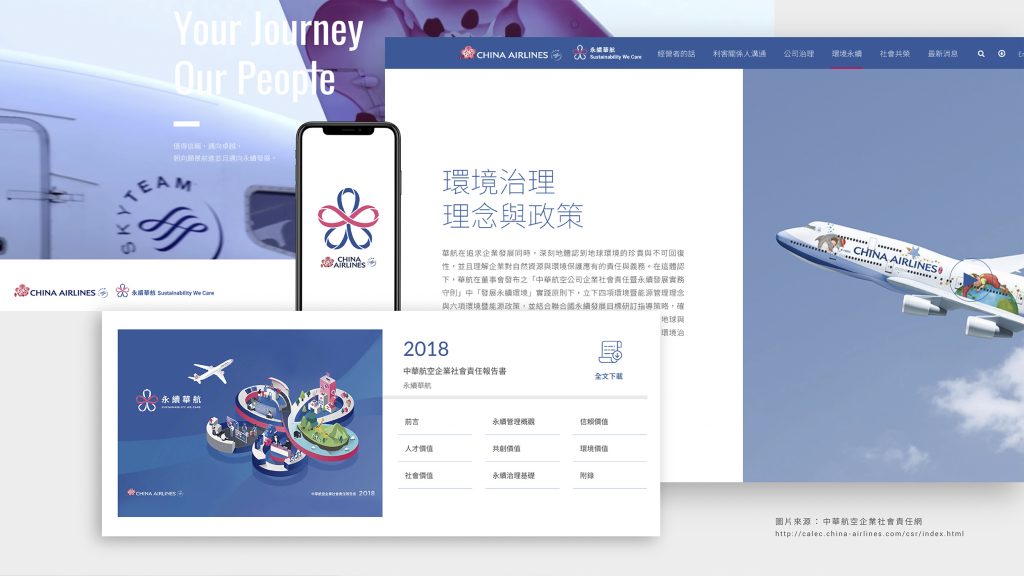
中華航空企業社會責任網 China Airlines Corporate Sustainability Site
http://calec.china-airlines.com/csr/index.html
—
結案時間 – 2018.9
設計師 – 王育安
設計總監 – 徐志揚
專案管理 – 林玉真
—
#中華航空 #ChinaAirlines #永續標章 #Logo #Logo設計 #手心設計 #brandarchitecture