
東杏齒科(Bliss Dental Care)是位於屏東東港的牙醫診所,希望讓看牙不再令人害怕,並把「與患者建立深度關心」落實成看得見的品牌。手心設計為東杏規劃完整的 CIS 品牌識別,從 Logo、中英文標準字、色彩計畫、輔助圖形,到名片、衛教單、門診紀錄表、紙袋與入口玻璃門等診所應用物。主要的設計選擇,是以粗細變化的交疊線條結合牙齒與心的意象,搭配取自建築外觀的灰褐色系,呈現專業與溫暖並存的診所形象。

東杏齒科想透過品牌解決什麼問題?§
看牙對多數人來說一直是令人惶恐不安的經驗。冰冷的器械聲、專業的醫療語彙,讓人總是抗拒面對,往往因而錯過最佳治療時機。與患者建立深度關心是東杏最重視也最有特色的品牌核心,而為了落實這樣的理想,李醫師夫婦在東港打造了一棟與在地連結對話的建築,將專業與溫暖落實在每一個角落,讓一直以來醫療資源缺乏的屏南地區民眾,也能擁有如都會區一般完整的治療選擇。
Going to the dentist has always been a scary experience for most people. Machine sounds and serious medical vocabulary make people always miss the best time for treatment because they are too afraid to face it.
To make a deep connection with patients is the core concept of Bliss Dental Care. In order to realize this ideal, Dr. Li and his wife built a building in Donggang township that connects with the locals.
Letting professionalism and warmth in every corner, so that people in Pingnan who lack medical resources can also have complete treatment options like a metropolitan area.
東杏齒科的 Logo 與標準字從哪些概念發展?§
發展識別的過程中,手心整理了東杏的品牌核心設定與情緒版,也到東港實地場勘、蒐集招牌資料,了解診所建築與周邊環境。Logo 由四個意象組成:牙齒、心、人與人的交流、生命力與生機;品牌主視覺則以 Professional、Warmth、Team 三個關鍵字,搭配「讓微笑加點杏福」的品牌標語。

在品牌塑造上我們決定延續此初衷,以專業與溫暖的結合為主要概念。線條的交疊融合呈現團隊團結一心的能量由內而外擴散,也象徵人與人之間的交流,傳達生機無限的流動感。線條的粗細變化也提升品牌整體的質感以及專業氣質,簡約柔軟的造型呈現專業與溫度並存的東杏。
In this brand design, we decide to continue this original intention, with the combination of professionalism and warmth as the main concept. The overlapping lines presents the power of united team, and also symbolizes the communication between people, conveying a sense of infinite flow of vitality.
The thickness changes of the lines enhance the overall texture and professionalism of the brand. The simple and soft shape presents the Bliss Dental Care’s coexistence of professionalism and warmth.
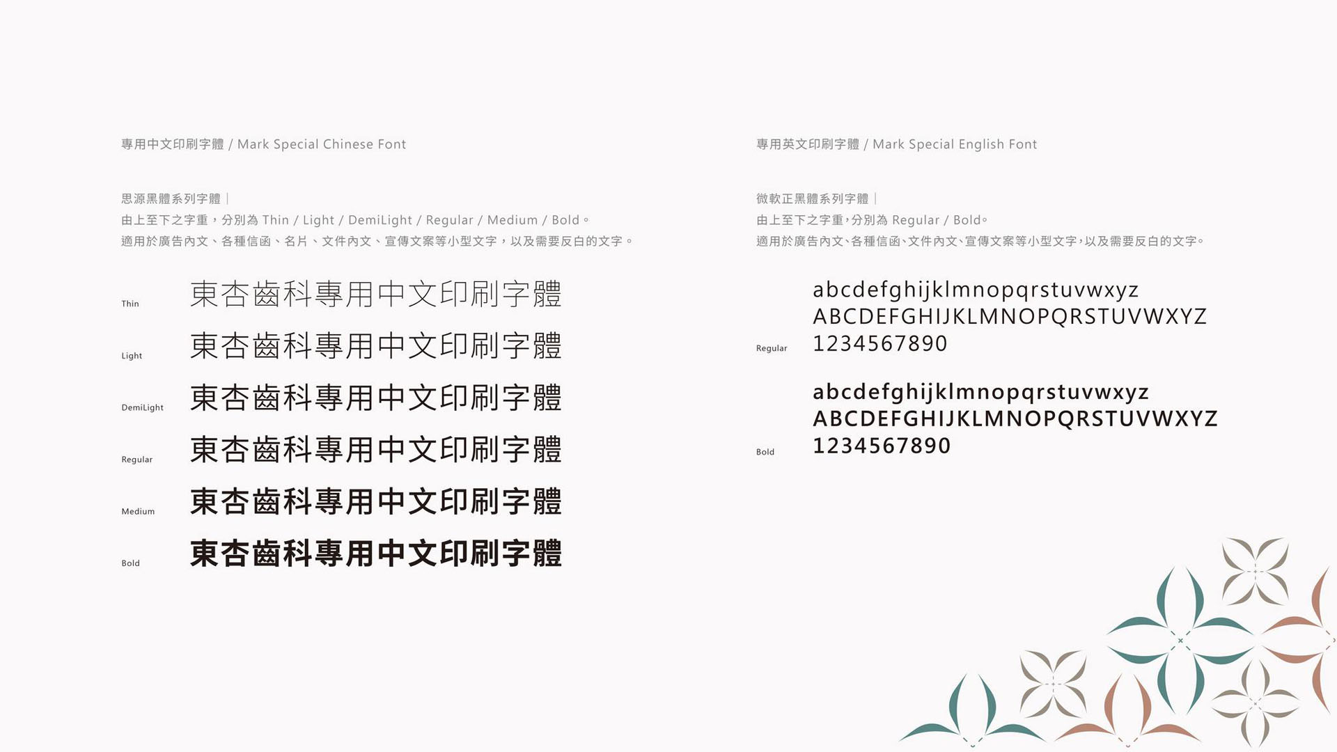
配合Logo造型,中英文標準字整體外型以長矩形構成,筆畫皆帶入具粗細變化的線條,直角與圓角並存的設計也展現品牌嚴謹卻親和的個性。其中「齒」的設計將中央的四個「人」相連,更象徵東杏團隊與民眾之間的羈絆,手牽著手共同向前的意象。
To match up the logo, the standard Chinese and English fonts are formed in a rectangular shape. The strokes all bring in lines with varying thickness, and the coexistence of right and rounded corners design also shows the brand’s rigorous but friendly personality.
Connecting the four “人”(means people in Chinese) in the center of the “齒”(means teeth in Chinese) symbolizes the connection between Bliss Dental Care and the people. It has the image that they are hand in hand and moving forward together.
東杏齒科的色彩計畫為什麼要對照診所建築?§
東杏在東港興建了新的診所建築,因此手心在色彩計畫階段,參考建築師提供的四向立面圖與模擬圖來挑選顏色,讓 Logo 色、主要色與次要色和建築外觀維持一致。
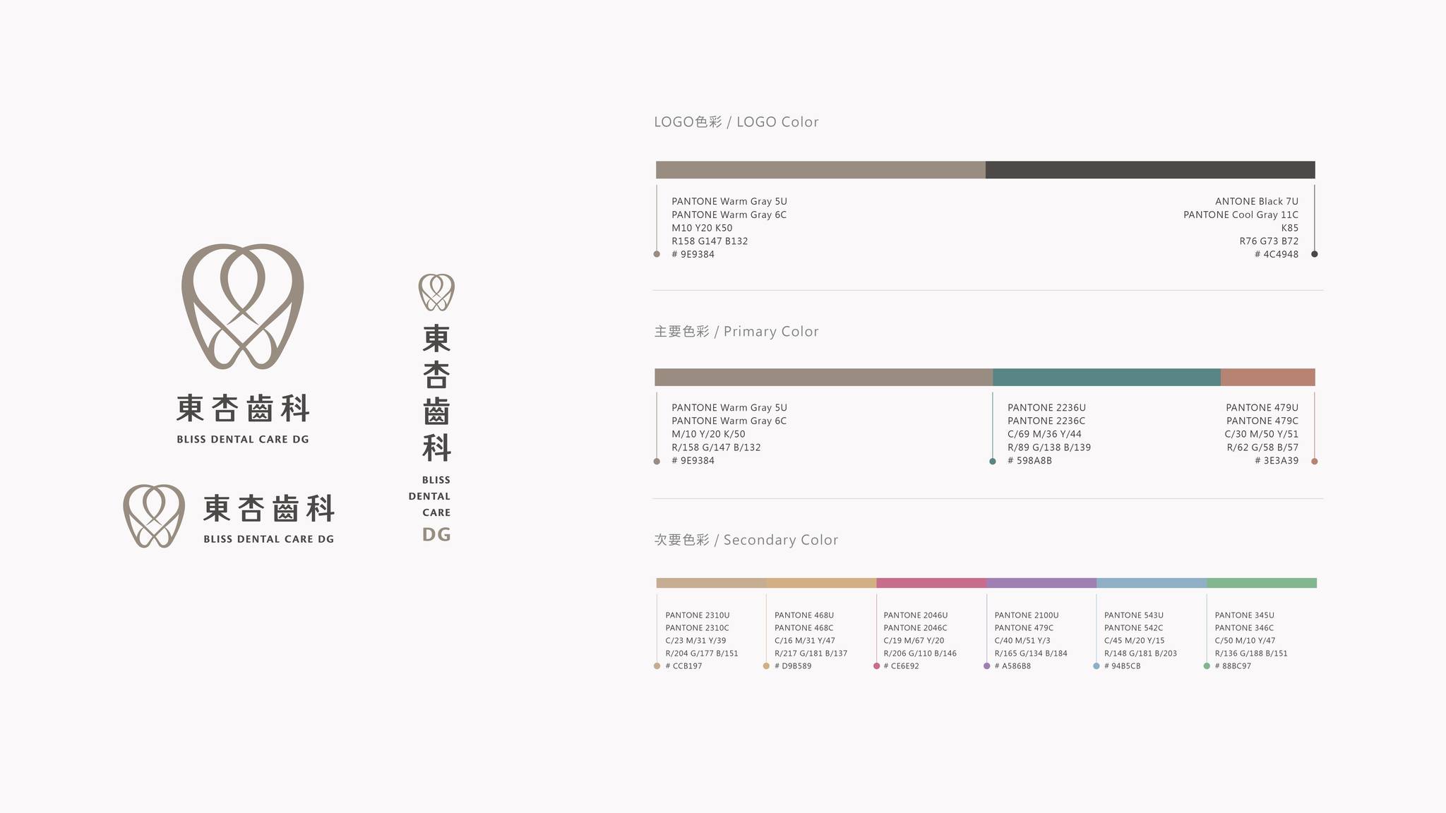
Logo以灰褐色及深灰色為呈現,灰褐色在色彩心理學上給人安心、優雅、誠懇、嚴謹的感受,為品牌增添文化氣息;接近黑色的深灰則強化東杏品牌在醫療方面的專業以及權威感,同時傳達現代簡約的高品質。
The logo is presented in taupe and dark gray. Taupe gives people a sense of peace of mind, elegance, sincerity, and rigor in color psychology, adding cultural flavor to the brand. Dark gray strengthens the professionalism and authority of the Bliss Dental Care in medical, while conveying the high quality of modern simplicity.
色彩計畫以此及建築體的顏色延伸出近似的淺土黃色及古銅色,達到品牌延伸識別度上的一致性,並加入東港識別的海洋及生機色彩。典雅的色彩使用在大面積上能使空間更有餘裕,降低病患的壓迫感,也象徵東杏帶給人們的溫暖、海洋、生機、熱情的意象。
The color plan uses the building to extend the similar light ocher and bronze color to achieve the consistency of brand extension recognition, and add the ocean and vitality color of Donggang recognition.
The use of elegant colors in a large area can make the space more spacious, reduce the sense of oppression, and also symbolize the warmth, ocean, vitality, and passion that Bliss Dental Care brings to people.
東杏齒科的品牌識別延伸到哪些診所應用物?§
應用系統提案從第一版調整到第六版。第二版曾提出水波、花、閃亮三款輔助圖形方向,之後以「花」為主軸延續發展,最後用在名片、植牙保固卡、門診紀錄表,以及拔牙與根管治療的衛教單上;衛教單也從大段文字說明,調整為以圖示呈現治療步驟與注意事項。您在下方還能看到海報、紙袋、礦泉水瓶標,以及標示營業時間與診療項目的入口玻璃門貼。


期許東杏在未來能夠深入在地,以專業和溝通為核心,打造患者最信賴的口腔治療空間,在每位病患的微笑中,加點杏福。
It is hoped that Bliss Dental Care will be able to go deep into local in the future, with professionalism and communication as the core, to create the most trusted oral treatment space for patients. Add some happiness to the smile of each patient.
哪些診所適合參考東杏齒科的識別設計?§
如果您的診所有以下情況,東杏齒科這個案例的做法可以參考:
- 如果您正在新建診所,可以參考建築外觀規劃識別色彩。
- 如果您的衛教單文字多,可以改用圖示說明治療步驟。
- 如果您的表單與保固卡各做各的,可以參考共用一套輔助圖形的做法。
可以參考的順序是:如果您要統一識別,可以先規劃色彩,再將輔助圖形延伸至文件。
如果您正規劃診所識別,可以參考CIS 企業識別設計。

-
結案時間 Case Closed-2021.03
設計師 Designer-潘東 PAN,DONG、盧臆雯 LU,YI-WEN、江珮瑜 JIANG,PEI-YU、劉立淇LIU,LI-CHI
專案企劃 Project Planning-蘇連捷 SU,LIEN-CHIEH
設計總監 Executive Design Director-徐志揚 HSU,CHIH-YANG