Project Overview
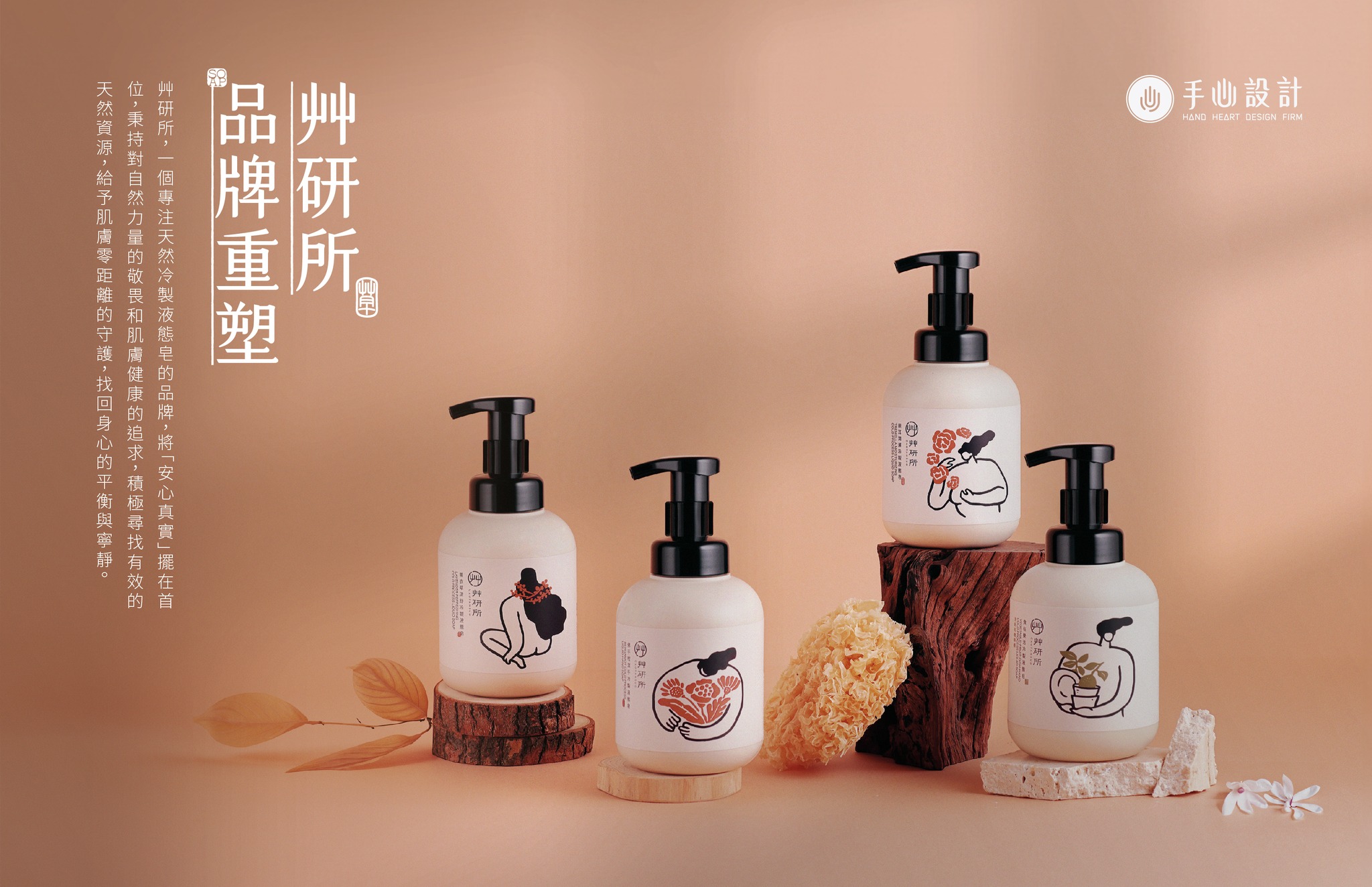
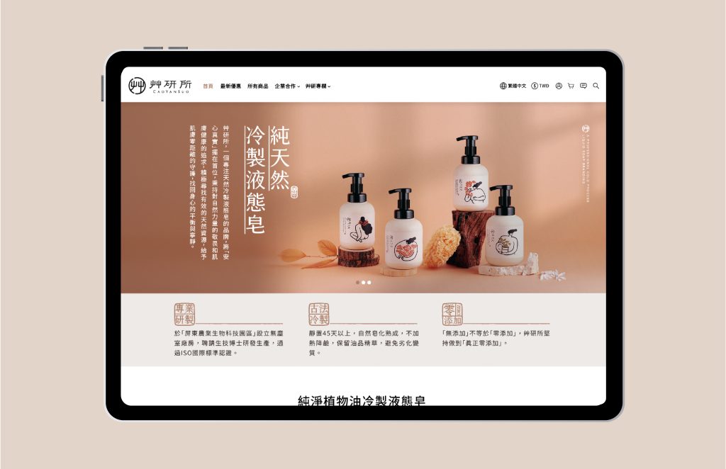
艸研所 是一個天然冷製液態皂的品牌,嘗試以古法晾皂、天然植物原料等為特色做出差異性,但由於缺乏記憶點,難以打動消費者。透過 品牌策略 ,我們重新定義艸研所的定位,強化訴求與特色的關聯性,打造獨特的品牌識別。
“Cao Yan Suo,” a brand specializing in liquid soap, trying to set apart by highlighting ancient air-dried method and natural ingredients. Lacking memorable communication factors made it challenging to capture consumers’s attention. Through brand strategy, we redefined the positioning of Cao Yen Suo, created a refreshed brand identity.
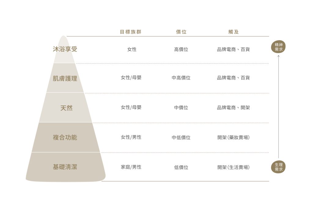
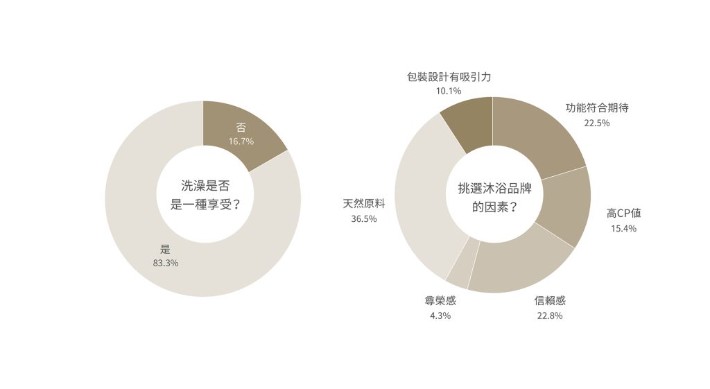
對大眾來說,洗澡不僅是個人清潔,更成為種愉悅的享受。天然原料是成為消費者選擇的重要因素,而品牌給予的安心及信賴感也是影響購買決策的關鍵因素之一。
For many, showering is merely cleaning but a self-care and indulgence. The rising prominence of natural ingredients speaks to consumers’ increasing desire for wholesome. Additionally, the sense of reliability fostered by brands also holds immense sway over purchasing decisions.
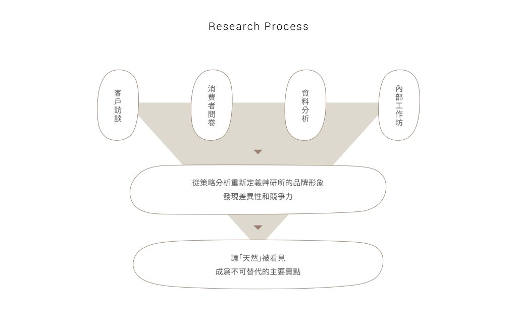
透過調查研究,我們總結對市場及消費者的以下分析,並從三個面向思考品牌的關鍵問題,以及內部和外部環境,重新定義了艸研所存在的獨特性。
Thorough research, we’ve distilled valuable insights into the market. Approaching the brand’s key issues from three perspectives, we’ve redefined the uniqueness of the brand essence.
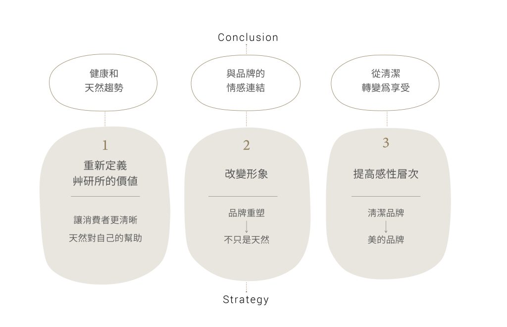
如何讓「天然」被消費者看見?
How is “natural” visible to customers?
Strategy
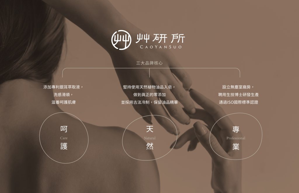
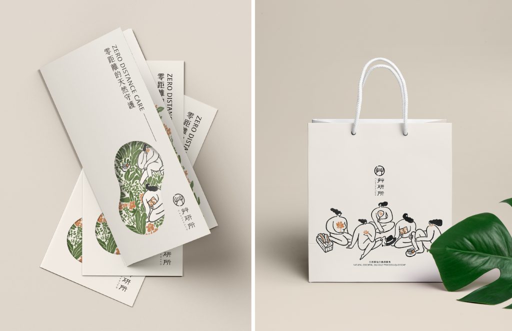
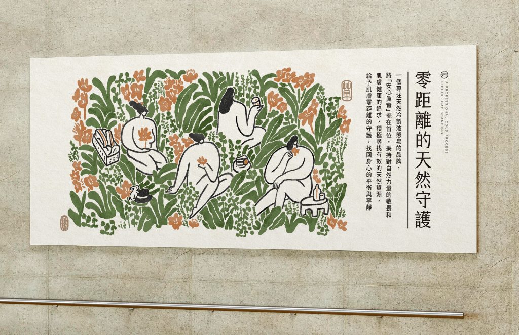
我們希望創造天然極簡主義以外的訴求,更著重於與消費者的情感聯繫和體驗,形成與他牌的差異性;我們確立了品牌的核心價值「呵護、天然、專業」,基於這些價值提出全新的 品牌策略 概念「零距離的天然守護」,打造來自艸研所的溫暖及可靠。
Our goal is to develop an appeal that goes beyond natural minimalism, focusing on emotional connections and with consumers. We’ve defined the brand values as “caring, natural, professional,” and introduced a new brand concept: “zero distance care,” creating a the warmth and reliability that originates from Cao Yen Suo.
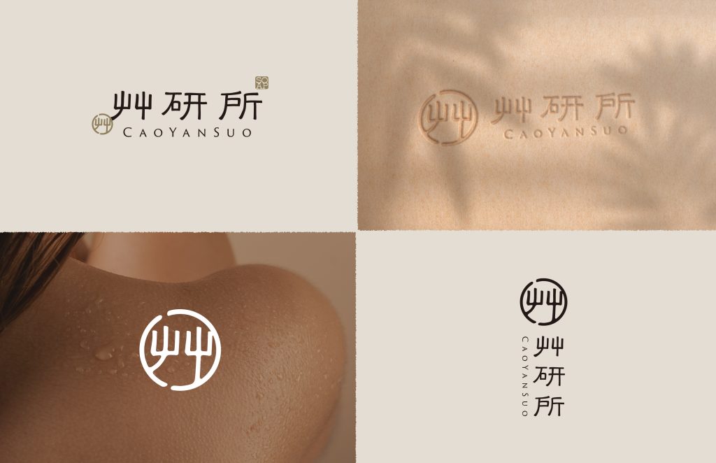
Brand Logo
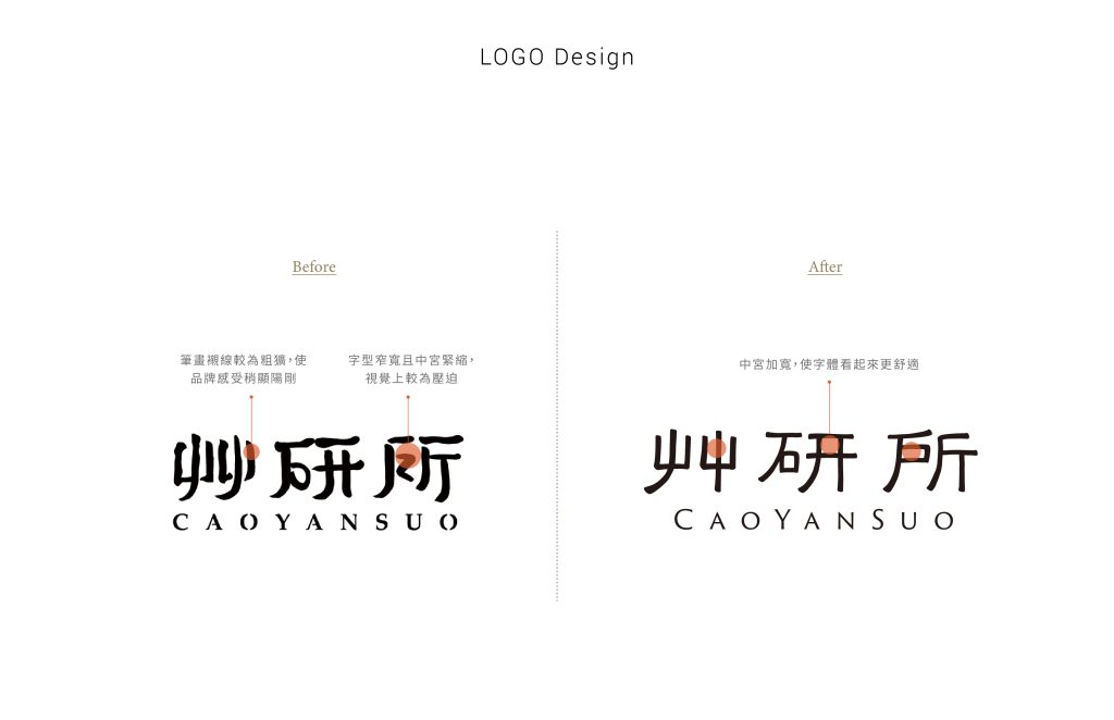
Logo優化將原有設計進行修飾,透過骨架調整,使整體形象更加細膩圓潤,展現更多溫暖舒適的空氣感。
The logo rebrand refines the original design for a warmer, more inviting ambiance.
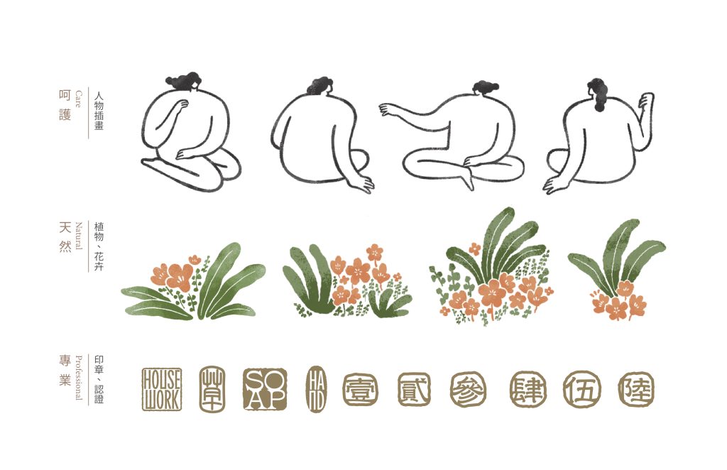
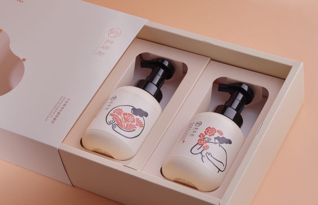
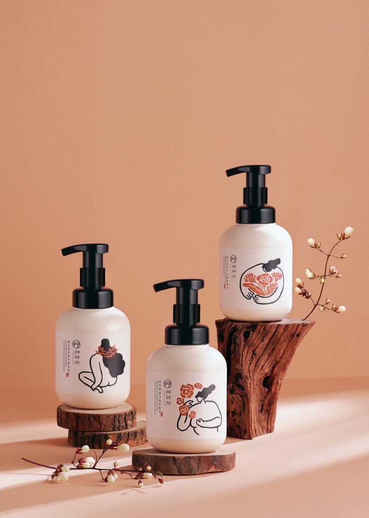
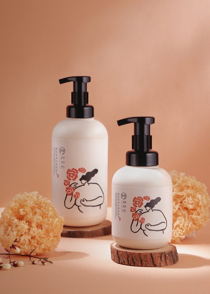
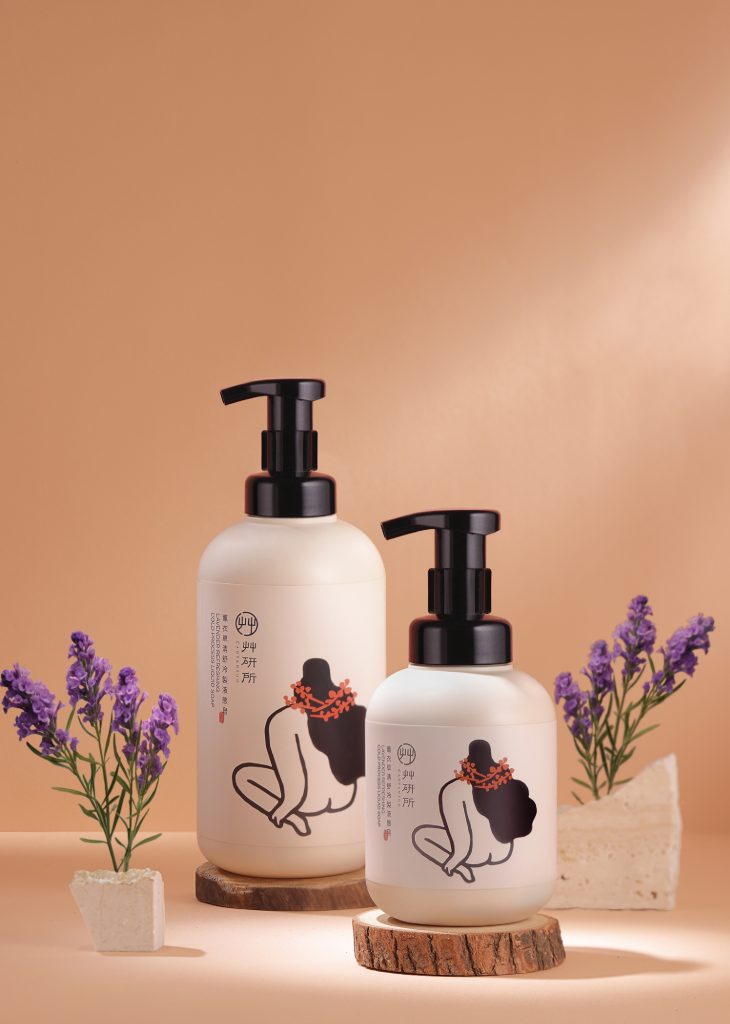
Key Visual
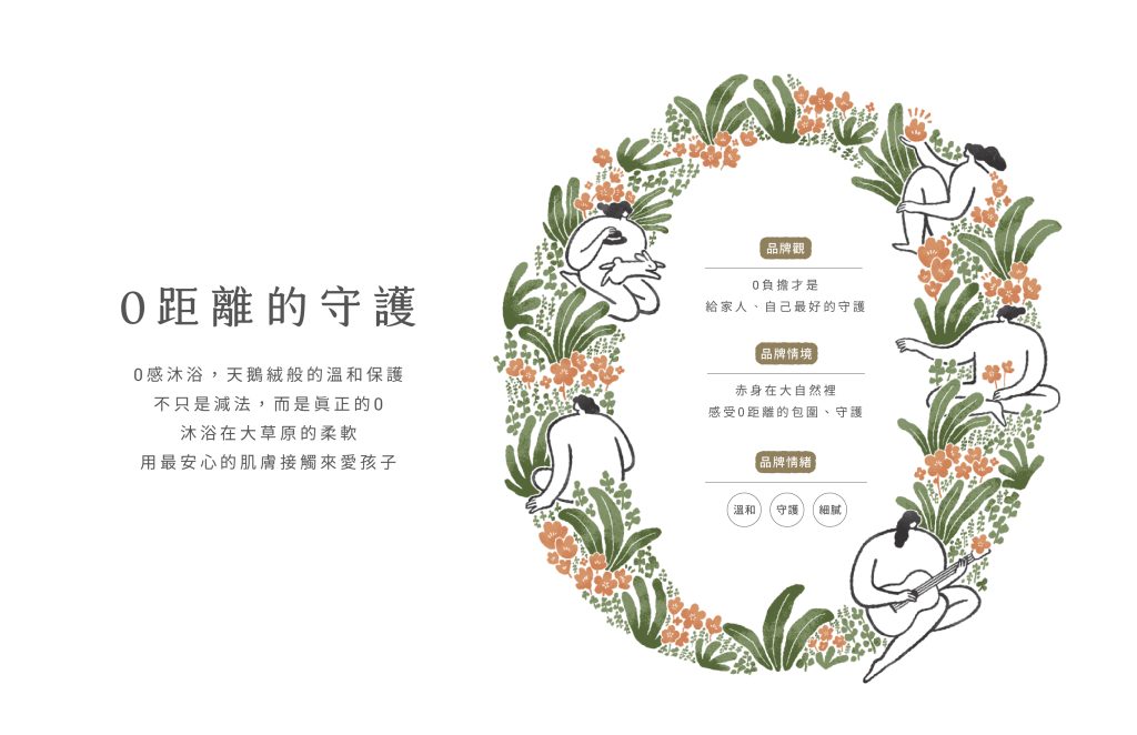
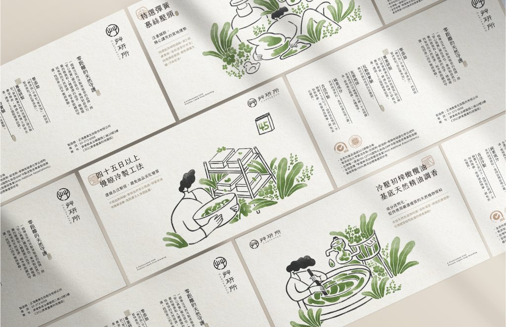
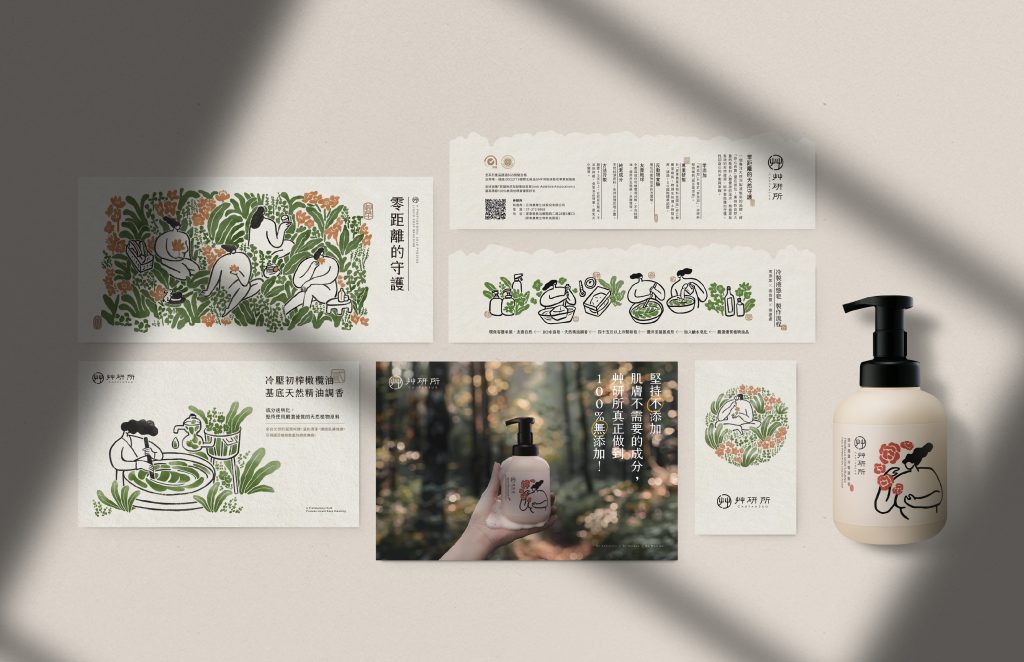
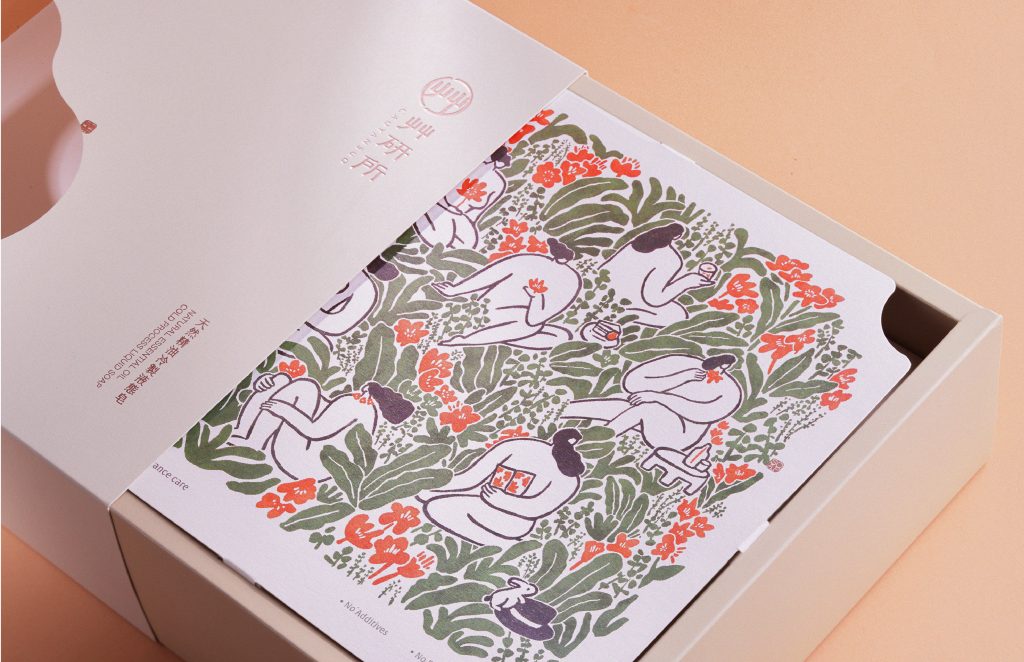
品牌主視覺以呵護感、人性化的風格插畫,透過人與植物間的互動強調天然親膚,營造親密情感記憶的品牌情境。
Adopting a nurturing and humanistic style, the key visual emphasizes natural interactions between humans and plants, fostering intimate emotional connections.
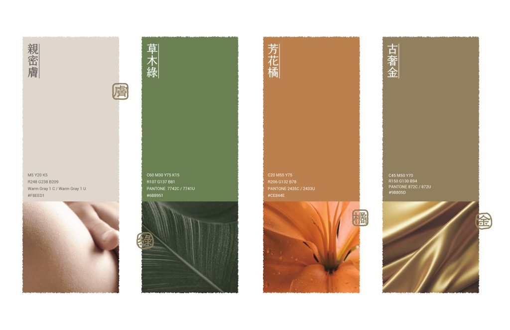
Color System
為使視覺形象更加統一,色彩系統從三種品牌核心感受為出發點,制定天然-綠、呵護-橘、專業-金,讓每個人都能感受到艸言所由內到外的零距離守護。
The color system, based on three core sensations – natural (green), nurturing (orange), and professional (gold) – ensures a cohesive visual identity, allowing people to experience Cao Yan Suo’s care, both internally and externally.

結案時間
設計總監
專案管理
專案企劃
統籌設計
Logo設計
插畫設計
規範書編排
動態設計
攝影師
影像合成
2024.03
徐志揚
蘇連捷、盧臆雯
盧臆雯
蘇筱雯、徐維志
鄭原傑
蘇筱雯、徐維志
李品蓁
鄭智鴻
雅特蘭攝影工作室
蘇筱雯、徐維志
Case Closed
Design Director
Project Manager
Project Planner
Designer
Logo Designer
Illustrator
Layout Designer
Motion Designer
Photographer
Image Process
2024.03
Yang Hsu
Lien-Chieh Su、Yi-wen Lu
Yi-wen Lu
Wen Su、Wei-zhi Hsu
Yuan-jie Cheng
Wen Su、Wei-zhi Hsu
Pin-chen Lee
Zhi-hong Cheng
KC Artlight
Wen Su、Wei-zhi Hsu