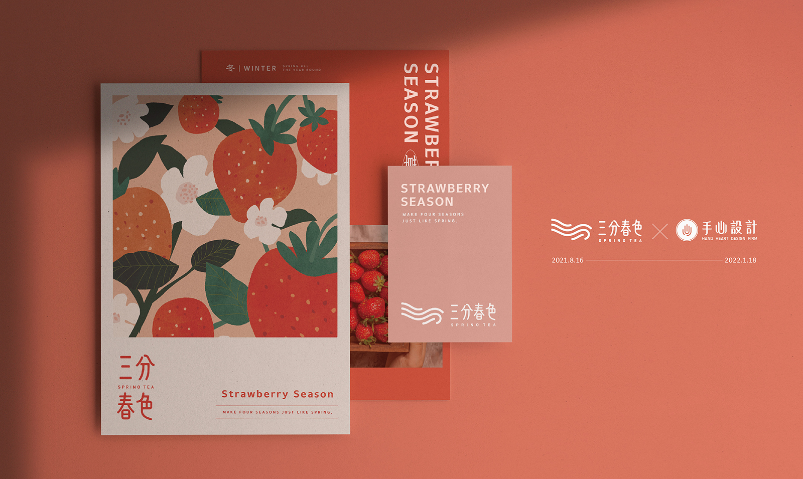
「三分春色」成立於2019年夏天,品牌主理人將執著注入茶飲中,以原創、精緻、健康為初衷,期待為茶飲市場帶來三分春意。隨著品牌擴展,各地分店也陸續成立,為了使品牌感更加明確、統一,我們由品牌的核心出發,延伸空間氛圍、裝潢風格、招牌、菜單、形象牆等,規劃模組化的 識別設計 及 門店設計 ,使未來在延伸應用時除了有一套明確的標準可依循外,更可塑造具有整體感及一致性的對外形象。
Sprino Tea was established in the summer of 2019. The founder infused passion into the tea beverages, with originality, refinement, and health as the principles, aiming to bring a touch of spring to the tea market. As the brand expanded, in order to ensure a clear and unified brand image, we started from the core essence of the brand, extend the space atmosphere, decor, menu, feature walls, etc. We planned a modular identity design so that there will be a clear set of standards to follow in future applications.
「以好茶為底、鮮果為韻,三春化作十二春」
“Good tea as the base, fresh fruits as the rhyme, bringing spring to every season.”
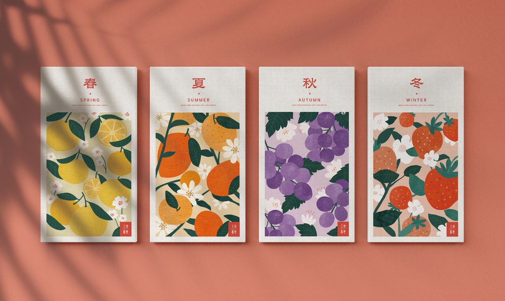
延續「三分春色」原有的古風韻味,結合目前門店的現代網美風進行「現代感」的重新詮釋,除了保有消費者對品牌既有的認知外,也再次將品牌的特色及差異最大化。三分春色的代表產品為鮮果類茶飲,因此將「水果」與「春天」融入標語,期待透過三分春色新鮮水果茶飲的提供,讓消費者的每一季都是春天。
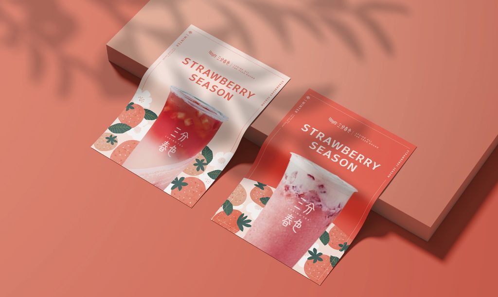
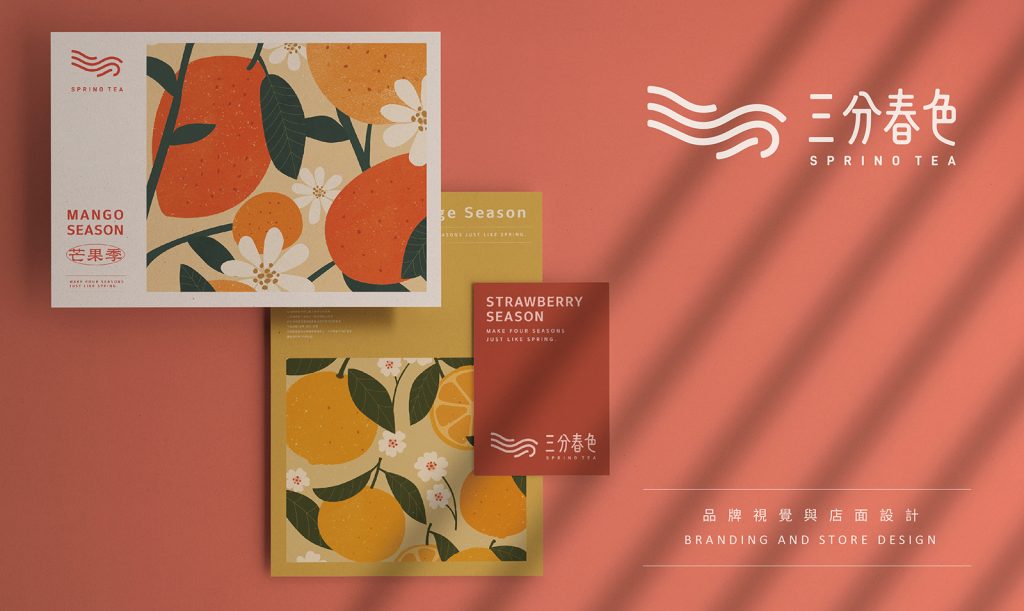
針對 識別設計 ,我們將象徵茶葉氤氳的線條造型與標準字互相呼應,整體造型更加流暢優雅,也強化了古典的韻味;元素使用上則運用插畫的形式將「替每個季節都帶來春意」的概念具象化,也能靈活運用在菜單、文宣等行銷應用上,使對外形象在視覺上具有整體性及一致性。
Continuing the brand’s original ancient charm, we’ve merged it with a modern reinterpretation. While preserving consumers’ existing understanding of the brand, we also emphasized its features and distinctions. The flagship product of Sprino Tea is fresh fruit tea. Thus, the slogan is set as “With good tea as the base and fresh fruit as the rhyme”, to make every season feel like spring for consumers.”
We’ve made subtle adjustments to the logo. The line shape symbolizing the mist of tea, echoes the standard typography, making the overall shape more fluid and elegant, and also strengthening the classical charm. In terms of element usage, illustrations are used to materialize the concept of “bringing spring to every season”. The elements can also be flexibly used in marketing applications to make the brand image visually integrated and consistent.

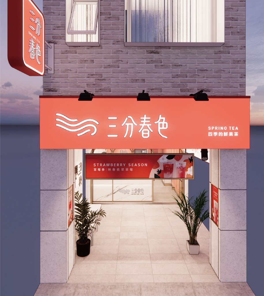
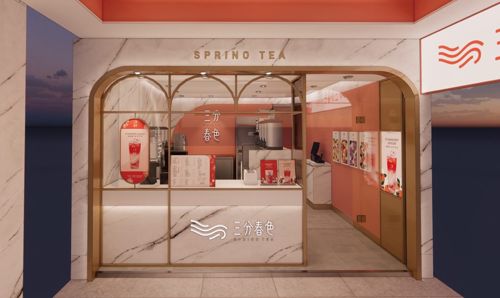
門店設計
呼應品牌精神及視覺設定,我們將三分春色的風格定義了三大主軸方向:溫暖的、圓潤的、明亮的,以品牌色「三分紅」為主色,點綴部分金屬材質,在線條使用上也運用圓弧、拱形,使整體風格溫潤典雅;玻璃材質的使用及多層次的照明規劃也讓門店的空間在視覺上寬敞通透,整體擁有閃閃發亮的細節與春天般的驚喜感。
考量後續品牌擴展分店時,會有不同店面形式使用情境,因此也規劃了一套系統性地使用規範,不論是單店面、雙店面或百貨門市,都可以依照標準化的尺寸比例進行裝潢,也確保了品牌形象的一致性,在消費者心中永遠像春天一般明亮清爽。
For the ethos and visual guidelines, we defined the Sprino Tea style into three main aspects: warmth, smoothness, and brightness. The brand color “red” is used as the main color, embellished with some metal materials, and the curves and arches gives the overall a warm and elegant feel. The multi-tiered lighting using glass materials add spacious and luminosity to the store’s ambiance. The entire space sparkles with details and evokes the delightful surprises of spring.
Considering the possibility of expansion with different branches in the future, a set of systematic usage guidelines has been planned. Whether it’s a single store, a double storefront, or a department store, decorations can be made following standardized size proportions. This ensures the consistency of the brand’s image across various outlets.

結案時間
設計師
專案企劃
設計總監
2022.01
蘇筱雯、珮華
盧臆雯
徐志揚
Case Close
Designer
Project Planner
Design Director
2022.01
Xiao-wen, Su / Pei-hua
Yu-wen,Lu
Chih-yang, Hsu

