品牌名稱源於巴黎左岸的書店, 莎士比亞烘焙坊 有著法國人的浪漫與熱情,是一間溫暖且具有人情味的幸福麵包店。這次的設計中,期望能透過 品牌識別 重塑打造更鮮明的形象,將美好的回憶與體驗帶給所有喜愛烘焙的人。
Originating from the romance and passion of Seine, we hope to bring beautiful memories and experiences to all those who loves baking through our bread. It is a warm and heartfelt bakery filled with happiness.
品質・生活・情感
為了將這份使命與願景保留下來,我們透過超過兩百份問卷、與創辦人訪談,歸納出莎士比亞最重要的三個核心價值——品質、生活與情感,在民眾的心中莎士比亞不僅是一間可以做出好吃麵包的麵包店,也是兼具令人安心、放鬆的社區鄰居。透過品牌重塑,從走進店面的招呼語,乃至麵包陳列的規劃,強化品牌在日常中的美好滿足感,讓每一口麵包轉換成單純幸福的味道,點亮每一位顧客的生活。
To preserve the mission and vision, we collected insights from over two hundred surveys and interviews with the founder, and identified Shakespeare’s three most important core values — quality, life, and emotion. To people, Shakespeare is not only a bakery that makes delicious bread but also a comforting and relaxing neighbor. Through rebranding, we amplify the brand’s delightful satisfaction in daily life. We aim to transform every bite of bread into a taste of pure happiness, brightening the lives of every customer.
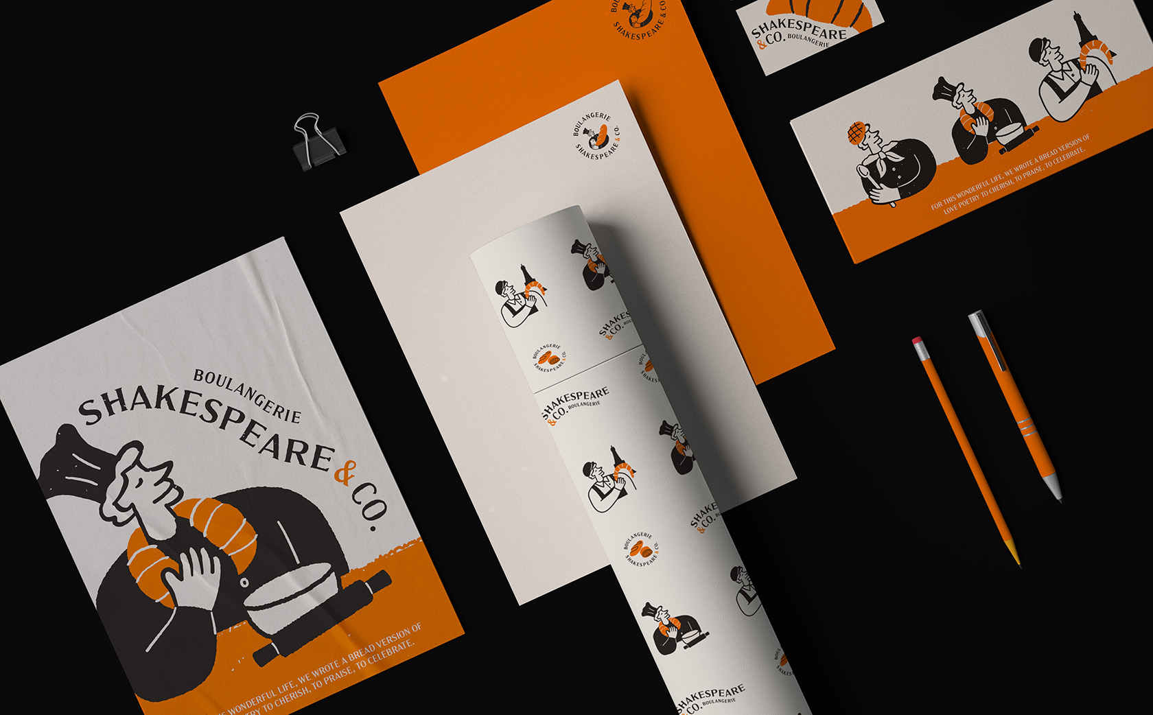
為呼應品牌的核心價值,我們保留舊Logo中廚師、麵包與貓咪的元素,並以溫暖療癒卻不過於可愛的風格重新繪製,透過群化與誇大部份物件比例的調整,解決過往 品牌識別 不清晰、焦點過於分散等問題,也重新以兼具穩重與親和的調性,定義了 莎士比亞烘焙坊 的品牌色彩。輔助圖形則延續Logo的人物造型,以不同型態的麵包融入角色的生活場景,呼應品牌「日常浪漫」的精神與風格。
For the core values, we kept elements of the chef, bread, and cat from the old logo and redrew them in a warm style that’s endearing without being overly cute. By grouping the elements together and exaggerating the proportions of certain objects, we addressed previous issues of unclear identification and overly dispersed focal points. We also redefined Shakespeare’s brand colors with a tone that’s both stable and friendly. The auxiliary graphics continue the character style from the logo, incorporating different breads into daily scenes, presenting the brand’s spirit and style of ‘everyday romance.’
結案時間
設計師
設計總監
2022.12
蘇筱雯、鄭原傑、葉子豪
徐志揚
Case Closed
Designer
Design Director
2022.12
Xiao-wen Su / Yuan-jie Cheng / Zhi-hao Yeh
Chih-yang, Hsu