
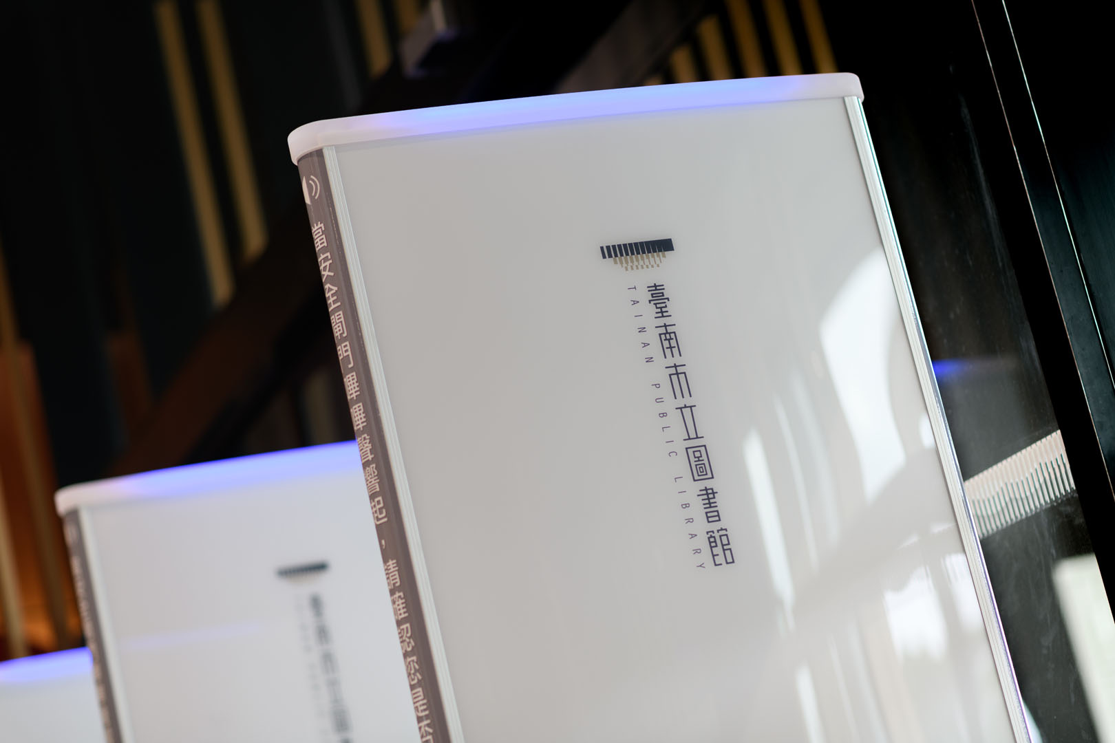
台南市立圖書館新總館之 CIS設計 ,為加深大眾的識別記憶與聯想,使用逐層往下內縮的建築外觀作為識別標誌輪廓,以象徵書冊的方形為單元,加入規律的漸變手法表現建物特色——頂層的隔柵構造,於塊面及其交界處融入象徵書冊、光影、氣息的幾何曲線造型,為幾何為主的標誌圖案帶入有機、連貫的自然氣息。
In order to deepen the identification and association of the people, we design the identity system of the new main building of Tainan Public Library with the building appearance that is indented layer by layer is used as the outline of the identification mark.
Taking the square symbolizing the book as a unit, integrate the gradual change technique to present the characteristics of the grille structure on the top floor. To bring the organic, coherent and natural scent into the logo, we connect the curves symbolizing the book, light, shadow, and breath are integrated into the block surface and its junction.

矩方形單元除了象徵書冊外,更代表此複合型生活空間,將成為市民讀者的多元學習窗口,期待場館啟用後,光影與書香將如同標誌設計一般,交錯流動於這座融和著過去與未來、傳統與當代的新場域。
The square unit not only symbolizes books, but also represents this comprehensive space, which will become a multi-learning place for citizens and readers. It is expected that after the opening of the library, the light, shadow and aroma of books will flow alternately in this new field that blends the past and the future, the tradition and the contemporary, just like the logo design.

我們同時也建構了一套動態識別系統:解構標誌圖案的方矩形單元,再根據各分館之館藏特色,重組成44個地方型分館的代表性新圖標,使各分館的特色得以呈現並與總館連結,讓使用者能在遠處更清楚辨認整體品牌。不僅充分展現品牌識別系統的高度延展性與包容力,亦為一種創新形式應用於總圖與其分館間,將品牌的經營理念與核心精神,透過統一的視覺設計加以整合,未來圖書館持續擴張或有新的地方圖書館時,皆能以這套系統進行延伸,達到永續發展的目標。
At the same time, we also constructed a dynamic identification system: the rectangular units of the deconstructed logo pattern. Then, according to the collection characteristics of each branch library, it will be reorganized into 44 representative new icons of local branch libraries. The characteristics of each branch library can be presented and connected with the main library, so that users can more clearly identify the overall brand from a distance.
It not only fully presents the high flexibleness and inclusiveness of the brand identity system, but also is an innovative form applied between the main library and branch libraries. To integrating the brand’s business idea and core spirit through a unified visual design. In the future, the library will continue to expand. When there is a new library, this system can be extended to achieve the goal of sustainable development.


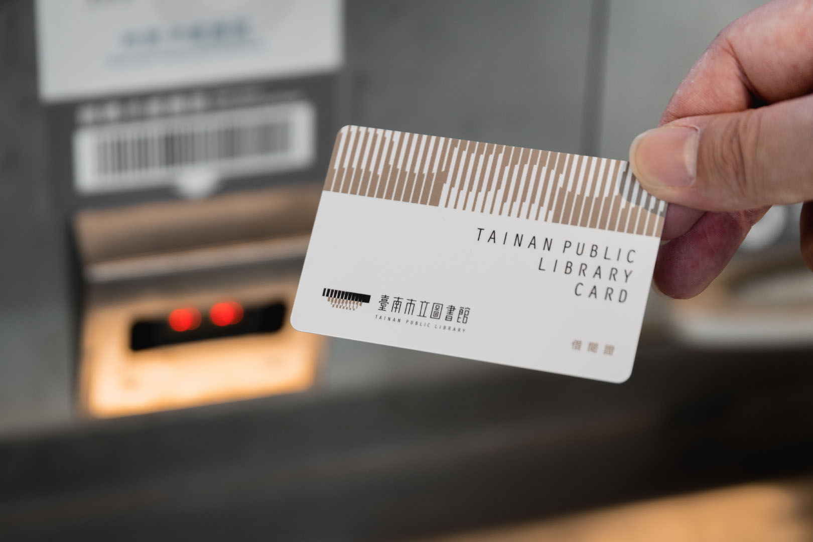
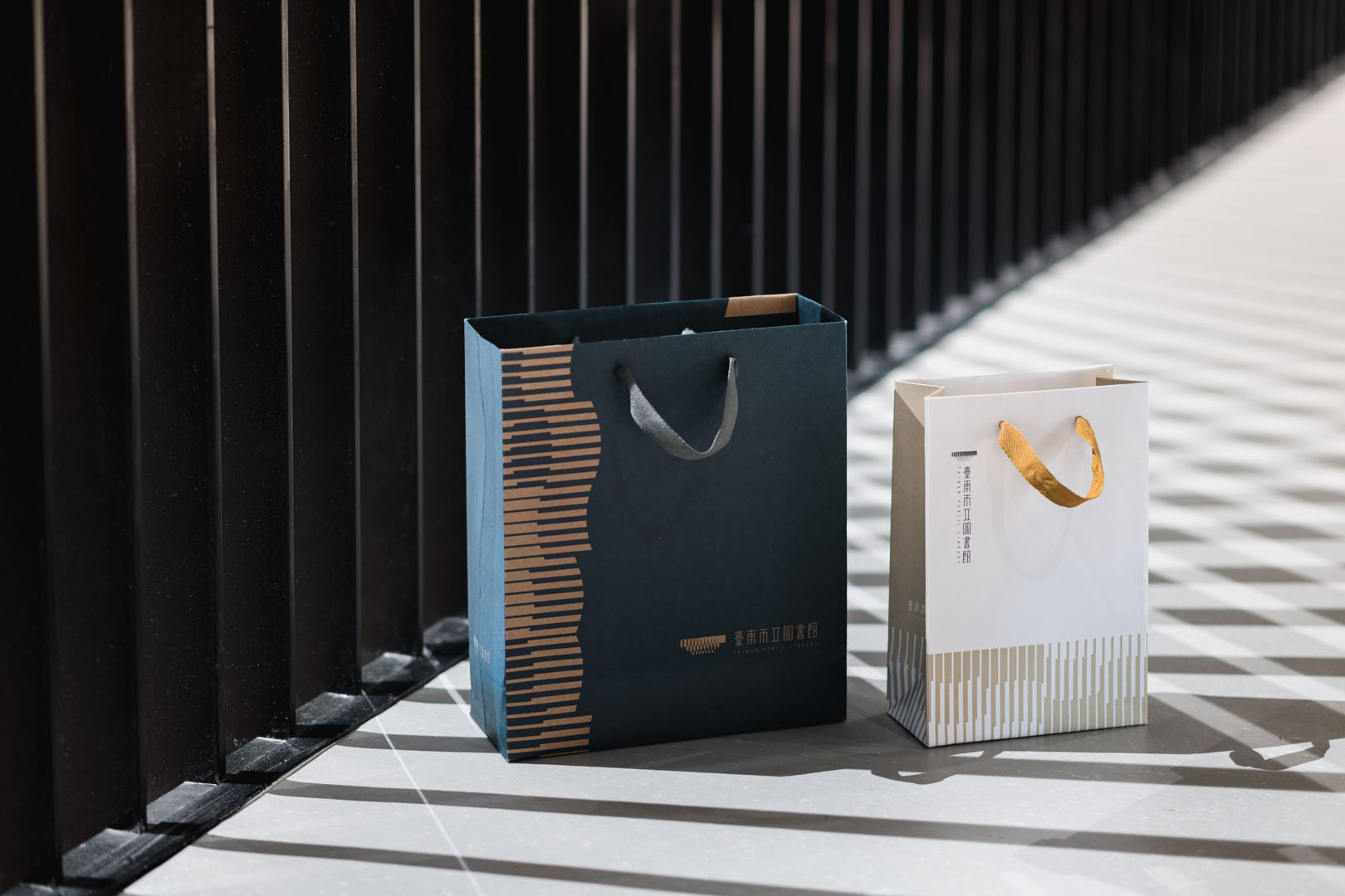
色彩計畫以自然建材中代表石材的藍灰色,與代表木頭的棕褐色搭配組成;輔助圖案則延續標誌圖案的漸變方塊手法,勾勒出書冊翻閱的視覺律動效果。期盼透過此次設計,為這座南臺灣的知識綠洲,建立深具人文與清晰識別度的視覺調性,在時代的更迭中展現彈性與包容,並期待能成為讀者與市民交換思想、分享生活的最佳歸屬。
The color plan is composed of light gray, which represents stone in natural building materials, and tan color which represents wood. The auxiliary pattern continues the gradient square technique of the logo, which outlines the visual rhythm effect of flipping through the book. It is hoped that through this design, a visual tone with deep humanity and clear recognition will be established for this knowledge oasis in southern Taiwan. It will show flexibility and tolerance in the changing times and become the best place for readers to exchange ideas.


-
設計統籌 Design Overall Planning-劉家溱 LIU,CHIA-CHEN
設計師 Designer-劉家溱 LIU,CHIA-CHEN、江珮瑜 JIANG,PEI-YU、潘東 PAN,DONG、盧臆雯 LU,YI-WEN
專案企劃 Project Planning-蘇連捷 SU,LIEN-CHIEH、王彥筑 WANG,YAN-ZHU
設計總監 Executive Design Director-徐志揚 HSU,CHIH-YANG