為感謝一直以來陪伴手心成長的夥伴,同時祝賀這個充滿傳統氣氛的年節,我們進行一連串腦力激盪,在極為有限的時間內設計出屬於手心獨特的祝福。此次新春賀卡 平面設計 以庚子年的吉祥物「老鼠」及「手心」作為主角,發想賀年卡的結構與設計,再從中融合與擷取適合的元素,誕生此次的作品。
In order to thank the partners who have been with Hand Heart Design Firm growing up and congratulate this festival full of traditional atmosphere, we carried out a series of brainstorming and designed unique blessings within a very limited time.
Taking the mascots of the Year of Rat and Hand Heart Design Firm as the protagonists, the structure and design of the New Year’s card were conceived, and then the appropriate elements were integrated and extracted to create this work.

燙印與製作是本次賀卡的一大挑戰。因為紙材較為特殊,刀模結構導致外部封口在撕開時產生紙張剝離的狀況,無法順暢的一撕到底,由於時間緊迫無法重開刀模,非常專業且耐心的「天成燙金」莊老闆協助嘗試了各種解決方案,經過雙方不斷討論,最終在沒有重開刀模的狀況下找到了解法,讓這個棘手的問題得以解決,後續若有機會再向大家分享問題解決的過程與克服的方法。
Hot stamping and making was a big challenge for this work. Due to the special paper material, the structure of the die-cut caused the envelope could not be opened smoothly, and the die-cut could not be remade due to the lack of time.
Mr. ZHUANG of TIAN-CHENG Bronzing is professional and patient that assist us to try various solutions. Finally, this problem has been successfully resolved. If there is an opportunity, we will share with you the process of solving the problem and how to overcome it.
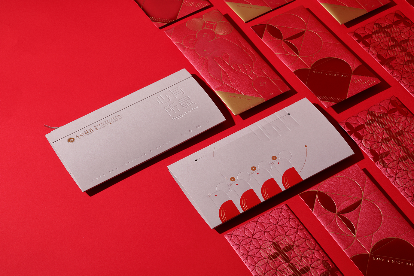
此次庚子年新春賀卡設計以鼠年「數」老鼠為概念——以手指的意象融合手心與庚子年的特色,在去年年輕的新夥伴加入後,嘗試以清新的路線進行設計,期望能讓收到的貴賓看見新鮮的氣息。「心有所鼠」意味著客戶、夥伴與手心間深刻的相伴,封套字體採用圓角的設計語彙,讓整體視覺和諧而圓滿。
The design of this Chinese New Year card is based on the concept of counting the rat in the Year of the Rat. (In Chinese”數”means “Counting”, pronounce “shu” ;“鼠”means ”Rat” pronounce “shu” )
Combine the Hand Heart Design Firm and this year’s mascot rat in the image of fingers. There are young new partners joining us, so this time we tried to design with a fresher way, hoping to make the received VIPs feel the fresh.
“心有所鼠” It means the deep connection between Hand Heart, partners and customers. The envelope design with rounded corners to make the overall visual harmonious and complete.
P.S. 心有所屬means I have someone in my mind. We change 屬(belong) into 鼠(Rat).
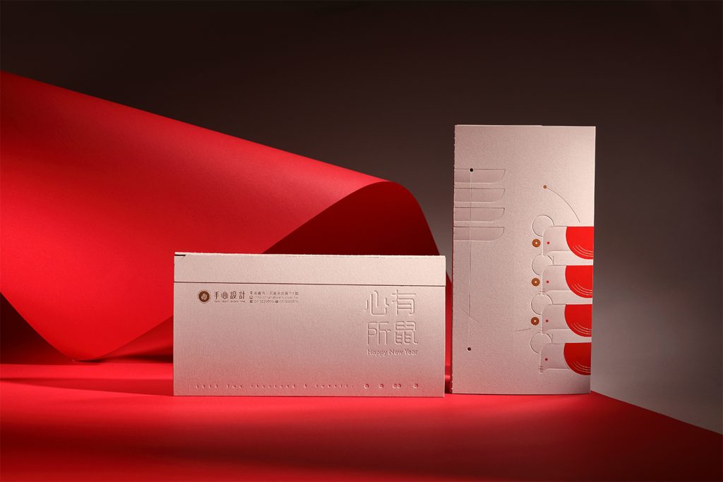
內頁結合年曆與紅包袋,希望這份賀年卡除了祝福的寓意,更能陪伴收到的貴賓度過今年的日子,每個月份的小icon隱藏了設計師的巧思,這個小彩蛋就留給大家解讀和發現摟!
The inner page combines the annual calendar and red envelopes. We hope that this greeting card can accompany the VIPs this year in addition to the meaning of blessing. The little icon of each month hides the designer’s ingenuity, and this little Easter egg is reserved for everyone interprets and discovers.

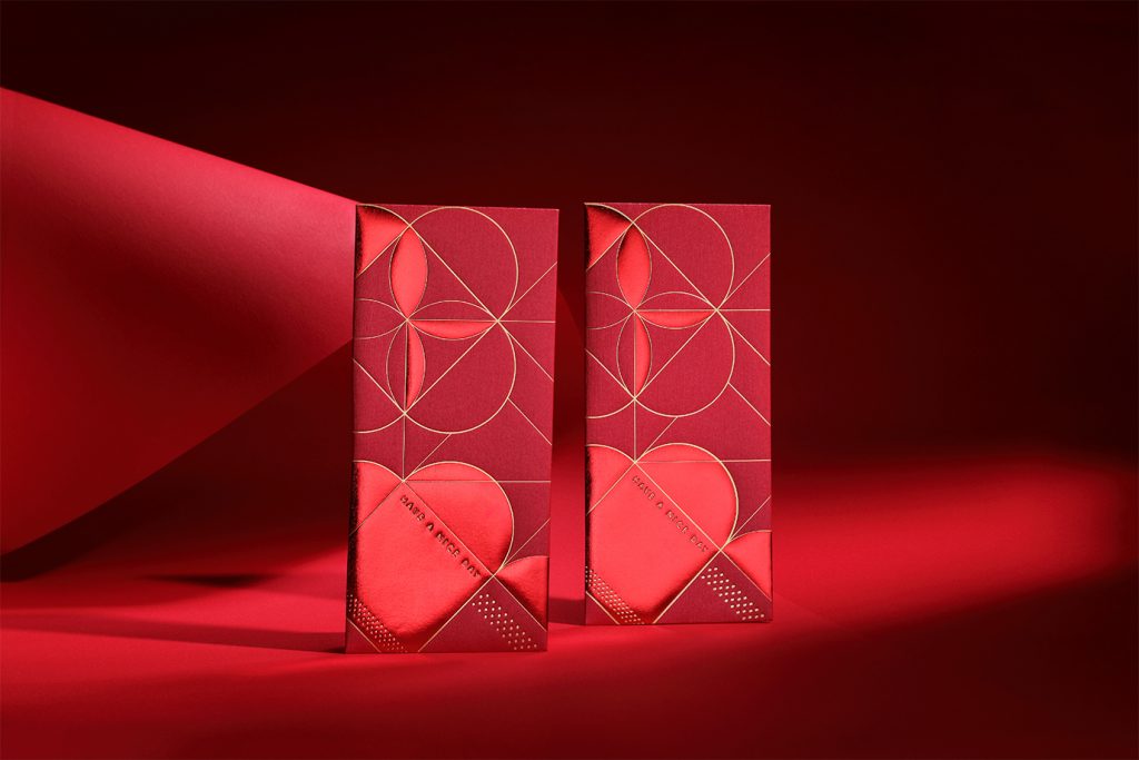
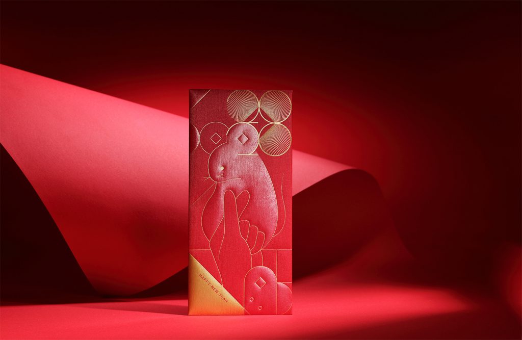
紅包袋的設計使用了貫穿整份賀年卡的幾何元素,以基礎圖形勾勒出愛心與花朵的圖案,象徵透過各種排列組合創造出無限可能。應景的老鼠款式則結合「手」、「心」及「台灣」,除了代表我們的新春祝福之外,愛心手勢也祝福大家在新的一年能有「鼠」不完的鈔票啦~
The design of the red envelope uses geometric elements throughout the whole New Year’s card, and outlines the basic patterns of love and flowers, symbolizing the creation of infinite possibilities through various arrangements and combinations.
The appropriate rat style combines “hand”, “heart” and “Taiwan”. In addition to representing our New Year wishes and hopes, the heart gesture also means everyone will have endless banknotes in the new year.

-
設計統籌 Design Overall Planning-周一潔 JHOU,YI-JIE
設計師 Designer-盧臆雯 LU,YI-WEN、江珮瑜 JIANG,PEI-YU、林宜慧 LIN, I-HUI、劉家溱 LIU,CHIA-CHEN、潘東 PAN,DONG、周一潔 JHOU,YI-JIE、李奕臻 LEE,I-CHEN
專案企劃 Project Planning-蘇連捷 SU,LIEN-CHIEH、王彥筑 WANG,YAN-ZHU
設計總監 Executive Design Director-徐志揚 HSU,CHIH-YANG
協力夥伴 Assistant Partner
攝影製作攝影 Photography-雅特蘭商業攝影
印刷Printing-天成燙金
紙材Paper-
封套:采憶紙品-244g 日本NT元素紙(024A)
紅包袋(紅款):鑫天力紙業-120P 珠光絲綢(LB120-06)
紅包袋(螢光款):聯美紙業-310gsm 德國環保金綺紙(FA03)