

智高點 Kaohsiung Orientations Of Innovation And Intelligence,縮寫為KO-IN。Orientaion為「價值取向」、「定位」、「定向」,以創新及智慧產業為主要定位,品牌命名與 LOGO設計 也隱含CO(共同)- IN(進駐、參與)之意,藉由共同參與建立社群,結合智慧產業廠商進駐基地,在KO-IN基地中發展城市未來的可能。
Kaohsiung Orientations of Innovation and Intelligence (KO-IN) takes innovation and smart industries as its main positioning. The brand name and LOGO imply the idea of KO (collaboration) – IN (join), building a community through collective engagement. By integrating smart industry manufacturers into the base, there’s potential to shape the future of the city within the KO-IN.


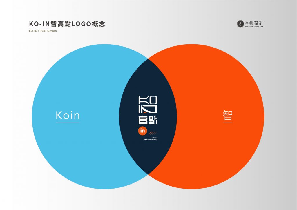
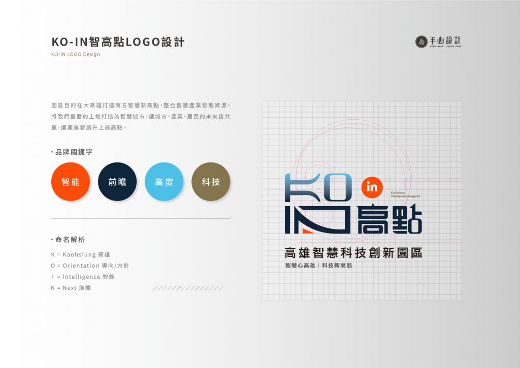
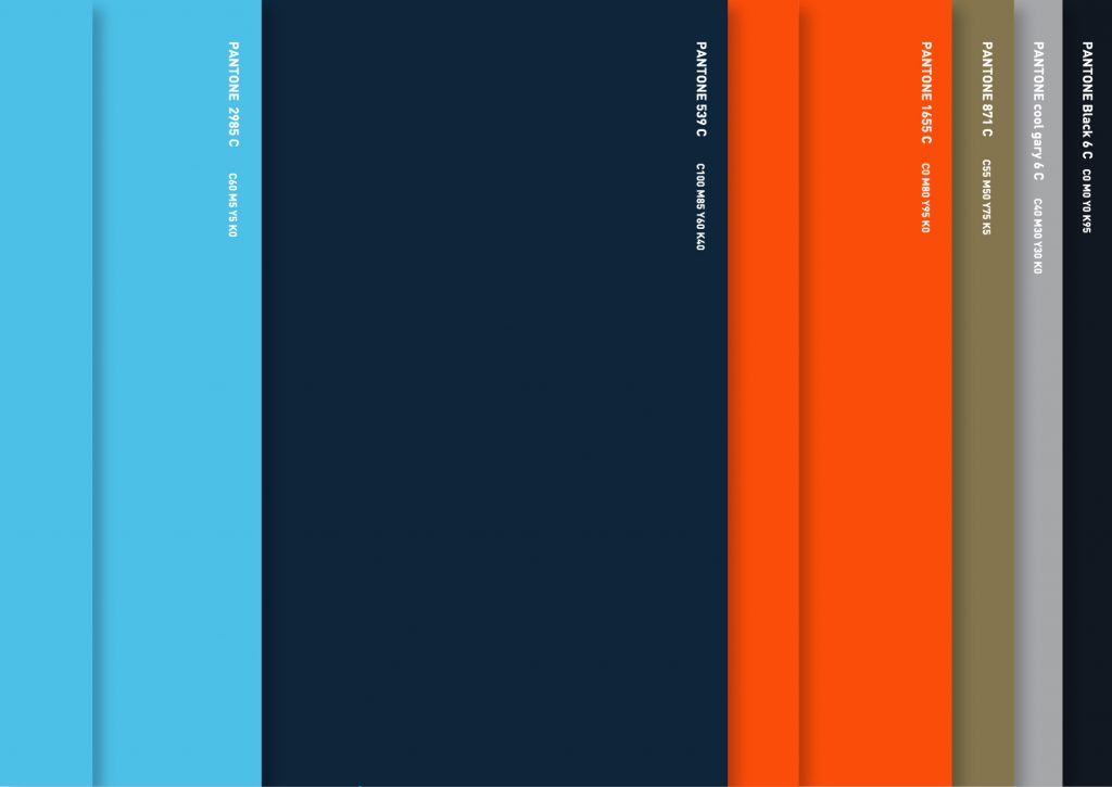
本LOGO在概念上結合了KO-IN的英文與中文「智」,字型設計上則採用了較方正、尖銳卻帶圓角的符號意象,以表現站上高點的衝勁及本園區內含的包容性,並且選用了對比性較高的色彩以凸顯創新的強烈意象,同時配合較冷調的色調表達科技與智能之意。
The logo combines the English and Chinese characters of KO-IN for wisdom. In terms of typography, it adopts a square, sharp but rounded symbol imagery, to represent the manner and inclusiveness of reaching a high point. The highly contrasting colors highlight the strong image of innovation, while using cooler tones to express the meaning of technology and intelligence.


—
結案時間 Completion Time – 2019.03
設計師 Designer – 張蒲政 Pu-zheng, Zhang、蘇亮丞 Liang-cheng, Su、潘東 Dong, Pan
設計總監 Design Director – 徐志揚 Chih-yang, Hsu
專案經理 Project Manager – 蘇連捷 Lien-chieh, Su
—
#LOGO設計 #品牌命名 #手心設計