

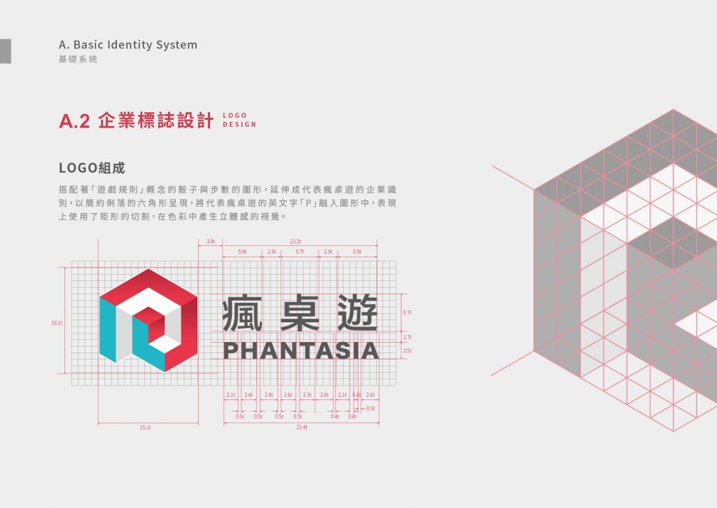
瘋桌遊是台灣最大的桌遊品牌,致力於為客人創造美好回憶。過去的瘋桌遊缺乏整體性的視覺傳達,過於制式的環境也模糊了其品牌的獨特性。因此我們將 CIS設計 重點放在視覺的系統化以及情境的體驗上,使其擁有更多元的應用性,增加視覺連結性外,在提升品牌質感的同時,也達到良好的市場傳播度。利用桌遊的重要元素「骰子」作為LOGO的主要設計發想,以立體骰子的側面結構(六角形),融合桌遊「步數」的概念,並融入代表瘋桌遊的「P」字,以簡約俐落的六角形呈現,同時使用矩形的切割,在色彩中產生立體的視覺效果。
Phantasia is the largest board game brand in Taiwan, dedicated to creating good memories for guests. In the past, they lacked overall visual communication, and the standard style also concealed the uniqueness of the brand.
Therefore, we focus on visual systematization and situational experience design, so that it has more diverse applications and increases visual connectivity. It not only improves the brand texture, but also achieves great market communication.
Creating the important element of board games “dice” as the concept of LOGO, use the hexagonal structure of the side of the 3D dice, add the concept of “steps” of board games, and the word “P” representing Phantasia, with a simple hexagonal presentation, while using rectangular cuts, creates a three-dimensional visual effect in the colors.

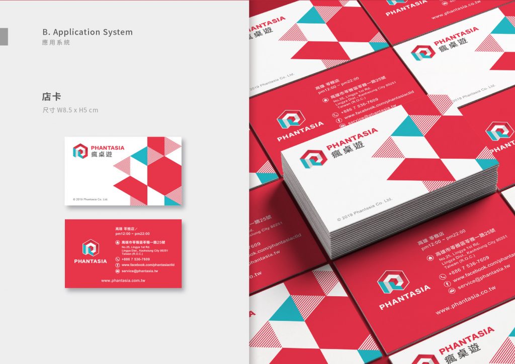
輔助圖形也結合「骰子」、「規則」和「故事多變性」的概念,使用各種代表不同步數的基礎型,於版面上切割形成各種畫面,使其在各應用物上皆能靈活運用,就如同桌遊「同樣的遊戲和規則,但沒有同樣的結局」。
Auxiliary graphics also combine the concepts of “dice”, “rules” and “story variability”, using various basic types representing different numbers to be cut on the layout to form various pictures, so that they can be flexibly used in various applications. It’s like a board game “same game and rules, but not the same ending”.

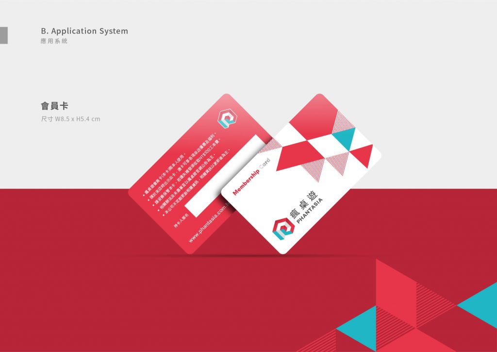
色彩計畫延續過往瘋桌遊的紅色,加入活潑且對比的亮藍色作為點綴,呼應品牌歡樂的企業理念,強化視覺識別度的同時也增加消費者的視覺連結性。
The color plan continues the red of the past of Phantasia, and adding a lively and contrasting bright blue as an embellishment, echoing the brand’s corporate philosophy of joy, strengthening visual recognition and increasing consumers’ visual connectivity.


-
設計師 Designer-藍啟睿 LAN,QI-RUI、徐子皓 SYU,ZIH-HAO、邱柏龍CIOU,BO-LONG、潘東 PAN,DONG、周一潔 JHOU,YI-JIE、吳依穗 WU,YI-SUI、杜孟霖DU,MENG-LIN、曾于齊 ZENG,YU-QI
專案企劃 Project Planning-蘇連捷 SU,LIEN-CHIEH、林玉真 LIN,YU-JHEN
設計總監 Executive Design Director-徐志揚 HSU,CHIH-YANG