美黛子以用心著想的態度為最高原則,推廣在地旅遊與文化,建立每次高品質旅遊的美好價值,態度親切、專屬客製化、注意細節,期盼創造一個充滿人情溫度的品牌,以完善良好的 視覺系統設計 ,在看過品牌的人們心裡留下深刻印象,穩固長遠品牌口碑。
Miyoko Tour takes the attitude as the highest principle, promotes local tourism and culture, and establishes the value of each high-quality tourism, with a friendly, exclusive customization, attention to details to create a brand full of warmth. With a perfect visual identity, it will make a deep impression on the people and stabilize the long-term brand reputation.
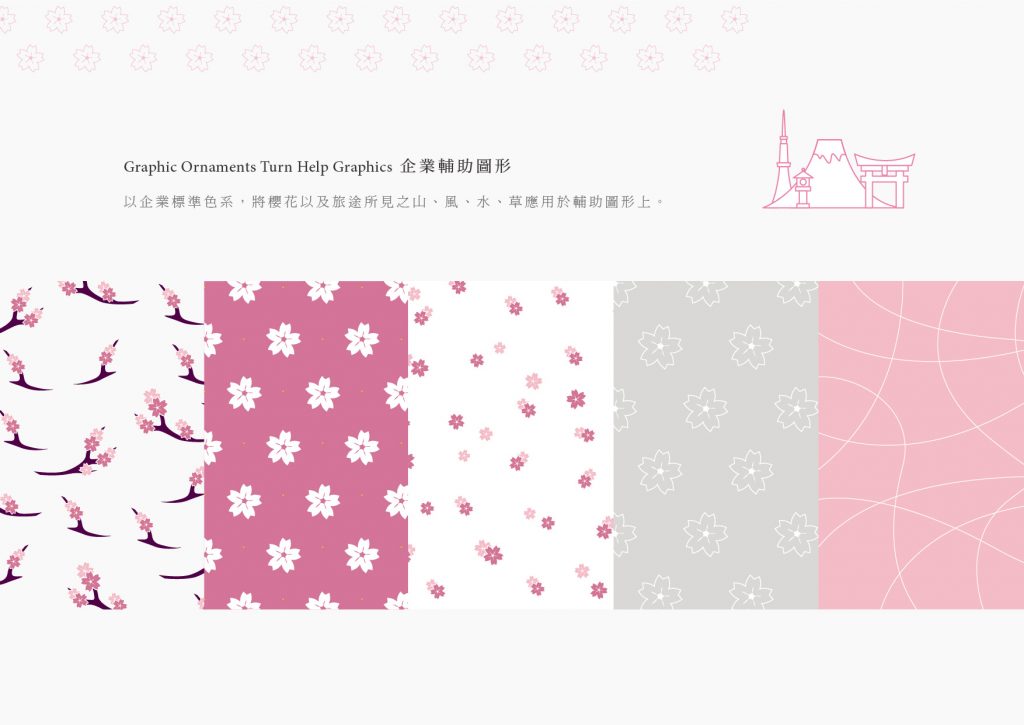
色彩計畫上,以櫻花氣質的「粉」為主調,優雅內斂地直接點出美黛子旅遊之視覺感受,對比色系「天藍」、「草綠」帶出旅遊的輕快活潑感,並輔以「深紫」彰顯獨特且現代典雅之品牌形象。
In the color scheme, the pink of cherry blossoms is the main tone, and the visual experience of Miyoko Tour is directly pointed out in an elegant manner. The contrasting colors sky blue and grass green bring out the lightness and liveliness of travel, and complemented by deep purple to demonstrate a unique, modern and elegant brand image.

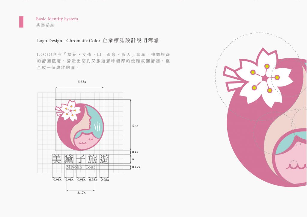
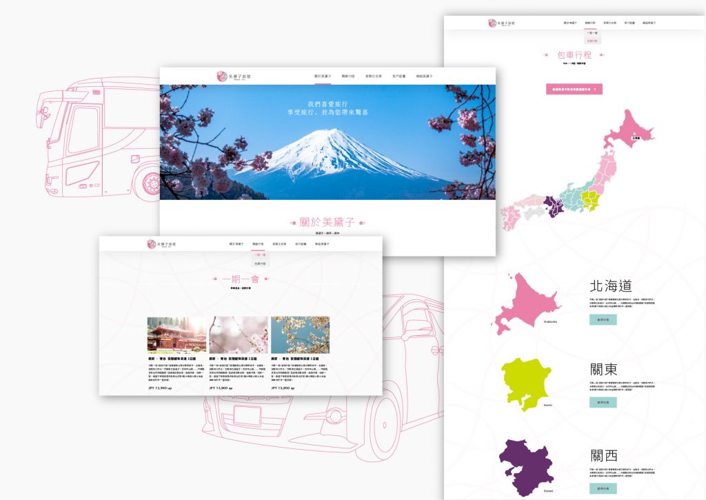
logo設計的部分,以日本女孩側面剪影、櫻花以及M字型山和溫泉水波結合而成,營造出旅遊愜意的優雅氛圍。型錄與網站延伸了視覺識別系統的設計,達到視覺識別的統一,整體以簡約清新的風格傳達親切、專業的品牌形象。
The logo design is combined with the silhouette of the Japanese girl, cherry blossoms, M-shaped mountain and water waves of hot spring, creating a comfortable and elegant atmosphere for travel. The catalog and website extend the design of the visual identity system to achieve the unity of visual identity, and convey a friendly and professional brand image in a simple and fresh style.

-
結案時間 Case Closed-2018.10
設計師 Designer-王育安 WANG,YU-AN、王諾婷 WANG,NUO-TING、蔡依庭 CAI,YI-TING、李俊寬 LI,JUN-KUAN、杜孟霖 DU MENG LIN、潘東 PAN,DONG
設計總監 Executive Design Director-徐志揚 HSU,CHIH-YANG


