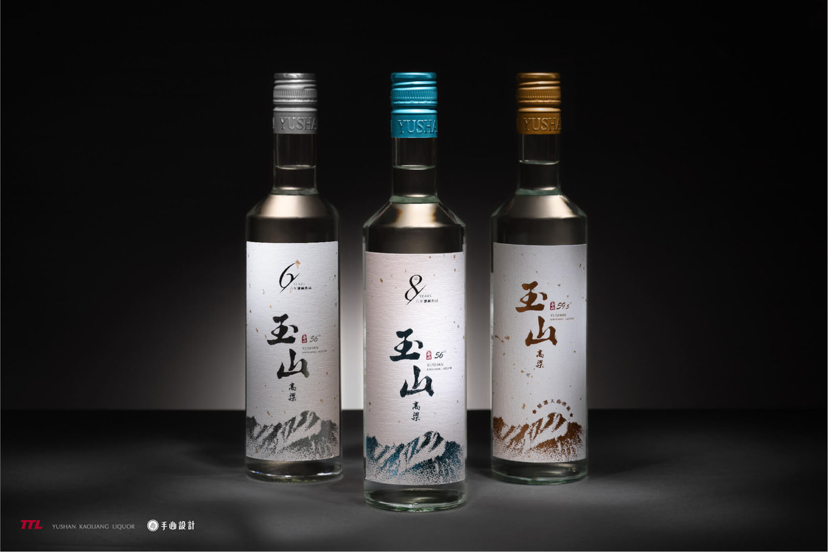
 針對「玉山大曲」、「玉山台灣高粱酒六年陳高」、「玉山台灣高粱酒八年甕藏」設計此系列瓶標及包裝。為兼顧三款酒體的獨特性與系列性,以色彩作為系列產品的主要識別:「玉山大曲」為高粱系列中最為人推薦的入門款之一,沿用過去玉山高粱的金、黃色系,讓既有的受眾直覺地擁有品牌熟悉感;只在特定通路販售的「六年陳高」與「八年甕藏」除了在酒標設計特別突顯年份外,色彩特別選用銀色與藍色,利用貴金屬與鑽石的代表色彩,象徵這兩支酒的高貴與不凡。
This proposal focuses on a series of YUSAN DAQU, YUSAN 6 YEARS OLD TAIWAN KAOLIANG LIQUOR and YUSAN 8 YEARS OLD JUGGING TAIWAN KAOLIANG LIQUOR to design the label of bottle and the packaging.
In order to give consideration to the uniqueness and link up the three wines, we chose color to be the main identification of the series products. The YUSAN DAQU is one of the most recommended entry-level in the Yusan Taiwan Kaoliang Liquor series. We use the gold and yellow colors of Yusan Taiwan Kaoliang Liquor, so that the existing customers can intuitively have a familiar brand identification.
The YUSAN 6 YEARS OLD TAIWAN KAOLIANG LIQUOR and YUSAN 8 YEARS OLD JUGGING TAIWAN KAOLIANG LIQUOR, which are only sold in specific channels. It not only be highlighted the year in the bottle label design, but also used silver and blue in color. We using the representative colors of precious metal and diamond to symbolize these two wines that are noble and extraordinary.
 瓶標採用透明設計,清晰地呈現酒體的澄澈,考量後續酒款的延伸性,特別設定以「冷燙」的印刷技法呈現,在色彩上可以有較多彈性運用的空間,符合未來擴充系列酒的目標考量。有別於金沙紙的華麗細膩,透明瓶標別有一絲冷洌沁涼的視覺感受,無邊界的設計自然的與內裝高粱融為一體,營造出無邊界的遼闊通透感,襯托玉山高粱酒的精緻釀造工藝精神。
The bottle label is adopted a transparent design, which customers can clearly see the clarity of the wine. Considering the extensibility of wines in the future, especially setting to present with the printing technique of cold perm. In terms of color, there will have more flexible way to use, which is in line with the goal of expanding the series of wines in the future.
Different from the gorgeousness and delicacy of Jinsha paper, the transparent bottle label has a cool visual sense. The borderless design naturally integrates with the kaoliang liquor inside, creating a vast and penetrating feeling. The Yusan Taiwan kaoliang liquor ‘s spirit of the exquisite brewing craftsmanship of the wine is be set off.
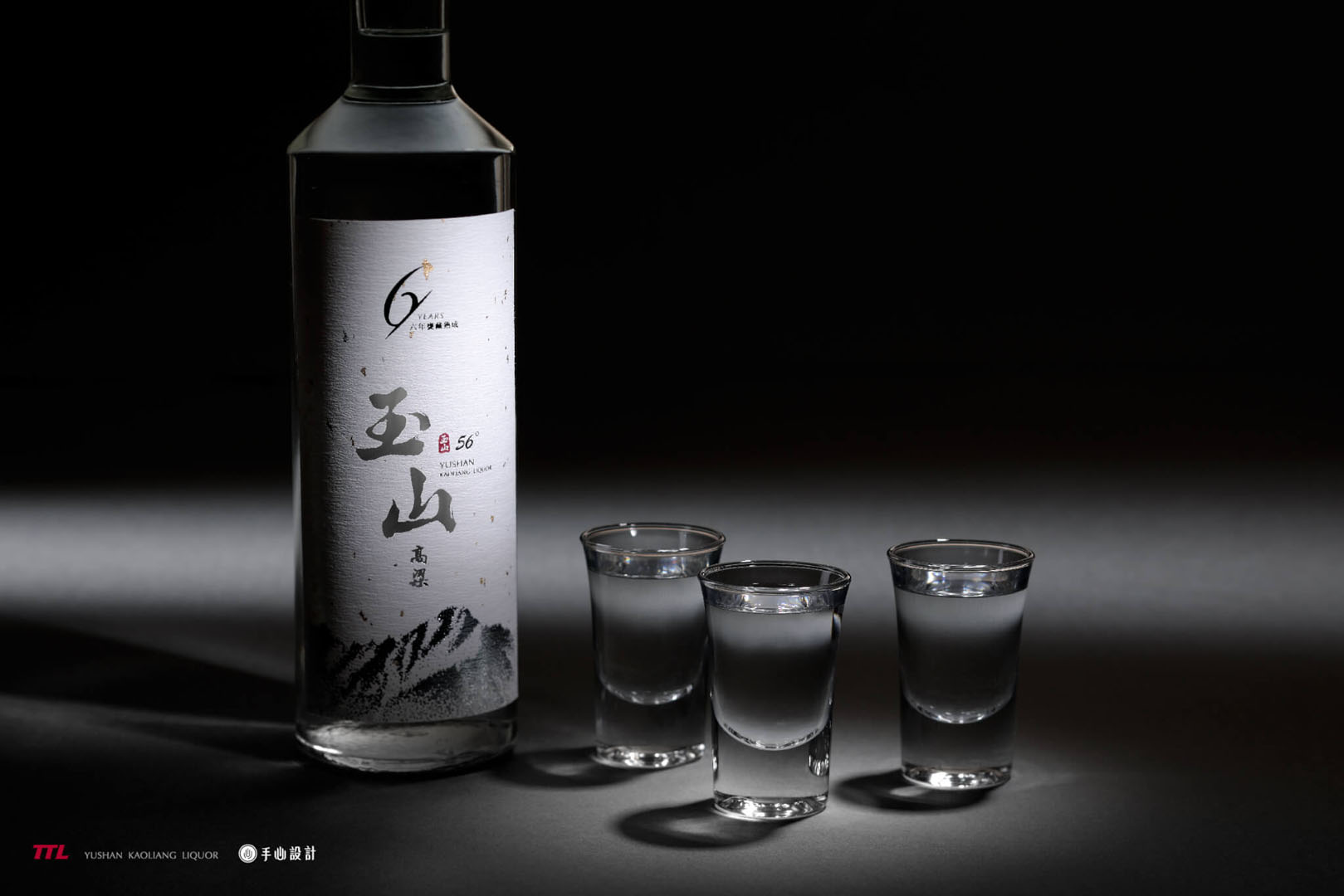 瓶身插畫以緊密細緻的點描技法勾勒台灣第一高峰的磅礡氣勢,透過此款設計傳遞飽滿酒體帶來的勁道及嗆感,細膩的筆觸除了提升品牌視覺上的豐富性之外,更與玉山高粱多層次的口感相互呼應。
考量到商品於貨架上擺放的位置及陳設,透明瓶身可能會與其他產品交疊干擾,因此此款設計並非最終採用版本,雖未能於市場上市,但與金沙紙的呈現各有千秋,運用不同材質將玉山的萬種風情淋漓盡致的展現無遺。
The bottle illustration depicts the majestic momentum of Taiwan’s highest mountain with a meticulous stippling. This design conveys the strength and choking feeling of the wine. In addition to enhancing the visual richness of the brand, the delicate brushstrokes also echo the different tastes of Yushan Taiwan kaoliang liquor.
Considering the position and display of the products on the shelf, the transparent bottle may overlap and interfere with other products, so this design is not the final version. Although the design proposal wasn’t adopted, the different materials present the various styles of Yushan.
-
設計師 Designer-林宜慧 LIN, I-HUI、劉家溱 LIU,CHIA-CHEN
3D影像設計 3D Designer-盧臆雯 LU,YI-WEN
專案企劃 Project Planning-蘇連捷 SU,LIEN-CHIEH
設計總監 Executive Design Director-徐志揚 HSU,CHIH-YANG
#台灣菸酒 #玉山高粱 #酒標設計 #包裝設計 #插畫設計 #印刷設計 #3D #手心設計 #高粱酒提案 #設計提案 #玉山大曲 #winproposal #designproposal #TTL #BottleDesign #PackagingDesign #PrintingDesign #HandHeartDesign #TaiwanDesign #SorghumLiquor #YusanTaiwanKaoliangLiquor