
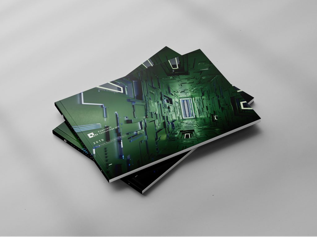
本次的力成科技 CSR 設計 從企業的經營理念中汲取靈感,訂定出以「傳送門」為主軸的視覺主題,利用封面上的抽象空間表現力成的技術內涵,「發光的門」也代表著力成在各個社會面向中的投射與體現。
The Powertech Technology CSR design inspiration from the business idea, formulates a visual theme with “transportation door” as the main axis, and uses the abstract space on the cover to express the technical connotation of the Powertech Technology. “Glowing Door” also represents that the Powertech Technology always focus on the reflection in various social aspects.
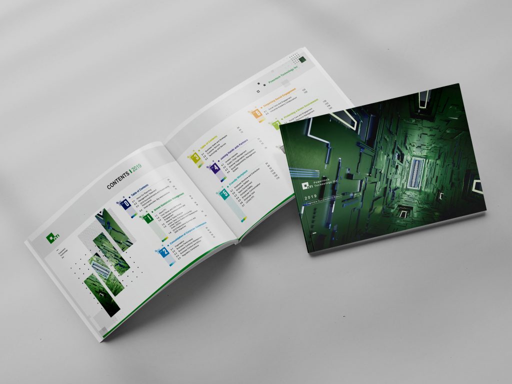

內頁首先拆解封面的設計元素,再配合妥善的資訊層級制定,一步步在作為骨架的結構之上,建構起能夠講述出品牌故事的血與肉:以力成科技的LOGO主色調綠色作為主題色彩,並環繞此一色彩,根據章節主題為各章制定出一套完整的色彩計畫。
The inner page disassembles the design elements of the cover, and then cooperates with the appropriate information level to formulate, step by step, on the structure as the framework, builds the blood and flesh that can tell the brand story. Taking the Powertech Technology’s logo main color as the theme color, a complete set of color plan for each chapter is formulated according to the chapter theme.

採用力成科技的產品元素「方形」作為輔助圖形及頁眉的設計靈感,不但能夠完整傳達力成的企業特性,也能夠與封面設計有所呼應。
The product element “square” of the Powertech Technology is used as the design inspiration for auxiliary graphics and page headers, which can not only fully convey the corporate characteristics of the Powertech Technology, but also echo the cover design.

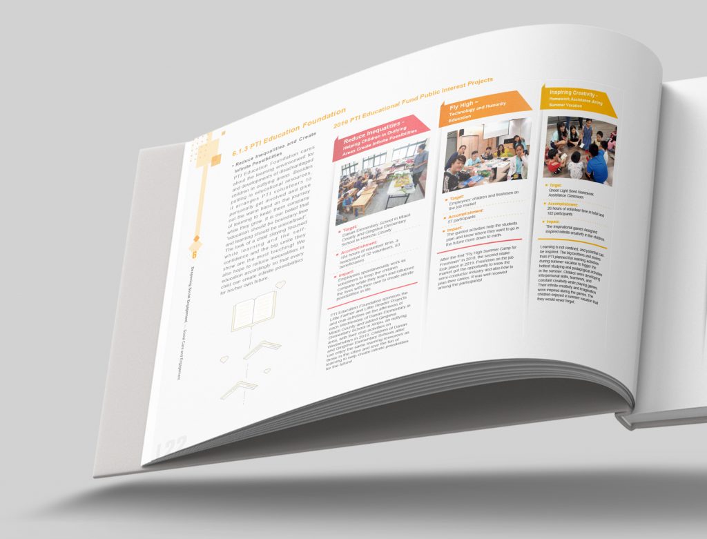
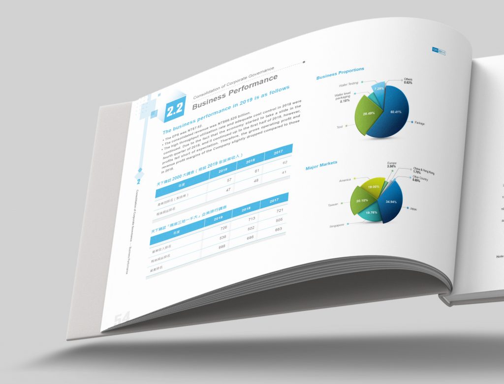
Pictogram及插畫則延伸自整體設計較具專業、科技的設計氛圍,並配合資訊視覺化的半立體圖表,讓冰冷的資訊有更好的易讀性,同時也讓品牌的調性在冰冷的刊物中透過美術編排更顯鮮明。
Pictogram and illustrations extend a more professional and technological design atmosphere from the overall design and cooperate with the semi-stereoscopic chart of information visualization to make the information easier to read, and also make the brand’s tonality more vivid through the art arrangement.


力成科技2019企業責任報告書下載:
The Powertech Technology 2019 CSR Design download:
https://www.pti.com.tw/zh/csr/interactive/download
-
結案時間 Case Closed-2020.08
設計師 Designer-盧臆雯 LU,YI-WEN、李奕臻 LEE,I-CHEN、周一潔 JHOU,YI-JIE
專案企劃 Project Planning-蘇連捷 SU,LIEN-CHIEH、王彥筑 WANG,YAN-ZHU
設計總監 Executive Design Director-徐志揚 HSU,CHIH-YANG