此次為高雄市立圖書館進行 周邊設計 ,兩款紙袋可各別使用於不同場合及族群。
Two types of paper bags of merchandises for Kaohsiung City Library can be used in different occasions and ethnic groups.


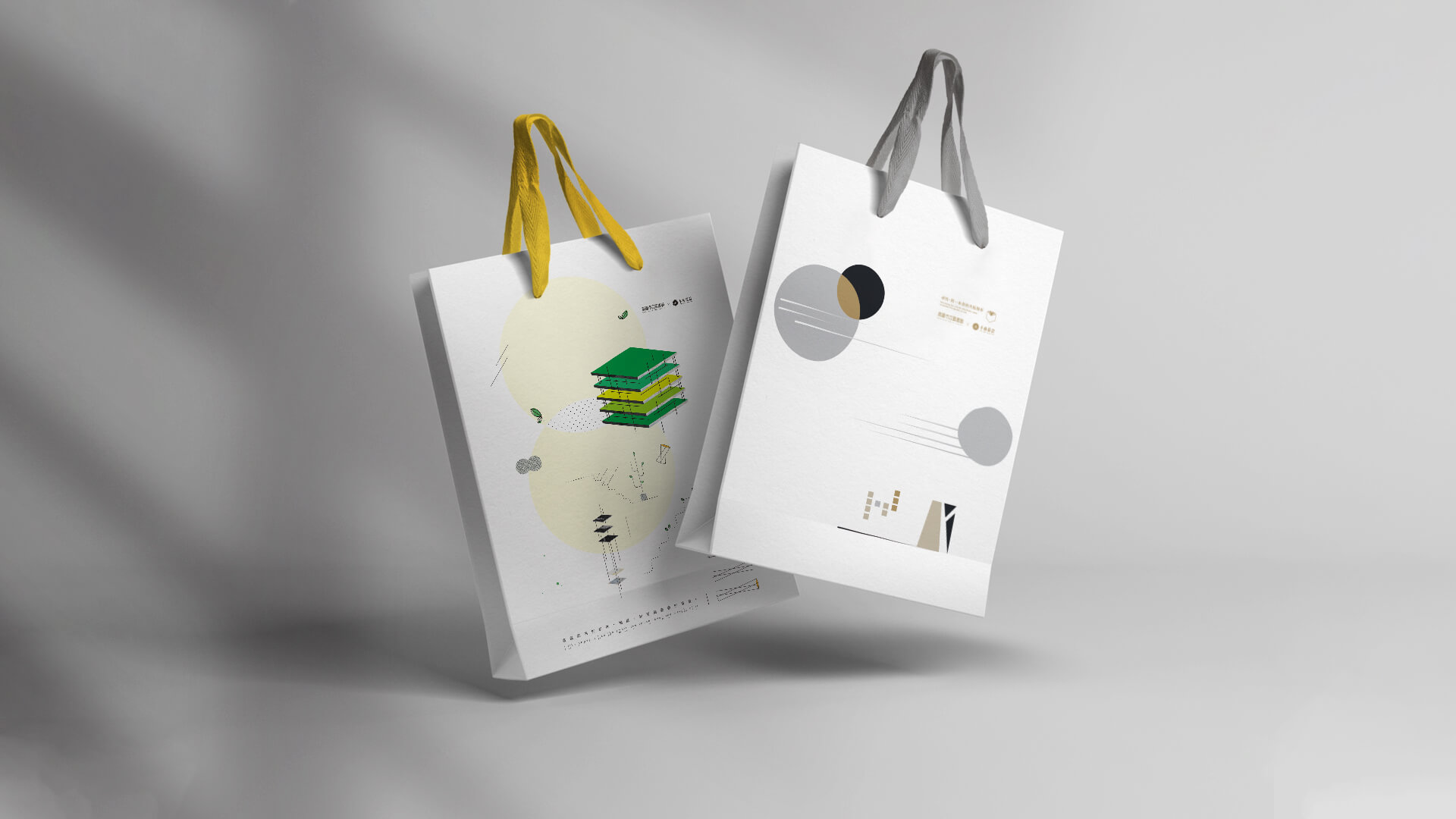
活潑款(黃綠)採用多種建築本身的語彙進行簡化與重組,並選用了異材質與圖樣進行結合,以呼應高市圖本身多元創新的經營方向;在主色上選用了黃與綠,除了代表活力與創新之意,也傳遞綠建築的環保意象。
The lively pattern adopts architectural terms for simplification and reorganization and choose different materials and patterns to combine. To echo the diversified and innovative directions of the Kaohsiung City Library, yellow and green are selected as the main colors. In addition to representing vitality and innovation, it also conveys the environmental protection image of green buildings.


簡約款(無彩色)採用高雄總圖的建築局部做為簡化的造型,幾何的元素擁有多樣化的排列組合,能在不同載體上延伸成為系列周邊,呈現半抽象半寫實之設計。色彩上以穩重的無彩色搭配,提升周邊尊榮、質感、大器之感受。
The simple pattern adopts part of the Kaohsiung City Library building as its model. The geometric elements have diversified permutations and combinations. Extending into a series of merchandises on different carriers, presenting a semi-abstract and semi-realistic design. The color is matched with a calm achromatic color which black and gold, to enhance the feeling of honor and texture.

-
結案時間 Case Closed-2019.12
設計師 Designer-潘東 PAN,DONG、盧臆雯 LU,YI-WEN、江珮瑜 JIANG,PEI-YU
專案企劃 Project Planning-蘇連捷 SU,LIEN-CHIEH
設計總監 Executive Design Director-徐志揚 HSU,CHIH-YANG