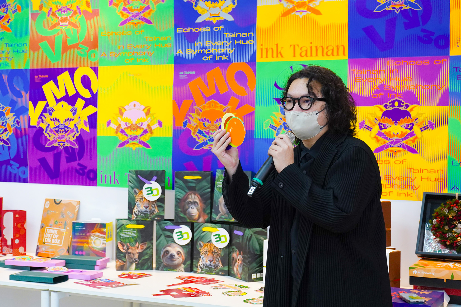
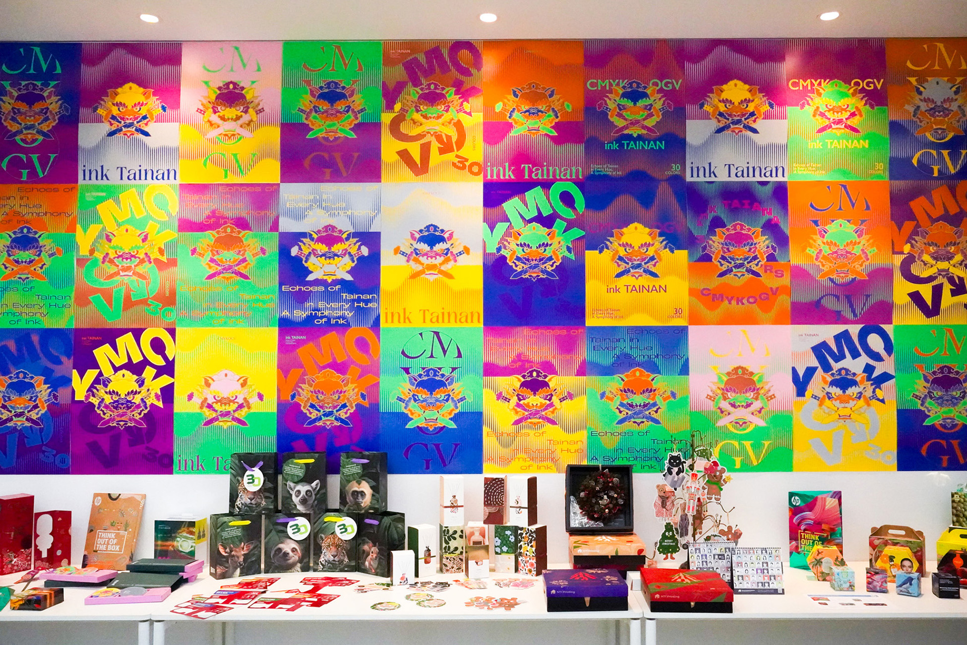
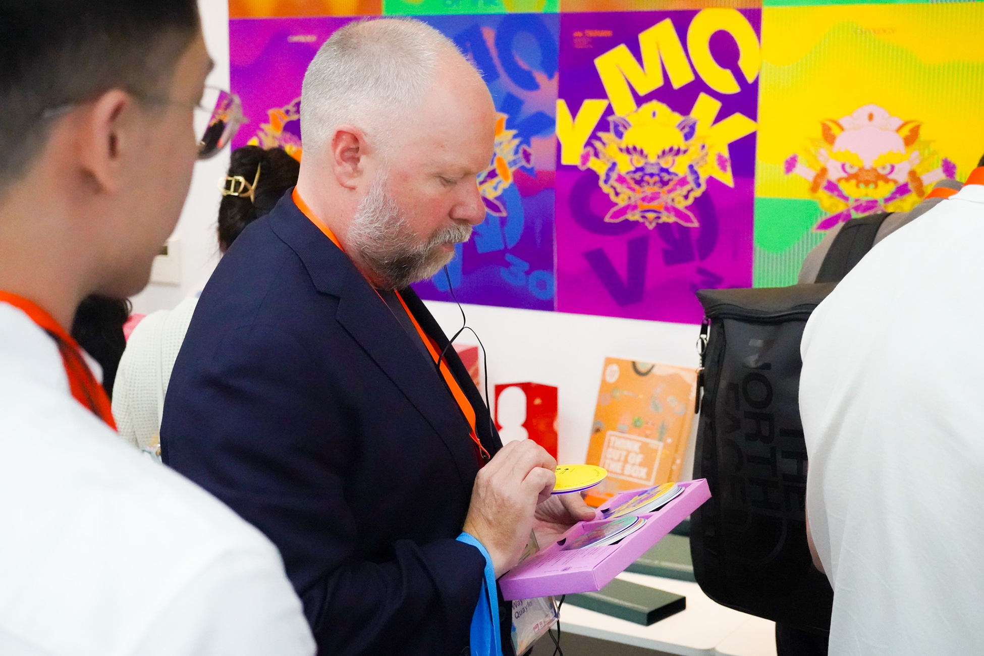
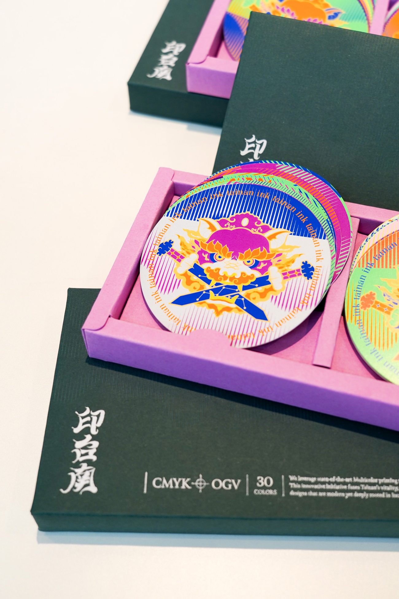
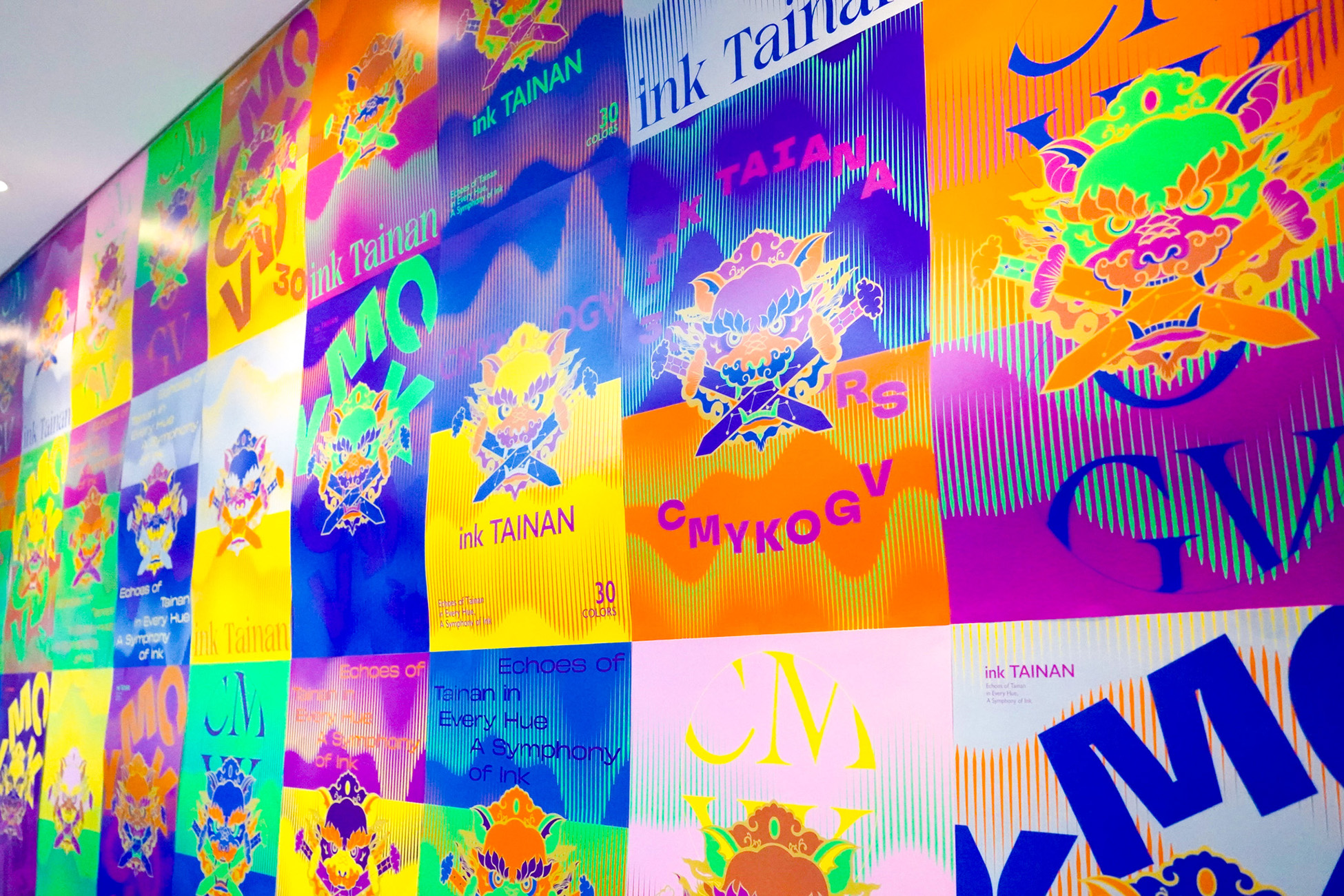
很榮幸受邀參與南台彩藝 INK TAINAN 發布會活動,一起推廣廣色域數位印刷和可變性印刷技術
我們精選30款色調,透過印刷演繹台南文化意象「劍獅」,融合傳統底蘊與現代創意,結合最新的可變性印刷技術,打造出多達450種不重複的海報圖騰樣式,詮釋劍獅的多重樣貌,不只展現成品的細膩質感,更開啟了設計創意的媒介,看見印刷帶來的各種可能性和設計思考的落地,並作為日後品牌行銷的廣泛應用。
We’re honored to be invited to participate in the INK TAINAN event by NTI Printing, joining forces to promote wide-gamut digital printing and variable data printing technologies.
For this collaboration, we curated 30 distinctive color tones to reinterpret the cultural symbol of Tainan — the “Sword Lion” — blending traditional heritage with modern creativity. Using cutting-edge variable printing techniques, we created 450 unique poster patterns, each offering a different expression of the Sword Lion.
The result not only highlights the delicate texture of the printed pieces, but also showcases the endless possibilities of printing as a powerful medium for design innovation. It paves the way for grounded creative thinking and opens up new potential for brand communication and marketing applications.
設計單位|手心設計 x 安根文化
總 經 理|徐志揚
品牌總監|蘇昱安
專案企劃|呂宜家
設 計 師|潘東、徐維志、謝心怡、袁書涵、林秝圻