「揀一」是一間位於台東的民宿,並持著「極簡」的生活態度,將精準、精緻的享受理念帶進品牌中,希望來到這裡的人能把自我歸零,以純粹簡單的眼光再一次地認識朝夕相處的自己。極簡並非不能擁有,而是在捨去的過程中,以更單純的心態來看待生命中的人事物,因為珍視,所以保留。
Minus One is a B&B in Taitung, and adopts a minimalist life attitude, bringing precision and exquisite concepts into the brand. Minus One hope that people who come here can return to zero. With a pure vision once again to realize yourself who get along day and night. Minimalism is not that you can’t have anything, but in the process of discarding, you will treat people and things in your life with a more pure and thankful mind, because you cherish them, so you keep them.


在品牌命名的階段中,我們試圖釐清品牌的核心價值,「極簡代表要一直丟東西嗎?」「極簡是不是會過得很辛苦、很可憐?」「以極簡為主題的民宿,會不會很冰冷、沒有家的感覺?」這些問題不斷地在了解品牌的過程中浮現,但隨著與民宿主人一次又一次的討論並閱讀了相關資料文獻,我們理解了減法的過程並非失去,而是透過檢視、篩選,創造並維持理想的生活樣態。
In the stage of brand naming, we try to clarify the core value of this brand. “Does Minimalism mean you have to give up things all the time?” “Is minimalism going to have a pitiful life?” “If a B&B with minimalism as the theme. Will it be felt cold and lonely?” These problems continue to surface in the process of understanding this brand, but after discussing with the B&B owner again and again and reading related materials, we finally understand that the process of subtraction is not to give up everything, but through inspecting and filtering to create and maintain an ideal life style.
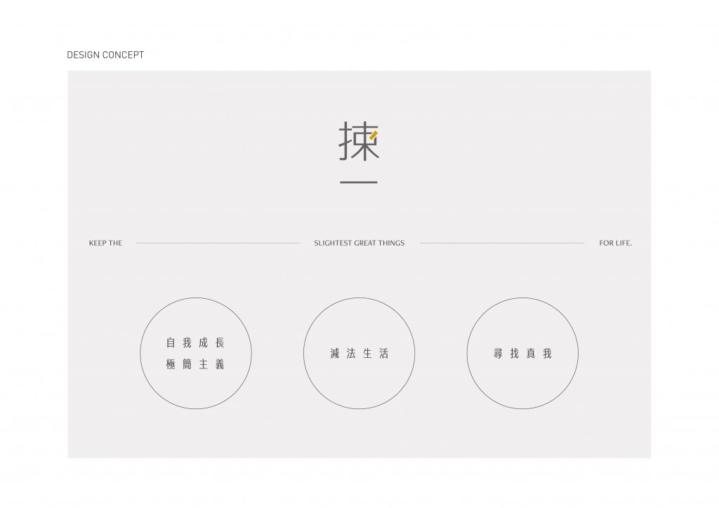
以數字「-1」為發想起源,我們思考著如何將「減少」與「獲得」的概念同時呈現,在反覆咀嚼的過程中,「減一」、「撿一」相繼迸出腦海卻又旋即被刪除,並非不好,只是總覺得似乎少了一味。最終代表著精挑細選、細細琢磨的「揀一」出現了,唸起來既保有極簡的減法精神,同時也透過文字傳遞著「得到更多」的單純快樂。
Taking the number “-1” as the idea, we are thinking about how to present the concepts of “減一” and “撿一” at the same time. In the process of repeated, “minus one” and “picking one” came to mind but immediately be delete. It’s not bad, but we always feel like something missing. After brainstorming, finally “揀一”, which represents careful selection and careful consideration, appeared. It not only retains the minimalist spirit of subtraction, but also conveys the simple joy of “getting more” through words. (In Chinese, The pronunciation of “減、撿、揀” is JIAN. But the meaning is different, 減 means minus; 撿 means pick; 揀 means select. We want to create the effect that sound like “minus one” but actually meaning is “selecting one” !)

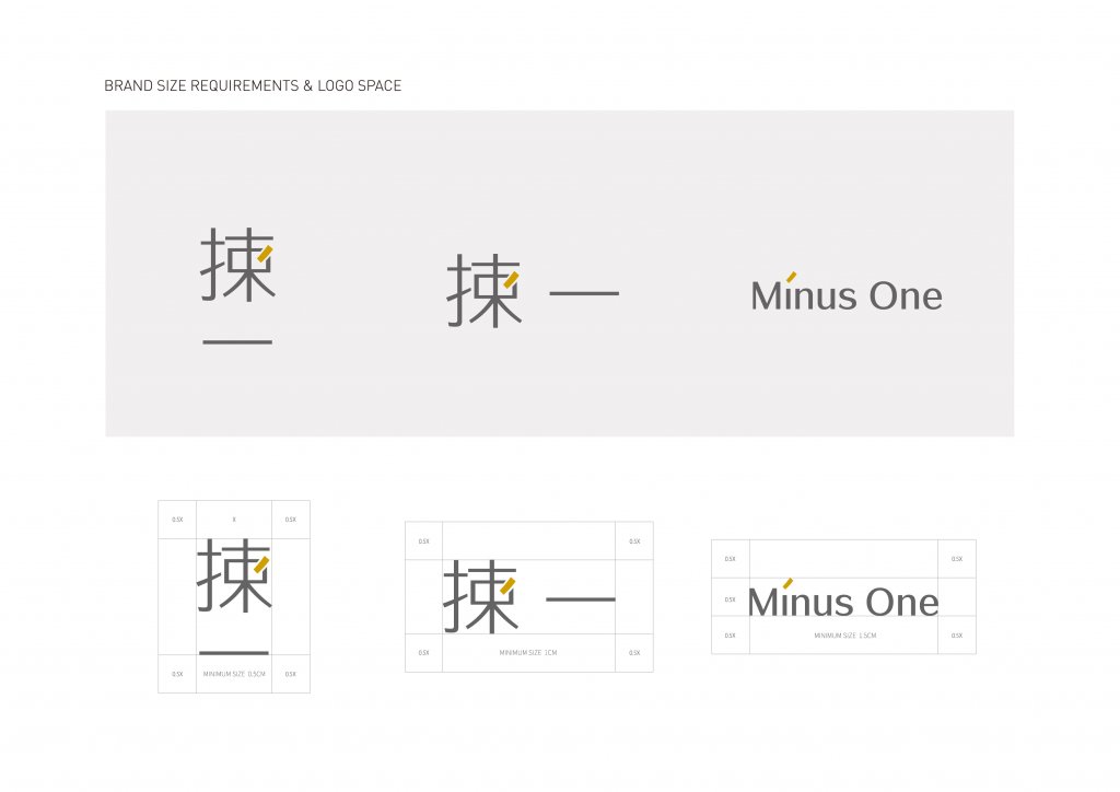
品牌Logo設計也回歸極簡的品牌初衷,以洗鍊卻保有溫度的文字造型,將所有內容簡化為基本質量並實現其簡單性,看似有稜有角,卻在細微處保有一絲圓潤及彈性;以俐落、理性的無彩色搭配溫潤明亮的薑黃色,將「為生活保留一點」的品牌Slogan轉化為令人會心一笑的設計巧思——生活可以很簡單,只要你擁有最純粹溫暖的一點。
The brand logo design has also returned to the core of the minimalist brand, simplifying all the content to the basics but with some changes. It seems to be angular, but retains a touch of roundness and flexibility in the details that is neat and tidy. Reasonable achromatic color with warm and bright ginger yellow, transform the “reserve a little for life” of brand Slogan into a ingenuity-design. life can be very simple, as long as you have the purest and warmest point.

-
結案時間 Case Closed-2021.03
設計師 Designer-林宜慧 LIN,YI-HUEI
專案企劃 Project Planning-蘇連捷 SU,LIAN-JIE、王彥筑 WANG,YAN-JHU
設計總監 Executive Design Director-徐志揚 HSU,CHIH-YANG
-


