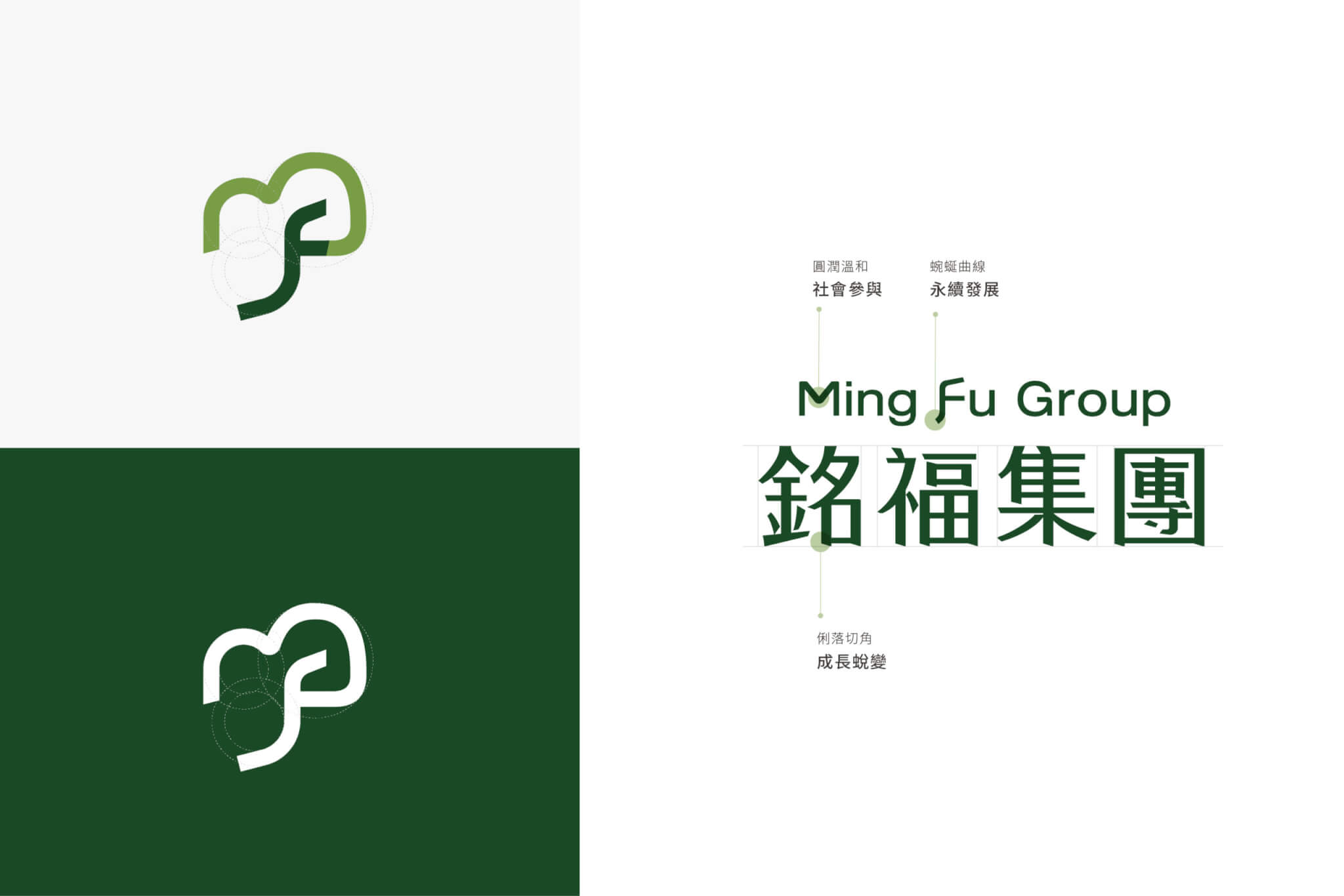
Design Concept
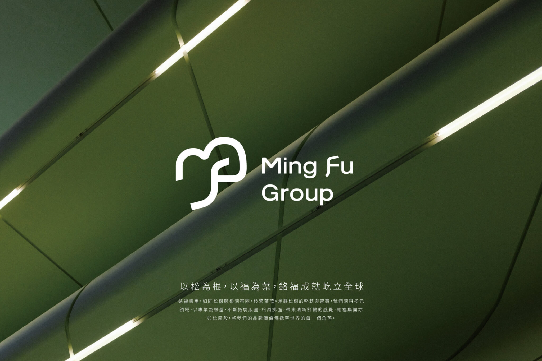
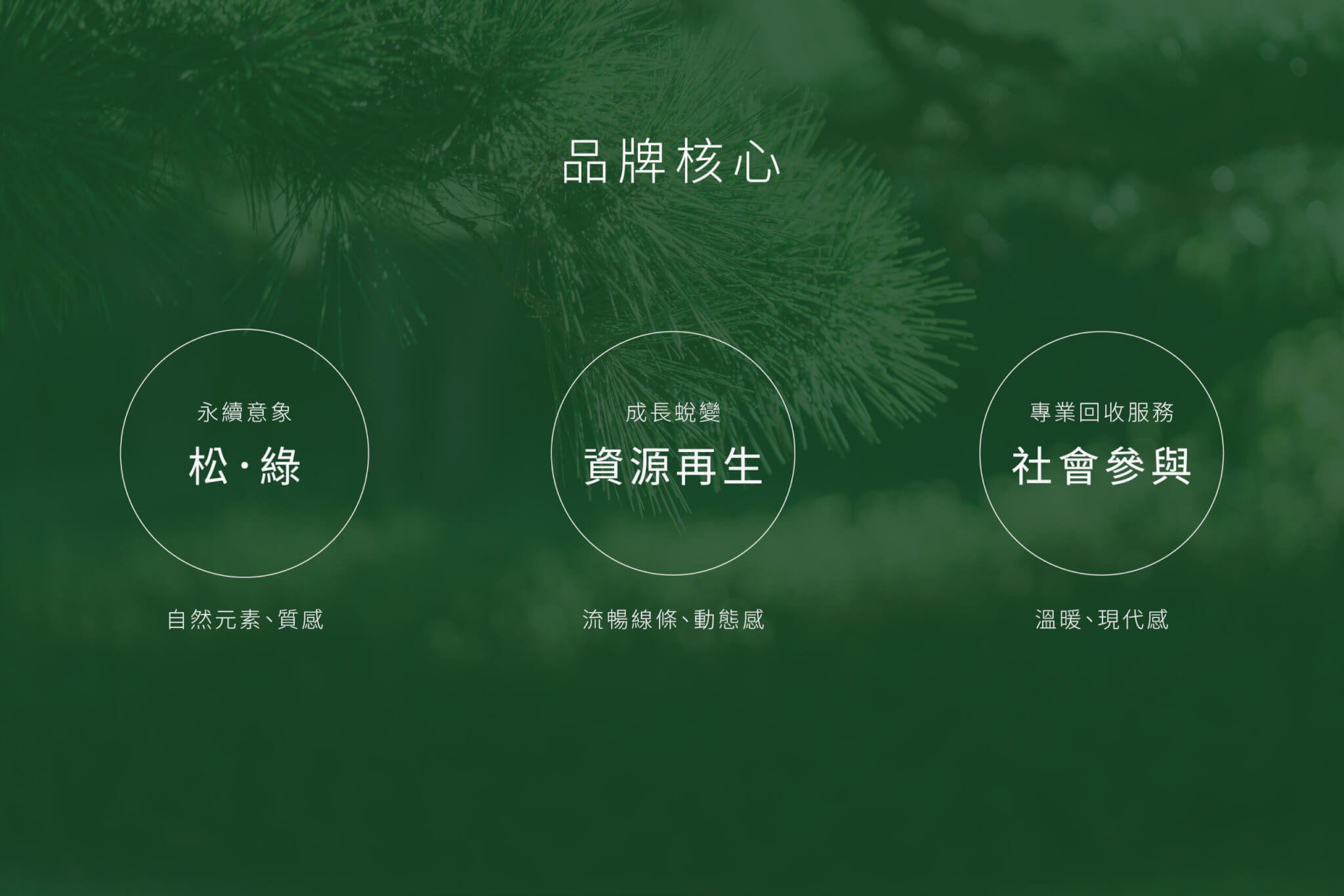
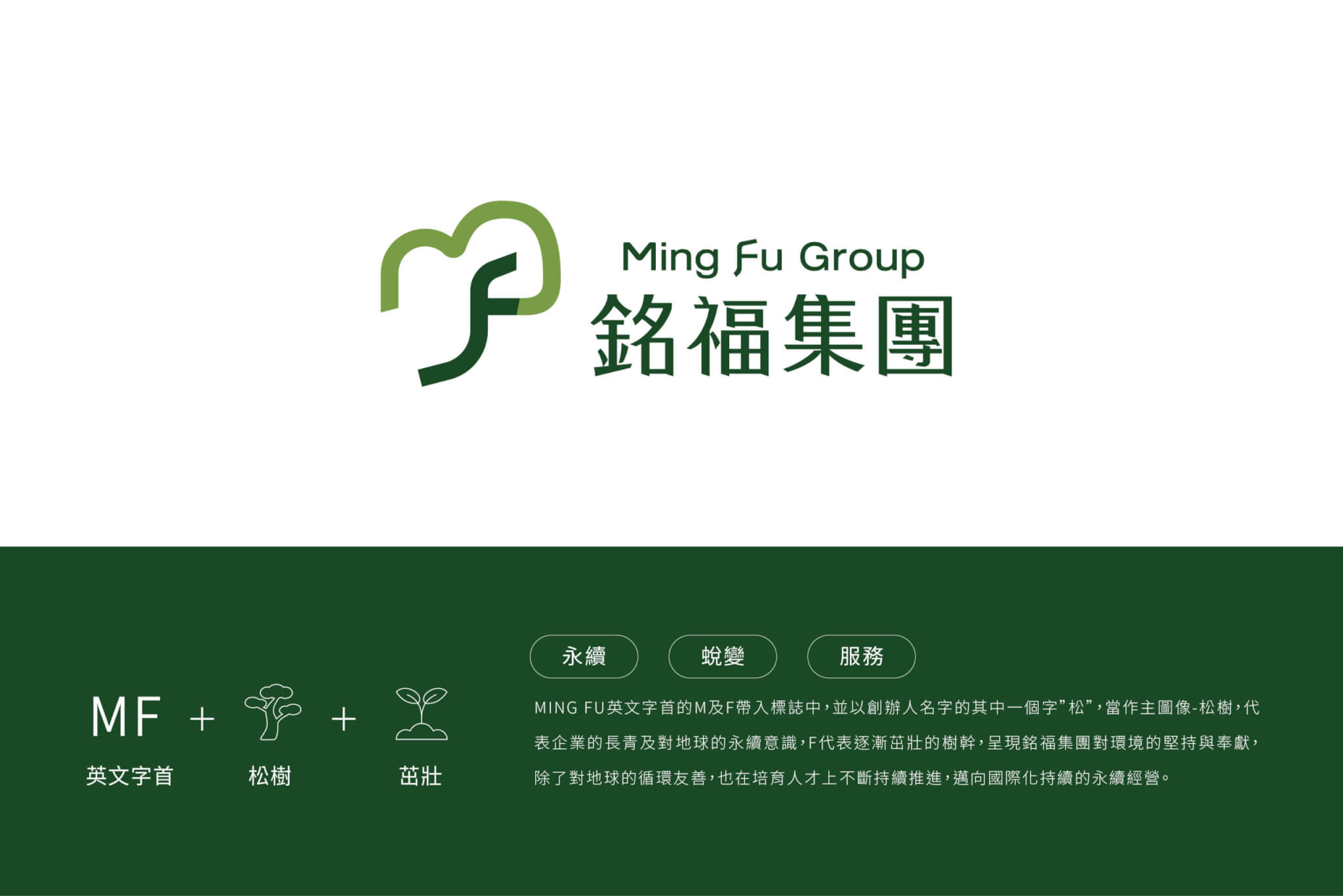
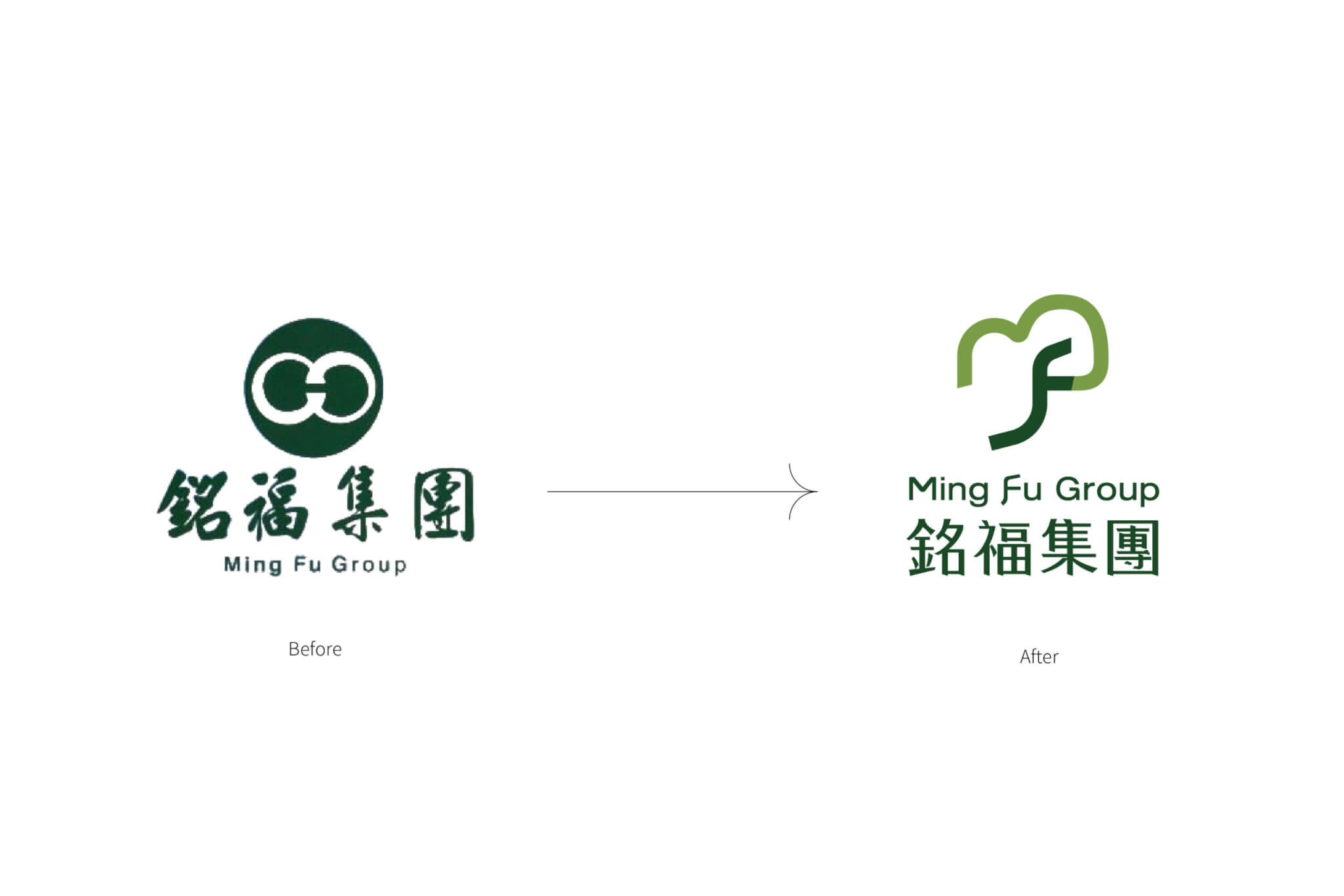
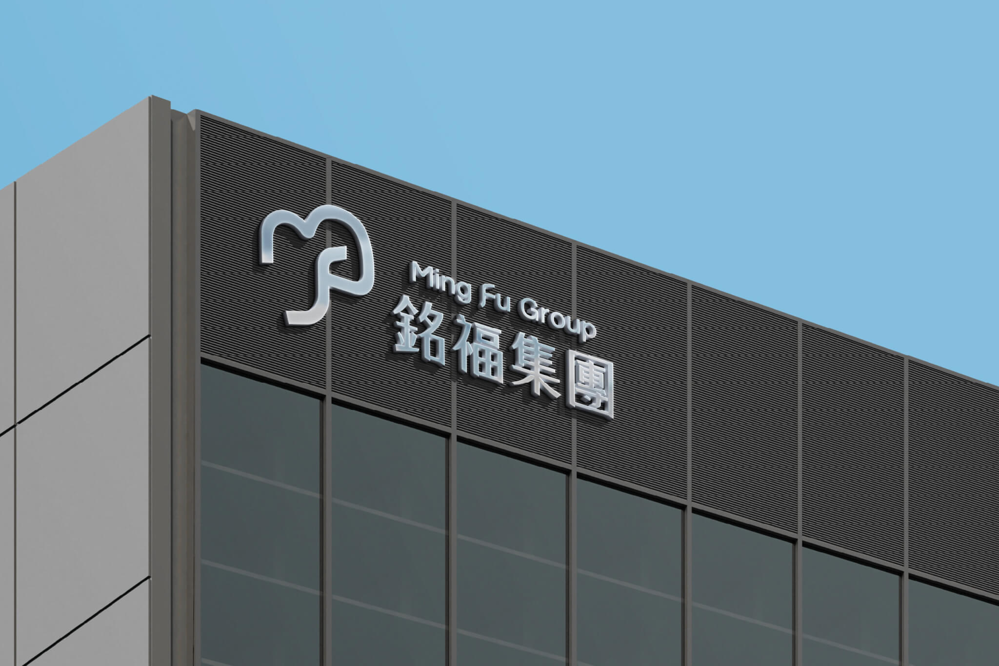
以松為根、以福為葉,銘福集團全新品牌標誌,在簡練的圖形中凝聚了企業長青與永續的願景。設計以創辦人名字中的「松」為主體,將松樹枝幹化作「F」,象徵深植大地、堅韌向上的企業精神;樹冠巧妙融入「M」的流線,勾勒枝繁葉茂、福澤共享的美好意象。
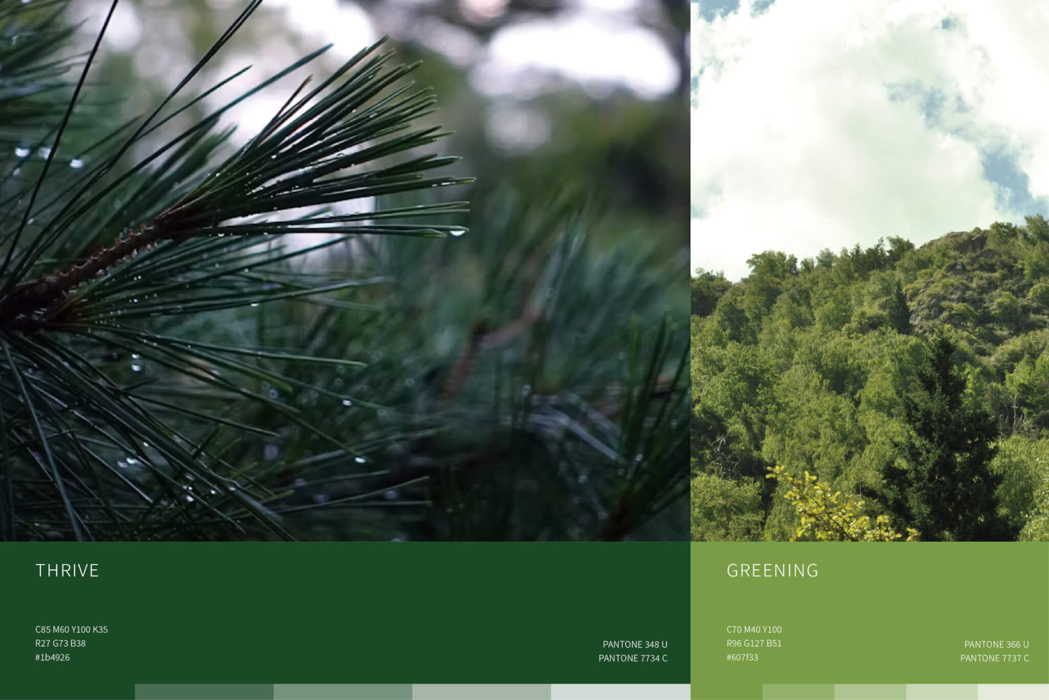
松風拂面,帶來清新而持續的能量;銘福亦以同樣的專業與韌性,將品牌價值吹送至世界。標誌俐落的幾何構成,傳遞「循環友善」、「人才耕耘」與「國際共榮」三大核心信念,以永續精神成就未來。
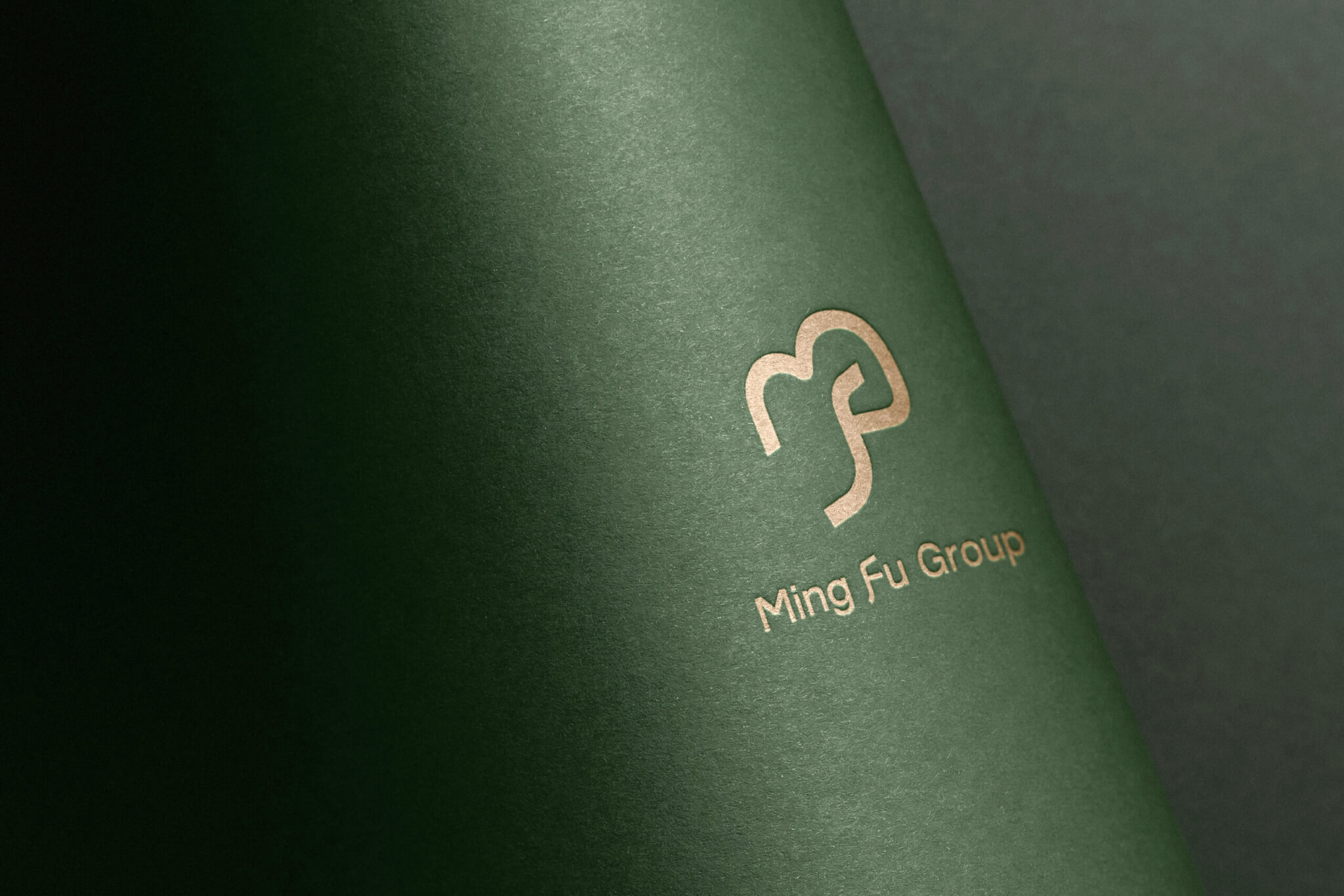
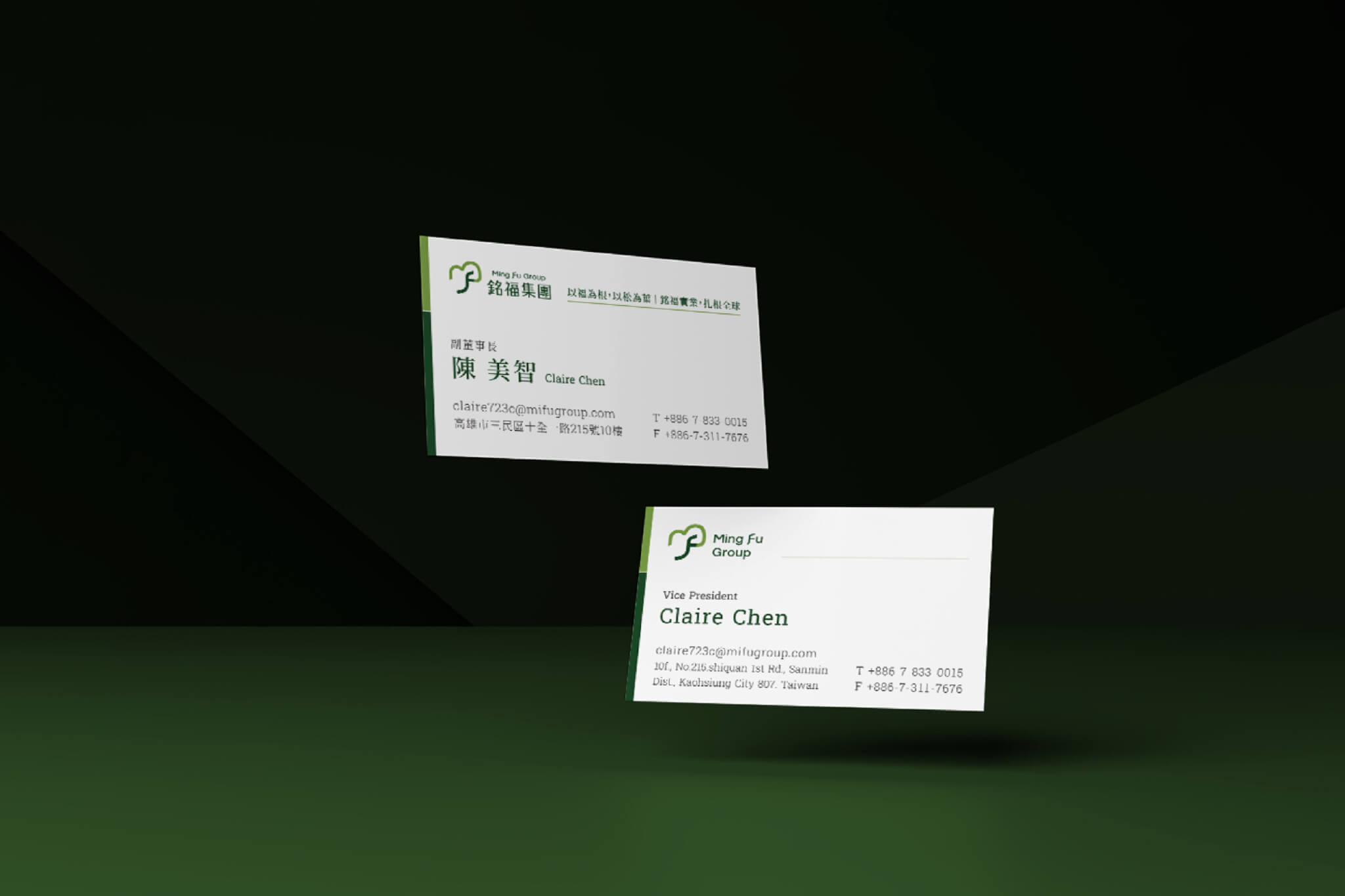
Ming Fu Group’s new logo crystallizes their evergreen commitment to sustainable growth. The trunk is shaped into the letter F, embodying resilience, while the crown forms the letter M, a symbol of shared prosperity.
The crisp geometry reflects three pillars: planet-friendly circularity, talent cultivation, and global co-prosperity. Together, these elements carry Ming Fu’s values worldwide with steadfast expertise.
結案時間
總經理
專案企劃
設計組長
設計師
2024.12
徐志揚
蕭婉智、呂宜家
潘東
林采霓
Case Closed
General Manager
Project Manager
Lead Designer
Designer
2024.12
Chih-yang Hsu
Wan Chih Hsiao、Elizabeth Lu
Dong Pan
Nina Lin