Project Overview
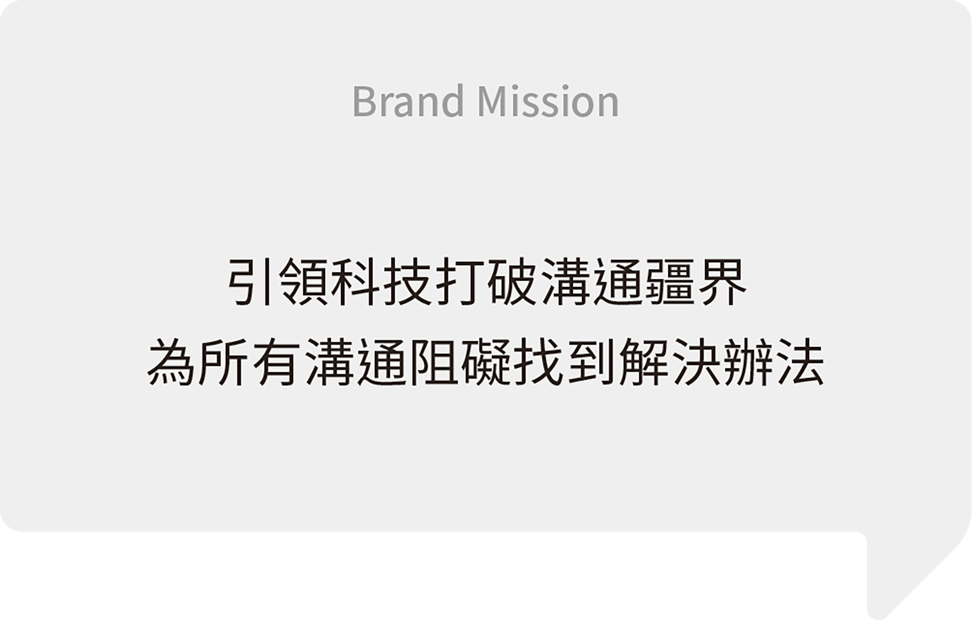
作為BXB卡訊電子的相關企業,聲像商研院延續卡訊的核心理念「用科技打破溝通疆界」,打造一站式的3C購物平台。因應高科技時代的需求,透過提供最專業的數位產品及資訊,為所有溝通阻礙找到解決辦法。
As a sister company of BXB Electronics, DoDo Eilfy stays true to BXB’s fundamental principle of “Breaking Communication Barriers with Technology.” In response to the demands of the high-tech era, they provide digital products and information to solve all communication obstacles.

Brand Value
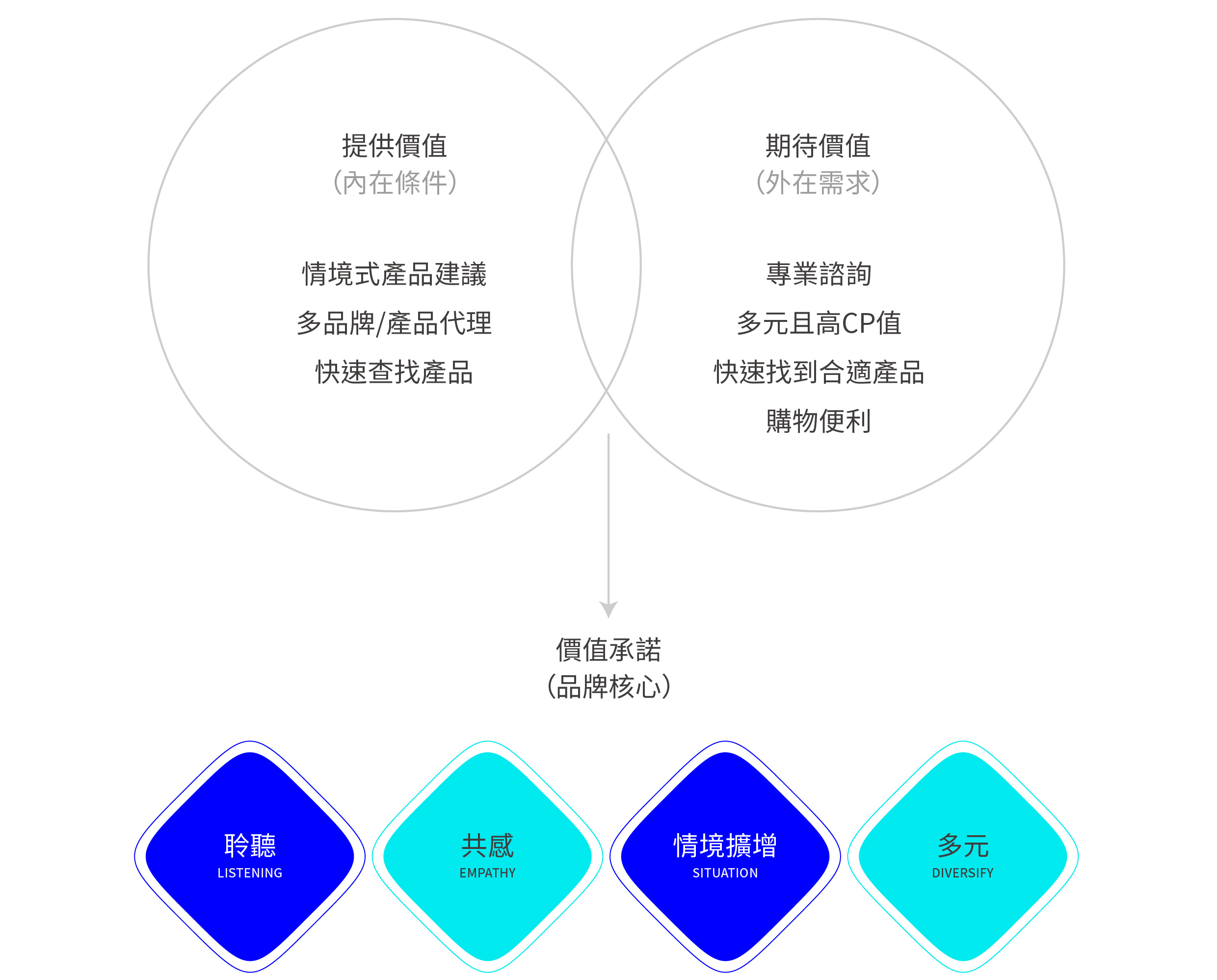
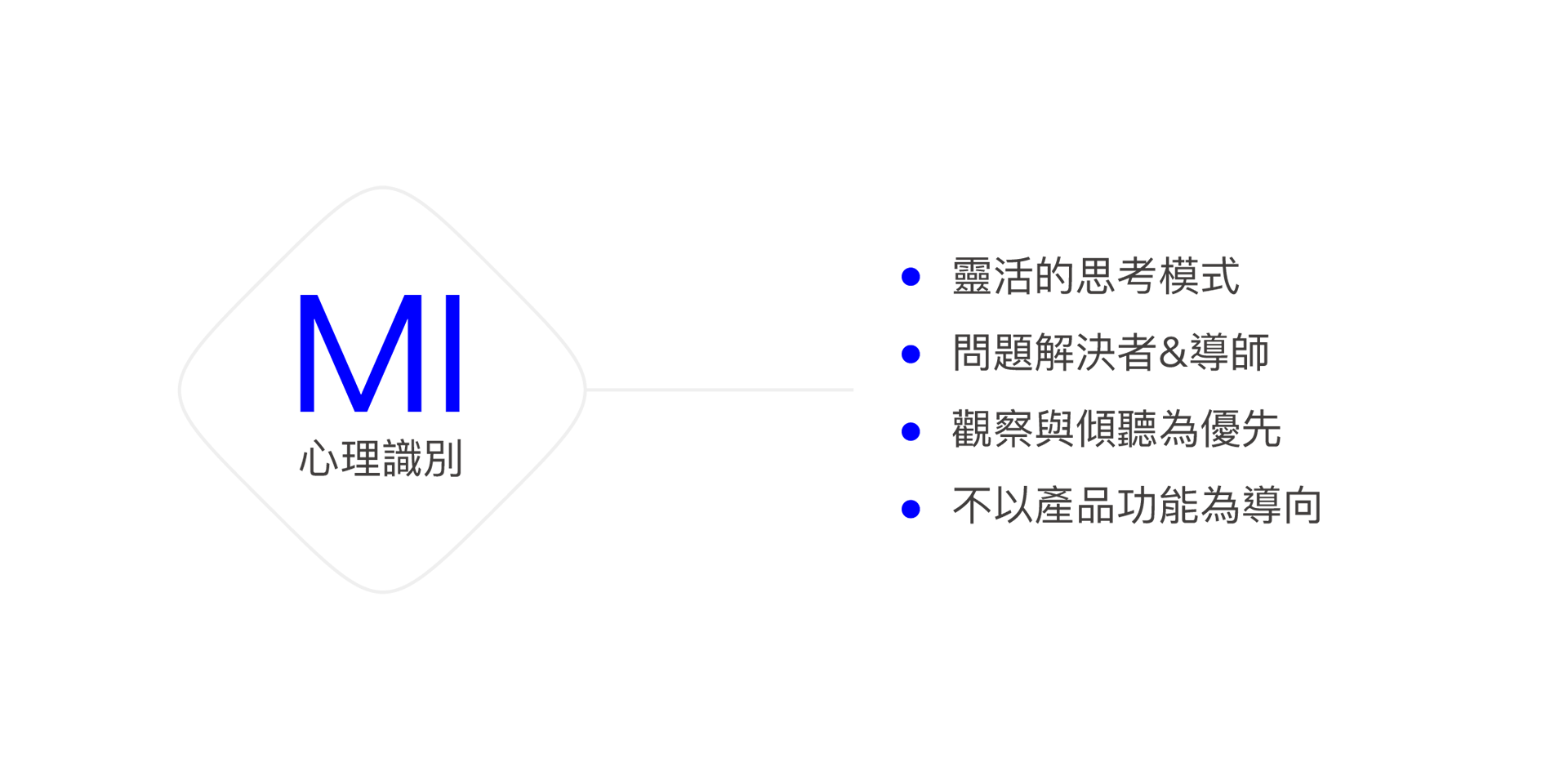
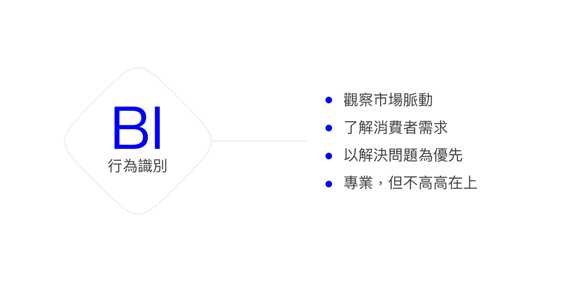
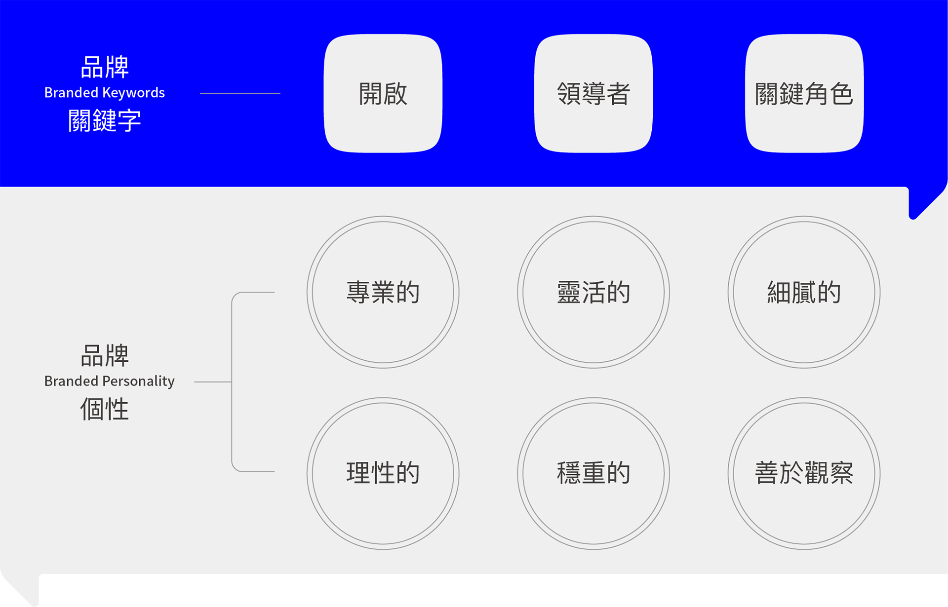
為了聚焦聲像的品牌價值,我們基於如何提供產品或服務的特點,以及消費者對品牌的期待,確立聲像在市場的定位和競爭優勢,並未品牌形象奠定基礎,建立完整的 CIS ( 企業識別系統 )發展脈絡。
To enhance Dodo Eilfy’s brand value, we focus on its service and features and align them with consumer expectations. This approach helps us establish Dodo Eilfy’s market positioning and competitive advantage. By doing so, we lay a solid foundation for the brand image and guide the development of a comprehensive Corporate Identity System (CIS).
Naming
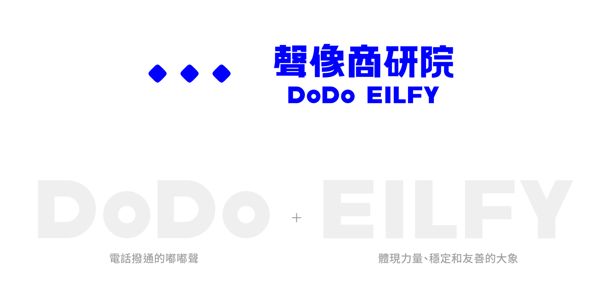
聲像的命名以品牌的核心產品「聲音與影像」為出發點,並在英文命名中給予更具體、更有畫面感的想像;「DoDo」代表著電話撥通的嘟嘟聲,給人直覺而親切的聯想。「大象」作為品牌的代表性角色,體現力量、穩定和友善,透過充滿想像力的視聽效果,喚起大眾對於聲音和影像的具體聯繫,同時將科技、溝通和情感融合在一起。
DoDo Eilfy’s brand name draws inspiration from the realms of “sound and image,” offering a vivid and tangible essence to the identity. “DoDo” captures the familiar beep of dialing, fostering an instinctive and welcoming connection. Meanwhile, the elephant symbolizes the brand’s core values of reliability and approachability. Through creative audiovisual elements, we forge a palpable link between individuals and the world of sound and image, seamlessly blending technology, communication, and emotion.

Visual Design
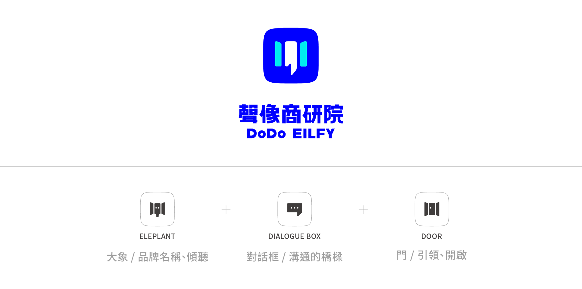
在 企業識別系統 中,Logo的設計以門為主體結合對話框,傳達開放、包容的概念,為用戶打開更廣闊的溝通空間和機會,同時圖形中組成的大象,也呼應了品牌名稱,凸顯「以科技為力量,提供穩定且友善的解決方案」。
The logo features a door and dialogue box, symbolizing openness and inclusivity. It represents our aim to expand communication spaces for users. The elephant within echoes our brand’s name, emphasizing tech-driven stability and friendliness.
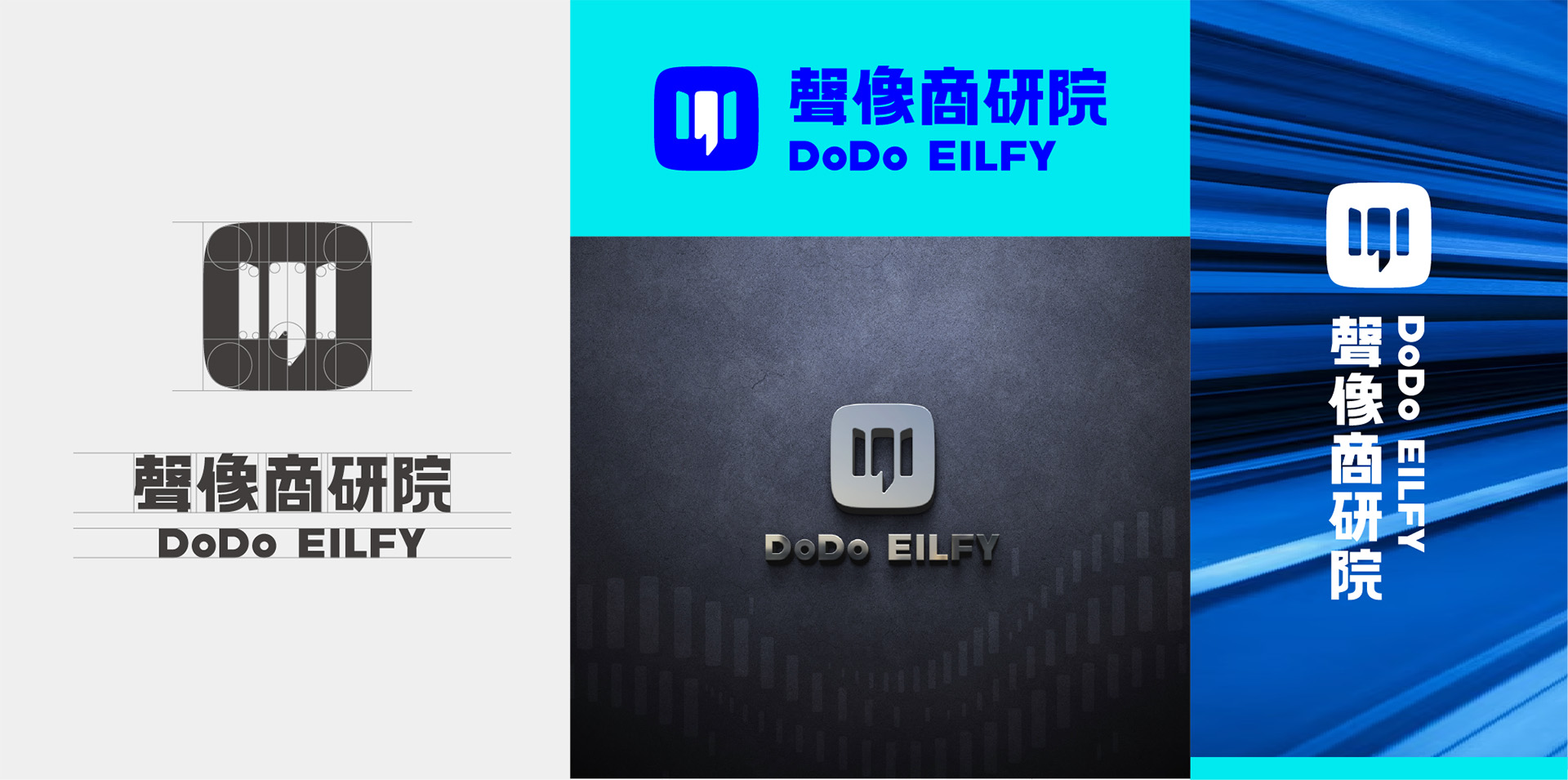
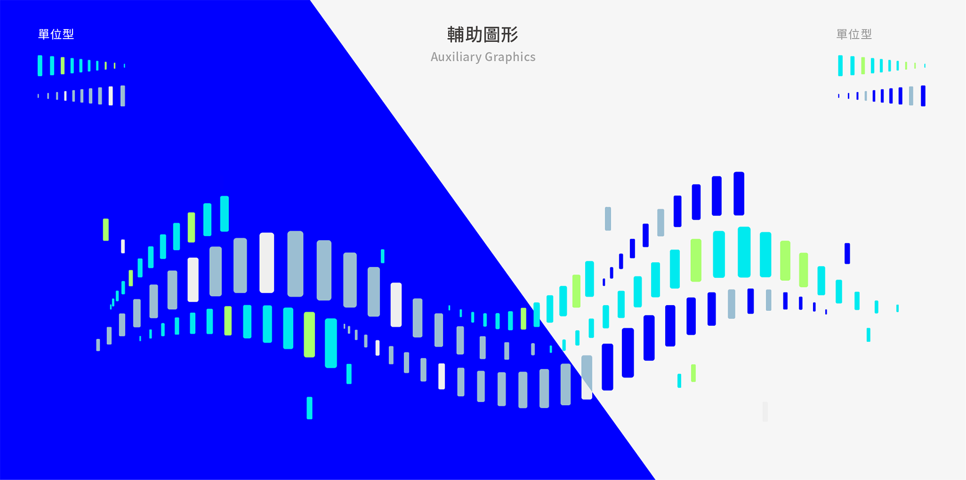
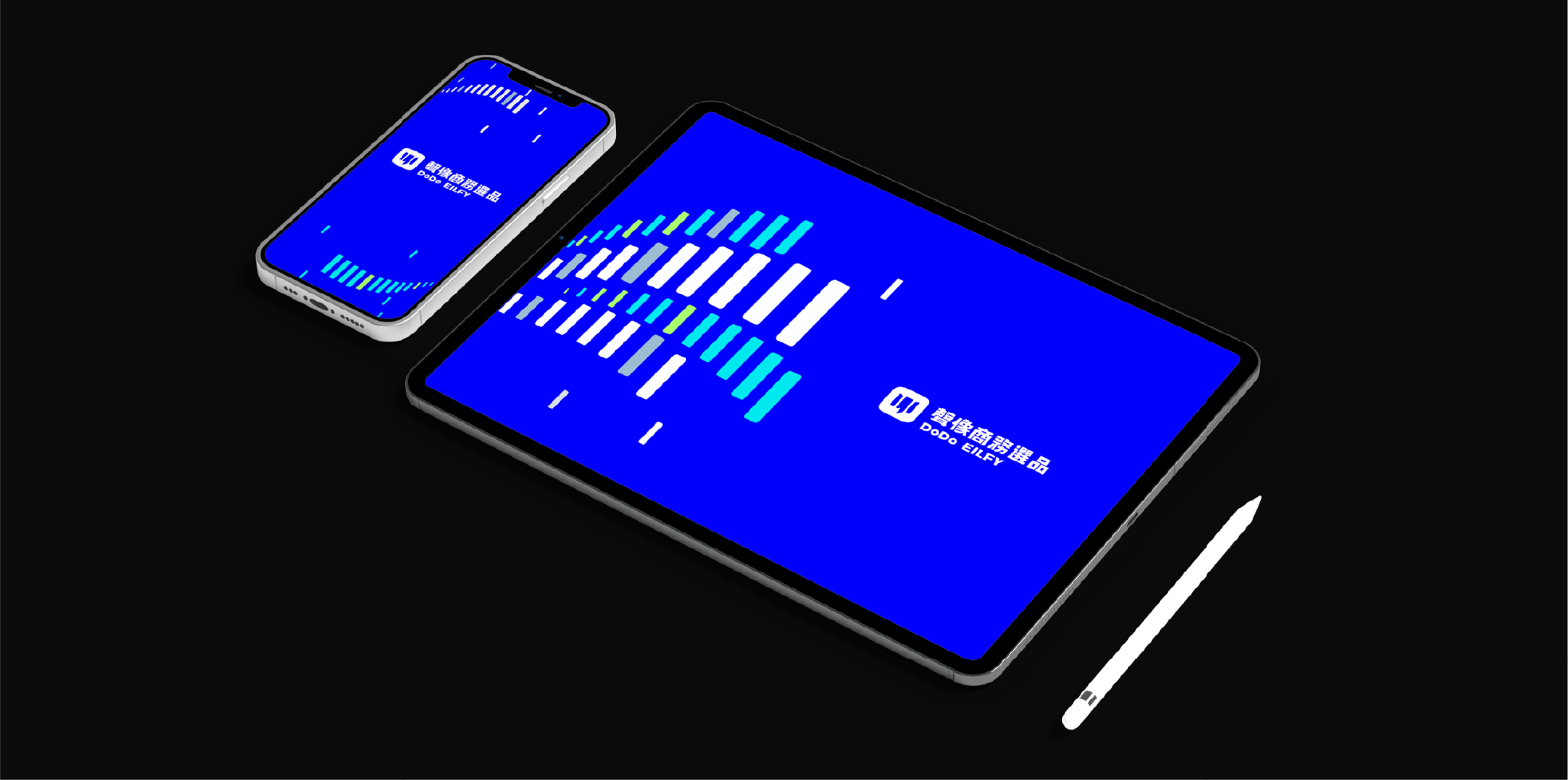
藉由標誌圖案的變化堆疊輔助圖紋,利用色塊逐漸放大的組成模式,呈現聲波擴大的意象,並加入曲線使聲波猶如流水般波動,透過不同的顏色表現對於不同聲音的包容性。
By incorporating variations in the logo design and layering auxiliary patterns, we create a composition where color blocks gradually expand, representing the amplification of sound waves. Curves are added to make the sound waves appear to flow like water. Different colors are used to symbolize the inclusivity of various sounds.
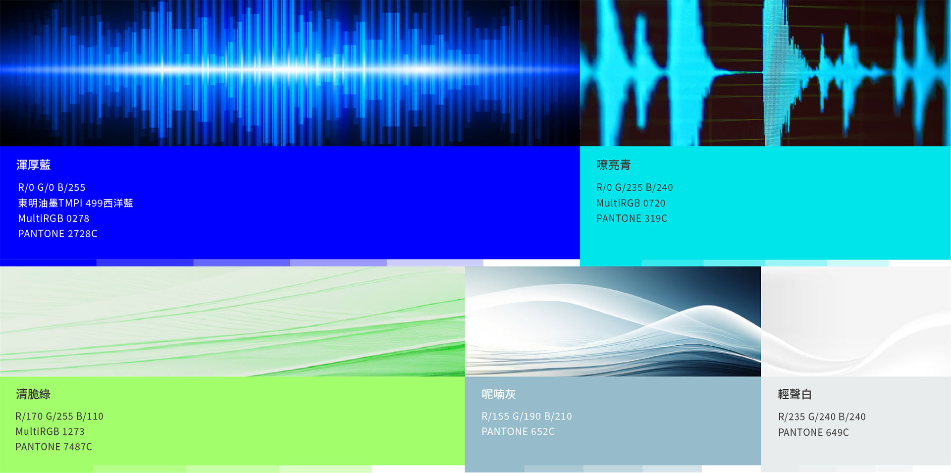
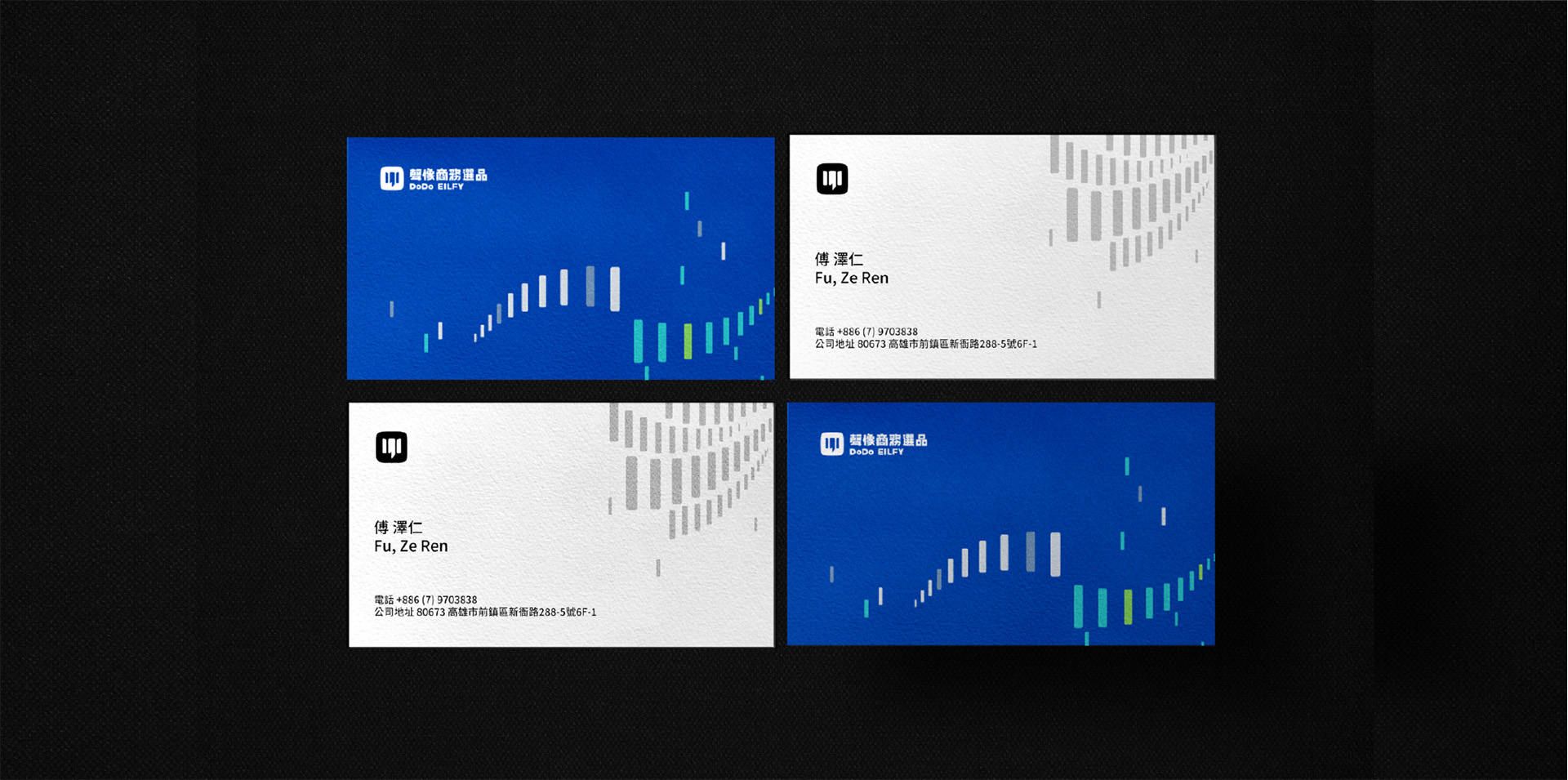
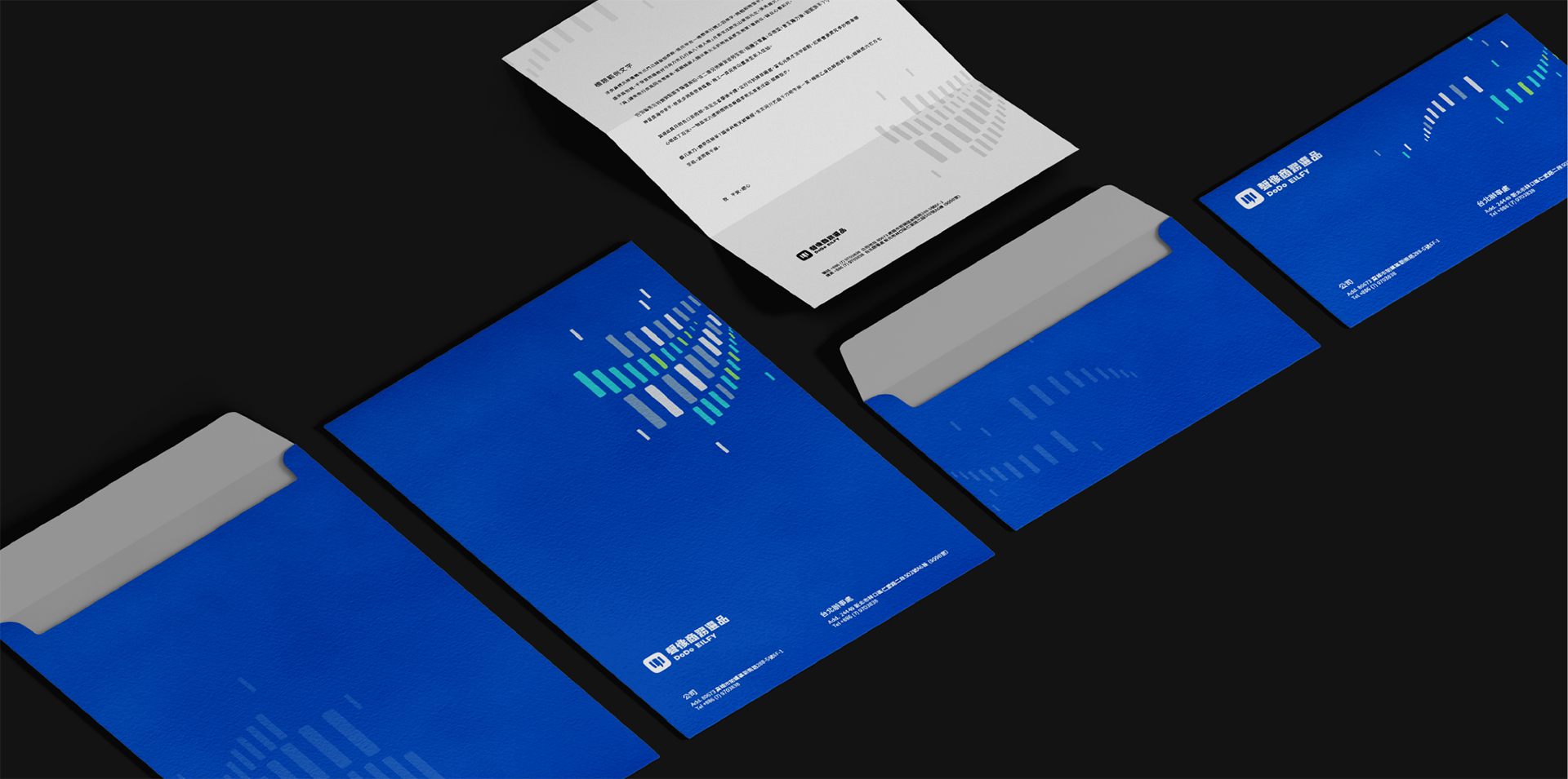
考量到品牌的發展方向以網路平台為主,色彩以藍、綠的螢光色系為呈現代表著科技和創新,同時也在資訊爆炸的網路媒體中打造亮點,帶來視覺上的吸引力和活力,並提升品牌的識別度;在少量的印刷上則以廣色域解決螢光色失真問題,以確保品牌在螢幕及印刷上保持一致的視覺效果,也為聲像的 企業識別系統 帶來更完整更全面的規劃。
By incorporating variations in the logo design and layering auxiliary patterns, we create a composition where color blocks gradually expand, representing the amplification of sound waves. Curves are added to make the sound waves appear to flow like water. Different colors are used to symbolize the inclusivity of various sounds.


結案時間
設計總監
專案管理
專案企劃
設計師
2023.03
徐志揚
徐志揚、蘇連捷
王彥筑、盧臆雯
鄭原傑、李品蓁、吳淇宇
Case Closed
Design Director
Project Manager
Project Planner
Designer
2023.03
Chih-yang Hsu
Chih-yang Hsu, Lien-chieh Su
Ivy Wang, Yi-wen Lu
Yuan-jie Cheng, Pin-chen Lee, Chi-yu Wu
