

新光金控 2019 企業社會責任報告書由手心設計負責封面、章節頁、內頁編排與圖表 icon 設計。設計以「光」為主題,呼應「活力新光,樂齡未來」的主軸:封面以漸層與光影結合「心」與新光大樓的視覺符號,內頁依章節訂定主題色,圖表與 icon 則用漸層光感色塊搭配簡約線條。
本次 CSR 的設計主題為「光」,以嶄新的形象開創新的世代,結合「活力新光,樂齡未來」作為核心主軸,將新光集團的溫暖、活力、及對未來金融概念濃縮至整本 CSR 報告書的視覺中。
The design theme of CSR is “Light”, creating a new generation with a brand-new image, combining “Energetic Shin Kong, Future of Elders ” as the core axis, compressing Shin Kong Group’s warmth, vitality, and future financial concepts into this CSR design.
【封面設計】【Cover Design】
封面利用色彩漸層與光影營造生活與智慧科技氛圍,也象徵新光蓬勃、匯流、脈動的主要意象,畫面結合「心」與新光大樓的視覺符號,引領出企業永續發展及社會責任的意象,打造別具品牌特色及社會溝通功能的專業 CSR 報告書。
The design theme of CSR is “Light”, creating a new generation with a brand-new image, combining “Energetic Shin Kong, Future of Elders ” as the core axis, compressing Shin Kong Group’s warmth, vitality, and future financial concepts into this CSR design.
The cover uses color gradients and light and shadow to create an atmosphere of connection between life and smart technology, and also symbolizes the image of Shin Kong’s vigorous development.
The cover picture combines heart and the Shin Kong Building image, leading the image of sustainable development and social responsibility of the company and creating a professional CSR that with a featuring features and social communication functions.
【內頁設計】【Inner Design】
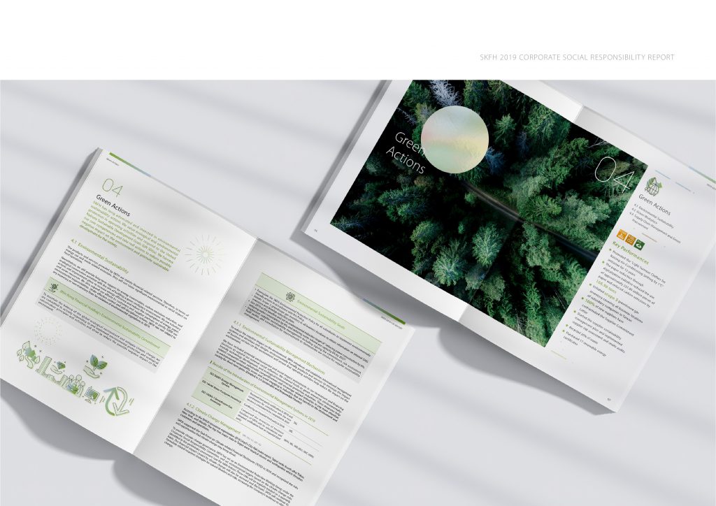
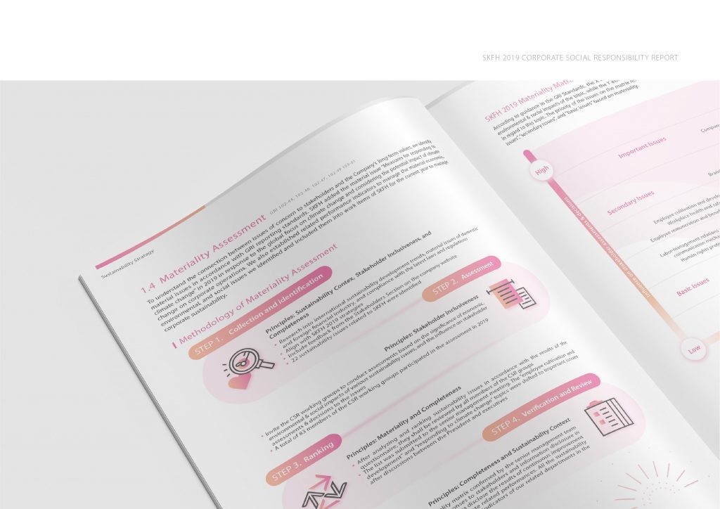
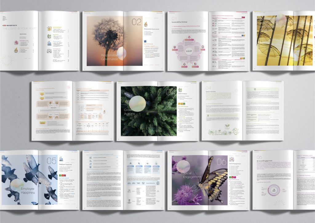
內頁延續封面的視覺元素,配合妥善的編排文字資訊層級制定,建構出完整且能充分描述品牌個性的編排方式:以封面主色調為核心,根據章節主題定義各自的主題色彩,並延伸出各自之輔助色系,以強化整本 CSR 之系統性與章節間的差異性。
The inner page continues the visual elements of the cover, with proper configuration to construct a complete arrangement that can fully come out the brand personality. Taking the main color of the cover as the core, the chapter colors are defined according to the theme of the chapters, and their auxiliary color systems are extended to strengthen the systematization of the whole CSR and the differences between chapters.
新光金控 CSR 的「光」主題是怎麼發展出來的?§
手心在 2020 年 2 月 14 日的風格與草圖提案中,先整理出新光品牌基調的四組關鍵字:未來感的(光)、溫暖的(紅)、生活的(人)、創新的(心),再以「光」發展出四個封面方向:活力新光、樂齡新光、光現未來,以及結合心光與新光大樓符號的「新光.心光」;同一份提案也為圖表 icon 試做「底色」與「線條」兩種表現。2 月 21 日的封面初稿提案中,兩款封面都以「新光.心光」發展。與完稿對照,現行頁面描述的封面以漸層與光影結合「心」與新光大樓,和「新光.心光」的說明一致。



圖表與 icon 怎麼讓資訊更好讀?§
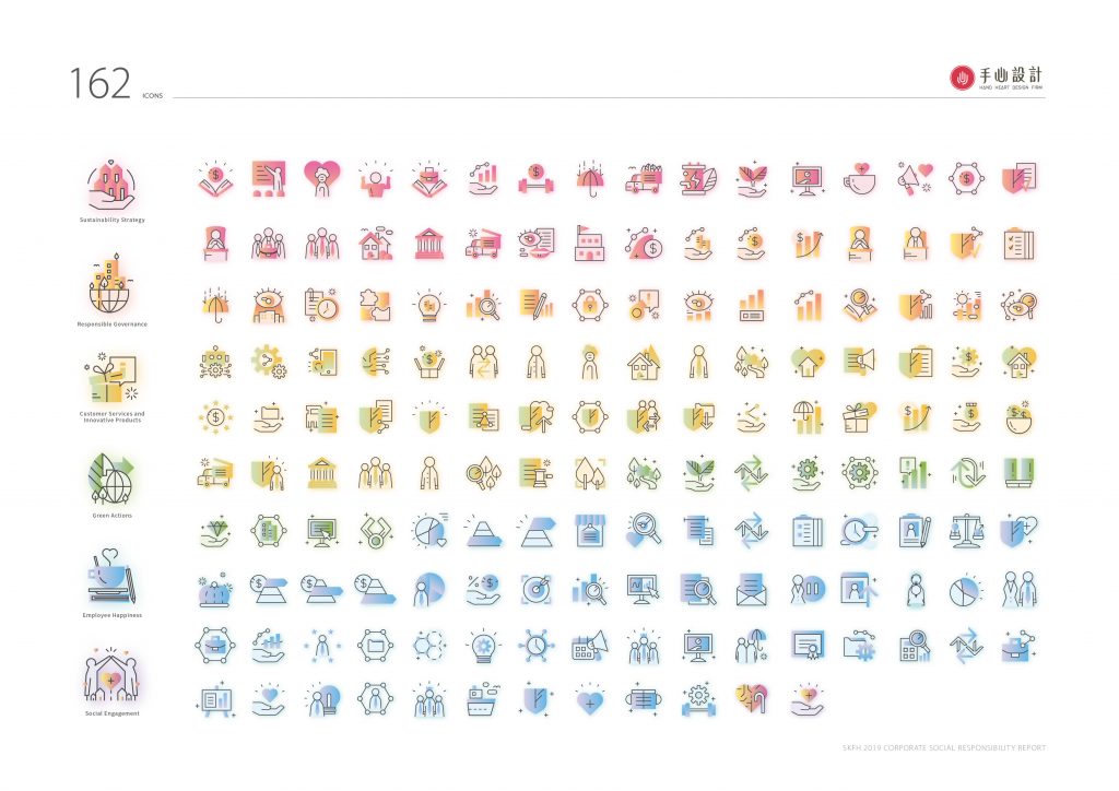
圖表及icon以漸層及光感色塊為主要風格,搭配簡約的線條,將複雜的文字資訊清晰、簡易的呈現,大大提高資訊的易讀性。
The charts and icons use gradients and light-sensitive color blocks as the main styles, collocate simple lines, the complex texts are presented simply, which greatly improves the readability of the information.


哪些情況適合參考新光金控報告書的做法?§
如果您的報告書有以下情況,新光金控這個案例的做法可以參考:
- 如果您有年度策略主軸,可以參考以主軸發展封面主題。
- 如果您的集團子公司多、章節多,可以參考章節主題色與輔助色系。
- 如果您的圖表與圖示多,可以先試底色與線條兩種表現。
可以參考的順序是:先發展主題,再比較圖表風格、整理章節配色與版型規範。
如果您也要規劃年度主題與章節配色,可參考ESG 永續報告書設計。
新光金控 2019 CSR 線上下載連結 2019 Shin Kong Financial Holding Co. CSR:新光金控 2019 企業社會責任報告書(PDF,約 10.8 MB)
-
結案時間 Case Closed-2020.08
設計統籌 Design Overall Planning-林宜慧 LIN, I-HUI
設計師 Designer-林宜慧 LIN, I-HUI、江珮瑜 JIANG,PEI-YU、盧臆雯 LU,YI-WEN
專案企劃 Project Planning-蘇連捷 SU,LIEN-CHIEH、王彥筑 WANG,YAN-ZHU
設計總監 Executive Design Director-徐志揚 HSU,CHIH-YANG
#企業社會責任報告書 #新光金控 #平面設計 #編排設計 #資訊視覺化 #CSR #2019CSR #CSR設計 #圖表設計 #手心設計 #CSR #ShinKong #TaiwanDesign #HandHeartDesign #GraphicDesign #DesignLayout #InformationDesign #InformationVisualization