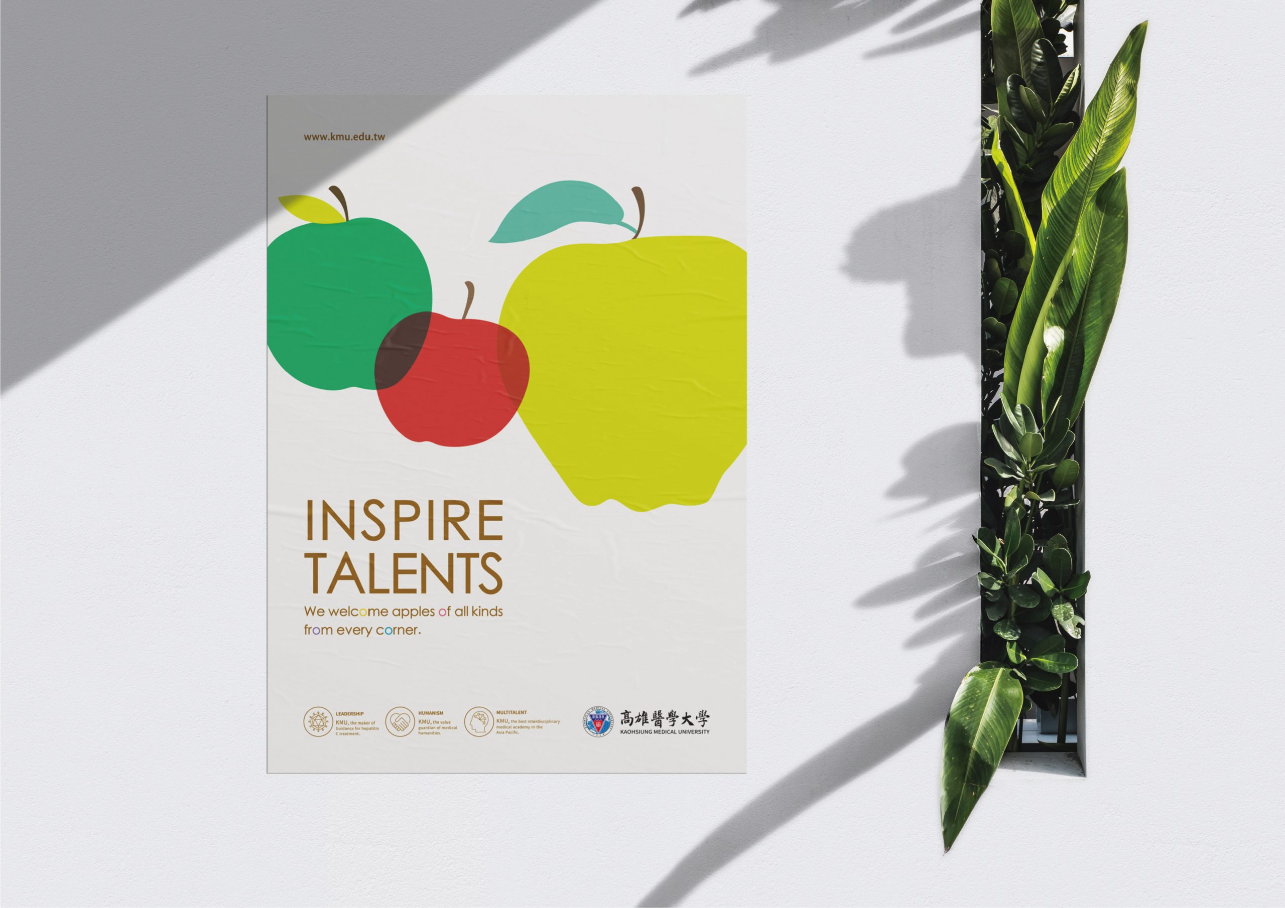
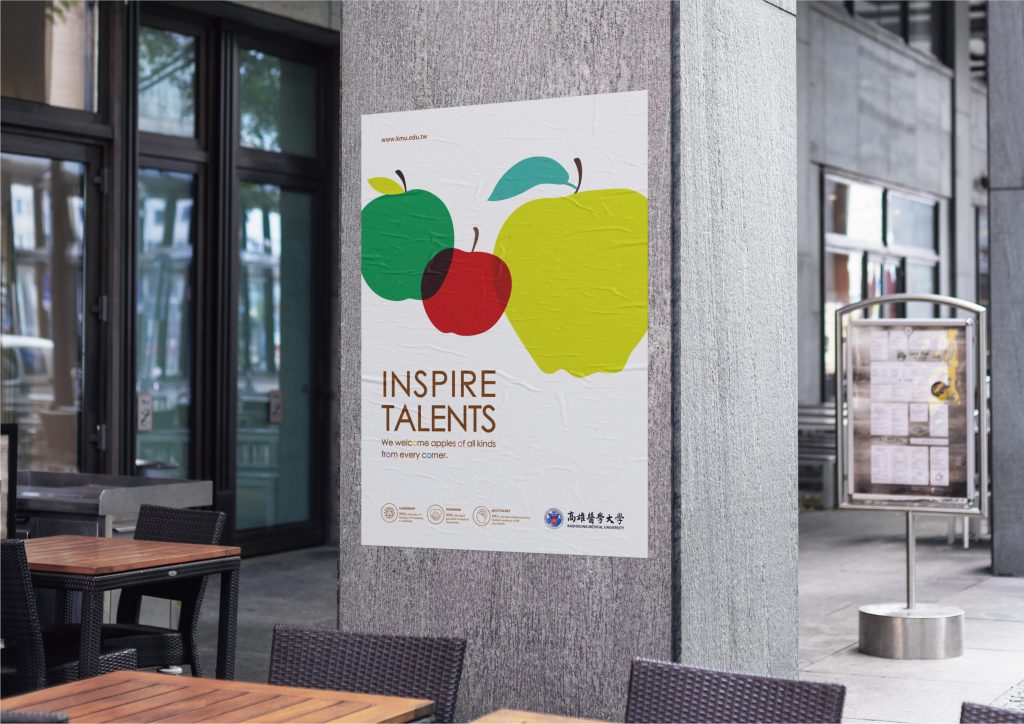
“You are the apple of my eye.” 此次高雄醫學大學國際形象稿的 平面設計 使用「蘋果」來譬喻優秀的、珍貴的、可愛的、健康的人,「來自不同角落的不同蘋果」象徵來自世界各地的跨領域人才,言簡意賅地表達高醫大推動、組織、培養優秀團隊,塑造亞太最佳跨領域醫療學研機構的願景。(同時也向現代設計大師Enzo Mari於1963年所創作的Serie della natura series致敬。)
“You are the apple of my eye.” The graphic design of the international image of Kaohsiung Medical University uses “apple” to refer to outstanding, precious, lovely, and healthy people. “Different Apples from Different Corners” symbolizes cross-disciplinary talents from all over the world, concisely and expressing the vision of Kaohsiung Medical University to promote, organize, and cultivate excellent teams to shape the best cross-field medical research institution in Asia-Pacific. (It also pays tribute to the Serie della natura series created by modern design Master Enzo Mari in 1963.)

手心設計透過科學化、系統化的品牌設計工作流程,和高雄醫學大學國際事務處攜手,以海外優秀學人(研究生、博士)及專業學者為對象,創造出一系列切中目標族群、向全球人才伸出友善之手的國際廣告文宣。
Hand heart design through scientific and systematic brand designs workflow, and work with the International Affairs Office of Kaohsiung Medical University, targeting outstanding overseas scholars (graduates, doctors) and professional scholars. Create a series of target groups and release friendly international advertisements to global talents.

針對不同學位學程的管理單位進行了數次基礎訪談,由那瑪夏基地的創生過程到侯忠武醫師的仁醫故事,我們傾聽並且細心紀錄,使設計團隊成員充分理解高雄醫學大學對於推動醫學教育所秉持的主要基本方針,包括對於生命的觀點、研究精神與多元發展方向。
In accordance with several basic interviews with management units of different degree programs. From the creation process of Namaxia base to the benevolent practice medicine story of Dr. Hou Zhongwu. We listen and record carefully, to enable the design team members to fully understand the main basic policy of Kaohsiung Medical University for the promotion of medical education. Including views on life, research spirit and multiple development directions.
由高醫大「尊重生命、追求真理、研發探索」的核心精神出發,教學團隊的主要幹部——校長、副校長及各系所主任等人,與設計團隊成員一同進行了「品牌基調工作坊」,選出最能夠代表高醫大的品牌性格、並且經由統計學、心理學與色彩學等科學方法進行視覺化的三大關鍵形容詞。
Starting from the core spirit of “Respect for Life, Pursue Truth, and Research and Explore” of the Kaohsiung Medical University. The main cadres of the teaching team including the principal, the vice principal, and the various chairman of department with members of the design team, select the distinguishing characteristic that represents the Kaohsiung Medical University. Three key adjectives visualized by scientific methods such as statistics, psychology and color science.


建立起充分的基礎認識與確立品牌基調後,設計團隊隨即展開一連串的色彩分析、視覺元素建構與文案撰寫工作,透過無數次的分析、討論與共同發想,成員們產出許多新鮮又有趣的創意。最終,我們為品牌建立了合乎當代美感、簡約但調性明確的視覺風格,以一系列吸睛且能夠讓觀者在短時間內留下印象的設計,完成了本次專案的階段性任務。
After establishing a sufficient basic understanding and make sure the brand tone, the design team immediately launched a series of color analysis, visual element construction and copywriting. Through countless analyses, discussions, members produced many fresh and interesting creatives.
In the end, we established a visual style of contemporary aesthetics, simple but clear tonality for the brand, and completed the phased task of this project with a series of eye-catching designs that can impress the audience in a short period of time.

—
結案時間 Case Closed-2019.12
設計師 Designer-林宜慧 LIN,YI-HUEI
專案經理 Project Manager-蘇連捷 SU,LIAN-JIE
專案企劃 Project Planning-蔡羽星 CAI,YU-SING
設計總監 Executive Design Director-徐志揚 SYU,JHIH-YANG


