深耕台灣二十餘年的台灣銅業是國內少數擁有「回收」與「製造」雙證照的廠商,具有處理國內外銅廢、以及熔煉純度高達 99.9%銅原料的能力,但B2B 的經營模式隨著台灣市場的飽和,勢必需要擴展國際上的相關業務,縱使產品品質優異,對於企業客戶或終端消費者來說,品牌形象皆是決定是否能長久合作、產生信任感的重要條件之一,目前較為陳舊的形象導致於擴展新市場的需求產生一定的阻礙,因此本次的設計目標便是打造嶄新的、具國際高度的品牌標誌,使品牌識別度達到有效提升。
Formosa Copper Technology Corporation, which has been cultivating Taiwan for more than 20 years, is one of the few domestic manufacturers with two licenses of “recycling” and “manufacturing”. It has the great ability to process copper waste and smelt copper raw materials with a purity of up to 99.9%. However, the B2B business model is almost saturated in the Taiwan market. The business is bound to expand internationally. Even though the product quality is excellent, brand image is one of the important conditions for customers to determine whether they can cooperate for a long time and generate a sense of trust. The current relatively outdated image has caused a lot of problems when expanding into new markets. The goal of this logo design is to create a brand new and international brand logo, so that the brand recognition can be effectively improved.


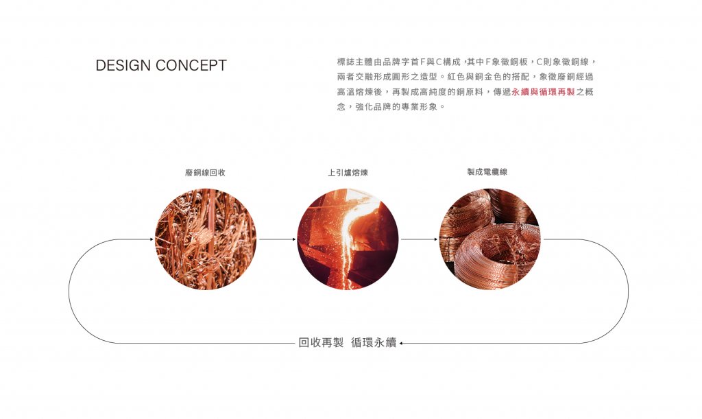
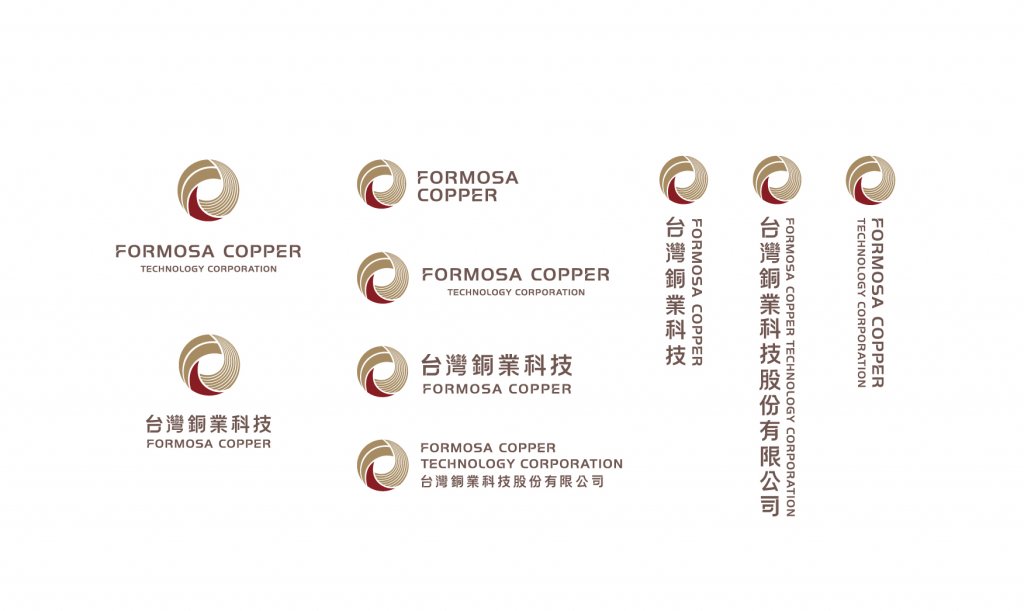
標誌主體由品牌字首F與C構成,其中F以大面積色塊的型態來象徵銅板,C則藉由精細排列的線條象徵銅線,並輔以象徵燒熔的紅、閃耀銅原色的金循環呈現,兩者交融形成一個動態的、流動的圓,也隱喻廢銅經過高溫熔煉後,再製成高純度的銅原料,呼應台灣銅業「城市礦山」的經營理念——將有限的銅資源經過專業熔煉回收,達到無限的利用,標準字設計也呼應標誌本身,在部分筆畫斷點來象徵循環的過程。永續的概念透過形象化的傳遞,能有效地強化品牌專業形象,輔以網站整體形象更新,傳遞品牌走向國際的高度與格局。
The main body of the logo is composed of brand prefixes F and C, where F is represented by a large area of color blocks to symbolize the copper plate, and C is represented by precise lines to symbolize the copper wire, and is supplemented by a symbol of burning red and sparkling copper color. The F and C blend to form a flowing circle, which also metaphors that scrap copper is smelted at high temperature to make high-purity copper raw materials. It echoes the business philosophy of Formosa Copper “city mine”, and the limited copper resources are professionally smelted and recycled to achieve Unlimited use. The standard word design also echoes the logo, with breakpoints to symbolize the process of circulation. The concept of sustainability can more effectively strengthen the professional image of the brand through visualization, and then update the overall image of the website to convey the height and pattern of the Formosa Copper determination to go into the world.

-
結案時間 Case Closed-2021.03
設計師 Designer-蘇筱雯 SU,SIAO-WUN
專案企劃 Project Planning-蘇連捷 SU,LIAN-JIE、王彥筑 WANG,YAN-JHU
設計總監 Executive Design Director-徐志揚 HSU,CHIH-YANG
-


